前端适配
rem
- rem是一个单位,比如一个html的font-size是14px,html里面的所有元素的样式使用rem来代替px,则1rem=14px,比如某个div大小为10rem=140px
<!DOCTYPE html><html lang="en"><head><meta charset="UTF-8"><meta http-equiv="X-UA-Compatible" content="IE=edge"><meta name="viewport" content="width=device-width, initial-scale=1.0"><title>Document</title><style>html {font-size: 14px;}div {height: 10rem;width: 10rem;background: blue;}span {display: block;height: 20rem;width: 20rem;background-color: rgb(122, 193, 193);}</style></head><body><div></div><span></span></body></html>
@media
<!DOCTYPE html><html lang="en"><head><meta charset="UTF-8"><meta http-equiv="X-UA-Compatible" content="IE=edge"><meta name="viewport" content="width=device-width, initial-scale=1.0"><title>Document</title><style>/* 我们在屏幕上,并且最大宽度是800px 设置我们想要的样式max-width 小于等于800px媒体查询可以根据不同的屏幕尺寸改变不同的样式*/@media screen and (max-width: 800px) {body {background-color: pink;}}/* 当屏幕宽度小于等于500px时使用这个样式 */@media screen and (max-width:500px) {body {background-color: yellow;}}</style></head><body></body></html>
媒体查询案例1
<!DOCTYPE html><html lang="en"><head><meta charset="UTF-8"><meta http-equiv="X-UA-Compatible" content="IE=edge"><meta name="viewport" content="width=device-width, initial-scale=1.0"><title>Document</title><style>/* 当屏幕宽度小于等于550px时,背景颜色为蓝色 */@media screen and (max-width: 550px) {body{background-color: blue;}}/* 当屏幕宽度大于等于556px小于等于779px时背景颜色为绿色 *//* @media screen and (min-width: 556px) and (max-width:779px) {body{background-color: green;}} *//* 下面这种写法也是可行的,推荐使用下面这种写法比如现在屏幕宽度大于等于556px还没有达到800px则使用下面背景绿色这个样式当屏幕宽度大于等于800px时使用的是大于等于800px背景红色的样式也就是后面的样式与前面样式有冲突会覆盖前面的样式 */@media screen and (min-width: 556px) {body{background-color: green;}}/* 当屏幕宽度大于等于800px时,背景颜色为红色 */@media screen and (min-width: 800px) {body{background-color: red;}}</style></head><body></body></html>
媒体查询案例2
<!DOCTYPE html><html lang="en"><head><meta charset="UTF-8"><meta http-equiv="X-UA-Compatible" content="IE=edge"><meta name="viewport" content="width=device-width, initial-scale=1.0"><title>Document</title><style>* {margin: 0;padding: 0;}/* 当屏幕宽度位于550px~749px,html的font-size为100px */@media screen and (min-width: 550px) {html {font-size: 100px;}}/* 当屏幕宽度大于等于750px,html的font-size为200px */@media screen and (min-width: 750px) {html {font-size: 200px;}}.car {height: 1rem;font-size: .5rem;background-color: green;line-height: 1rem;color: white;text-align: center;}</style></head><body><div class="car">购物车</div></body></html>
Less基础
Less介绍
Less(Leaner Style Sheets) 是一门css扩展语言,也称为css预处理器,在css现有的语法上加入了程序式语言特性
Less中文网址:http://lesscss.cn
常见的css预处理器:Sass、Less、Stylus
Less编译
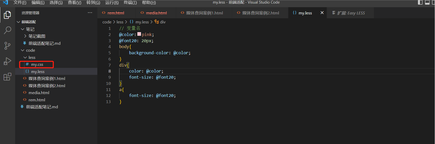
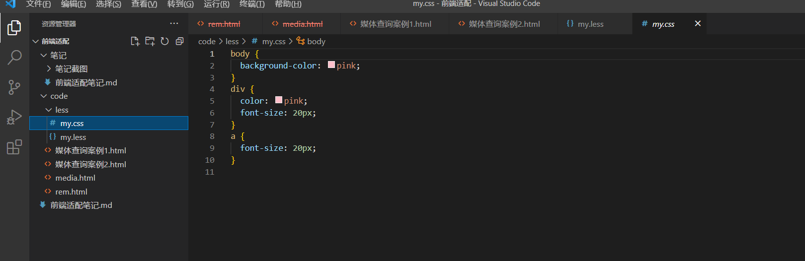
vscodr Less插件-Easy Less,安装完成之后只要保存以下less文件,会自动编译生成css文件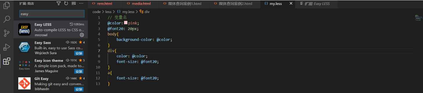
Less嵌套
- css写法
div {height: 100px;}div a {color: red;}div a:hover {background-color: green;}.parent {background-color: blue;}.parent .children {background-color: pink;}
- less写法
div {height: 100px;a {color: red;// 伪类需要在前面加上&&:hover {background-color: green;}}}.parent{background-color: blue;.children{background-color: pink;}}
Less运算
- less代码
@fontSize: 14px;html {font-size: @fontSize;}div {height: 250px + 10;background-color: red;}.container {span {height: (80rem / @fontSize);}}// 运算符两边要有空格,新版本除法运算要加括号// 如果两个数值运算只有一个数值有单位,运算结果的单位就是这个单位// 如果参与运算的两个数值都有单位,运算结果的单位为第一个数值的单位,比如10rem / 5px = 2rem
- 编译后的css代码
html {font-size: 14px;}div {height: 260px;background-color: red;}.container span {height: 5.71428571rem;}
如何进行适配
- 利用vscode开发,安装px to rem插件将px单位转换成为rem,安装完成之后,点击该插件的设置按钮,选择扩展设置,将Root Font Size 设置为你设计稿的字体大小
- 编写测试类,注意:如果使用媒体查询使用的是min-width,要从小到大来写,要不然不会起到你意料之中的适配效果
- 如下是测试代码
<!DOCTYPE html><html lang="en"><head><meta charset="UTF-8"><meta http-equiv="X-UA-Compatible" content="IE=edge"><meta name="viewport" content="width=device-width, initial-scale=1.0"><title>Document</title><link rel="stylesheet" href="./less/example.css"><style>/* 假如我根据的设计稿是1920*1080大小的,将宽度划分10等份,那么html的font-size=1920/10=192px,在开发的过程中就以192px为基准,为了适应其他的屏幕大小,需要在媒体查询中为每个屏幕大小设置其html 的font-size大小,为(屏幕宽度/10px) *//* 如果屏幕大小为500*360,那么1rem=500/10=50px */@media screen and (min-width:500px) {html {font-size: 50px;}}/* 如果屏幕大小为640*360,那么1rem=640/10=64px */@media screen and (min-width:640px) {html {font-size: 64px;}}/* 如果屏幕大小为740*360,那么1rem=740/10=74px */@media screen and (min-width:740px) {html {font-size: 74px;}}/* 如果屏幕大小为915*412,那么1rem=915/10=91.5px */@media screen and (min-width:915px) {html {font-size: 91.5px;}}/* 如果屏幕大小为1024*768,那么1rem=1024/10=102.4px */@media screen and (min-width:1024px) {html {font-size: 102.4px;}}/* 如果屏幕大小为1300*500的,划分10等份,那么1rem=1300/10=130px */@media screen and (min-width: 1300px) {html {font-size: 130px;}}/* 如果屏幕大小是1400*1080的,划分10等份,那么1rem=1400/10=140px */@media screen and (min-width: 1400px) {html {font-size: 140px;}}/* 如果屏幕大小是1500*1080的,划分10等份,那么1rem=1500/10=150px */@media screen and (min-width: 1500px) {html {font-size: 150px;}}/* 如果屏幕大小是1920*1080的,划分10等份,那么1rem=1920/10=192px */@media screen and (min-width: 1920px) {html {font-size: 192px;}}</style></head><body><div class="header"><span>头部</span><span>头部</span><span>头部</span><span>头部</span></div><div class="content">内容</div></body></html>
.header {border: 0.0052rem solid red;height: 1.0417rem;width: 8.8542rem;display: flex;margin: auto;justify-content: center;align-items: center;margin-bottom: 0.1042rem;}.header span {background-color: blue;color: white;height: 0.5208rem;text-align: center;line-height: 0.5208rem;margin: 0 0.1042rem;width: 1.5625rem;font-size: 0.2604rem;}.content {width: 8.8542rem;height: 2.6042rem;text-align: center;line-height: 2.6042rem;background-color: pink;margin: auto;}
.header {border: .0052rem solid red;height: 1.0417rem;width: 8.8542rem;display: flex;margin: auto;justify-content: center;align-items: center;margin-bottom: .1042rem;span {background-color: blue;color: white;height: .5208rem;text-align: center;line-height: .5208rem;margin: 0 .1042rem;width: 1.5625rem;font-size: .2604rem;}}.content {width: 8.8542rem;height: 2.6042rem;text-align: center;line-height: 2.6042rem;background-color: pink;margin: auto;}

若有收获,就点个赞吧
0 人点赞
