- 一、项目结构
- 二、标签、样式
- 三、小程序组件
- 五、扩展组件 Uni
- 1、Badge 数字角标
- 2、Calendar 日历
- 3、Card 卡片⭐
- 4、Collapse 折叠面板⭐
- 5、Combox 组合框⭐
- 6、CountDown 倒计时
- 7、Drawer 抽屉⭐
- 8、Fab 悬浮按钮
- 9、Fav 收藏按钮
- 10、GoodsNav 商品导航⭐
- 11、Grid 宫格布局
- 12、Icons 图标
- 13、IndexedList 索引列表⭐
- 14、List 列表
- 15、LoadMore 加载更多
- 16、NavBar 导航栏⭐
- 17、NoticeBar 通告栏⭐
- 18、NumberBox 数字输入框⭐
- 19、Pagination 分页器
- 20、Popup 弹出层⭐
- 21、Rate 评分组件⭐
- 22、SearchBar 搜索栏
- 23、SegmentedControl 分段器⭐
- 24、Steps 步骤条⭐
- 25、SwipeAction滑动操作⭐
- 26、SwiperDot 轮播图指示点⭐
- 27、Tag 标签
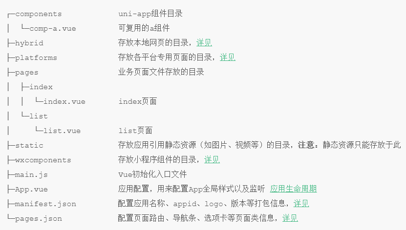
一、项目结构
二、标签、样式
1、标签更改
- body 改为page
- div、ul、li等改为view
- span、font改为text
- a 改为 navigator
- img 改为 image
- select 改成 picker
- iframe 改成 web-view
2、rpx
uni-app 支持的通用 css 单位包括 px、rpx
- rpx 即响应式px,一种根据屏幕宽度自适应的动态单位。以750宽的屏幕为基准,750rpx恰好为屏幕宽度
- 微信小程序设计 rpx 解决不同宽度手机宽度变形问题,作为相对基准宽度的单位,可根据屏幕宽度自适应
uni-app规定屏幕基准宽度 750rpx。开发者可以通过设计稿基准宽度计算页面元素 rpx 值,设计稿 1px 与框架样式 1rpx 转换公式如下:设计稿 1px / 设计稿基准宽度 = 框架样式 1rpx / 750rpx
3、css 变量
- —status-bar-height:系统状态栏高度。
var(--status-bar-height)在微信小程序环境为固定25px - —window-top:内容区域距离顶部 NavigationBar 的距离,H5表现为 navigationBar 高度
- —window-bottom:内容区域距离底部 tabbar 的距离,H5表现为 tabbar 高度
三、小程序组件
1、page-meta 页面属性配置节点
微信基础库2.9.0新增,指定页面的一些属性、监听页面事件。可部分替代pages.json的功能。但渲染速度还是pages.json方式的写法更快
- 类似html里的header标签。页面的背景色、原生导航栏的参数,都可以写在
page-meta里 page-meta只能是页面内的第一个节点。可以配合 navigation-bar 组件一同使用<page-meta>与 pages.json 的设置相冲突时,会覆盖 page.json 的配置
2、navigation-bar 导航栏
页面导航条配置节点,用于指定导航栏的一些属性。只能是 page-meta 组件内的第一个节点,需要配合它一同使用
navigation-bar与 pages.json 的设置相冲突时,会覆盖 page.json 的配置
3、navigator 页面链接跳转
- url有长度限制,太长的字符串会传递失败,可使用窗体通信、全局变量,或
encodeURIComponent等方式解决 - 跳转tabbar页面,必须设置open-type=”switchTab”
<navigator url="navigate/navigate?title=navigate" hover-class="navigator-hover"><button type="default">跳转到新页面</button></navigator><navigator url="redirect/redirect?title=redirect" open-type="redirect" hover-class="other-navigator-hover"><button type="default">在当前页打开</button></navigator><navigator url="/pages/tabBar/extUI/extUI" open-type="switchTab" hover-class="other-navigator-hover"><button type="default">跳转tab页面</button></navigator>
4、原生组件
1. canvas 画布⭐
canvas 在微信小程序、百度小程序、QQ小程序中为原生组件,层级高于前端组件,请勿内嵌在 scroll-view、swiper、picker-view、movable-view 中使用。解决 canvas 层级过高无法覆盖,参考 native-component。canvas 标签默认宽度 300px、高度 225px,动态修改 canvas 大小后需要重新绘制
- 如考虑小程序,推荐使用全端可用的uChart。
如只考虑H5端,可以使用echart、f2等常规web图表。H5端的echart报表因涉及大量dom操作,无法跨端使用
<canvas style="width: 300px; height: 200px;" canvas-id="firstCanvas"></canvas>
onReady: function (e) {
//uni.createCanvasContext(canvasId, this) 创建 canvas 绘图上下文,
//在自定义组件下,第二个参数传入组件实例this,以操作组件内 <canvas/> 组件
var context = uni.createCanvasContext('firstCanvas')

context.setStrokeStyle("#00ff00")
context.setLineWidth(5)
context.rect(0, 0, 200, 200)
context.stroke()
context.setStrokeStyle("#ff0000")
context.setLineWidth(2)
context.moveTo(160, 100)
context.arc(100, 100, 60, 0, 2 * Math.PI, true)
context.moveTo(140, 100)
context.arc(100, 100, 40, 0, Math.PI, false)
context.moveTo(85, 80)
context.arc(80, 80, 5, 0, 2 * Math.PI, true)
context.moveTo(125, 80)
context.arc(120, 80, 5, 0, 2 * Math.PI, true)
context.stroke()
context.draw()
}
2. map 地图⭐
latitude纬度,longitude经度,markers标记点用于在地图上显示标记的位置,含 id、latitude、longitude、iconPath,polyline 路线指定一些系列坐标点。常用坐标系:
- WGS84:为一种大地坐标系,也是目前广泛使用的GPS全球卫星定位系统使用的坐标系
- GCJ02:又称火星坐标系,是由中国国家测绘局制定的地理坐标系统,是由WGS84加密后得到的坐标系
- BD09:为百度坐标系,在GCJ02坐标系基础上再次加密。其中bd09ll表示百度经纬度坐标,bd09mc表示百度墨卡托米制坐标
注意:互联网地图在国内必须至少使用GCJ02进行首次加密,不允许直接使用WGS84坐标下的地理数据,同时任何坐标系均不可转换为WGS84坐标。
<map style="width: 100%; height: 300px;" :latitude="latitude" :longitude="longitude"
    :markers="covers"></map>
latitude: 23.099994,
longitude: 113.324520,
covers: [{
    id: 0, // 使用 marker点击事件 需要填写id
    title: 'map',
    latitude: 23.099994,
    longitude: 113.324520,
    iconPath: '../../static/map.png',
}]
3. camera 相机
uni-app中 页面内嵌的区域相机组件。APP\H5如需调用原生的摄像头用于拍照、摄像操作,可通过plus.camera获取摄像头管理对象。应用场景:拍照、录像、OCR识别、扫码。创建相机上下文:uni.createCameraContext
- 拍照:从相册选择图片或使用相机拍照,返回相片的临时文件路径。对应API 为 uni.chooseImage
uni.chooseImage({
    count: 6, //默认9
    sizeType: ['original', 'compressed'], //可以指定是原图还是压缩图,默认二者都有
    sourceType: ['album'], //从相册选择
    success: function (res) {
        console.log(JSON.stringify(res.tempFilePaths));
    }
});
- 录像:拍摄视频或从手机相册中选视频,返回视频的临时文件路径。对应API 为 uni.chooseVideo
注意:小程序可通过用户授权API 即 uni.authorize(OBJECT) 来判断用户是否给应用授予相册或摄像头的访问权限var self = this; uni.chooseVideo({ count: 1, sourceType: ['camera', 'album'], success: function (res) { self.src = res.tempFilePath; } });<camera device-position="back" flash="off" @error="error" style="width: 100%; height: 300px;"></camera> <button type="primary" @click="takePhoto">拍照</button> <view>预览</view> <image mode="widthFix" :src="src"></image>// src:"" takePhoto() { const ctx = uni.createCameraContext();//创建并返回 camera 组件的上下文 cameraContext 对象 ctx.takePhoto({ quality: 'high', success: (res) => { this.src = res.tempImagePath } }); }, error(e) { console.log(e.detail); }
4. video 视频
创建视频上下文:uni.createVideoContext
<video id="myVideo" src="http://clips.vorwaerts-gmbh.de/big_buck_bunny.mp4"
    @error="videoErrorCallback" :danmu-list="danmuList" enable-danmu danmu-btn controls>
</video>
<input v-model="danmuValue" class="uni-input" type="text" placeholder="在此处输入弹幕内容" />
<button style="margin: 30rpx auto" @click="sendDanmu" type="primary">发送弹幕</button>
danmuList: [{
  text: '第 1s 出现的弹幕',
  color: '#ff0000',
  time: 1
    },{
  text: '第 3s 出现的弹幕',
  color: '#ff00ff',
  time: 3
  }],
danmuValue: ''

onReady() {
    this.videoContext = uni.createVideoContext('myVideo')
},
methods:{
 sendDanmu() {
   this.videoContext.sendDanmu({
     text: this.danmuValue,
     color: this.getRandomColor()
   });
   this.danmuValue = '';
 },
   getRandomColor() {
     const rgb = []
     for (let i = 0; i < 3; ++i) {
       let color = Math.floor(Math.random() * 256).toString(16)
       color = color.length == 1 ? '0' + color : color
       rgb.push(color)
     }
     return '#' + rgb.join('')
   },
     videoErrorCallback(e) {
       //显示模态弹窗
       uni.showModal({
         content: e.target.errMsg,
         showCancel: false
       })
     }
}
5. live-player 实时直播拉流
实时音视频播放,小程序专用。App、H5的实时音视频播放,不是使用 live-player,而是直接使用 video 组件
6. live-pusher 实时直播推流
实时音视频录制,小程序专用。app平台的vue页面支持直播推流需编写条件编译代码,使用 plus.video.LivePusher
7. textarea 多行输入框
5、表单组件
1. checkbox-group、checkbox 多选框
<checkbox-group>
  <label>
    <checkbox value="cb" checked="true" />选中
  </label>
  <label>
    <checkbox value="cb" />未选中
  </label>
</checkbox-group>
2. radio-group、radio 单选框
<radio-group @change="radioChange">
  <label v-for="(item, index) in items" :key="item.value">
    <radio :value="item.value" :checked="index === current" />
    <view>{{item.name}}</view>
  </label>
</radio-group>
items: [{
    value: 'USA',
    name: '美国'
    },
    {
    value: 'CHN',
    name: '中国',
    checked: 'true'
    },
    {
    value: 'BRA',
    name: '日本'
    }],
current: 0

radioChange(e) {
  for (let i = 0; i < this.items.length; i++) {
      if (this.items[i].value === e.target.value) {
        this.current = i;
      break;
    }
  }
}
3. picker 滚动选择器⭐
从底部弹起的滚动选择器。支持五种选择器,通过mode来区分,分别是普通选择器,多列选择器,时间选择器,日期选择器,省市区选择器
- 多列选择器
```javascript multiIndex:[0,0,0], multiArray:[[‘无脊柱动物’, ‘脊柱动物’],<view class="uni-list"> <view class="uni-list-cell"> <view class="uni-list-cell-left">当前选择——</view> <view class="uni-list-cell-db"> <picker mode="multiSelector" :value="multiIndex" :range="multiArray" @change="bindMultiPickerChange" @columnchange="bindMultiPickerColumnChange"> <view class="uni-input"> {{multiArray[0][multiIndex[0]]}},{{multiArray[1][multiIndex[1]]}},{{multiArray[2][multiIndex[2]]}}</view> </picker> </view> </view>['扁性动物', '线形动物', '环节动物', '软体动物', '节肢动物'], ['猪肉绦虫', '吸血虫']]
bindMultiPickerChange(e){ console.log(‘picker发送选择改变,携带值为’, e.detail.value) this.multiIndex = e.detail.value }, bindMultiPickerColumnChange(e){ console.log(‘修改的列为’, e.detail.column, ‘,值为’, e.detail.value); var data = { multiArray: this.multiArray, multiIndex: this.multiIndex }; data.multiIndex[e.detail.column] = e.detail.value; switch (e.detail.column) { case 0: switch (data.multiIndex[0]) { case 0: data.multiArray[1] = [‘扁性动物’, ‘线形动物’, ‘环节动物’, ‘软体动物’, ‘节肢动物’]; data.multiArray[2] = [‘猪肉绦虫’, ‘吸血虫’]; break; case 1: data.multiArray[1] = [‘鱼’, ‘两栖动物’, ‘爬行动物’]; data.multiArray[2] = [‘鲫鱼’, ‘带鱼’]; break; } data.multiIndex[1] = 0; data.multiIndex[2] = 0; break; case 1: switch (data.multiIndex[0]) { case 0: switch (data.multiIndex[1]) { case 0: data.multiArray[2] = [‘猪肉绦虫’, ‘吸血虫’]; break; case 1: data.multiArray[2] = [‘蛔虫’]; break; case 2: data.multiArray[2] = [‘蚂蚁’, ‘蚂蟥’]; break; case 3: data.multiArray[2] = [‘河蚌’, ‘蜗牛’, ‘蛞蝓’]; break; case 4: data.multiArray[2] = [‘昆虫’, ‘甲壳动物’, ‘蛛形动物’, ‘多足动物’]; break; } break; case 1: switch (data.multiIndex[1]) { case 0: data.multiArray[2] = [‘鲫鱼’, ‘带鱼’]; break; case 1: data.multiArray[2] = [‘青蛙’, ‘娃娃鱼’]; break; case 2: data.multiArray[2] = [‘蜥蜴’, ‘龟’, ‘壁虎’]; break; } break; } data.multiIndex[2] = 0; break; } console.log(data.multiIndex); this.multiArray=data.multiArray; this.multiIndex=data.multiIndex }
- 日期选择器
```html
<view class="uni-list">
  <view class="uni-list-cell">
    <view class="uni-list-cell-left">
      当前选择
      </view>
    <view class="uni-list-cell-db">
      <picker mode="date" :value="date" :start="startDate" :end="endDate" @change="bindDateChange">
        <view class="uni-input">{{date}}</view>
      </picker>
    </view>
  </view>
 </view>
data(){
    const currentDate = this.getDate({
        format: true
    })
  return{
        date:currentDate
  }
},
computed:{
    startDate() {
    return this.getDate('start');
  },
    endDate() {
      return this.getDate('end');
    }
},
methods:{
    bindDateChange: function(e) {
      this.date = e.target.value
},
  getDate(type) {
    const date = new Date();
    let year = date.getFullYear();
    let month = date.getMonth() + 1;
    let day = date.getDate();

    if (type === 'start') {
      year = year - 60;
    } else if (type === 'end') {
      year = year + 2;
    }
    month = month > 9 ? month : '0' + month;;
    day = day > 9 ? day : '0' + day;
    return `${year}-${month}-${day}`;
  }
}
4. picker-view 嵌入页面的滚动选择器
其中只可放置 picker-view-column组件
5. slider 滑动选择器
可设置step、最小最大值。是原生input类型 range 的变形。另一个 progress 进度条也是 range 的变形。
6. switch 开关选择器
7. editor 富文本编辑器
6、视图容器
1. scroll-view 可滚动视图区域
可设置横向滚动和竖向滚动,使用竖向滚动时,需要给 scroll-view一个固定高度。
- scroll-view 不适合放长列表,有性能问题。长列表滚动和下拉刷新,应该使用原生导航栏搭配页面级的滚动和下拉刷新实现。
- scroll-view是区域滚动,不会触发页面滚动,无法触发pages.json配置的下拉刷新、页面触底onReachBottomDistance、titleNView的transparent透明渐变
- 组件属性设置不生效解决办法:
- 监听scroll事件,记录组件内部变化的值,在设置新值之前先设置为记录的当前值
```html
A B C
- 监听scroll事件,记录组件内部变化的值,在设置新值之前先设置为记录的当前值
```html
```javascript
export default {
  data() {
    return {
      scrollTop: 0,
      old: {
        scrollTop: 0
      }
    }
  },
  methods: {
    upper(e){
      console.log(e)
    },
    lower(e){
      console.log(e)
    },
    scroll: function(e) {
      this.old.scrollTop = e.detail.scrollTop
    },
    goTop: function(e) {
      this.scrollTop = this.old.scrollTop
      this.$nextTick(function() {
        this.scrollTop = 0
      });
    }
  }
}
2. swiper滑块视图容器
一般用于左右滑动或上下滑动,比如banner轮播图,注意是滑动切换而不是滚动。swiper下的每个swiper-item是一个滑动切换区域,不能停留在2个滑动区域之间。
- swiper是单页组件,适合做banner图轮播和简单列表左右滑动,一般缓存3页数据
banner图的切换效果和指示器的样式,有多种风格可自定义
<swiper class="swiper" :indicator-dots="indicatorDots" :autoplay="autoplay"
  :interval="interval" :duration="duration">
<swiper-item>
  <view class="swiper-item uni-bg-red">A</view>
</swiper-item>
<swiper-item>
  <view class="swiper-item uni-bg-green">B</view>
</swiper-item>
<swiper-item>
  <view class="swiper-item uni-bg-blue">C</view>
</swiper-item>
</swiper>
data(){ return { indicatorDots: true, autoplay: true, interval: 2000, duration: 500 } }3、movable-area 可移动区域
movable-area 必须设置 width 和 height 属性,不设置默认为 10px
4、movable-view 可移动视图容器
在页面中可以拖拽滑动。必须在<movable-area/>组件中,并且必须是直接子节点,否则不能移动
- movable-view 必须设置width和height属性,不设置默认为10px
- movable-view 默认为绝对定位,top和left属性为0px
- 当movable-view小于movable-area时,movable-view的移动范围是在movable-area内;
- 当movable-view大于movable-area时,movable-view的移动范围必须包含movable-area(x轴方向和y轴方向分开考虑)
movable-view的移动方向,属性值有all、vertical、horizontal、none
<movable-area style="width:200px;height: 200px;background-color: #D3D3D3;">
<movable-view :x="x" :y="y" direction="all" @change="onChange"
    style="width: 50px;height: 30px;background-color: #DD524D;text-align: center;">text</movable-view>
</movable-area>
<view @tap="tap">点击这里移动至 (30px, 30px)</view>
data(){ return{ x: 0, y: 0, old: { x: 0, y: 0 } } }, methods:{ tap(e){ this.x = this.old.x this.y = this.old.y this.$nextTick(function() { this.x = 30 this.y = 30 }) }, onChange(e){ this.old.x = e.detail.x this.old.y = e.detail.y } }5、cover-view 覆盖在原生组件上的文本视图
**
支持的事件:
click。可覆盖的原生组件:canvas、camera、live-player、live-pusher- 只支持嵌套 cover-view、cover-image
6、cover-image 覆盖在原生组件上的图片视图
支持的事件:click。可覆盖的原生组件:<video>、<map>
<video class="video" id="demoVideo" :controls="false" :enable-progress-gesture="false"
    :show-center-play-btn="false" src="http://clips.vorwaerts-gmbh.de/big_buck_bunny.mp4">
  <cover-view class="controls-title">简单的自定义 controls</cover-view>
  <cover-image class="controls-play img" @click="play" src="/static/map.png"></cover-image>
  <cover-image class="controls-pause img" @click="pause" src="/static/maps.png"></cover-image>
</video>
.img {
        position: absolute;
        width: 100rpx;
        height: 100rpx;
        top: 50%;
        margin-top: -50rpx;
    }

.controls-play {
  left: 50rpx;
}

.controls-pause {
  right: 50rpx;
}
.controls-title {
  width: 100%;
  text-align: center;
  color: #FFFFFF;
}
onReady(){
  this.videoCtx = uni.createVideoContext('demoVideo')
},
play(event) {
  this.videoCtx.play();
  uni.showToast({
    title: '开始播放',
    icon: 'none'
  });
},
  pause(event) {
    this.videoCtx.pause();
    uni.showToast({
      title: '暂停播放',
      icon: 'none'
    });
  }
五、扩展组件 Uni
1、Badge 数字角标
数字角标(徽章)组件,在元素周围如列表、九宫格、按钮等地进行数量提示,默认为实心灰色背景。用来标记重点信息使用,如接受到新消息、有未读消息等。<uni-badge text="+1" type="warning"></uni-badge>
2、Calendar 日历
日历组件。<uni-calendar :lunar="true" :insert="true" @change="change"></uni-calendar>
3、Card 卡片⭐
卡片组件用来显示完整且独立的一段信息,如文章预览图、作者信息、时间等。卡片通常是更复杂详细信息的入口。
<uni-card title="基础卡片" thumbnail="https://img-cdn-qiniu.dcloud.net.cn/new-page/uni.png"
    extra="extra message" note="bottom tips">内容主体,可自定义内容及样式
</uni-card>

<uni-card title="图文卡片" mode="style" thumbnail="https://img-cdn-qiniu.dcloud.net.cn/uniapp/images/cbd.jpg"
    extra="extra message" note="bottom tips">内容主体,可自定义内容及样式
</uni-card>

<uni-card title="标题卡片" mode="title" thumbnail="https://img-cdn-qiniu.dcloud.net.cn/uniapp/images/muwu.jpg"
    extra="extra message" note="bottom tips">内容主体,可自定义内容及样式
</uni-card>
4、Collapse 折叠面板⭐
折叠面板组件用于折叠显示过长的内容或列表,常用于多内容分类项使用。
- 手风琴效果:每次只能展开一个面板
<uni-collapse accordion="true">
<uni-collapse-item title="标题1" thumb="https://img-cdn-qiniu.dcloud.net.cn/new-page/uni.png" :showAnimation="true">
  <view style="padding: 30rpx;">
    手风琴效果
  </view>
</uni-collapse-item>
<uni-collapse-item title="标题2" thumb="https://img-cdn-qiniu.dcloud.net.cn/new-page/hx.png" :showAnimation="true">
  <view style="padding: 30rpx;">
    手风琴效果
  </view>
</uni-collapse-item>
</uni-collapse>
5、Combox 组合框⭐
组合框组件,可直接输入,也可下拉选择的表单项输入框。
<uni-combox label="城市" :candidates="candidates" placeholder="请选择城市" v-model="city">
</uni-combox>
6、CountDown 倒计时
倒计时组件,可选择天数,可设置基本样式
<uni-countdown color="#FFFFFF" background-color="#00B26A" border-color="#00B26A"
    :show-day="false" :hour="2" :minute="30" :second="0"></uni-countdown>
7、Drawer 抽屉⭐
抽屉组件,用于展示侧滑菜单,侧滑导航。默认点击遮罩关闭抽屉。要显示抽屉:this.refs.drawer.open()
<uni-drawer ref="drawer" mode="right">
  <view style="padding:30rpx;">抽屉式导航</view>
</uni-drawer>
8、Fab 悬浮按钮
悬浮按钮组件,点击可展开一个图标按钮菜单。
<uni-fab :content="content"></uni-fab>
return{
    content: [
    {
      iconPath: 'https://img-cdn-qiniu.dcloud.net.cn/new-page/uni.png',
      selectedIconPath: 'https://img-cdn-qiniu.dcloud.net.cn/new-page/hx.png',
      text: 'hello',
        },
        {
      iconPath: 'https://img-cdn-qiniu.dcloud.net.cn/new-page/hx.png',
      text: 'world',
    },
  ]
}
9、Fav 收藏按钮
用于收藏功能,可点击切换选中、不选中的状态。checked为true时,显示已收藏
<uni-fav :checked="checked" circle="true" bg-color="#fff"
    bg-color-checked="#007aff" @click="onClick"></uni-fav>
return{
    checked:false
}

onClick(){
    this.checked = true
}
10、GoodsNav 商品导航⭐
用于电商类应用底部导航,可自定义加入购物车,购买等操作
<uni-goods-nav :fill="true" :options="options" :button-group="buttonGroup"
    @click="toClick" @buttonClick="buttonClick" />
options: [{
                    icon: 'headphones',
                    text: '客服'
                }, {
                    icon: 'shop',
                    text: '店铺',
                    info: 1,
                    infoBackgroundColor: '#35ff2b',
                    infoColor: "red"
                }, {
                    icon: 'cart',
                    text: '购物车',
                    info: 2
                }],
buttonGroup: [{
                        text: '加入购物车',
                        backgroundColor: '#ff0000',
                        color: '#fff'
                    },
                    {
                        text: '立即购买',
                        backgroundColor: '#ffa200',
                        color: '#fff'
                    }
                ]
11、Grid 宫格布局
uni-grid-item 子组件新增 index 属性,是一个唯一标识,为必传项。以下为带边框矩形显示,并微调样式
<uni-grid :column="3" :square="true">
  <uni-grid-item v-for="(item,index) in Grids" v-bind:key="index">
    <view>Grid {{item}}</view>
    <uni-badge type="success" class="badge" :text="item"></uni-badge>
  </uni-grid-item>
</uni-grid>
>>> .uni-grid-item__box{
        justify-content: center;
        align-items: center;
    }
    .badge{
        position: absolute;
        top:28px;
        right:14px;
        width:8px !important;
        height:18px;
        border-radius: 50%;
        align-items: center;
    }
12、Icons 图标
常用图标组件,可自定义大小、颜色:<uni-icons type="contact" size="30" color="red"></uni-icons>
13、IndexedList 索引列表⭐
常用于选择城市、联系人等。默认位置为 absolute
<uni-indexed-list :options="indexedList" :showSelect="false" @click="bindClick">
</uni-indexed-list>
indexedList: [
  {
    "letter": "A",
    "data": [
      "阿克苏机场",
      "阿拉山口机场",
      "阿勒泰机场",
    ]
    }, {
    "letter": "B",
    "data": [
      "保山机场",
      "包头机场",
      "北京首都国际机场"
    ]
    }
]
14、List 列表
列表组件。右侧可自定义插槽
<uni-list>
  <uni-list-item title="item1" note="describe msg"
      thumb="https://img-cdn-qiniu.dcloud.net.cn/new-page/hx.png"></uni-list-item>
  <uni-list-item title="item2" :show-extra-icon="true"
      :extra-icon="{color: '#4cd964',size: '22',type: 'contact'}"></uni-list-item>
  <uni-list-item title="item3" :show-badge="true" badge-text="12"></uni-list-item>
  <uni-list-item title="item4" :show-switch="true" :show-arrow="false"></uni-list-item>
  <uni-list-item title="item5" :showArrow="false">
    <template v-slot:right="">
      <image style="width: 40px;height: 40px;" src="/static/virus.png" mode="widthFix"></image>
    </template>
  </uni-list-item>
</uni-list>
15、LoadMore 加载更多
加载更多数据时页面底部显示内容。展示 loading 状态。<uni-load-more :status="more"></uni-load-more>
16、NavBar 导航栏⭐
自定义导航栏组件,主要用于头部导航
- 左右显示文字或图标
<uni-nav-bar left-icon="back" right-icon="list" title="导航栏"></uni-nav-bar>
- 左右插入slot
<uni-nav-bar>
<input type="text" placeholder="请输入关键词" v-model="keywords" />
<view slot="left">
  <text>中国</text>
  <uni-icons type="arrowdown"></uni-icons>
</view>
<view slot="right">
  <uni-icons type="scan"></uni-icons>
</view>
</uni-nav-bar>
17、NoticeBar 通告栏⭐
常用于展示公告信息。可设置滚动展示、关闭图标、展示图标、查看更多、单行或多行显示
<uni-notice-bar scrollable="true" showClose="true" showIcon="true"
    @getmore="getMore" :showGetMore="true" moreText="查看更多" single="true"
      text="[单行] 这是 NoticeBar 通告栏"></uni-notice-bar>
18、NumberBox 数字输入框⭐
带加减按钮的数字输入框: <uni-number-box :min="0" :max="9"></uni-number-box>
19、Pagination 分页器
分页器组件,用于展示页码、请求数据等:
<uni-pagination title="标题文字" show-icon="true" total="50" current="2"></uni-pagination>
20、Popup 弹出层⭐
弹出层组件,为了解决遮罩弹层的问题。提供三种基础样式:message 提示信息、dialog 对话框、share 分享示例
<button @click="open">打开弹窗</button>
<uni-popup ref="popup" type="bottom">底部弹出 Popup</uni-popup>
 open(){
     this.$refs.popup.open()
 }
21、Rate 评分组件⭐
自定义评分星星图标的大小、间隔、评分数。<uni-rate disabled="true" value="3.5" max="5" size="30" style="margin-top: 50rpx;"></uni-rate>
22、SearchBar 搜索栏
搜索栏组件,通常用于搜索商品、文章等。是原生input类型 search 的变形
<uni-search-bar :radius="100" @confirm="search"></uni-search-bar>
23、SegmentedControl 分段器⭐
分段器由至少 2 个分段控件组成,用作不同视图的显示。current为当前索引,value为各段选项卡标题。分段器样式类型,可选值:button(按钮类型)默认,text(文字类型)
<uni-segmented-control :current="current" :values="items" @clickItem="onClickItem"></uni-segmented-control>
<view class="content">
  <view v-show="current === 0">
    选项卡1的内容
  </view>
  <view v-show="current === 1">
    选项卡2的内容
  </view>
  <view v-show="current === 2">
    选项卡3的内容
  </view>
</view>
//items: ['选项卡1', '选项卡2', '选项卡3'],current: 0
onClickItem(e) {
  if (this.current !== e.currentIndex) {
    this.current = e.currentIndex;
  }
}
24、Steps 步骤条⭐
步骤条组件,提供横向和纵向,默认横向
<uni-steps direction="column" :options="[{title: '事件一'}, {title: '事件二'},
    {title: '事件三'}, {title: '事件四'}]" :active="1"></uni-steps>
25、SwipeAction滑动操作⭐
通过滑动触发选项的容器
<uni-swipe-action>
  <uni-swipe-action-item :options="optionSwipe" @click="swipeClick">
  <view class='cont'>SwipeAction 基础使用场景</view>
  </uni-swipe-action-item>
</uni-swipe-action>
optionSwipe:[{
    text: '取消',
    style: {backgroundColor: '#007aff'}
  }, {
    text: '确认',
    style: {backgroundColor: '#dd524d'}
  },{
    text:'置顶',
    style:{backgroundColor:'#233233'}
  }
 ]

swipeClick(e){
  console.log('当前点击的是第'+e.index+'个按钮,点击内容是'+e.content.text)
}
26、SwiperDot 轮播图指示点⭐
自定义轮播图指示点组件
<uni-swiper-dot :info="info" :current="current" :mode="mode">
  <swiper @change="changeSwiper"  :autoplay="true" :interval="3000" :duration="1000">
    <swiper-item v-for="(item ,index) in info" :key="index">
      <view class="swiper-item">
        {{item.content}}
      </view>
    </swiper-item>
  </swiper>
</uni-swiper-dot>
info: [{
  content: '内容 A'
}, {
  content: '内容 B'
}, {
  content: '内容 C'
}],
mode: 'round',
current: 0

changeSwiper(e) {
    this.current = e.detail.current;
}
27、Tag 标签
用于展示1个或多个文字标签,可点击切换选中、不选中的状态:
<uni-tag text="标签" type="error" :circle="true"></uni-tag>

若有收获,就点个赞吧
0 人点赞
