1.float原理
所谓float就是元素相对于页面漂浮起来
问题:对后面的元素造成了影响 解决:给受到影响的元素添加clear:both;
<!DOCTYPE html><html lang="en"><head><meta charset="UTF-8"><meta name="viewport" content="width=device-width, initial-scale=1.0"><title>Document</title><style>/*float原理:所谓float就是元素相对于页面漂浮起来问题:对后面的元素造成了影响 解决:给受到影响的元素添加clear:both;*/.one{width:100px;height: 100px;background-color: red;float:left;}.two{width:200px;height: 200px;background-color:yellow;float: left;}.three{width:300px;height: 300px;background-color: green;clear: both;}</style></head><body><div class="one"></div><div class="two"></div><div class="three"></div></body></html>
2.float目的
并排显示元素
<!DOCTYPE html>
<html lang="en">
<head>
    <meta charset="UTF-8">
    <meta name="viewport" content="width=device-width, initial-scale=1.0">
    <title>Document</title>
    <style>
        *{margin:0;padding:0}
        li{
            float:left;
            list-style:none;
            width:100px;
            text-align: center;
        }
        ul{
            overflow: hidden;
            line-height: 50px;
            background-color: pink;
        }
    </style>
</head>
<body>
    <!-- 为了让元素并排显示 -->
    <ul>
        <li>新闻</li>
        <li>地图</li>
        <li>hao123</li>
    </ul>
</body>
</html>
3.float关系
1影响后面的元素 解决方案:clear:both
2.子元素float,父元素的高度坍塌了
<!DOCTYPE html>
<html lang="en">

<head>
    <meta charset="UTF-8">
    <meta name="viewport" content="width=device-width, initial-scale=1.0">
    <title>Document</title>
    <style>
        /*1影响后面的元素 解决方案:clear:both
          2.子元素float,父元素的高度坍塌了
        */
        * {
            margin: 0;
            padding: 0
        }

        .parent {
            width: 200px;
            background-color: red;
        }

        .child {
            width: 100px;
            height: 100px;
            background-color: yellow;
            float: left;
        }
    </style>
</head>

<body>
    <div class="parent">
        <div class="child"></div>
    </div>
</body>

</html>
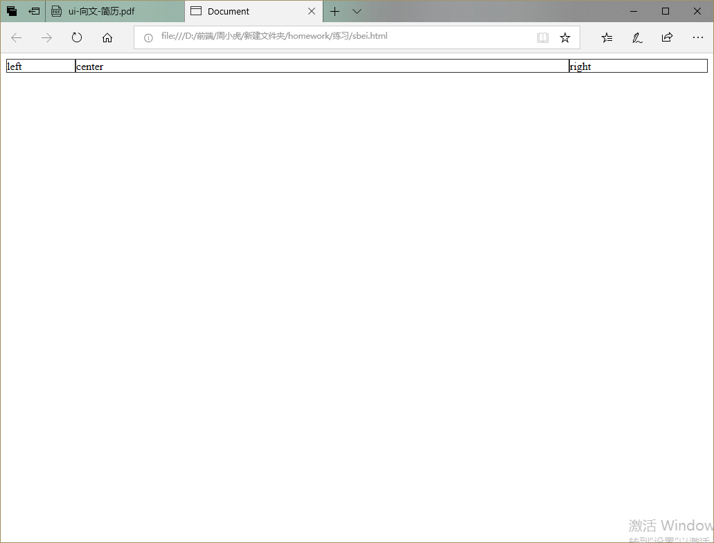
4.float 宽度自适应布局
<!DOCTYPE html>
<html lang="en">
<head>
    <meta charset="UTF-8">
    <meta name="viewport" content="width=device-width, initial-scale=1.0">
    <title>Document</title>
</head>
<style>
    body{
        min-width: 550px;
    }
    .parent{
        padding-left: 100px;
        padding-right: 200px;
        overflow: hidden;
    }
    .parent div{
        box-sizing: border-box;
        border:1px solid #333;
        float: left;
    }
    .left{
        margin-left: -100px;
        width: 100px;
    }
    .center{
        width: 100%;
    }
    .right{
        margin-right: -200px;
        width: 200px;
    }
</style>
<body>
    <div class="parent">
        <div class="left">left</div>
        <div class="center">center</div>
        <div class="right">right</div>
    </div>
</body>
</html>
 5.float隐藏
<!DOCTYPE html>
<html lang="en">

<head>
    <meta charset="UTF-8">
    <meta name="viewport" content="width=device-width, initial-scale=1.0">
    <title>Document</title>
    <style>
        .nav::after {
            content: "";
            display: table;
            clear: both;
        }

        .nav {
            width: 1080px;
            margin: 0 auto;
        }

        ul {
            list-style: none;
            background-color: pink;
            line-height: 50px;
        }

        li {
            float: left;
            width: 100px;
            text-align: center;
        }

        li:hover {
            background-color: rgb(133, 127, 130);
        }

        .drop-menu {
            position: relative;
        }

        .drop-content {
            display: none;
            width: 100px;
            position: absolute;
            background-color: deeppink;
        }

        .drop-menu:hover .drop-content {
            display: block;
        }
    </style>
</head>

<body>
    <ul class="nav">
        <li class="drop-menu">
            收藏夹
            <div class="drop-content">
                <p>收藏宝贝</p>
                <P>收藏店铺</p>
            </div>
        </li>
        <li>卖家中心</li>
        <li>联系客服</li>
    </ul>

</body>

</html>
6.float伪元素
1.给爹overflow:hidden;
2.用伪元素解决 .parent::after{content:””;display:table;clear:both}
<!DOCTYPE html>
<html lang="en">

<head>
    <meta charset="UTF-8">
    <meta name="viewport" content="width=device-width, initial-scale=1.0">
    <title>Document</title>
    <style>
        /*
        1.给爹overflow:hidden;
        2.用伪元素解决 .parent::after{content:"";display:table;clear:both}
        */
        .parent{
            width:200px;
            background-color: yellow;
        }
        .child{
            width: 100px;
            height: 100px;
            background-color: red;
            float:left;
        }
        .parent::after{
            content:"";
            display:table;
            clear:both;
        }
    </style>
</head>

<body>
    <div class="parent">
        <div class="child"></div>
    </div>
</body>

</html>

若有收获,就点个赞吧
0 人点赞
