任务分解(Task)
- 引入 UnoCSS 样式;
- 实现组件属性定制按钮样式;
- 实现【Icon图标按钮】。
原子样式
每个组件库都有一套完备的样式系统,确保组件样式风格的统一。经典的组件库 (ElementUI) 的样式系统都是遵循「Semantic CSS 」(语义化 CSS )搭建的
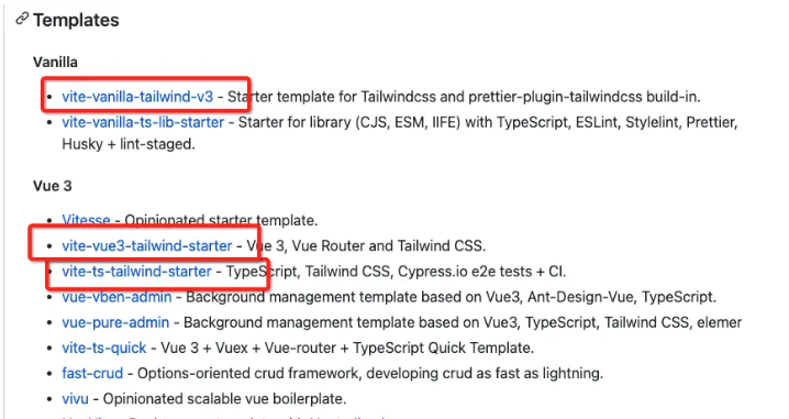
组件库通常都需要搭建一个 CSS 子工程,用于实现自己的类型系统。比如 Element 就是基于 Sass + Gulp 搭建的,不过随着原子样式的出现,有了一些替代方案,无需搭建样式系统也可以完成类似效果 可以看一下 Vite 的社区模板库,tailwind 几乎就是标配
2020年一种叫做AtomicCSS的组件风格横空出世,代表作就是 TailwindCSS。最近两年,TailwindCSS 一直保持高热度。
为什么选 UnoCSS 实现 AtomicCSS 而不是 Tailwind
原子样式也有很多选择,最著名的就是 Tailwind。 Tailwind 虽然好,但是性能上有一些不足。由于Tailwind 会生成大量样式定义。全量的 CSS 文件往往体积会多至数 MB。这个对于页面性能是完全不可接受的。
开源界一个叫做 Antfu 的大神设计了 UnoCSS。UnoCSS 是一个拥有高性能且具灵活性的即时原子化 CSS 引擎,可以兼顾产物体积和开发性能。
GitHub - unocss/unocss: The instant on-demand atomic CSS engine.
入门使用
安装
pnpm i -D unocss@"0.45.6"pnpm i -D @iconify-json/ic@"1.1.4"
图标库
Icônes
配置vite
import { presetUno, presetAttributify, presetIcons } from "unocss";import Unocss from "unocss/vite";defineConfig({plugins:[...,// 添加UnoCSS插件Unocss({presets: [presetUno(), presetAttributify(), presetIcons()],}),...]})
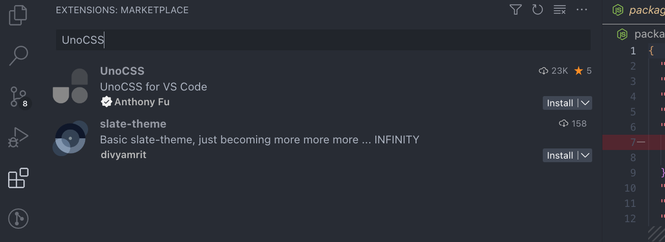
unocss的Vscode配套插件
测试使用unocss
import { defineComponent} from "vue";import "uno.css";export default defineComponent({name: "SButton",setup(props, {slots}) {return () => <buttonclass={`py-2px-4font-semiboldrounded-lgshadow-mdtext-whitebg-green-500hover:bg-green-700border-nonecursor-pointer`}>{slots.default ? slots.default() : ''}</button>}});
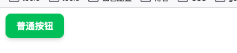
import { createApp } from "vue"import SmartyUI from './entry'createApp({template: `<div><SButton>普通按钮</SButton></div>`}).use(SmartyUI).mount("#app");
import MyButton from "./button/index.jsx";import SFCButton from "./SFCButton.vue"; // 关于ts类型警告,通过.d.ts声明文件去除警告import JSXButton from "./JSXButton.jsx";import { App } from "vue";// 导出单独组件export { MyButton, SFCButton, JSXButton };// 编写一个插件,实现一个install方法export default {install(app: App): void {app.component(MyButton.name, MyButton);app.component(SFCButton.name, SFCButton);app.component(JSXButton.name, JSXButton);},};
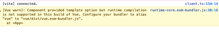
测试运行-报错 [Vue warn]: Component provided template option but runtime compilation is not supported in this build of Vue. Configure your bundler to alias “vue” to “vue/dist/vue.esm-bundler.js”. at
import { createApp } from "vue/dist/vue.esm-bundler.js";// import { createApp } from "vue"import SmartyUI from './entry'createApp({template: `<div><SButton>普通按钮</SButton></div>`}).use(SmartyUI).mount("#app");
将unocss组合自定义组件实现自定义样式配置
import { defineComponent} from "vue";import "uno.css";export const props = {color: {type: String,default: 'blue' // 设定默认颜色},}export default defineComponent({name: "SButton",props, // 注册属性setup(props, {slots}) {return () => <buttonclass={`py-2px-4font-semiboldrounded-lgshadow-mdtext-whitebg-${props.color}-500hover:bg-${props.color}-700border-nonecursor-pointer`}>{slots.default ? slots.default() : ''}</button>}});
浏览器显示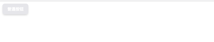
这里出现了异常,我们配置的默认颜色没有生效 ,应该是unocss的相关配置问题,需要到官网或者论坛查找答案 主要原因是 UnoCSS 默认是按需生成方式。也就是说只生成代码中使用过的样式。那如果在 class 属性中使用变量,是无法分析变量的取值的。这样也就无法动态生成样式了。
重构Unocss配置
import { presetUno, presetAttributify, presetIcons } from "unocss";import Unocss from "unocss/vite";const colors = ["white","black","gray","red","yellow","green","blue","indigo","purple","pink",];const safelist = [...colors.map((v) => `bg-${v}-100`),...colors.map((v) => `bg-${v}-400`),...colors.map((v) => `bg-${v}-500`),...colors.map((v) => `hover:bg-${v}-100`),...colors.map((v) => `hover:bg-${v}-300`),...colors.map((v) => `hover:bg-${v}-400`),...colors.map((v) => `hover:bg-${v}-500`),...colors.map((v) => `border-${v}-400`),...colors.map((v) => `border-${v}-500`),...colors.map((v) => `text-${v}-500`),...colors.map((v) => `hover:text-${v}-500`),'text-white',...Array.from({ length: 8 }, (_, i) => `px-${i + 1}`),...Array.from({ length: 8 }, (_, i) => `py-${i + 1}`),...["xs", "sm", "base", "lg", "xl", "2xl", "3xl"].map((v) => `text-${v}`),...["rounded-full", "rounded-lg"],...["search","edit","check","message","star-off","delete","add","share",].map((v) => `i-ic-baseline-${v}`),];export default () =>Unocss({safelist,presets: [presetUno(), presetAttributify(), presetIcons()],});
修改vite配置
import Unocss from "./config/unpcss";defineConfig({...plugins: [vue(),// 添加UnoCSS插件Unocss(),// 添加JSX插件vueJsx({// options are passed on to @vue/babel-plugin-jsx}),],...})
按钮组件重构
import { defineComponent , PropType} from "vue";import "uno.css";export type ISize = "small" | "medium" | "large";export type IColor =| "black"| "gray"| "red"| "yellow"| "green"| "blue"| "indigo"| "purple"| "pink";export const props = {// 新增size: {type: String as PropType<ISize>,default: "medium",},color: {type: String as PropType<IColor>,default: "blue",},textColor: {type: String,default: "#ffffff", // 设定默认颜色},round: {type: Boolean,default: false,},plain: {type: Boolean,default: false,},icon: {type: String,default: "",},} as const;// as const 也是类型断言export default defineComponent({name: "SButton",props, // 注册属性setup(props, { slots }) {console.log(`html`, document.querySelector(`#app`)?.innerHTML);const size = {small: {x: "2",y: "1",text: "sm",},medium: {x: "3",y: "1.5",text: "base",},large: {x: "4",y: "2",text: "lg",},};return () => (<button class={`py-${size[props.size].y}px-${size[props.size].x}${props.round ? "rounded-full" : "rounded-lg"}bg-${props.color}-${props.plain ? "100" : "500"}hover:bg-${props.color}-400border-${props.color}-${props.plain ? "500" : "500"}cursor-pointerborder-solidtext-${props.plain ? props.color + "-500" : "white"}text-${size[props.size].text}hover:text-whitetransition duration-300 ease-in-out transform hover:scale-105mx-1`}>{props.icon !== "" ? (<i class={`i-ic-baseline-${props.icon} p-3`}></i>) : ("")}{slots.default ? slots.default() : ""}</button>);},});
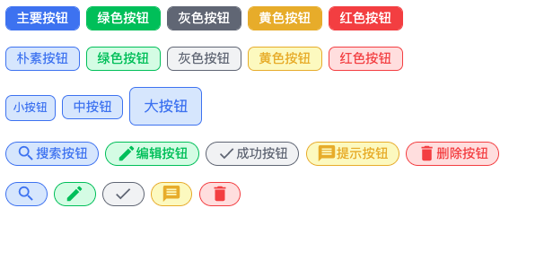
结果预览
源代码参考

若有收获,就点个赞吧
0 人点赞
