本例中所有调用np.random 使用123456做种子
We use the standard convention for referencing the matplotlib API:
import pandas as pdimport numpy as npimport matplotlib.pyplot as pltnp.random.seed(123456)plt.close('all') # 关闭所有 figure windowsplt.show()
Basic plotting: plot
plot方法用于Series 和 DataFrame 仅需调用 plt.plot()
We will demonstrate the basics, see the cookbook for some advanced strategies.
The plot method on Series and DataFrame is just a simple wrapper around plt.plot():
import pandas as pd
import numpy as np
import matplotlib.pyplot as plt

np.random.seed(123456)

ts = pd.Series(np.random.randn(1000),index=pd.date_range('1/1/2000', periods=1000))
ts = ts.cumsum()
ts.plot()  # AxesSubplot(0.125,0.11;0.775x0.77)
plt.show()

If the index consists of dates, it calls gcf().autofmt_xdate() to try to format the x-axis nicely as per above.
On DataFrame, plot() is a convenience to plot all of the columns with labels:
如果行索引包含日期,将调用gcf().autofmt_xdate()去格式化x轴,在DataFrame中, plot()可以方便的绘制全部列索引标签
df = pd.DataFrame(np.random.randn(1000, 4),index=ts.index, columns=list('ABCD'))
df = df.cumsum()                    # cumsum()是累加
plt.figure()
df.plot()
plt.show()

You can plot one column versus another using the x and y keywords in plot():
可以在 中使用 x 和 y 关键字绘制一列与另一列的比较:
df3 = pd.DataFrame(np.random.randn(1000, 2), columns=['B', 'C']).cumsum()  # cumsum()是累加
df3['A'] = pd.Series(list(range(len(df))))
df3.plot(x='A', y='B')
plt.show()

Other plots
plot()方法允许处理区别与线型图的不同的绘制风格,使用方法是在[plot()](https://pandas.pydata.org/docs/reference/api/pandas.DataFrame.plot.html#pandas.DataFrame.plot)中提供kind关键字参数,主要包括以下几种:
- ‘bar’ or ‘barh’ 柱型图
- ‘hist’ 直方图
- ‘box’ 箱线图
- ‘kde’ or ‘density’ 核基密度图
- ‘area’ 面积图
- ‘scatter’散点图
- ‘hexbin’ 蜂窝六角图
- ‘pie’ 饼图
Plotting methods allow for a handful of plot styles other than the default line plot. These methods can be provided as the kind keyword argument to plot(), and include:
- ‘bar’ or ‘barh’ for bar plots
- ‘hist’ for histogram
- ‘box’ for boxplot
- ‘kde’ or ‘density’ for density plots
- ‘area’ for area plots
- ‘scatter’ for scatter plots
- ‘hexbin’ for hexagonal bin plots
- ‘pie’ for pie plots
For example, a bar plot can be created the following way:
例如,可以通过以下方式创建一个柱形图
plt.figure()
df.iloc[5].plot(kind='bar')
plt.show()
You can also create these other plots using the methods DataFrame.plot.<kind> instead of providing the kind keyword argument. This makes it easier to discover plot methods and the specific arguments they use:
你也可以利用DataFrame.plot.<kind>方法代替提供kind 关键字创建其他图型,这种方法使发现绘制方法及其应用的参数更简单。
kind可用的方法包括:
df.plot.area df.plot.barh df.plot.density df.plot.hist df.plot.line df.plot.scatter
df.plot.bar df.plot.box df.plot.hexbin df.plot.kde df.plot.pie
而且,在这些类型中,还有分别用于不同接口的DataFrame.hist(), and DataFrame.boxplot()方法
In addition to these kind s, there are the DataFrame.hist(), and DataFrame.boxplot() methods, which use a separate interface.
Finally, there are several plotting functions in pandas.plotting that take a Series or DataFrame as an argument. These include:
- Scatter Matrix
- Andrews Curves
- Parallel Coordinates
- Lag Plot
- Autocorrelation Plot
- Bootstrap Plot
- RadViz
Plots may also be adorned with errorbars or tables.
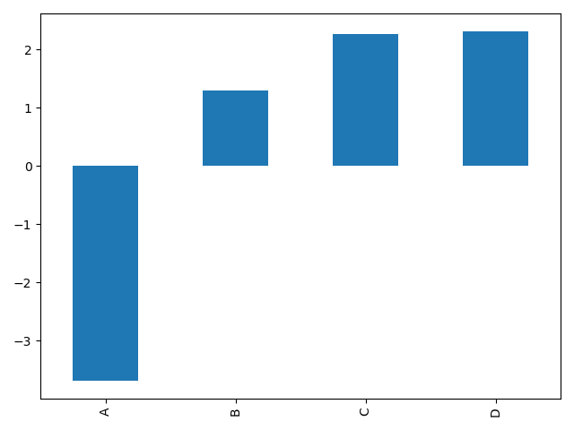
Bar plots
For labeled, non-time series data, you may wish to produce a bar plot:
对于非时间序列的数据,你可能会希望产生 一个带标签的柱形图
plt.figure()
df.iloc[5].plot.bar()
plt.axhline(0, color='k')
plt.show()

Calling a DataFrame’s plot.bar() method produces a multiple bar plot:
调用DataFrame的 plot.bar()方法生产一个多柱形图
df2 = pd.DataFrame(np.random.rand(10, 4), columns=['a', 'b', 'c', 'd'])
df2.plot.bar()
plt.show()

To produce a stacked bar plot, pass stacked=True:
设置 stacked=True 可绘制堆叠柱形图
df2 = pd.DataFrame(np.random.rand(10, 4), columns=['a', 'b', 'c', 'd'])
df2.plot.bar(stacked=True)  # 堆叠效果
plt.show()
To get horizontal bar plots, use the barh method:
通过barh 方法获得水平排列
df2 = pd.DataFrame(np.random.rand(10, 4), columns=['a', 'b', 'c', 'd'])
df2.plot.barh(stacked=True) # 水平效果
plt.show()

Histograms
Histograms can be drawn by using the DataFrame.plot.hist() and Series.plot.hist() methods.
直方图
可以使用 DataFrame.plot.hist() 和 Series.plot.hist() 方法绘制直方图
# 直方图
df4 = pd.DataFrame({'a': np.random.randn(1000) + 1, 'b': np.random.randn(1000),'c': np.random.randn(1000) - 1}, columns=['a', 'b', 'c'])
plt.figure()
df4.plot.hist(alpha=0.5)
plt.show()

A histogram can be stacked using stacked=True. Bin size can be changed using the bins keyword.stacked=True可以设置堆叠效果,bins 可以设置分箱数量
# 堆叠直方图
df4 = pd.DataFrame({'a': np.random.randn(1000) + 1, 'b': np.random.randn(1000),'c': np.random.randn(1000) - 1}, columns=['a', 'b', 'c'])
plt.figure()
df4.plot.hist(stacked=True, bins=20)   # 堆叠效果,分箱数量20个
plt.show()

You can pass other keywords supported by matplotlib hist. For example, horizontal and cumulative histograms can be drawn by orientation='horizontal' and cumulative=True.
你可以传递 matplotlib hist 中提供支持的其他关键字,例如,水平和堆叠直方图可以通过设置参数orientation='horizontal' 和 cumulative=True.
# 水平直方图
df4 = pd.DataFrame({'a': np.random.randn(1000) + 1, 'b': np.random.randn(1000),'c': np.random.randn(1000) - 1}, columns=['a', 'b', 'c'])
plt.figure()
df4['a'].plot.hist(orientation='horizontal', cumulative=True)
plt.show()

The existing interface DataFrame.hist to plot histogram still can be used.
利用现存的接口 DataFrame.hist 绘制直方图的方法仍然可用
# 直方图
df4 = pd.DataFrame({'a': np.random.randn(1000) + 1, 'b': np.random.randn(1000),'c': np.random.randn(1000) - 1}, columns=['a', 'b', 'c'])
plt.figure()
df['A'].diff().hist()
plt.show()

DataFrame.hist() plots the histograms of the columns on multiple subplots:DataFrame.hist() 可以将不同列绘制在多子图中
df4 = pd.DataFrame({'a': np.random.randn(1000) + 1, 'b': np.random.randn(1000),'c': np.random.randn(1000) - 1}, columns=['a', 'b', 'c'])
plt.figure()
df.diff().hist(color='k', alpha=0.5, bins=50)
plt.show()

The by keyword can be specified to plot grouped histograms:
by 关键 字可用于将直方图分组绘制
data = pd.Series(np.random.randn(1000))
data.hist(by=np.random.randint(0, 4, 1000), figsize=(6, 4))
plt.show()

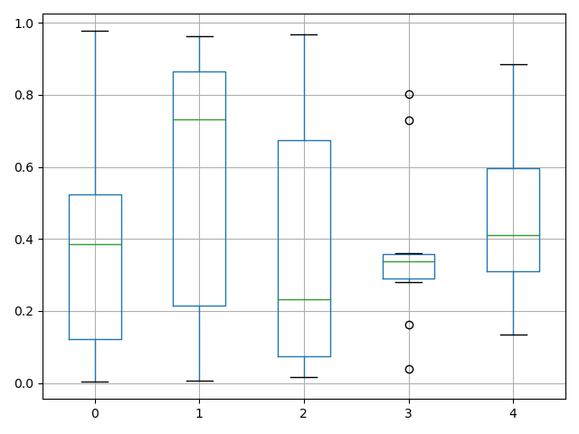
Box plots
Boxplot can be drawn calling Series.plot.box() and DataFrame.plot.box(), or DataFrame.boxplot() to visualize the distribution of values within each column.
For instance, here is a boxplot representing five trials of 10 observations of a uniform random variable on [0,1).
箱线图可以调用 Series.plot.box() 和 DataFrame.plot.box()绘制,也可以调用 DataFrame.boxplot() 绘制。表明每列数据的值的分布
实例是一个10组[0,1] 之间的随机变量的5次实验结果展示:
# Box plots
df = pd.DataFrame(np.random.rand(10, 5), columns=['A', 'B', 'C', 'D', 'E'])
df.plot.box()
plt.show()

Boxplot can be colorized by passing color keyword. You can pass a dict whose keys are boxes, whiskers, medians and caps. If some keys are missing in the dict, default colors are used for the corresponding artists. Also, boxplot has sym keyword to specify fliers style.
When you pass other type of arguments via color keyword, it will be directly passed to matplotlib for all the boxes, whiskers, medians and caps colorization.
The colors are applied to every boxes to be drawn. If you want more complicated colorization, you can get each drawn artists by passing return_type.
color参数可以指定颜色,传递一个以boxes, whiskers, medians 和 caps.为键的字典
# Box plots
df = pd.DataFrame(np.random.rand(10, 5), columns=['A', 'B', 'C', 'D', 'E'])
color = {'boxes': 'DarkGreen', 'whiskers': 'DarkOrange','medians': 'DarkBlue', 'caps': 'Gray'}
df.plot.box(color=color, sym='r+')
plt.show()

Also, you can pass other keywords supported by matplotlib boxplot. For example, horizontal and custom-positioned boxplot can be drawn by vert=False and positions keywords.
同样可以传递 matplotlib boxplot 支持的关键字参数,例如,可以用 vert=False and positions 指定水平和堆叠
# Box plots
df = pd.DataFrame(np.random.rand(10, 5), columns=['A', 'B', 'C', 'D', 'E'])
color = {'boxes': 'DarkGreen', 'whiskers': 'DarkOrange','medians': 'DarkBlue', 'caps': 'Gray'}
df.plot.box(color=color, vert=False, positions=[1, 4, 5, 6, 8])
plt.show()

See the boxplot method and the matplotlib boxplot documentation for more.
The existing interface DataFrame.boxplot to plot boxplot still can be used.
DataFrame.boxplot方法仍可用于绘制箱线图
# Box plots
df = pd.DataFrame(np.random.rand(10, 5))
plt.figure()
bp = df.boxplot()
plt.show()
You can create a stratified boxplot using the by keyword argument to create groupings. For instance,
可以通过使用by 关键字创建分组箱线图
df['X'] = pd.Series(['A', 'A', 'A', 'A', 'A', 'B', 'B', 'B', 'B', 'B'])
plt.figure()
bp = df.boxplot(by='X')
plt.show()
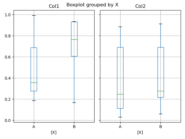
You can also pass a subset of columns to plot, as well as group by multiple columns:
也可以将每列的绘制放入一个子图中
df = pd.DataFrame(np.random.rand(10, 3), columns=['Col1', 'Col2', 'Col3'])
df['X'] = pd.Series(['A', 'A', 'A', 'A', 'A', 'B', 'B', 'B', 'B', 'B'])
df['Y'] = pd.Series(['A', 'B', 'A', 'B', 'A', 'B', 'A', 'B', 'A', 'B'])
plt.figure()
bp = df.boxplot(column=['Col1', 'Col2'], by=['X', 'Y'])
plt.show()

In boxplot, the return type can be controlled by the return_type, keyword. The valid choices are {"axes", "dict", "both", None}. Faceting, created by DataFrame.boxplot with the by keyword, will affect the output type as well:
return_type= |
Faceted | Output type |
|---|---|---|
None |
No | axes |
None |
Yes | 2-D ndarray of axes |
'axes' |
No | axes |
'axes' |
Yes | Series of axes |
'dict' |
No | dict of artists |
'dict' |
Yes | Series of dicts of artists |
'both' |
No | namedtuple |
'both' |
Yes | Series of namedtuples |
Groupby.boxplot always returns a Series of return_type.
np.random.seed(1234)
df_box = pd.DataFrame(np.random.randn(50, 2))
df_box['g'] = np.random.choice(['A', 'B'], size=50)
df_box.loc[df_box['g'] == 'B', 1] += 3
bp = df_box.boxplot(by='g')
plt.show()

The subplots above are split by the numeric columns first, then the value of the g column. Below the subplots are first split by the value of g, then by the numeric columns.
np.random.seed(1234)
df_box = pd.DataFrame(np.random.randn(50, 2))
df_box['g'] = np.random.choice(['A', 'B'], size=50)
df_box.loc[df_box['g'] == 'B', 1] += 3
bp = df_box.groupby('g').boxplot()
plt.show()


若有收获,就点个赞吧
0 人点赞
