1. Flutter区别于其他方案的关键技术
- Flutter 使用 Native 引擎渲染视图
- React Native 之类的框架,只是通过 JavaScript 虚拟机扩展调用系统组件,由 Android 和 iOS 系统进行组件的渲染;Flutter 则是自己完成了组件渲染的闭环。
- UI线程使用Dart来构建视图结构数据,这些数据会在GPU线程进行图层合成,随后交给Skia引擎加工成GPU数据,而这些数据会通过OpenGL最终提供给GPU渲染.
- 使用Dart语言,同时支持JIT(动态编译,需要用的时候编译,开发的时候)和AOT(静态编译,先编译好,正式包的时候)

2. Widget的设计思路和基本原理
- 核心设计思想: 一切皆Widget

- Widget是不可变的,当视图渲染的配置信息发生变化时,Flutter会选择重建Widget树的方法进行数据更新.
- 数据驱动UI构建
- Widget本身不涉及实际渲染位图,它是轻量级的数据结构,重建成本低.
- Element是Widget的一个实例化对象,它承载了视图构建的上下文数据,是连接结构化的配置信息到完成最终渲染的桥梁
- Element同时持有Widget和RenderObject,最后负责渲染的是RenderObject
- Flutter展示过程: 布局,绘制,合成,渲染
3. State的选择
- Widget有StatelessWidget和StatefulWidget
- StatefulWidget对应有交互,需要动态变化视觉效果的场景,StatelessWidget则用于处理静态的,无状态的视图展示
- Flutter的视图开发是声明式的,其核心设计思想就将视图和数据分离
- Widget生命周期内,State中的任何更改都将强制Widget重新构建
- StatelessWidget,如Text,Container,Row,Column等.它们一旦创建成功就不再关心,也不相应任何数据变化进行重绘
- 避免无谓的StatefulWidget使用,可以提高Flutter应用渲染性能.
4. 生命周期
4.1 Widget 视图生命周期
- 生命周期其实是State的
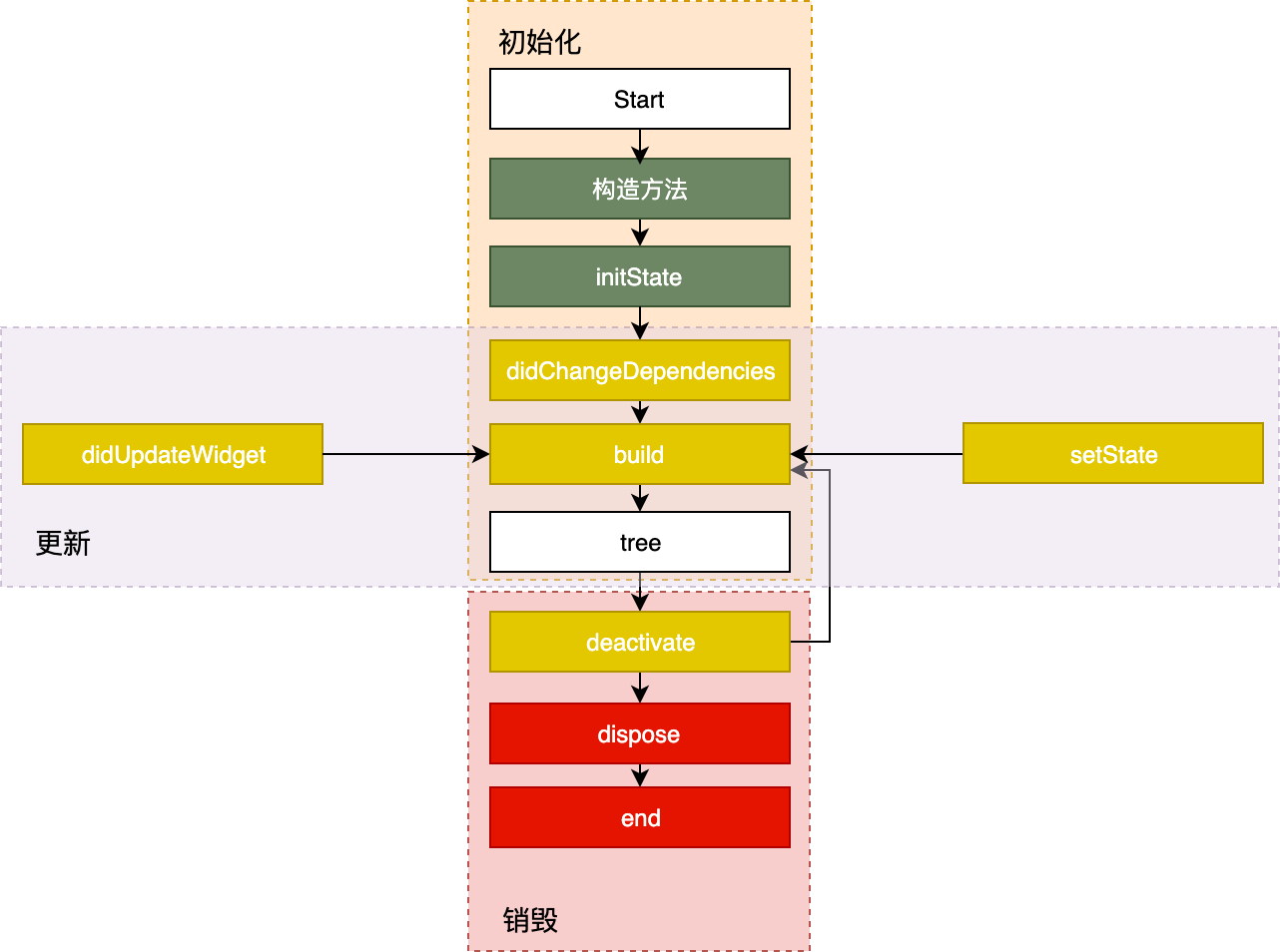
- State生命周期分为3个阶段
- 创建(插入视图树)
- 更新(在视图树中存在)
- 销毁(从视图树中移除)
- 创建
- 构造方法
- initState
- didChangeDependencies
- build
- 更新
- setState->build
- disUpdateWidget->build
- didChangeDependencies->build
- 销毁
- deactivate
- dispose
- 构造方法: 接收父Widget传递的初始化UI配置数据
- initState: State对象被插入视图树的时候被调用,在这里做初始化工作
- didChangeDependencies: 处理State对象依赖关系变化,initState()调用结束后会被调用
- build: 构建视图,在这里根据父Widget传递过来的初始化配置数据,以及State状态,创建一个Widget返回
- setState: 当状态数据发生变化时,调用这个方法,告诉Flutter,数据变了,根据更新后的数据重建UI
- didChangeDependencies: State对象的依赖关系发生变化时(系统语言Locale或应用主题更改),系统会通知State调用此方法
- didUpdateWidget: 当Widget的配置发生变化时,如父Widget触发重建,热重载时,会被调用.
- deactivate: 组件的可见状态发生变化,State会被暂时从视图树中移除. 页面切换时,上一个页面的State对象在视图树种的位置发生了变化,会先调用deactivate,再调用build.
- dispose: 当State被永久地从视图树中移除,比如关闭页面.到这里时,组件就要销毁了,这里做最终的资源释放,移除监听,清理环境.
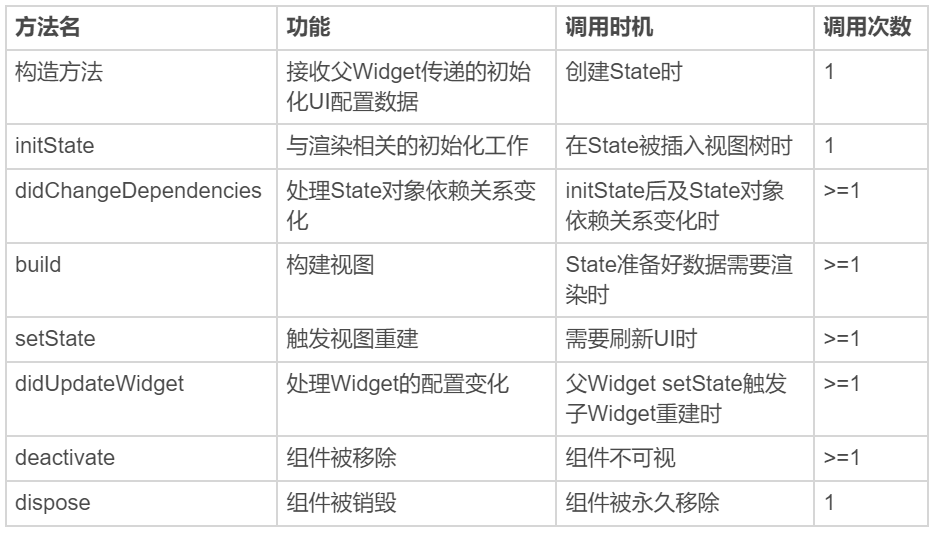
| 方法名 | 功能 | 调用时机 | 调用次数 | | —- | —- | —- | —- | | 构造方法 | 接收父Widget传递的初始化UI配置数据 | 创建State时 | 1 | | initState | 与渲染相关的初始化工作 | 在State被插入视图树时 | 1 | | didChangeDependencies | 处理State对象依赖关系变化 | initState后及State对象依赖关系变化时 | >=1 | | build | 构建视图 | State准备好数据需要渲染时 | >=1 | | setState | 触发视图重建 | 需要刷新UI时 | >=1 | | didUpdateWidget | 处理Widget的配置变化 | 父Widget setState触发子Widget重建时 | >=1 | | deactivate | 组件被移除 | 组件不可视 | >=1 | | dispose | 组件被销毁 | 组件被永久移除 | 1 |
4.2 App(也是Widget) 生命周期
- 利用WidgetsBindingObserver类
abstract class WidgetsBindingObserver {//页面popFuture<bool> didPopRoute() => Future<bool>.value(false);//页面pushFuture<bool> didPushRoute(String route) => Future<bool>.value(false);//系统窗口相关改变回调,如旋转void didChangeMetrics() { }//文本缩放系数变化void didChangeTextScaleFactor() { }//系统亮度变化void didChangePlatformBrightness() { }//本地化语言变化void didChangeLocales(List<Locale> locale) { }//App生命周期变化void didChangeAppLifecycleState(AppLifecycleState state) { }//内存警告回调void didHaveMemoryPressure() { }//Accessibility相关特性回调void didChangeAccessibilityFeatures() {}}
- 在didChangeAppLifecycleState回调函数中,AppLifecycleState参数是枚举类,它是Flutter对App生命周期状态的封装.
- resumed 可见的,并能响应用户输入
- inactive: 处在不活动状态,无法处理用户响应
- paused: 不可见并不能响应用户的输入,但是在后台继续活动中
- 在initState中注册监听器,在dispose中移除监听器
class _MyHomePageState extends State<MyHomePage> with WidgetsBindingObserver{...@override@mustCallSupervoid initState() {super.initState();WidgetsBinding.instance.addObserver(this);//注册监听器}@override@mustCallSupervoid dispose(){super.dispose();WidgetsBinding.instance.removeObserver(this);//移除监听器}@overridevoid didChangeAppLifecycleState(AppLifecycleState state) async {print("$state");if (state == AppLifecycleState.resumed) {//do sth}}}
- 后台(paused)切入前台: AppLifecycleState.inactive->AppLifecycleState.resumed
- 前台(resumed)退回到后台: AppLifecycleState.inactive->AppLifecycleState.paused
- WidgetsBingding提供了单次Frame绘制回调,以及实时Frame绘制回调两种机制.
- 单次
WidgetsBinding.instance.addPostFrameCallback((_){print("单次Frame绘制回调");//只回调一次});
- 实时绘制
WidgetsBinding.instance.addPersistentFrameCallback((_){print("实时Frame绘制回调");//每帧都回调});
5. 文本
- Text,单一样式. 构造参数分为2类
- 控制整体文本布局的参数: 对齐方式textAlign,文本排版方向textDirection,文本显示最大行数 maxLines、文本截断规则 overflow 等
- 控制文本展示样式的参数: 统一封装到style参数中,字体名称fontFamily,字体大小fontSize,文本颜色color,文本阴影shadows等
Text('文本是视图系统中的常见控件,用来显示一段特定样式的字符串,就比如Android里的TextView,或是iOS中的UILabel。',textAlign: TextAlign.center,//居中显示style: TextStyle(fontWeight: FontWeight.bold, fontSize: 20, color: Colors.red),//20号红色粗体展示);
- TextSpan,可展示混合样式.(类似SpannableString)
TextStyle blackStyle = TextStyle(fontWeight: FontWeight.normal, fontSize: 20, color: Colors.black); //黑色样式TextStyle redStyle = TextStyle(fontWeight: FontWeight.bold, fontSize: 20, color: Colors.red); //红色样式Text.rich(TextSpan(children: <TextSpan>[TextSpan(text:'文本是视图系统中常见的控件,它用来显示一段特定样式的字符串,类似', style: redStyle), //第1个片段,红色样式TextSpan(text:'Android', style: blackStyle), //第1个片段,黑色样式TextSpan(text:'中的', style:redStyle), //第1个片段,红色样式TextSpan(text:'TextView', style: blackStyle) //第1个片段,黑色样式]),textAlign: TextAlign.center,);
6. 图片
- Image
- 加载本地资源图片,如 Image.asset(‘images/logo.png’);
- 加载本地(File 文件)图片,如 Image.file(new File(’/storage/xxx/xxx/test.jpg’));
- 加载网络图片,如 Image.network(‘http://xxx/xxx/test.gif‘)
- 填充模式fit,拉伸 centerSlice,重复模式repeat
- Image通过内部ImageProvider根据缓存状态,触发异步加载流程,通知
_imageState(Image这种控件肯定不是静态的撒,得需要一个State)刷新UI. - FadeInImage,可以提供占位图,加载动画等.
FadeInImage.assetNetwork(placeholder: 'assets/loading.gif', //gif占位image: 'https://xxx/xxx/xxx.jpg',fit: BoxFit.cover, //图片拉伸模式width: 200,height: 200,)
- 图片默认缓存到内存,LRU(最近最少使用),如需缓存到本地则需要使用第三方的CachedNetworkImage(还提供了错误展示图片)控件
7. 按钮
- FloatingActionButton 圆形按钮
- RaisedButton,凸起的按钮,和Android默认的Button长得一样丑
- FlatButton,扁平的按钮,默认透明背景,被点击后呈现灰色背景
FloatingActionButton(onPressed: () => print('FloatingActionButton pressed'),child: Text('Btn'),);FlatButton(onPressed: () => print('FlatButton pressed'),child: Text('Btn'),);RaisedButton(onPressed: () => print('RaisedButton pressed'),child: Text('Btn'),);
- onPressed参数用于设置回调,如果参数为空,则按钮会被禁用
- child参数用于控制控件长什么样子
- 其他丰富api
FlatButton(color: Colors.yellow, //设置背景色为黄色shape:BeveledRectangleBorder(borderRadius: BorderRadius.circular(20.0)), //设置斜角矩形边框colorBrightness: Brightness.light, //确保文字按钮为深色onPressed: () => print('FlatButton pressed'),child: Row(children: <Widget>[Icon(Icons.add), Text("Add")],));
- Button都是由RawMaterialButton承载视觉,Image都是RawImage,Text是RichText。它们都继承自RenderObjectWidget,而RenderObjectWidget的父类就是Widget。
8. ListView
8.1 ListView
- 同时支持垂直方向和水平方向滚动
- 创建子视图方式 | 构造函数名 | 特点 | 适用场景 | 适用频次 | | —- | —- | —- | —- | | ListView | 一次性创建好全部子Widget | 适用于展示少量连续子Widget的场景 | 中 | | ListView.builder | 提供子Widget创建方法,仅在需要展示的时候才创建 | 适用于子Widget较多,且视觉效果呈现某种规律性的场景 | 高 | | ListView.separated | 与ListView.builder类似,并提供了自定义分割线的功能 | 与ListView.builder场景类似 | 中 |
- 第一种 ListView 直接构建
ListView(children: <Widget>[//设置ListTile组件的标题与图标ListTile(leading: Icon(Icons.map), title: Text('Map')),ListTile(leading: Icon(Icons.mail), title: Text('Mail')),ListTile(leading: Icon(Icons.message), title: Text('Message')),]);
- 第二种 ListView.builder.itemExtent 并不是一个必填参数。但,对于定高的列表项元素,我强烈建议你提前设置好这个参数的值。
ListView.builder(//itemCount,表示列表项的数量,如果为空,则表示 ListView 为无限列表itemCount: 100, //元素个数itemExtent: 50.0, //列表项高度itemBuilder: (BuildContext context, int index) => ListTile(title: Text("title $index"), subtitle: Text("body $index")));
- 第三种 ListView.separated
//使用ListView.separated设置分割线ListView.separated(itemCount: 100,separatorBuilder: (BuildContext context, int index) => index %2 ==0? Divider(color: Colors.green) : Divider(color: Colors.red),//index为偶数,创建绿色分割线;index为奇数,则创建红色分割线itemBuilder: (BuildContext context, int index) => ListTile(title: Text("title $index"), subtitle: Text("body $index"))//创建子Widget)
8.2 CustomScrollView
- CustomScrollView是用来处理多个需要自定义滑动效果的Widget.在CustomScrollView中,这些彼此独立的,可滑动的Widget被统称为Sliver.
- 比如ListView 的 Sliver 实现为 SliverList,AppBar 的 Sliver 实现为 SliverAppBar
- 这些Sliver不再维护各自的滚动状态,交由CustomScrollView统一管理,最终实现滑动效果的一致性
CustomScrollView(slivers: <Widget>[SliverAppBar(//SliverAppBar作为头图控件title: Text('CustomScrollView Demo'),//标题floating: true,//设置悬浮样式flexibleSpace: Image.network("https://xx.jpg",fit:BoxFit.cover),//设置悬浮头图背景expandedHeight: 300,//头图控件高度),SliverList(//SliverList作为列表控件delegate: SliverChildBuilderDelegate((context, index) => ListTile(title: Text('Item #$index')),//列表项创建方法childCount: 100,//列表元素个数),),]);
8.3 ScrollController
- ScrollController用于对ListView进行滚动信息的监听,以及相应的滚动控制.
class MyControllerAppState extends State<MyControllerApp> {//ListView控制器ScrollController _controller;//标识目前是否需要启用top按钮bool isToTop = false;@overridevoid initState() {_controller = ScrollController();_controller.addListener(() {//ListView向下滚动1000 则启用top按钮if (_controller.offset > 1000) {setState(() {isToTop = true;});} else if (_controller.offset < 300) {//向下滚动不足300,则禁用按钮setState(() {isToTop = false;});}});super.initState();}@overrideWidget build(BuildContext context) {return MaterialApp(home: Scaffold(body: ListView.builder(//将控制器传入controller: _controller,itemCount: 100,itemExtent: 100,itemBuilder: (context, index) =>ListTile(title: Text('index $index'))),floatingActionButton: RaisedButton(//如果isToTop是true则滑动到顶部,否则禁用按钮onPressed: isToTop? () {//滑动到顶部_controller.animateTo(0.0,duration: Duration(microseconds: 200),curve: Curves.ease);}: null,child: Text('top'),),),);}@overridevoid dispose() {_controller.dispose();super.dispose();}}
8.4 NotificationListener
- NotificationListener是一个Widget,需要将ListView添加到NotificationListener中
class MyListenerApp extends StatelessWidget {@overrideWidget build(BuildContext context) {return MaterialApp(home: Scaffold(body: NotificationListener<ScrollNotification>(//添加NotificationListener作为父容器//注册通知回调onNotification: (scrollNotification) {//开始滑动if (scrollNotification is ScrollStartNotification) {//scrollNotification.metrics.pixels 滑动的位置print('scroll start ${scrollNotification.metrics.pixels}');} else if (scrollNotification is ScrollUpdateNotification) {//滑动中print('scroll update');} else if (scrollNotification is ScrollEndNotification) {//滑动结束print('scroll end');}return null;},child: ListView.builder(itemCount: 100,itemExtent: 70,itemBuilder: (context, index) => ListTile(title: Text('index $index'),)),),),);}}
9. 布局容器
9.1 Container,Padding,Center
- Container内部提供了间距,背景样式,圆角边框等基础属性,可以控制子Widget的摆放方式(居中,左,右)
- Padding 设置间距,将Widget放里面
- Center 设置居中,将Widget放里面
getContainer() {return Container(child: Center(child: Text('Container(容器)在UI框架中是一个很常见的概念,Flutter也不例外。'),),//内边距padding: EdgeInsets.all(18.0),//外边距margin: EdgeInsets.all(44.0),width: 180.0,height: 240,//子Widget居中对齐/* alignment: Alignment.center,*///Container样式decoration: BoxDecoration(//背景色color: Colors.red,//圆角边框borderRadius: BorderRadius.circular(10.0),),);}getPadding() {//只需要设置边距 可以使用Paddingreturn Padding(padding: EdgeInsets.all(44.0),child: Text('我是Padding'),);}getCenter() {//直接居中return Center(child: Text('center text'),);}
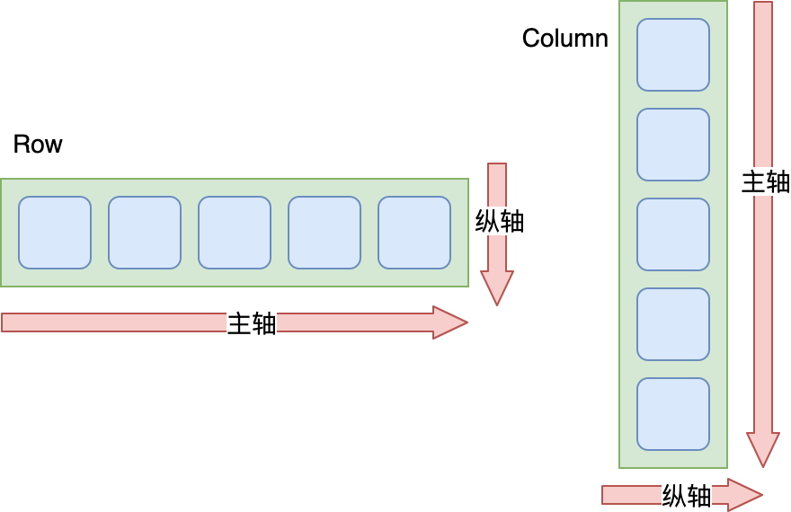
9.2 Row,Column,Expanded
- Row是水平布局
- Column是垂直布局
- Expanded表示将剩余的空间,如何分配
- Row 与 Column 自身的大小由父widget的大小、子widget的大小、以及mainSize设置共同决定(mainAxisSize和crossAxisSize)
- 主轴(纵轴)值为max:主轴(纵轴)大小等于屏幕主轴(纵轴)方向大小或者父widget主轴(纵轴)方向大小
- 主轴(纵轴)值为min: 所有子widget组合在一起的主轴(纵轴)大小
//Row的用法示范Row(children: <Widget>[Container(color: Colors.yellow, width: 60, height: 80,),Container(color: Colors.red, width: 100, height: 180,),Container(color: Colors.black, width: 60, height: 80,),Container(color: Colors.green, width: 60, height: 80,),],);//Column的用法示范Column(children: <Widget>[Container(color: Colors.yellow, width: 60, height: 80,),Container(color: Colors.red, width: 100, height: 180,),Container(color: Colors.black, width: 60, height: 80,),Container(color: Colors.green, width: 60, height: 80,),],);//第一个和最后一个平分Row(children: <Widget>[Expanded(flex: 1, child: Container(color: Colors.yellow, height: 60)), //设置了flex=1,因此宽度由Expanded来分配Container(color: Colors.red, width: 100, height: 180,),Container(color: Colors.black, width: 60, height: 80,),Expanded(flex: 1, child: Container(color: Colors.green,height: 60),)/设置了flex=1,因此宽度由Expanded来分配],);
对齐方式
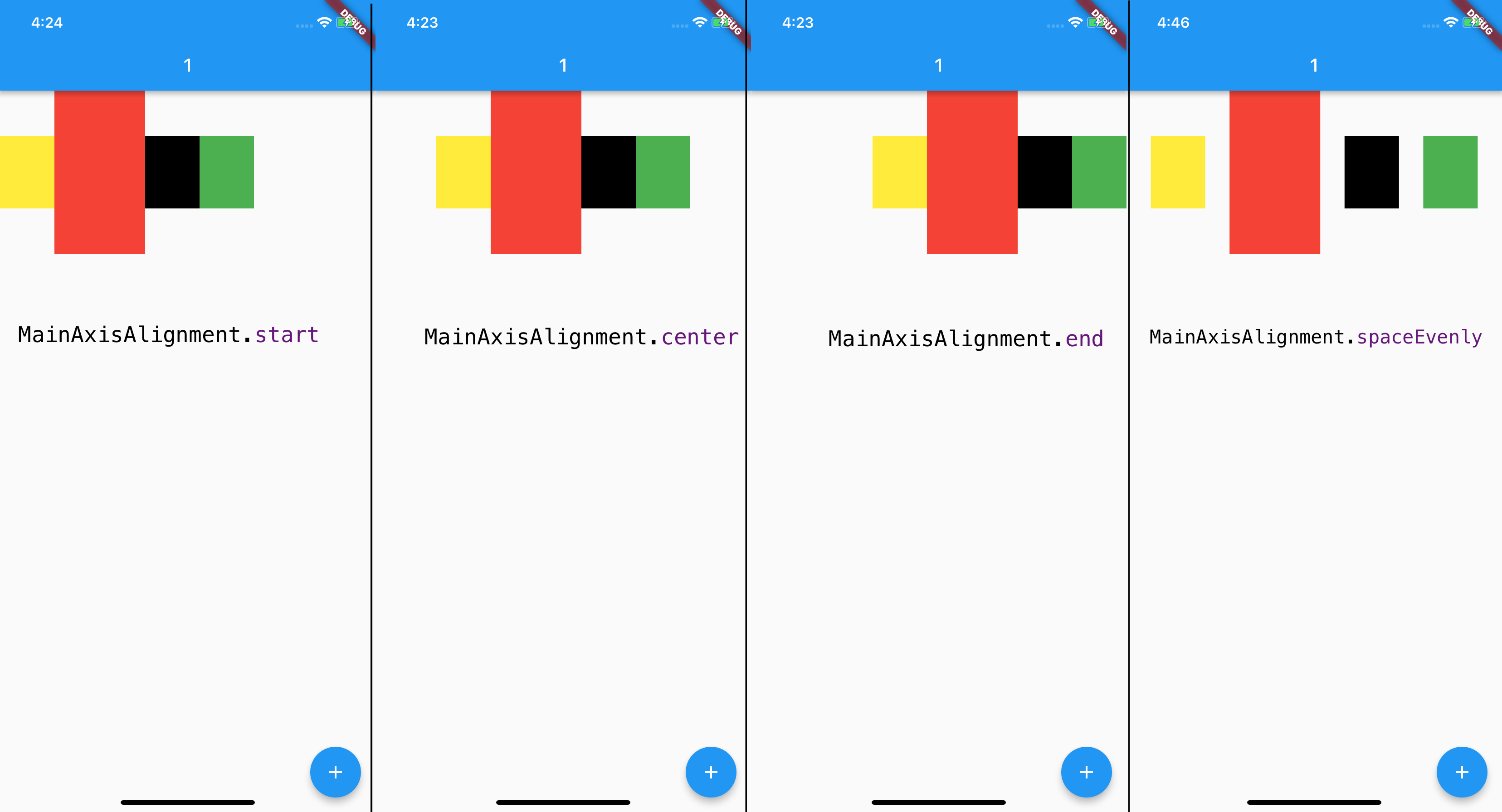
- 根据主轴与纵轴,设置子Widget在这两个方向上的对齐规则mainAxisAlignment与crossAxisAlignment.比如主轴方向start表示靠左对齐,center表示横向居中对齐,end表示靠右对齐,spaceEvenly表示按固定间距对齐;而纵轴方向start则表示靠上对齐,center表示纵向居中对齐,end表示靠下对齐.看图

控制大小
- 如果想让容器与子Widget在主轴上完全匹配,需要通过设置Row的mainAxisSize参数为MainAxisSize.min,由所有子Widget来决定主轴方向的容器长度,即主轴方向的长度尽可能小.类似wrap_content.
mainAxisSize: MainAxisSize.min, //让容器宽度与所有子Widget的宽度一致
9.3 Stack,Positioned
- Stack,类似FrameLayout.
- Stack提供了层叠布局的容器,而Positioned则提供了设置子Widget位置的能力.
Stack(children: <Widget>[Container(color: Colors.yellow, width: 300, height: 300),//黄色容器Positioned(left: 18.0,top: 18.0,child: Container(color: Colors.green, width: 50, height: 50),//叠加在黄色容器之上的绿色控件),Positioned(left: 18.0,top:70.0,child: Text("Stack提供了层叠布局的容器"),//叠加在黄色容器之上的文本)],)
- Positioned只能在Stack中使用.
10. 自定义控件
10.1 组合控件
- 将多个控件组合在一起
10.2 自定义控件
- CustomPaint是用来承接自绘控件的容器,并不负责真正的绘制.
- 画布是canvas,画笔是Paint.
- 画成什么样子由CustomPainter来控制,将CustomPainter设置给容器CustomPaint的painter属性,我们就完成了一个自绘组件的封装
- Paint,其实和Android中的差不多,可以配置它的各种属性,比如颜色、样式、粗细等;而画布 Canvas,则提供了各种常见的绘制方法,比如画线 drawLine、画矩形 drawRect、画点 DrawPoint、画路径 drawPath、画圆 drawCircle、画圆弧 drawArc 等。
class WheelPainter extends CustomPainter {Paint getColoredPaint(Color color) {Paint paint = Paint();paint.color = color;return paint;}@overridevoid paint(Canvas canvas, Size size) {//半径double wheelSize = min(size.width, size.height) / 2;//分成6份double nbElem = 6;//角度double radius = (2 * pi) / nbElem;//包裹饼图的矩形框 center:相对于原点的偏移量Rect boundingRect = Rect.fromCircle(center: Offset(wheelSize, wheelSize), radius: wheelSize);//每次画1/6圆canvas.drawArc(boundingRect, 0, radius, true, getColoredPaint(Colors.orange));canvas.drawArc(boundingRect, radius, radius, true, getColoredPaint(Colors.green));canvas.drawArc(boundingRect, radius * 2, radius, true, getColoredPaint(Colors.red));canvas.drawArc(boundingRect, radius * 3, radius, true, getColoredPaint(Colors.blue));canvas.drawArc(boundingRect, radius * 4, radius, true, getColoredPaint(Colors.pink));canvas.drawArc(boundingRect, radius * 5, radius, true,getColoredPaint(Colors.deepOrange));}@overridebool shouldRepaint(CustomPainter oldDelegate) {//判断是否需要重绘,简单做下比较return oldDelegate != this;}}class Cake extends StatelessWidget {@overrideWidget build(BuildContext context) {//CustomPaint是用来承载自定义View的容器,需要自定义一个画笔,得继承自CustomPainterreturn CustomPaint(size: Size(200, 200),painter: WheelPainter(),);}}
11. 主题定制
- 视觉效果是易变的,我们将这些变化的部分抽离出来,把提供不同视觉效果的资源和配置按照主题进行归类,整合到一个统一的中间层去管理,这样我们就能实现主题的管理和切换.
- Flutter中由ThemeData来统一管理主题的配置信息
- ThemeData中涵盖了Material Design规范的可自定义部分样式,比如应用明暗模式 brightness、应用主色调 primaryColor、应用次级色调 accentColor、文本字体 fontFamily、输入框光标颜色 cursorColor 等。
- 全局统一的视觉风格:
MaterialApp(title: 'Flutter Demo',//标题theme: ThemeData(//设置主题brightness: Brightness.dark,//设置明暗模式为暗色accentColor: Colors.black,//(按钮)Widget前景色为黑色primaryColor: Colors.cyan,//主色调为青色iconTheme:IconThemeData(color: Colors.yellow),//设置icon主题色为黄色textTheme: TextTheme(body1: TextStyle(color: Colors.red))//设置文本颜色为红色),home: MyHomePage(title: 'Flutter Demo Home Page'),);
局部主题: 需要使用Theme来对App的主题进行局部覆盖,Theme是一个单子Widget容器,将控件放里面就可以控制主题了.
局部新建主题: 如果不想继承任何App全局的颜色或字体样式,可以直接新建一个ThemeData实例,依次设置对应的样式.
// 新建主题Theme(data: ThemeData(iconTheme: IconThemeData(color: Colors.red)),child: Icon(Icons.favorite));
继承主题: 如果不想在局部重写所有的样式,则可以继承App的主题,使用copyWith方法,只更新部分样式
// 继承主题Theme(data: Theme.of(context).copyWith(iconTheme: IconThemeData(color: Colors.green)),child: Icon(Icons.feedback));
主题另一个用途是样式复用.
Container(color: Theme.of(context).primaryColor,//容器背景色复用应用主题色child: Text('Text with a background color',style: Theme.of(context).textTheme.title,//Text组件文本样式复用应用文本样式));
12. 依赖管理
- 可以把资源房任意目录,只需要使用根目录下的pubspec.yaml文件,对这些资源的所在位置进行显示声明就行.
12.1 图片
flutter:assets:- assets/background.jpg #挨个指定资源路径- assets/loading.gif #挨个指定资源路径- assets/result.json #挨个指定资源路径- assets/icons/ #子目录批量指定- assets/ #根目录也是可以批量指定的
- Flutter遵循了基于像素密度的管理方式,如1.0x,2.0x,3.0x.Flutter会根据当前设备分辨率加载最接近设备像素比例的图片资源
- 想让Flutter适配不同的分辨率,只需要将其他分辨率的图片放到对应的分辨率子目录中.
目录如下assets├── background.jpg //1.0x图├── 2.0x│ └── background.jpg //2.0x图└── 3.0x在pubspec.yaml文件声明:flutter:assets:- assets/background.jpg #1.0x图资源
12.2 字体
fonts:- family: RobotoCondensed #字体名字fonts:- asset: assets/fonts/RobotoCondensed-Regular.ttf #普通字体- asset: assets/fonts/RobotoCondensed-Italic.ttfstyle: italic #斜体- asset: assets/fonts/RobotoCondensed-Bold.ttfweight: 700 #粗体
12.3 三方库 三方组件库
- Dart提供包管理工具: Pub,管理代码和资源
- 对于包,通常是指定版本区间,而很少直接指定特定版本.
- 多人协作时,建议将Dart和Flutter的SDK环境写死,统一团队的开发环境.避免因为跨SDK版本出现的API差异而导致工程问题.
dependencies://1. #路径依赖package1:path: ../package1///2. githubdate_format:git:url: https://github.com/xxx/package2.git #git依赖//3. pub上面的date_format: 1.0.6
13. 手势识别
- 底层原始指针事件: 用户的触摸数据,如手指接触屏幕 PointerDownEvent、手指在屏幕上移动 PointerMoveEvent、手指抬起 PointerUpEvent,以及触摸取消 PointerCancelEvent.
Listener(child: Container(color: Colors.red,//背景色红色width: 300,height: 300,),onPointerDown: (event) => print("down $event"),//手势按下回调onPointerMove: (event) => print("move $event"),//手势移动回调onPointerUp: (event) => print("up $event"),//手势抬起回调);
- 冒泡分发机制: 将触摸事件交给最内层的组件去响应,事件会从这个最内层的组件开始,沿着组件树向根节点向上冒泡分发.
- 封装了底层指针事件手势语义的Gesture,平常一般使用GestureDetector.如点击 onTap、双击 onDoubleTap、长按 onLongPress、拖拽 onPanUpdate、缩放 onScaleUpdate 等。
//红色container坐标double _top = 0.0;double _left = 0.0;Stack(//使用Stack组件去叠加视图,便于直接控制视图坐标children: <Widget>[Positioned(top: _top,left: _left,child: GestureDetector(//手势识别child: Container(color: Colors.red,width: 50,height: 50),//红色子视图onTap: ()=>print("Tap"),//点击回调onDoubleTap: ()=>print("Double Tap"),//双击回调onLongPress: ()=>print("Long Press"),//长按回调onPanUpdate: (e) {//拖动回调setState(() {//更新位置_left += e.delta.dx;_top += e.delta.dy;});},),)],);
- 事件处理机制: Flutter会使用手势竞技场来进行各个手势的PK,以保证最后只有一个手势能够响应用户行为.
- 手势冲突只是手势的语义化识别过程,对于底层指针事件是不会冲突的.
- 父子都有点击事件的情况 因为子视图在父视图的上面,所以如果点击区域在子视图区域,子视图响应事件.
14. 跨组件共享数据
视图层级比较深的UI样式,直接通过属性传值会导致很多中间层增加冗余属性.
14.1 InheritedWidget
- 共享父Widget的属性
14.2 Notification
- 从下往上的数据传递,在父Widget中监听来自子Widget的事件
14.3 EventBus
- EventBus 不依赖Widget树 这是事件总线,666
- 遵循发布订阅 模式
14.4 对比
| 方式 | 数据流动方式 | 使用场景 |
|---|---|---|
| 属性传值 | 父到子 | 简单数据传递 |
| InheritedWidget | 父到子 | 跨层数据传递 |
| Notification | 子到父 | 状态通知 |
| EventBus | 发布订阅 | 消息批量同步 |
15. 路由管理
- Route是页面的抽象,主要负责创建对应的界面,接收参数,响应Navigator打开和关闭
- Navigator则会维护一个路由栈管理Route,Route打开即入栈,Route关闭即出栈.
- 基本路由: 创建一个MaterialPageRoute实例,调用Navigator.push方法将新页面压到堆栈的顶部
class FirstScreen extends StatelessWidget {@overrideWidget build(BuildContext context) {return RaisedButton(//打开页面onPressed: ()=> Navigator.push(context, MaterialPageRoute(builder: (context) => SecondScreen())););}}class SecondPage extends StatelessWidget {@overrideWidget build(BuildContext context) {return RaisedButton(// 回退页面onPressed: ()=> Navigator.pop(context));}}
- 命名路由: 简化路由管理,命名路由.给页面起一个名字,然后通过名字打开
MaterialApp(...//注册路由routes:{"second_page":(context)=>SecondPage(),},);//使用名字打开页面Navigator.pushNamed(context,"second_page");
- 错误路由处理,统一返回UnknownPage
MaterialApp(...//注册路由routes:{"second_page":(context)=>SecondPage(),},//错误路由处理,统一返回UnknownPageonUnknownRoute: (RouteSettings setting) => MaterialPageRoute(builder: (context) => UnknownPage()),);//使用错误名字打开页面Navigator.pushNamed(context,"unknown_page");
- 页面参数: Flutter提供了路由参数的机制,可以在打开路由时传递相关参数,在目标页面通过RouteSettings来获取页面参数
//打开页面时传递字符串参数Navigator.of(context).pushNamed("second_page", arguments: "Hey");class SecondPage extends StatelessWidget {@overrideWidget build(BuildContext context) {//取出路由参数String msg = ModalRoute.of(context).settings.arguments as String;return Text(msg);}}
- 返回参数(类似startActivityForResult): 在push目标页面时,可以设置目标页面关闭时监听函数,以获取返回参数.而目标页面可以在关闭路由时传递相关参数.
class SecondPage extends StatelessWidget {@overrideWidget build(BuildContext context) {return Scaffold(body: Column(children: <Widget>[Text('Message from first screen: $msg'),RaisedButton(child: Text('back'),//页面关闭时传递参数onPressed: ()=> Navigator.pop(context,"Hi"))]));}}class _FirstPageState extends State<FirstPage> {String _msg='';@overrideWidget build(BuildContext context) {return new Scaffold(body: Column(children: <Widget>[RaisedButton(child: Text('命名路由(参数&回调)'),//打开页面,并监听页面关闭时传递的参数onPressed: ()=> Navigator.pushNamed(context, "third_page",arguments: "Hey").then((msg)=>setState(()=>_msg=msg)),),Text('Message from Second screen: $_msg'),],),);}}
- Navigator.push
A->B->C->D,如何从 D页面 pop 到 B 呢?Navigator.popUntil(context,ModalRoute.withName('B'));

若有收获,就点个赞吧
0 人点赞
