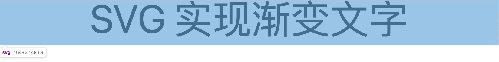
实现效果:
代码:
<svg viewBox="0 0 716 65"><defs><linearGradient id="textGradient" x1="0" y1="0" x2="0" y2="1"><stop offset="0%" stop-color="#d8dadc" /><stop offset="100%" stop-color="#99d0fa" /></linearGradient><filter filterUnits="userSpaceOnUse" id="textShadow" x="0" y="0" width="716" height="65"><feOffset in="SourceAlpha" dx="0" dy="5" /><feGaussianBlur result="blurOut" stdDeviation="2.2" /><feFlood flood-color="rgb(0, 0, 0)" result="floodOut" /><feComposite operator="atop" in="floodOut" in2="blurOut" /><feComponentTransfer><feFuncA type="linear" slope="0.97" /></feComponentTransfer><feMerge><feMergeNode /><feMergeNode in="SourceGraphic" /></feMerge></filter><pattern id="textPattern" width="716" height="65" patternUnits="userSpaceOnUse"><rect x="0" y="0" width="100%" height="100%" fill="url(#textGradient)"></rect></pattern></defs><text x="50%" y="50%" alignment-baseline="middle" text-anchor="middle" font-size="56" font-weight="400" fill="url(#textPattern)" style="filter: url(#textShadow)">SVG 实现渐变文字</text></svg>
svg 文字
<svg viewBox="0 0 716 65"><text x="50%" y="50%" alignment-baseline="middle" text-anchor="middle" font-size="56" font-weight="400">SVG 实现渐变文字</text></svg>
x,y 坐标
alignment-baseline
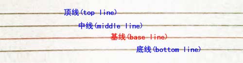
表示该元素的基线如何相对于它的父元素对齐。默认为 auto, 其计算值为 baseline,即文字的 baseline 对齐到 y 坐标。
张鑫旭 - 我对CSS vertical-align的一些理解与认识(一):
我们刚学英语的时使用的那个英语本子每行有四条线,其中底部第二条线就是基线,是a,c,z,x等字母的底边线。下图的红色线即为基线。
text-anchor
该文本与点 (x, y) 的对齐方式 (start、middle、end)。
文本居中
<text x="50%" y="50%" alignment-baseline="middle" text-anchor="middle" font-size="56" font-weight="400">SVG 实现渐变文字</text>
或者:
<text x="50%" y="0" alignment-baseline="before-edge" text-anchor="middle" font-size="56" font-weight="400">SVG 实现渐变文字</text>
或者:
<text x="50%" y="100%" alignment-baseline="after-edge" text-anchor="middle" font-size="56" font-weight="400">SVG 实现渐变文字</text>
渐变文字
linearGradient
线性渐变。x1、y1、x2、y2 表示起始点 (x1, y1) 和终点坐标 (x2, y2);
<svg viewBox="0 0 716 65"><defs><linearGradient id="textGradient" x1="0" y1="0" x2="0" y2="1"><stop offset="0%" stop-color="#d8dadc" /><stop offset="100%" stop-color="#99d0fa" /></linearGradient><pattern id="textPattern" width="716" height="65" patternUnits="userSpaceOnUse"><rect x="0" y="0" width="100%" height="100%" fill="url(#textGradient)"></rect></pattern></defs><text x="50%" y="50%" alignment-baseline="middle" text-anchor="middle" font-size="56" font-weight="400" fill="url(#textPattern)" style="filter: url(#textShadow)">SVG 实现渐变文字</text></svg>
文字阴影效果

<svg viewBox="0 0 716 65"><defs><filter filterUnits="userSpaceOnUse" id="textShadow" x="0" y="0" width="716" height="65"><feOffset in="SourceAlpha" dx="0" dy="5" /><feGaussianBlur result="blurOut" stdDeviation="2.2" /><feFlood flood-color="rgb(0, 0, 0)" result="floodOut" /><feComposite operator="atop" in="floodOut" in2="blurOut" /><feComponentTransfer><feFuncA type="linear" slope="0.97" /></feComponentTransfer><feMerge><feMergeNode /><feMergeNode in="SourceGraphic" /></feMerge></filter></defs><text x="50%" y="50%" alignment-baseline="middle" text-anchor="middle" font-size="56" font-weight="400" style="filter: url(#textShadow)">SVG 实现渐变文字</text></svg>
feOffset
feGaussianBlur 高斯模糊
feFlood 着色
feComposite 组合
feComponentTransfer RGBA 颜色通道滤镜
<feComponentTransfer>SVG滤镜基元对每个像素执行颜色分量的数据重映射。它允许进行像亮度调整,对比度调整,色彩平衡或阈值的操作。 计算是使用非预乘色值进行执行的。(什么是非预乘数据:非预乘数据可以理解为例如rgba(180,160,130,0.8) )中的 180,160,130,它们没有被除以 255 以及乘以透明度 0.8 而转化为 0~1 范围的值,当被除以 255 并且乘以 0.8 而转化为 0~1 范围中的值的预处理被称为 premultiplied color value (预乘数据) )。颜色值在每一个通道 (R,G,B,A) 中被分别修改然后输出,这些通道分别是<feFuncR>,<feFuncB>,<feFuncG>, and<feFuncA>。
feMerge
同时应用滤镜效果而不是按顺序应用滤镜效果

若有收获,就点个赞吧
0 人点赞
