最近要实现一个长按两秒,然后显示圆环倒数进度条的动画。 不想找轮子,想自己写来试试。
原理
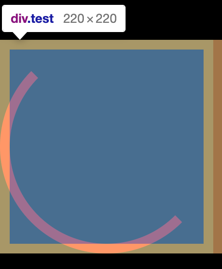
由一个白色和蓝色两个圈组成,选择白色为底色,即白色的圆在下面,蓝色圈分为两个半圆,分别运动到白色圈的上面。
1.如何画一个半圆环
(1)正方形画一半的边
方法不好用,一是border的分段出来有45度的旋转,二是元素余出大量空间,这一点导致我一直因为元素zindex的问题无法实现,因为这种实现方式形成了一个环,最上面的元素最后要藏在最下面的元素下(花了我一晚上的时间,脑壳都想破了也没想出来,最后参考别人用了第二种矩形的方法)。
.box {width: 200px;height: 200px;border-radius: 50%;border: 2px solid red;border-top-color: transparent;border-right-color: transparent;}
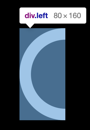
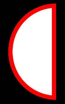
(2)矩形border-radius设为短边,大小两个圆构成圆环。不能用border来画,否则是下图二的样子。
.box {width: 80px;height: 160px;border-top-left-radius: 80px;border-top-right-radius: 0px;border-bottom-right-radius: 0px;border-bottom-left-radius: 80px;}
2.如何让圆转圈
- 定义按照rotate行动
- 定义旋转中心transform-origin
3.如何让动画停在最后一帧
animation-fill-mode: forwards
4.伪类为什么会偏移
在父元素有border的时候,伪类元素会在border结束的地方开始绘制
附上源码
<div class="loading"><div class="left"></div><div class="right"></div><div class="progress"></div></div>.loading .progress {position: absolute;width: 120px;height: 120px;background-color: #000;border-radius: 50%;left: 20px;top: 20px;line-height: 120px;text-align: center;}.left,.right {width: 80px;height: 160px;overflow: hidden;position: relative;float: left;background-color: #fff;}.left {border-radius: 80px 0 0 80px;}.right {border-radius: 0 80px 80px 0;}.left:after,.right:after {content: "";position: absolute;display: block;width: 80px;height: 160px;border-radius: 80px 0 0 80px;background-color: blue;animation-duration: 2s;animation-iteration-count: infinite;animation-timing-function: linear;}.right:after {content: "";position: absolute;display: block;border-radius: 0 80px 80px 0;}.left:after {transform-origin: right center;animation-name: spin-left;}.right:after {transform-origin: left center;animation-name: spin-right;}@keyframes spin-right {0 {transform: rotate(0deg);}50% {transform: rotate(180deg);}100% {transform: rotate(180deg);}}@keyframes spin-left {0 {transform: rotate(0deg);}50% {transform: rotate(0deg);}100% {transform: rotate(180deg);}}
1.scss的keyframe写法
3.原理(究竟为什么能实现转圈后消失)

若有收获,就点个赞吧
0 人点赞
