3. border&background
3.1 border&background1
1. border-radius
CSS 属性 border-radius 允许你设置元素的外边框圆角。当使用一个半径时确定一个圆形,当使用两个半径时确定一个椭圆。这个(椭)圆与边框的交集形成圆角效果。


清楚 border-radius 是如何切割每个角 形成圆角效果的即可
- border-radius 属性值的多种格式
selector {
    border-radius: 10px; /* 4个角 */
    border-radius: 10px 10px; /* 左上 右下 */
    border-radius: 10px 10px 10px; /* 左上 右上左下 右下 */
    border-radius: 10px 10px 10px 10px; /* 左上 右上 右下 左下 */
    border-radius: 10px / 10px; /* 4个角的 水平半径(horizontal radius) 和 垂直半径(vertical radius) 都设置为 10px */
    border-radius: 10px 10px / 10px 10px; /* / 前后为两组 每一组的第 n 个值 表示的是一个角的 水平半径 和 垂直半径 */
    border-radius: 10px 10px 10px / 10px 10px 10px;
    border-radius: 10px 10px 10px 10px / 10px 10px 10px 10px;
}
/* 上面这些写法都是等效的 只不过写法不同罢了 */
/* 设置左上角的 水平和垂直半径 为 10px */
selector {
    border-top-left-radius: 10px;
    border-top-left-radius: 10px 10px;
}
/* 设置右下角的 水平半径 为 10px 垂直半径 为 20px */
selector {
    border-bottom-right-radius: 10px 20px;
}
/* 左上角和右下角的水平半径为 10px 垂直半径为 120px
右上角和左下角的水平半径为 100px  垂直半径为 120px */
selector {
    border-radius: 10px 100px / 120px;
}
notes
  单位也可以是 % 或其他长度单位 并非必须是 px
  属性值的写法非常多样 遇到陌生的 查就完事
- 画一个1/4圆
<!DOCTYPE html>
<html lang="en">

<head>
    <meta charset="UTF-8">
    <title>1/4圆</title>
    <style>
        div {
            position: absolute;
            top: calc(50% - 50px);
            left: calc(50% - 50px);

            border: 1px solid #ddd;
            width: 100px;
            height: 100px;

            border-radius: 100px 0 0 0 / 100px 0 0 0;
        }
    </style>
</head>

<body>
    <div></div>
</body>

</html>

- 画一个半圆
<!DOCTYPE html>
<html lang="en">

<head>
    <meta charset="UTF-8">
    <title>半圆</title>
    <style>
        div {
            position: absolute;
            top: calc(50% - 50px);
            left: calc(50% - 50px);

            border: 1px solid #ddd;
            width: 200px;
            height: 100px;

            border-radius: 100px 100px 0 0 / 100px 100px 0 0;
        }
    </style>
</head>

<body>
    <div></div>
</body>

</html>

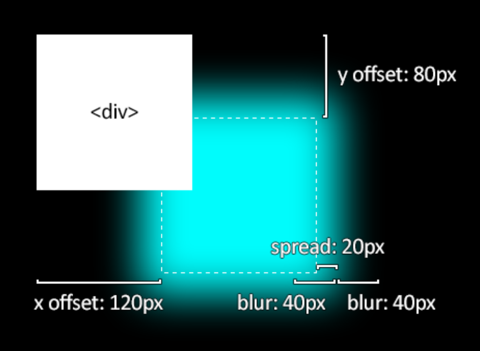
2. box-shadow
CSS box-shadow 属性用于在元素的框架上添加阴影效果。你可以在同一个元素上设置多个阴影效果,并用逗号将他们分隔开。该属性可设置的值包括阴影的X轴偏移量、Y轴偏移量、模糊半径、扩散半径和颜色。
语法
selector {
    /* x偏移量 | y偏移量 | 阴影颜色 */
    box-shadow: 60px -16px teal;

    /* x偏移量 | y偏移量 | 阴影模糊半径 | 阴影颜色 */
    box-shadow: 10px 5px 5px black;

    /* x偏移量 | y偏移量 | 阴影模糊半径 | 阴影扩散半径 | 阴影颜色 */
    box-shadow: 2px 2px 2px 1px rgba(0, 0, 0, 0.2);

    /* 插页(阴影向内) | x偏移量 | y偏移量 | 阴影颜色 */
    box-shadow: inset 5em 1em gold;

    /* 任意数量的阴影,以逗号分隔 */
    box-shadow: 3px 3px red, -1em 0 0.4em olive;

    /* 全局关键字 */
    box-shadow: inherit;
    box-shadow: initial;
    box-shadow: unset;
}
认识各个属性值
<!DOCTYPE html>
<html lang="en">

<head>
    <meta charset="UTF-8">
    <title>box-shadow</title>
    <style>
        body {
            background-color: #000;
        }

        div {
            position: absolute;
            top: calc(50% - 50px);
            left: calc(50% - 50px);
            width: 100px;
            height: 100px;
            border: 1px solid #ddd;
        }
    </style>
</head>

<body>
    <div></div>
</body>

</html>

div {
    box-shadow: 0 0 0 50px #0ff;
}

div {
    box-shadow: 10px 20px 0 0 #0ff;
}

div {
    box-shadow: 50px 100px 0 0 #0ff;
}

div {
    box-shadow: 50px 100px 50px 0 #0ff;
}

div {
    /* 重复设置多次 阴影会有加重的效果 */
    box-shadow: 50px 100px 50px 0 #0ff,
                50px 100px 50px 0 #0ff;
}

div {
    /* 内阴影和外阴影相同 只要加上一个 inset 属性值即可实现内阴影效果 */
    box-shadow: inset 10px 20px 10px 0 #0ff;
}

div {
    /* 文字 在内阴影的上面 显示
    内阴影 在背景的上面 显示 */
    color: #fff;
    background-color: #999;
    box-shadow: inset 10px 20px 10px 0 #0ff;
}
<div>Lorem ipsum dolor sit amet consectetur.</div>

以上案例几乎都只设置了一个值 但是 我们也可以多同时设置多个值 注意: 先设置的会覆盖在后设置的上面
/* 先写的 box-shadow 和 后写的 box-shadow 若有重叠区域 那么先写的会覆盖后写的 */
div {
    box-shadow: 10px 20px 0 0 green,
        20px 10px 10px 0 red,
        10px -20px 10px 0 blue,
        -20px -20px 10px 0 yellow,
        0 0 100px 10px #fff;
}

展示1
<!DOCTYPE html>
<html lang="en">
<head>
<meta charset="UTF-8">
<title>box-shadow</title>
<style>
div {
width: 400px;
margin: 20px auto;
padding: 20px;
text-indent: 2em;
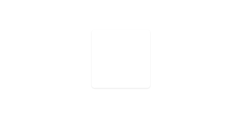
box-shadow:
inset 0 -3em 3em rgba(0, 0, 0, 0.1),
0 0 0 2px rgb(255, 255, 255),
0.3em 0.3em 1em rgba(0, 0, 0, 0.3);
}
p {
text-align: right;
}
span {
color: #999;
}
</style>
</head>
<body>
<div>
Lorem ipsum dolor sit amet consectetur, adipisicing elit. Totam modi maxime nostrum dolor temporibus fuga,
dolorum non repellendus autem molestias, sequi id? Error nemo expedita quam laborum, itaque harum obcaecati.<br>
<p>
<span>—— dahuyou</span>
</p>
</div>
</body>
</html>

展示2
<!DOCTYPE html>
<html lang="en">

<head>
    <meta charset="UTF-8">
    <title>box-shadow</title>
    <style>
        body {
            background-color: #000;
        }

        div {
            color: #fff;
            position: absolute;
            left: calc(50% - 150px);
            top: calc(50% - 150px);
            width: 300px;
            height: 300px;
            background-color: red;
            border-radius: 50%;


            box-shadow: inset 0px 0px 50px #fff,
                inset 10px 0px 80px #f0f,
                inset -10px 0px 80px #0ff,
                inset 10px 0px 300px #f0f,
                inset -10px 0px 300px #0ff,
                0px 0px 50px #fff,
                -10px 0px 80px #f0f,
                10px 0px 80px #0ff;
        }
    </style>
</head>

<body>
    <div></div>
</body>

</html>

展示3
<!DOCTYPE html>
<html lang="en">

<head>
    <meta charset="UTF-8">
    <title>box-shadow</title>
    <style>
        body {
            background-color: #000;
        }

        div {
            position: absolute;
            left: calc(50% - 25px);
            top: calc(50% - 25px);
            width: 50px;
            height: 50px;
            background-color: #fff;
            border-radius: 50%;

            box-shadow: 0px 0px 100px 50px #fff,
                0px 0px 250px 125px #ff0;
        }
    </style>
</head>

<body>
    <div></div>
</body>

</html>

展示4
<!DOCTYPE html>
<html lang="en">

<head>
    <meta charset="UTF-8">
    <title>box-shadow</title>
    <style>
        /* body {
            background-color: #000;
        } */

        div {
            position: absolute;
            border-radius: 5px;
            left: calc(50% - 50px);
            top: calc(50% - 50px);
            width: 100px;
            height: 100px;
            background-color: #fff;

            box-shadow: 0px 1px 2px rgba(0, 0, 0, .1);
            transition: all .6s;
        }

        div::after {
            content: "";
            position: absolute;
            left: 0;
            top: 0;
            width: 100%;
            height: 100%;
            border-radius: 5px;
            box-shadow: 0px 5px 15px rgba(0, 0, 0, 0.3);
            opacity: 0;
            transition: all .6s;
        }

        div:hover {
            transform: scale(1.25, 1.25);
        }

        div:hover::after {
            opacity: 1;
        }
    </style>
</head>

<body>
    <div></div>
</body>

</html>

3.2 border&background2
1. border-image
border-image CSS属性允许在元素的边框上绘制图像。这使得绘制复杂的外观组件更加简单,也不用在某些情况下使用九宫格了。使用 border-image 时,其将会替换掉 border-style 属性所设置的边框样式。虽然规范要求使用 border-image 时边框样式必须存在,但一些浏览器可能没有实现这一点。
特别注意,若 border-image-source(此值可用border-image-source或border-image简写设置) 的值为 none 或者图片不能显示,则将应用 border-style。
border-image 是一个简写属性
本节介绍的 CSS3 的属性 border-image 重点在于理解 border-image-slice
/* 语法 */
selector {
  border-image: border-image-source|[border-image-slice,border-image-width,border-image-outset]|border-image-repeat
}
border-style 失效
<!DOCTYPE html>
<html lang="en">
<head>
    <meta charset="UTF-8">
    <meta http-equiv="X-UA-Compatible" content="IE=edge">
    <meta name="viewport" content="width=device-width, initial-scale=1.0">
    <title>border-image</title>
    <style>
        div{
            position: absolute;
            top: calc(50% - 50px);
            left: calc(50% - 50px);

            height: 100px;
            width: 100px;
            border: 10px solid #ddd;
            /* border 是一个简写属性
            border-width    10px
            border-style    solid
            border-color    #ddd */
        }
    </style>
</head>
<body>
    <div></div>
</body>
</html>

div {
    /* 若设置了 border-iamge 那么 border-style 就不好使了 */
    border-image-source: linear-gradient(red, yellow);
    border-image-slice: 10;
}

border-image-slice


<!DOCTYPE html>
<html lang="en">
<head>
    <meta charset="UTF-8">
    <meta http-equiv="X-UA-Compatible" content="IE=edge">
    <meta name="viewport" content="width=device-width, initial-scale=1.0">
    <title>border-image</title>
    <style>
        div {
            position: absolute;
            top: calc(50% - 15px);
            left: calc(50% - 15px);

            /* 上 mdn 上下载下来的 border.png 图片的尺寸是 90 * 90 */
            height: 30px;
            width: 30px;
            border: 30px solid #ddd;
            border-image-source: url('./border.png');
            border-image-slice: 30;
            /* 等价于下面这样的写法 它制定的是 4 条分割线的位置
            border-image-slice: 30 30 30 30;
            分别表示这 4 个方向: top right bottom left
            注意: 只能填数字 或 百分数 */
        }
    </style>
</head>
<body>
    <div></div>
</body>
</html>

div {
    border-image-slice: 100%; /* 默认值是 100% */
}

notes
  通常情况下 border-width 的大小就是 border-image-slice 的大小
  美工会把背景图给设计好 9 宫格的形式
border-image-outset
border-image-width
若 border-image-width 给定的是 数字 那么它表示的是 border-width 的倍数
若 border-image-width 给定的是 默认值 auto 那么它的值等于 boeder-image-slice (单位是 px)
border-image-repeat
border-image-repeat 解决的是 5678 4个区域如何填充的问题
3.3 border&background3
1. background-image
linear-gradient 和 radial-gradient
<!DOCTYPE html>
<html lang="en">
<head>
<meta charset="UTF-8">
<meta http-equiv="X-UA-Compatible" content="IE=edge">
<meta name="viewport" content="width=device-width, initial-scale=1.0">
<title>border-image</title>
<style>
div {
position: absolute;
top: calc(50% - 50px);
left: calc(50% - 50px);
width: 100px;
height: 100px;
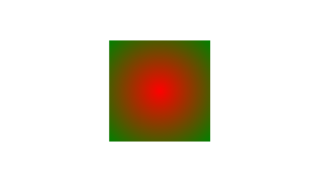
background-image: linear-gradient(red, green);
/* 下面的两个颜色渐变 当作背景图片来使
linear-gradient 表示的是 线性渐变
radial-gradient 表示的是 径向渐变
*/
}
</style>
</head>
<body>
<div></div>
</body>
</html>

div {
    background-image: radial-gradient(red, green);
}
background-image 多 url
<!DOCTYPE html>
<html lang="en">

<head>
    <meta charset="UTF-8">
    <title>background-image</title>
    <style>
        div {
            position: absolute;
            top: calc(50% - 50px);
            left: calc(50% - 125px);

            width: 250px;
            height: 100px;
            border: 2px dashed #008c8c;

            /* 一个容器引入多张图片
            注意: 需要设置好 size 和 repeat 和 position */
            background-image: url(./bz.jpg), url(./dahuyou.jpg);
            background-size: 150px 100px, 100px 100px;
            background-repeat: no-repeat;
            background-position: 0 0, 150px 0;
        }
    </style>
</head>

<body>
    <div></div>
</body>

</html>

作用
  1. 容错处理
     若第一张图片的路径写错了 那么会展示第二张图片
  2. 改善体验
     若第一张图片的体积过大 请求的时间比较长 那么在请求该图片的时间段内 会优先展示第二张图片
     实现这种需求的第二张图片一般是存在浏览器里的 就是浏览器中保存有第二张图片 在渲染页面时 直接上浏览器里取就行了 不需要请求
2. background-origin
background-origin 规定了指定背景图片 background-image 属性的原点位置的背景相对区域。注意:当使用 background-attachment 为fixed时,该属性将被忽略不起作用。
background-origin 属性一共有 3 个值
  content-box
  padding-box
  border-box
它的默认值是 padding-box

注意: 该属性规定的是图片从哪开始渲染 并未规定 图片渲染到哪一部分结束渲染
3. background-clip
background-clip 设置元素的背景(背景图片或颜色)是否延伸到边框、内边距盒子、内容盒子下面。
background-clip 属性一共有 4 个值 (下面这 4 个值的效果 看一下 mdn 上的展示示例 即可)
  text
  content-box
  padding-box
  border-box (默认值)
<!DOCTYPE html>
<html lang="en">

<head>
    <meta charset="UTF-8">
    <meta http-equiv="X-UA-Compatible" content="IE=edge">
    <meta name="viewport" content="width=device-width, initial-scale=1.0">
    <title>Document</title>
    <style>
        div {
            font-size: 100px;
            font-weight: bold;
            text-align: center;
            background-image: url('./bz.jpg');

            /* text 属性值 需要搭配 -webkit-text-fill-color 来使用
            该效果只有在 webkit系列内核的浏览器下才好使 */
            background-clip: text;
            -webkit-background-clip: text;
            -webkit-text-fill-color: transparent;
        }
    </style>
</head>

<body>
    <div>dahuyou</div>
</body>

</html>

4. background-repeat
background-repeat CSS 属性定义背景图像的重复方式。背景图像可以沿着水平轴,垂直轴,两个轴重复,或者根本不重复。
5. background-attachment
background-attachment CSS 属性决定背景图像的位置是在视口内固定,或者随着包含它的区块滚动。
background-attachment 的三个属性值
fixed
  此关键属性值表示背景相对于视口固定。
  即使一个元素拥有滚动机制,背景也不会随着元素的内容滚动。
local
  此关键属性值表示背景相对于元素的内容固定。
  如果一个元素拥有滚动机制,背景将会随着元素的内容滚动,并且背景的绘制区域和定位区域是相对于可滚动的区域而不是包含他们的边框。
scroll
  此关键属性值表示背景相对于元素本身固定,而不是随着它的内容滚动(对元素边框是有效的)。
<!DOCTYPE html>
<html lang="en">

<head>
    <meta charset="UTF-8">
    <title>background-attachment</title>
    <style>
        .content {
            width: 400px;
            border: 1px solid #ddd;
            height: 500px;
            overflow: scroll;

            background: url('./bz.jpg') 50px 200px / 300px no-repeat;

            /* 把这 3 个属性值 都试试 体验体验区别即可 */
            /* background-attachment: scroll; */
            /* background-attachment: fixed; */
            background-attachment: local;
        }
    </style>
</head>

<body>
    <!-- 手动输入 lorem1000 后 按回车 生成 1000 个假单词用作演示 -->
    <div class="content">lorem1000</div>
    <!-- 为了出现纵向滚动条 -->
    <div style="height: 1000px;"></div>
</body>

</html>

6. background-size
background-size 设置背景图片大小。图片可以保有其原有的尺寸,或者拉伸到新的尺寸,或者在保持其原有比例的同时缩放到元素的可用空间的尺寸。
- 理解两个属性值
cover
缩放背景图片以完全覆盖背景区,可能背景图片部分看不见。和 contain 值相反,cover 值尽可能大的缩放背景图像并保持图像的宽高比例(图像不会被压扁)。该背景图以它的全部宽或者高覆盖所在容器。当容器和背景图大小不同时,背景图的 左/右 或者 上/下 部分会被裁剪。
contain
缩放背景图片以完全装入背景区,可能背景区部分空白。contain 尽可能的缩放背景并保持图像的宽高比例(图像不会被压缩)。该背景图会填充所在的容器。当背景图和容器的大小的不同时,容器的空白区域(上/下或者左/右)会显示由 background-color 设置的背景颜色。
7. linear-gradient 和 radial-gradient
8. color_value
颜色值的多种写法color_value mdn- currentColor 关键字 mdn
<!DOCTYPE html>
<html lang="en">

<head>
    <meta charset="UTF-8">
    <title>css 中转颜色 CurrentColor</title>
    <style>
        div{
            width: 100px;
            height: 100px;
            border: 1px solid currentColor;
            /* border-color 的默认值是 currentColor [box-shadow 颜色的默认值也是它]
            currentColor 表示的是 当前(文字)颜色 */
        }
    </style>
</head>

<body>
    <div></div>
</body>

</html>

div {
    color: #f40; /* 当我们把文字颜色设置为红色时 border-color 的颜色也会跟着变化 */
}

<!DOCTYPE html>
<html lang="en">

<head>
    <meta charset="UTF-8">
    <title>css 中转颜色 CurrentColor</title>
    <style>
        div {
            width: 100px;
            height: 100px;
            color: #f40;
            background-color: currentColor;
            /* 我们可以把 currentColor 当做一个变量来使 */
        }
    </style>
</head>

<body>
    <div></div>
</body>

</html>


若有收获,就点个赞吧
0 人点赞
