盒模型
- 盒模型的概念:css定义的所有元素都可以拥有像盒子一样的外形和平面空间,它是css布局的基石,它规定了网页元素如何显示以及元素间的相互关系。
- 盒模型分为两种:W3C标准盒模型 (box-sizing:content-box)+ IE盒模型(box-sizing:border-box)
- 盒模型的四个属性:内容(content)、填充(padding)、边框(border)、边界(margin)
- W3C标准盒模型计算方式:盒子宽(渲染区域的宽)= width + padding2 + border2
- IE盒模型:盒子宽(渲染区域宽)= width ————padding、border 向内延伸
BFC
在解释BFC之前,先说一下文档流。我们常说的文档流其实分为定位流、浮动流和普通流三种。而普通流其实就是指BFC中的FC。FC是formatting context的首字母缩写,直译过来是格式化上下文,它是页面中的一块渲染区域,有一套渲染规则,决定了其子元素如何布局,以及和其他元素之间的关系和作用。常见的FC有BFC、IFC,还有GFC和FFC。BFC是block formatting context,也就是块级格式化上下文,是用于布局块级盒子的一块渲染区域。
定义
BFC(Block formatting context)直译为”块级格式化上下文”。它是一个独立的渲染区域,只有Block-level box参与, 它规定了内部的Block-level Box如何布局,并且与这个区域外部毫不相干。
BFC布局规则:
- 内部的Box会在垂直方向,一个接一个地放置。
- Box垂直方向的距离由margin决定。属于同一个BFC的两个相邻Box的margin会发生重叠
- 每个元素的margin box的左边, 与包含块border box的左边相接触(对于从左往右的格式化,否则相反)。即使存在浮动也是如此。
- BFC的区域不会与float box重叠。
- BFC就是页面上的一个隔离的独立容器,容器里面的子元素不会影响到外面的元素。反之也如此。
- 计算BFC的高度时,浮动元素也参与计算
触发条件:
- 根元素
- position: absolute/fixed
- display: inline-block / table
- float 元素
- ovevflow !== visible
两、三栏自适应布局
/* 两栏布局 */.left {width: 200px;height: 200px;background-color: red;float: left;}.right {height: 400px;overflow: hidden;background-color: green;}<div id="layout"><div class="left"></div><div class="right"></div></div>
/* 三栏布局--浮动float布局*/#layout2 .left {width: 200px;height: 200px;background-color: rosybrown;float: left;}#layout2 .center {height: 400px;margin: 0 200px;background-color: burlywood;}#layout2 .right {width: 200px;height: 200px;background-color: rosybrown;float: right;}<div id="layout2"><div class="left"></div><div class="right"></div><div class="center"></div></div>
</* 三栏布局 position布局 */>* {margin: 0;padding: 0;}#layout3 .left {position: absolute;left: 0;width: 200px;height: 200px;background-color: rosybrown;}#layout3 .center {position: absolute;left: 200px;right: 200px;height: 400px;background-color: pink;}#layout3 .right {position: absolute;right: 0;width: 200px;height: 200px;background-color: rosybrown;}<div id="layout3"><div class="left"></div><div class="center"></div><div class="right"></div></div>
</* 三栏布局 table布局 */>#layout4 {width: 100%;height: 300px;display: table;}#layout4 .left,#layout4 .center,#layout4 .right {display: table-cell;}#layout4 .left {width: 300px;background-color: cadetblue;}#layout4 .center {background-color: chartreuse;}#layout4 .right {width: 300px;background-color: cadetblue;}<div id="layout4"><div class="left"></div><div class="center"></div><div class="right"></div></div>
</* 三栏布局 弹性flex布局 */>#layout5 {display: flex;}#layout5 .left {width: 200px;height: 300px;background-color: burlywood;}#layout5 .center {flex: 1;height: 200px;background-color: plum;}#layout5 .right {width: 200px;height: 300px;background-color: burlywood;}<div id="layout5"><div class="left"></div><div class="center"></div><div class="right"></div></div>
</* 三栏布局 网格gird布局 */>#layout6 {width: 100%;display: grid;grid-template-rows: 100px;grid-template-columns: 300px auto 300px;}#layout6 .left {background-color: powderblue;}#layout6 .center {background-color: greenyellow;}#layout6 .right {background-color: powderblue;}<div id="layout6"><div class="left"></div><div class="center"></div><div class="right"></div></div>
清除浮动带来的影响(父元素高度塌陷)
清除浮动主要是为了解决父级元素因为子级元素浮动引起的内部高度为0的问题
- 给父元素设置高度
- 额外标签法:给谁清除浮动,就在其后额外添加一个空白标签 。(clear:both)
- 父级添加overflow方法:可以通过触发BFC的方式,实现清楚浮动效果。(父元素生成BFC,内部的浮动元素也会参与高度计算,)
伪元素清除
.bfc2::after {content: "";display: block;height: 0;clear: both;visibility: hidden;}.bfc2{*zoom: 1;}
使用before和after双伪元素清除
.bfc2:before, .bfc2:after {content: '';display: table;}.bfc2::after {clear: both;}.bfc2 {*zoom: 1;}
参考网站:
https://juejin.cn/post/6844903496970420237
https://juejin.cn/post/6844903776512393224
https://www.jianshu.com/p/bf927bc1bed4
伪类有 :link :hover :active :visited :focus :first-child。 伪元素有 ::before ::after。
常见布局
水平居中
行内元素:text-align:center
.text {text-align: center;}<div class="text"><span>我是行内元素</span></div>
块级元素:margin:0 auto
.block1 {width: 100px;height: 20px;background-color: red;margin: 0 auto;}
块级和行内元素都适用:
行内元素:line-height:height
.text {height: 50px;line-height: 50px;}<div class="text"><span>我是行内元素</span></div>
absolute + transform
.block2 {width: 100px;height: 20px;background-color: green;position: absolute;top: 50%;transform: translateY(-10px);}
flex + align-items: center
.block3 {display: flex;align-items: center;height: 30px;background-color: greenyellow;}
table:默认垂直居中
.parent-frame {width: 500px;height: 400px;background: pink;}<table class="parent-frame"><tr><td>table默认垂直居中[vertical-align: middle]</td><td style="text-align:center;">水平居中添加text-align:center</td></tr></table>
水平垂直居中
absolute + transform
.block2 {width: 100px;height: 20px;background-color: green;position: absolute;top: 50%;left: 50%;transform: translate(-50px,-10px);}
flex + justify-content + align-items
.block3 {display: flex;align-items: center;justify-content: center;height: 30px;background-color: greenyellow;}
怪异模式
选择器
优先级:
!important > 行内样式 > id > class=伪类 > 标签(类型选择器)= 伪元素选择器 > * (全体选择器) > 继承 > 默认
选择器从右往左解析简单选择器:
1. 类型选择器(标签选择器)和 全体选择器
2. class选择器 和 id选择器
3. 属性选择器:~=, |=, ^=, $=, *= ,=,attr
“value 是完整单词” 类型的比较符号: ~=, |=
“拼接字符串” 类型的比较符号: *=, ^=, $=attribute 属性中包含 value:
[attribute~=value] 属性中包含独立的单词为 value,例如:
[title~=flower] --> <img src="/i/eg_tulip.jpg" title="tulip flower" />
[attribute*=value] 属性中做字符串拆分,只要能拆出来 value 这个词就行,例如:
[title*=flower] --> <img src="/i/eg_tulip.jpg" title="ffffflowerrrrrr" />
attribute 属性以 value 开头:
[attribute|=value] 属性中必须是完整且唯一的单词,或者以 - 分隔开:,例如:
[lang|=en] --> <p lang="en"> <p lang="en-us">
[attribute^=value] 属性的前几个字母是 value 就可以,例如:
[lang^=en] --> <p lang="ennn">
attribute 属性以 value 结尾:
树结构关系伪类选择器
- :root—伪类表示树的根元素,在选择器是针对完整的 HTML 文档情况,我们一般用 HTML 标签即可选中根元素。
- :empty—伪类表示没有子节点的元素(空白文本也算有子节点,例如)
- :nth-child 、 :nth-last-child、:only-child(选中唯一一个子元素,例如 我是子元素4)
- of-type 系列,是一个变形的语法糖,S:nth-of-type(An+B) 是:nth-child(|An+B| of S) 的另一种写法。以此类推,还有 nth-last-of-type、first-of-type、last-of-type、only-of-type。
- 链接与行为伪类选择器
- :any-link 表示任意的链接,包括 a、area 和 link 标签都可能匹配到这个伪类。
- :link 表示未访问过的链接, :visited 表示已经访问过的链接。
- :hover 表示鼠标悬停在上的元素。
- :active 表示用户正在激活这个元素,如用户按下按钮,鼠标还未抬起时,这个按钮就处于激活状态。
- :focus 表示焦点落在这个元素之上。
- :target 用于选中浏览器 URL 的 hash 部分所指示的元素
- 逻辑伪类选择器
- :not—这个伪类是个函数型伪类,它的作用是选中内部的简单选择器未命中的元素。例如::not(p)
- 其他伪类选择器
5. 伪元素选择器
::before 和 ::after,有了这两个伪元素,一些修饰性元素,可以使用纯粹的 CSS 代码添加进去,这能够很好地保持 HTML 代码中的语义,既完成了显示效果,又不会让 DOM 中出现很多无语义的空元素。
- ::first-line——注意这里的第一行指的是排版后显示的第一行,跟 HTML 代码中的换行无关。
- ::first-letter
- ::before
- ::after
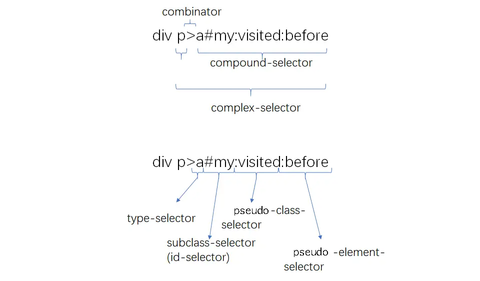
复合选择器:连续写在一起的简单选择器,针对元素自身特征选择单个元素
复杂选择器:由“(空格)”“ >”“ ~”“ +”“ ||”等符号连接的复合选择器,根据父元素或者前序元素检查单个元素。

若有收获,就点个赞吧
0 人点赞
