弹性盒模型
- 简称
felxbox、全称是flexible box - 出现的目的是让子元素能更好的布局和对齐
felx布局是一维的布局,一次只能处理一个维度上的布局,也就是主轴
二维的布局方式
设置flex
div {display: flex;display: -webkit-box;display: -webkit-flex;display: -ms-flexbox;}
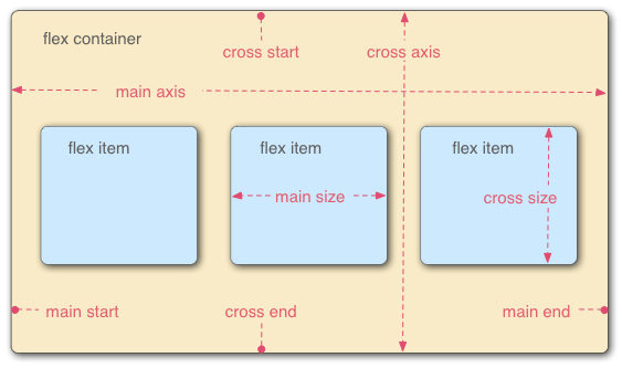
flex的元素构成
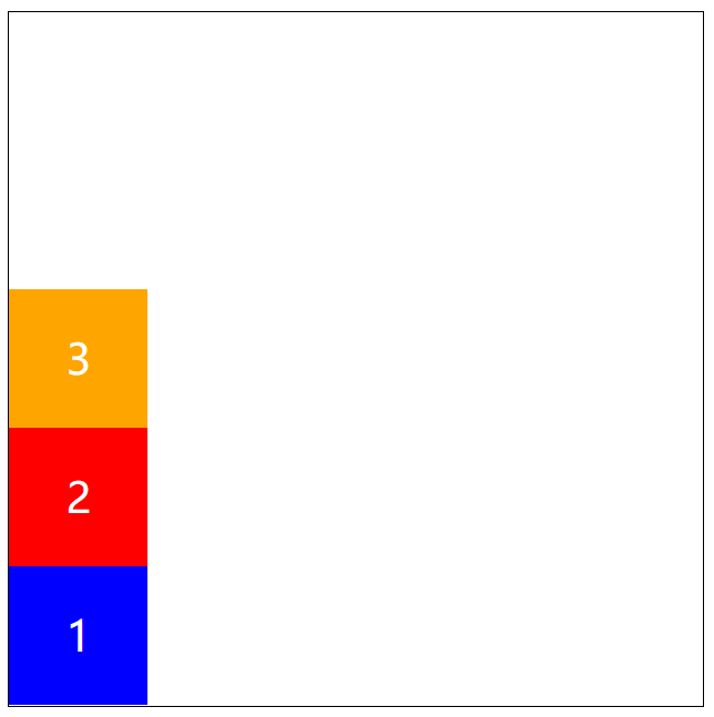
flex父级容器:flex container-
html代码
```html
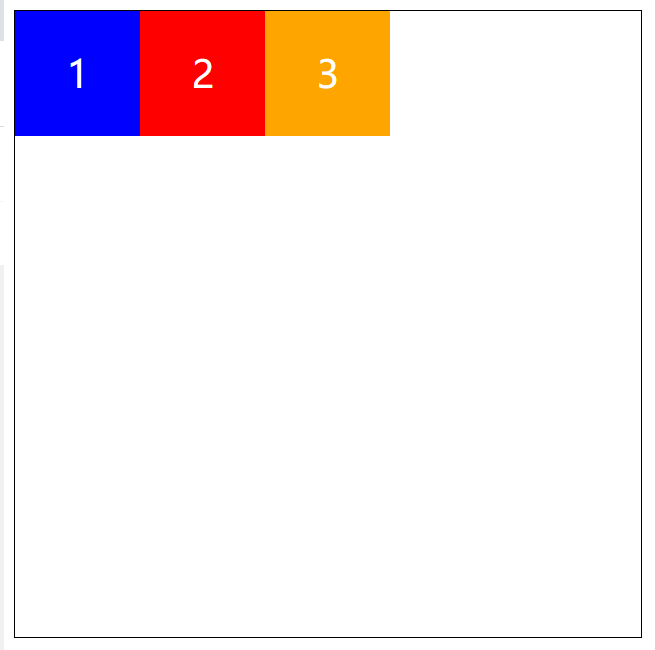
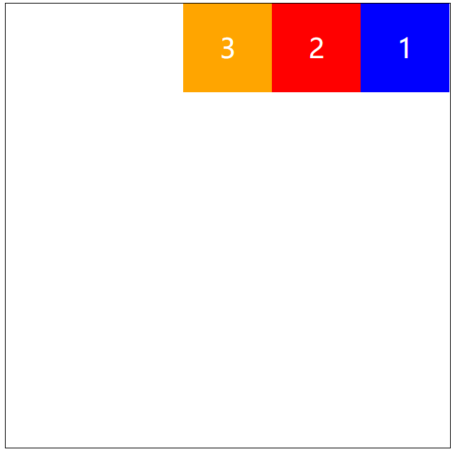
123<a name="WsM8y"></a> # 父容器上面的属性 <a name="R916X"></a> ## HTML代码html <!DOCTYPE html>123<a name="yzjEd"></a> ## 定义主轴的排列方向 `direction`方向,用来定义主轴的方向 <a name="UKj1d"></a> ### 默认方向从左到右 ```css flex-direction: row;逆向,主轴方向在右边,从右到左排列
flex-direction: row-reverse;主轴方向为竖直方向
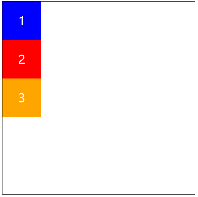
flex-direction: column;垂直方向翻转
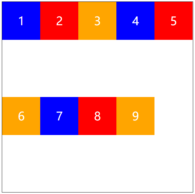
flex-direction: column-reverse;盒子超出后是否换行
默认排成一排,不换行(默认)
flex-wrap: nowrap;换行
flex-wrap: wrap;颠倒折行
flex-wrap: wrap-reverse;主轴+折行简写
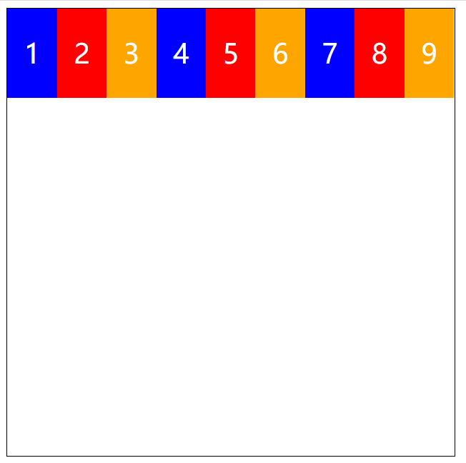
flex-flow:row wrap;主轴上的对齐方式
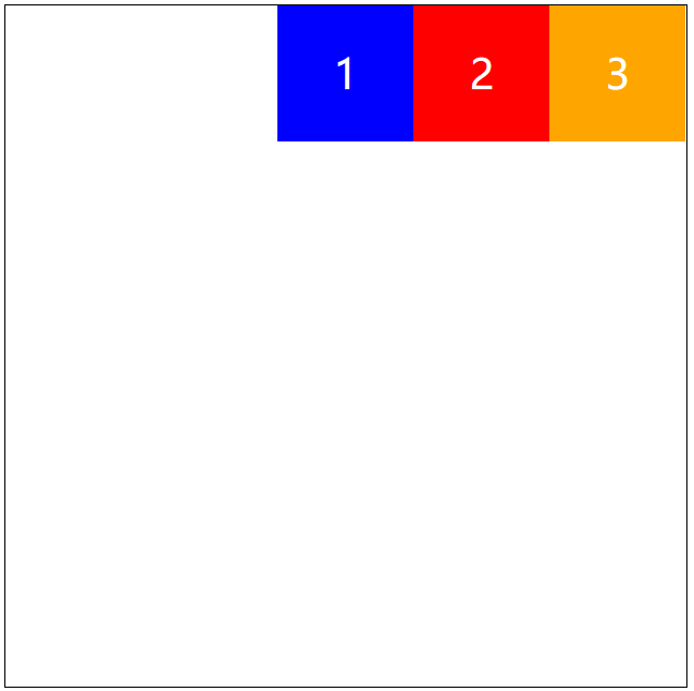
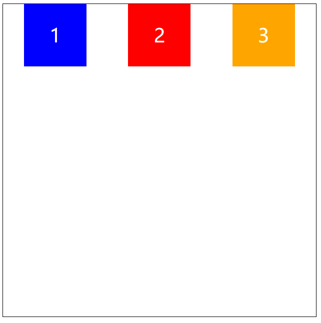
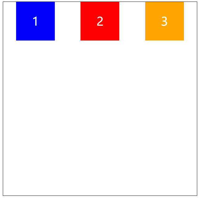
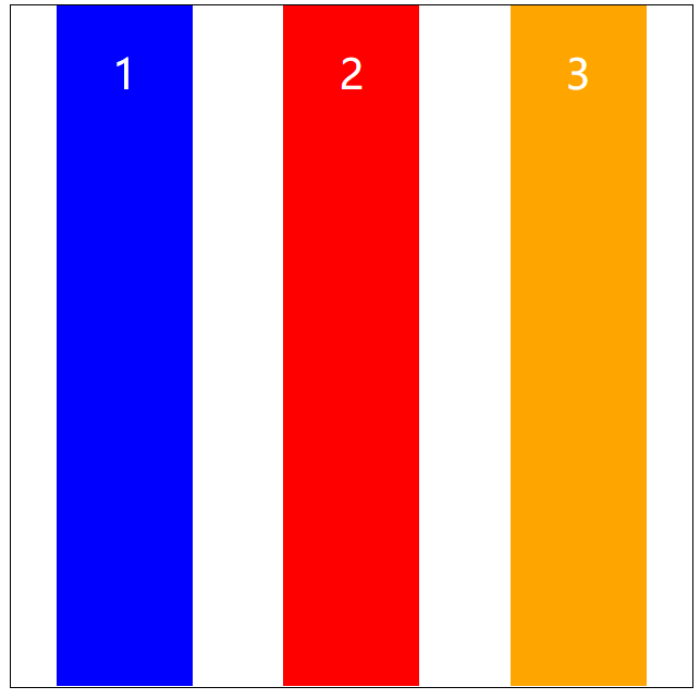
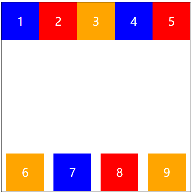
默认值-沿着起点对齐
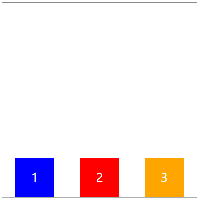
justify-content: flex-start;沿着终点对齐
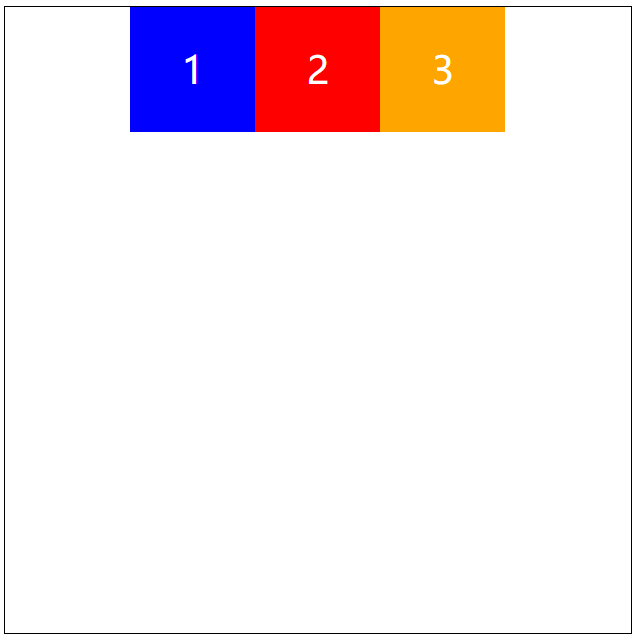
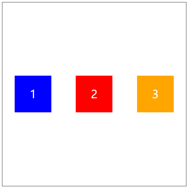
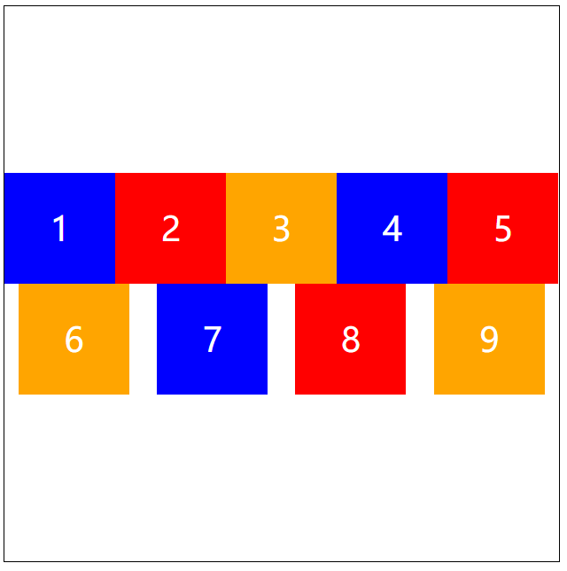
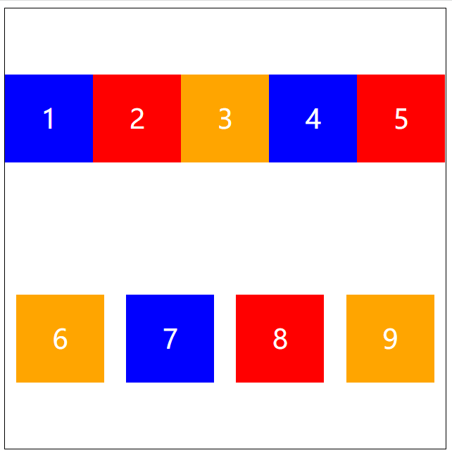
justify-content: flex-end;多个盒子居中对齐
justify-content: center;两端对齐
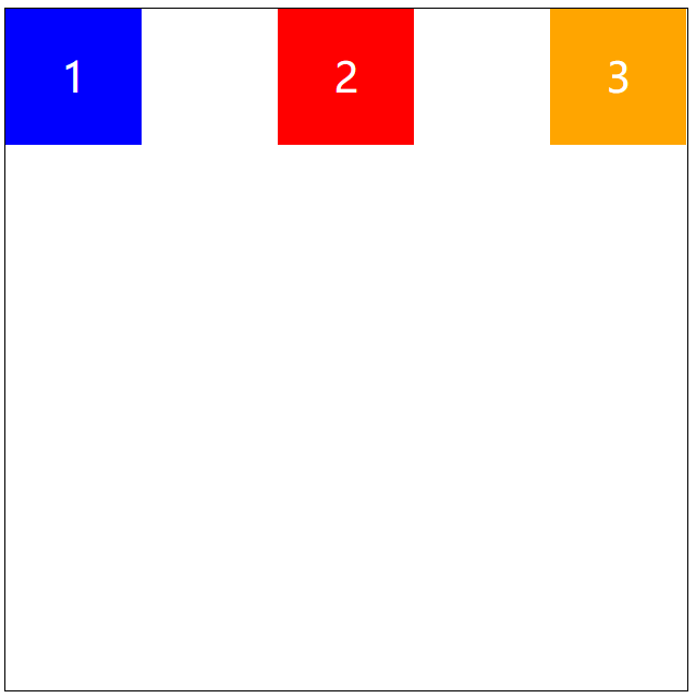
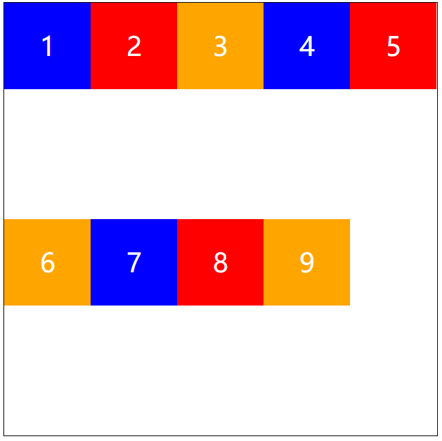
justify-content: space-between;盒子两侧的间距相等
flex item两侧距离间隔相等justify-content: space-around;垂直对齐
-
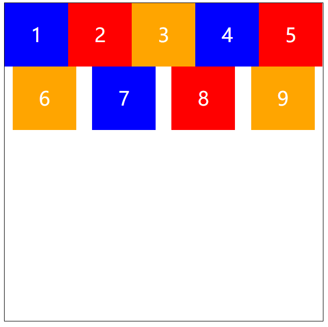
沿着起点方向
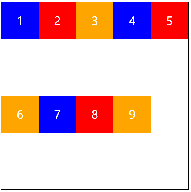
    flex-flow: row wrap;
    justify-content: space-around;
    align-items: flex-start;
沿着终点方向
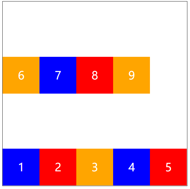
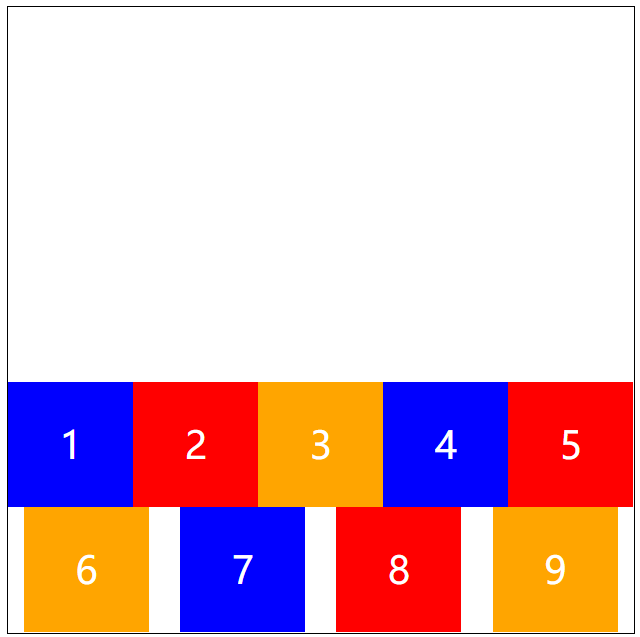
    flex-flow: row wrap;
    justify-content: space-around;
    align-items: flex-end;
交叉轴居中
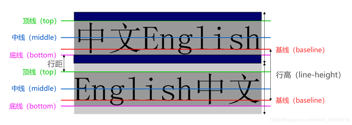
align-items: center;沿着基准线对齐
沿着文字的基准线对齐
align-items: baseline;占满高度
在不给高度的情况下,会占满。
align-items: stretch;多轴对齐方式
沿着交叉轴的起点对齐
    align-content: flex-start;
    justify-content: space-around;
沿着交叉轴的终点对齐
    align-content: flex-end;
    justify-content: space-around;
交叉轴两端对齐
    align-content:space-between;
    justify-content: space-around;
交叉轴中间对齐
    align-content:center;
    justify-content: space-around;
交叉轴间距相等
    align-content:space-around;
    justify-content: space-around;
等分交叉轴,顶端对齐
    flex-flow: row wrap;
    justify-content: flex-start;
    align-content:stretch;
移动端固定
position: fixed;然后给定位置。 ```html <!DOCTYPE html>菜单栏
```
-

若有收获,就点个赞吧
0 人点赞
