问题列表
页面滚动比较卡顿
body {-webkit-overflow-scrolling: touch;overflow-scrolling: touch;}.elem {overflow: auto;}
某些手机针对input type为search时有清除按钮样式
#Search::-webkit-search-cancel-button{display: none;}
translation清除闪屏
-webkit-transform-style: preserve-3d; //设置内嵌的元素在 3D 空间如何呈现:保留3D-webkit-backface-visibility:hidden; //设置进行转换的元素的背面在面对用户时是否可见:隐藏-webkit-perspective: 1000;
position:fixed的一些问题
fixed是移动端支持不好的,尤其是键盘出现的时候。
var ua = navigator.userAgent.indexOf('Android');if(ua>-1){$('.ipt').on('focus', function(){$('.css').css({'visibility':'hidden'})}).on('blur', function(){$('.css').css({'visibility':'visible'})})}// body被顶起的高度$('body').height($('body')[0].clientHeight);
移动端的placeholder位置偏上
line-height:normal
ios上下拉动边界出现空白
描述
手指按住屏幕下拉动,顶部会出现白色区域;向上拉动,底部会出现白色区域
原因
在 iOS 中,手指按住屏幕上下拖动,会触发 touchmove 事件。这个事件触发的对象是整个 webview 容器,容器自然会被拖动,剩下的部分会成空白。
解决方案
1. 监听事件禁止滑动:判断是否需要滚动
移动端触摸事件有三个,分别定义为
1. touchstart :手指放在一个DOM元素上。2. touchmove :手指拖曳一个DOM元素。3. touchend :手指从一个DOM元素上移开。
显然我们需要控制的是 touchmove 事件,由此我在 W3C 文档中找到了这样一段话
Note that the rate at which the user agent sends touchmove events is implementation-defined, and may depend on hardware capabilities and other implementation details. If the preventDefault method is called on the first touchmove event of an active touch point, it should prevent any default action caused by any touchmove event associated with the same active touch point, such as scrolling.
touchmove 事件的速度是可以实现定义的,取决于硬件性能和其他实现细节preventDefault 方法,阻止同一触点上所有默认行为,比如滚动。
由此我们找到解决方案,通过监听 touchmove,让需要滑动的地方滑动,不需要滑动的地方禁止滑动。
值得注意的是我们要过滤掉具有滚动容器的元素。
实现如下:
document.body.addEventListener('touchmove', function(e) {if(e._isScroller) return;// 阻止默认事件e.preventDefault();}, {passive: false});
2. 滚动妥协填充空白,装饰成其他功能
在很多时候,我们可以不去解决这个问题,换一直思路。根据场景,我们可以将下拉作为一个功能性的操作。
比如:下拉后刷新页面,上拉加载更多
**
iphonex 的安全区域
在iphonex的显示区域有部分为安全区域,图示如下: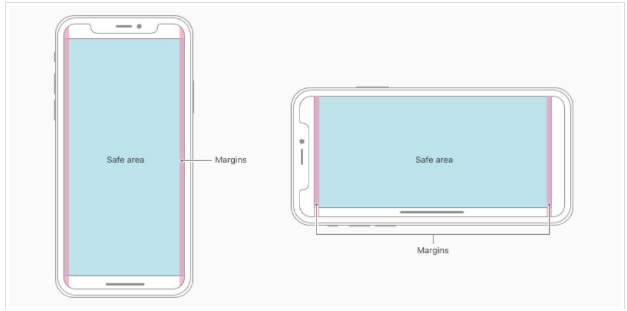
对此,技术方案为设置对应的viewport 的值。
viewport-fit取值如下:
| auto | 默认:viewprot-fit:contain;页面内容显示在safe area内 |
|---|---|
| cover | viewport-fit:cover,页面内容充满屏幕 |
如果使用auto,则不使用圆角区域,但我们一般都是设置为cover的,这就需要在布局上处理这部分效果。那么就需要在对应的顶部以及左右设置处理这部分的样式代码。
在设置cover的情况下,可以获取四个相关的变量,safe-area-inset-left, safe-area-inset-right, safe-area-inset-top和 safe-area-inset-bottom。
<meta name="viewport" content="width=device-width,initial-scale=1,maximum-scale=1,user-scalable=no,viewport-fit=cover">
如果你的按钮在底部,那么你对应的样式代码可以设置为:
padding-bottom: var(--safe-area-inset-bottom);
如果你的按钮或者元素是底部固定位置的,可以bottom使用这个值,可能存在的问题是底部有内容占据视野,不是实际意义的页面底部。
如果是应用全局的页面不希望占用底部,可以针对body容器追加padding-bottom:
padding-bottom: constant(safe-area-inset-bottom);padding-bottom: env(safe-area-inset-bottom);
淘宝的底部设计样式为:其viewport为cover充满,bottom为占据最底部,然后使用padding-bottom再底部留出空间如果是x。
.tb-toolbar-container {box-sizing: border-box;display: flex;position: fixed;left: 0;bottom: 0;padding-bottom: constant(safe-area-inset-bottom);padding-bottom: env(safe-area-inset-bottom);}
相关文章:链接
同等大小的图片pc清楚,手机端模糊
经研究发现是devicePixelRatio作怪,因为手机分辨率太小,如果按照分辨率来显示网页字会非常小,所以苹果就把iPhone 4的960640分辨率在网页里只显示了480320,这样devicePixelRatio=2;现在android比较乱,有1.5/2/3等,想让图片在手机里显示更为清晰必须使用2x的背景图来代替img标签(一般情况都是用2倍),例如一个div的宽高是100100,背景图必须得200200,然后background-size:contain;,这样显示出来的图片就比较清晰了;代码如下:
background:url(../images/icon/all.png) no-repeat center center;-webkit-background-size:50px 50px;background-size: 50px 50px;display:inline-block;width:100%;height:50px;
设置应用以全屏方式运行
apple-mobile-web-app-capable是设置Web应用是否以全屏模式运行;语法:
//content设置为yesWeb应用会以全屏模式运行,反之则不会;content的默认值是no,表示正常显示,可以通过只读属性window.navigator.standalone来确定网页是否以全屏模式显示
<meta name="apple-mobile-web-app-capable" content="yes">
页面含有缓存,如何清除
方式一 :离开时清除
点击浏览器的回退有时候不会自动执行js,特别是在mobilesafari中;这与往返缓存(bfcache)有关系,解决方法:每次退出页面执行函数
window.onunload = function(){};
方式二 :页面进入时 判断是否是从缓存中过来
这种情况是以前遇到的,这里也说下;主要会发生在webview里多一点,当点击后退时页面以缓存形式出现,而不是刷新后的,很多情况下这不是你预期的效果,解决方法是用js:
window.onpageshow = function(evt){if(evt.persisted){document.body.style.display ="none";location.reload();}};
onpageshow每次页面加载都会触发,无论是从缓存中加载还是正常加载,这是他和onload的区别;persisted判断页面是否从缓存中读出。
推荐文章

若有收获,就点个赞吧
0 人点赞
