https://towardsdatascience.com/explain-your-model-with-the-shap-values-bc36aac4de3d
何谓Shapley?
Let me explain the Shapley value with a story: Assume Ann, Bob, and Cindy together were hammering an “error” wood log, 38 inches, to the ground. After work, they went to a local bar for a drink and I, a mathematician, came to join them. I asked a very bizarre question: “What is everyone’s contribution (in inches)?”
How to answer this question? I listed all the permutations and came up with the data in Table A.(Some of you already asked me how to come up with this table. See my note at the end of the article.) When the ordering is A, B, C, the marginal contributions of the three are 2, 32, and 4 inches respectively.
The table shows the coalition of (A,B) or (B,A) is 34 inches, so the marginal contribution of C to this coalition is 4 inches. I took the average of all the permutations for each person to get each individual’s contribution: Ann is 2 inches, Bob is 32 inches and Cindy is 4 inches. That’s the way to calculate the Shapley value: It is the average of the marginal contributions across all permutations. I will describe the calculation in the formal mathematical term at the end of this post. But now, let’s see how it is applied in machine learning.
I called the wood log the “error” log for a special reason: It is the loss function in the context of machine learning. The “error” is the difference between the actual value and prediction. The hammers are the predictors to attack the error log. How do we measure the contributions of the hammers (predictors)? The Shapley values!
From the Shapley Value to SHAP (SHapley Additive exPlanations)
The SHAP (SHapley Additive exPlanations) deserves its own space rather than an extension of the Shapley value. Inspired by several methods (1,2,3,4,5,6,7) on model interpretability, Lundberg and Lee (2016) proposed the SHAP value as a united approach to explaining the output of any machine learning model. Three benefits worth mentioning here.
- The first one is global interpretability — the collective SHAP values can show how much each predictor contributes, either positively or negatively, to the target variable. This is like the variable importance plot but it is able to show the positive or negative relationship for each variable with the target (see the SHAP value plot below).
- The second benefit is local interpretability — each observation gets its own set of SHAP values (see the individual SHAP value plot below). This greatly increases its transparency. We can explain why a case receives its prediction and the contributions of the predictors. Traditional variable importance algorithms only show the results across the entire population but not on each individual case. The local interpretability enables us to pinpoint and contrast the impacts of the factors.
- Third, the SHAP values can be calculated for any tree-based model, while other methods use linear regression or logistic regression models as the surrogate models.
Model Interpretability Does Not Mean Causality 因果关系
It is important to point out the SHAP values do not provide causality. In the “identify causality” series of articles, I demonstrate econometric techniques that identify causality. Those articles cover the following techniques: Regression Discontinuity (see “Identify Causality by Regression Discontinuity”), Difference in differences (DiD)(see “Identify Causality by Difference in Differences”), Fixed-effects Models (See “Identify Causality by Fixed-Effects Models”), and Randomized Controlled Trial with Factorial Design (see “Design of Experiments for Your Change Management”).Data Visualization and Model Explainability
Data visualization and model explainability are two integral aspects in a data science project. They are the binoculars helping you to see the patterns in the data and the stories in your model. I have written a series of articles on data visualization, including “Pandas-Bokeh to Make Stunning Interactive Plots Easy”, “Use Seaborn to Do Beautiful Plots Easy”, “Powerful Plots with Plotly” and “Create Beautiful Geomaps with Plotly”. Or you can bookmark the summary post “Dataman Learning Paths — Build Your Skills, Drive Your Career” that lists the links to all articles. My goal in the data visualization articles is to assist you to produce data visualization exhibits and insights easily and proficiently. Also, I choose the same data for both the data visualization and model explainability in all these articles so you can see how the two go hand in hand. If you would like to adopt all these data visualization codes or make your work more proficient, take a look of them.

How to Use SHAP in Python?
I am going to use the red wine quality data in Kaggle.com to do the analysis. The target value of this dataset is the quality rating from low to high (0–10). The input variables are the content of each wine sample including fixed acidity, volatile acidity, citric acid, residual sugar, chlorides, free sulfur dioxide, total sulfur dioxide, density, pH, sulphates and alcohol. There are 1,599 wine samples.
In this post, I build a random forest regression model and will use the TreeExplainer in SHAP. Some readers have asked if there is one SHAP Explainer for any ML algorithm — either tree-based or non-tree-based algorithms. Yes, there is. It is called the _KernelExplainer. _You can read my second post “Explain Any Models with the SHAP Values — Use the KernelExplainer”, in which I show that if your model is a tree-based machine learning model, you should use the tree explainer TreeExplainer() that has been optimized to render fast results. If your model is a deep learning model, use the deep learning explainer DeepExplainer(). For all other types of algorithms (such as KNNs), use KernelExplainer(). Also, the SHAP api has more recent development. See “The SHAP with More Elegant Charts”.
For readers who want to get deeper into the Machine Learning algorithms, you can check my post “My Lecture Notes on Random Forest, Gradient Boosting, Regularization, and H2O.ai”. For deep learning, check “Explaining Deep Learning in a Regression-Friendly Way”. For RNN/LSTM/GRU, check “A Technical Guide on RNN/LSTM/GRU for Stock Price Prediction”.
The SHAP value works for either the case of continuous or binary target variable. The binary case is achieved in the notebook here.
import pandas as pdimport numpy as npnp.random.seed(0)import matplotlib.pyplot as pltdf = pd.read_csv('/winequality-red.csv') # Load the datafrom sklearn.model_selection import train_test_splitfrom sklearn import preprocessingfrom sklearn.ensemble import RandomForestRegressor# The target variable is 'quality'.Y = df['quality']X = df[['fixed acidity', 'volatile acidity', 'citric acid', 'residual sugar','chlorides', 'free sulfur dioxide', 'total sulfur dioxide', 'density','pH', 'sulphates', 'alcohol']]# Split the data into train and test data:X_train, X_test, Y_train, Y_test = train_test_split(X, Y, test_size = 0.2)# Build the model with the random forest regression algorithm:model = RandomForestRegressor(max_depth=6, random_state=0, n_estimators=10)model.fit(X_train, Y_train)
(A) Variable Importance Plot — Global Interpretability
You can pip install SHAP from this Github. The shap.summary_plot function with plot_type=”bar” let you produce the variable importance plot. A variable importance plot lists the most significant variables in descending order. The top variables contribute more to the model than the bottom ones and thus have high predictive power.
import shapshap_values = shap.TreeExplainer(model).shap_values(X_train)shap.summary_plot(shap_values, X_train, plot_type="bar")

Readers may want to output any of the summary plots. Although the SHAP does not have built-in functions, you can output the plot by using matplotlib:
import matplotlib.pyplot as pltf = plt.figure()shap.summary_plot(rf_shap_values, X_test)f.savefig("/summary_plot1.png", bbox_inches='tight', dpi=600)
The SHAP value plot can further show the positive and negative relationships of the predictors with the target variable. The code shap.summary_plot(shap_values, X_train)produces the following plot:
This plot is made of all the dots in the train data. It demonstrates the following information:
- Feature importance: Variables are ranked in descending order.
- Impact: The horizontal location shows whether the effect of that value is associated with a higher or lower prediction.
- Original value: Color shows whether that variable is high (in red) or low (in blue) for that observation.
- Correlation: A high level of the “alcohol” content has a high and positive impact on the quality rating. The “high” comes from the red color, and the “positive” impact is shown on the X-axis. Similarly, we will say the “volatile acidity” is negatively correlated with the target variable.
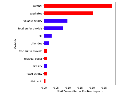
Simplified plot: I made the following simplified version for easier interpretation. It highlights the correlations in colors. The red color means a feature is positively correlated with the target variable. The python code is available in the end of the article for readers who are interested.
(B) SHAP Dependence Plot — Global Interpretability
You may ask how to show a partial dependence plot. The partial dependence plot shows the marginal effect one or two features have on the predicted outcome of a machine learning model (J. H. Friedman 2001). It tells whether the relationship between the target and a feature is linear, monotonic or more complex. In order to create a dependence plot, you only need one line of code: shap.dependence_plot(“alcohol”, shap_values, X_train). The function automatically includes another variable that your chosen variable interacts most with. The following plot shows there is an approximately linear and positive trend between “alcohol” and the target variable, and “alcohol” interacts with “sulphates” frequently.
Suppose you want to know “volatile acidity” and the variable that it interacts the most, you can do shap.dependence_plot(“volatile acidity”, shap_values, X_train). The plot below shows there exists an approximately linear but negative relationship between “volatile acidity” and the target variable. This negative relationship is already demonstrated in the variable importance plot Exhibit (K).
(C) Individual SHAP Value Plot — Local Interpretability
In order to show you how the SHAP values can be done on individual cases, I will execute on several observations. I randomly chose a few observations in as shown in Table B below:
# Get the predictions and put them with the test data.X_output = X_test.copy()X_output.loc[:,'predict'] = np.round(model.predict(X_output),2)# Randomly pick some observationsrandom_picks = np.arange(1,330,50) # Every 50 rowsS = X_output.iloc[random_picks]S

If you use Jupyter notebook, you will need to initialize it with initjs(). To save space, I write a small function shap_plot(j) to execute the SHAP values for the observations in Table B.
# Initialize your Jupyter notebook with initjs(), otherwise you will get an error message.shap.initjs()# Write in a functiondef shap_plot(j):explainerModel = shap.TreeExplainer(model)shap_values_Model = explainerModel.shap_values(S)p = shap.force_plot(explainerModel.expected_value, shap_values_Model[j], S.iloc[[j]])return(p)
Let me walk you through the above code step by step. The above shap.force_plot() takes three values: the base value (explainerModel.expected_value[0]), the SHAP values (shap_values_Model[j][0]) and the matrix of feature values (S.iloc[[j]]). The base value or the expected value is the average of the model output over the training data X_train. It is the base value used in the following plot.
When I execute shap_plot(0) I get the result for the first row of Table B: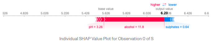
Let me describe this elegant plot in great detail:
- The output value is the prediction for that observation (the prediction of the first row in Table B is 6.20).
- The base value: The original paper explains that the base value E(y_hat) is “the value that would be predicted if we did not know any features for the current output.” In other words, it is the mean prediction, or mean(yhat). You may wonder why it is 5.62. This is because the mean prediction of Y_test is 5.62. You can test it out by
Y_test.mean()which produces 5.62. - Red/blue: Features that push the prediction higher (to the right) are shown in red, and those pushing the prediction lower are in blue.
- Alcohol: has a positive impact on the quality rating. The alcohol content of this wine is 11.8 (as shown in the first row of Table B) which is higher than the average value 10.41. So it pushes the prediction to the right.
- pH: has a negative impact on the quality rating. A lower than the average pH (=3.26 < 3.30) drives the prediction to the right.
- Sulphates: is positively related to the quality rating. A lower than the average Sulphates (= 0.64 < 0.65) pushes the prediction to the left.
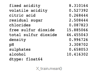
- You may wonder how we know the average values of the predictors. Remember the SHAP model is built on the training data set. The means of the variables are:
X_train.mean()
What is the result for the 2nd observation in Table B look like? Let’s doshap_plot(1):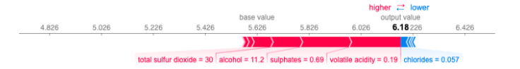
How about the 3rd observation in Table B? Let’s do shap_plot(2):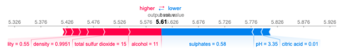
Just to do one more before you become bored. The 4th observation in Table B is this: shap_plot(3)
Things that the SHAP Values Do Not Do
Since I published this article, its sister article “Explain Any Models with the SHAP Values — Use the KernelExplainer”, and the recent development, “The SHAP with More Elegant Charts”, readers have shared with me questions from their meetings with their clients. The questions are not about the calculation of the SHAP values, but the audience thought what SHAP values can do. One main comment is “Can you identify the drivers for us to set strategies?”
The above comment is plausible, showing the data scientists already delivered effective content. However, this question concerns correlation and causality. The SHAP values do not identify causality, which is better identified by experimental design or similar approaches. For readers who are interested, please read my two other articles “Design of Experiments for Your Change Management” or “Machine Learning or Econometrics?”
Ending Note: Shapley Value in the Mathematical Form
Twenty-something years ago when I was a graduate student learning cooperative games and the Shapley value, I wasn’t quite sure any real-world applications but I was drawn to the elegance of the Shapley value concept. Twenty years later I see the Shapley value concept is applied successfully to machine learning. In the above story, I describe it in a layman’s term, here I am going to explain it in the mathematical form.
Lloyd Shapley came up with this solution concept for a cooperative game in 1953. Shapley wants to calculate the contribution of each player in a coalition game. Assume there are N players and S is a subset of the N players. Let v(S) be the total value of the S players. When player i join the S players, Player i’s marginal contribution is  . If we take the average of the contribution over the possible different permutations in which the coalition can be formed, we get the right contribution of player i:
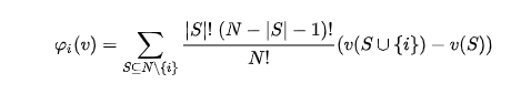
Shapley establishes the following four Axioms in order to achieve a fair contribution:
- Axiom 1: Efficiency. The sum of the Shapley values of all agents equals the value of the total coalition.
- Axiom 2: Symmetry. All players have a fair chance to join the game. That’s why Table A above lists all the permutations of the players.
- Axiom 3: Dummy. If player i contributes nothing to any coalition S, then the contribution of Player i _is zero, i.e. , φᵢ(v)=0. _Obviously we need to set the boundary value.
- Axiom 4: Additivity. For any pair of games v, w:
 , _where
  for all _S. This property enables us to do the simple arithmetic summation.
I apply the Shapley value calculation to Table (A) to get the marginal contribution:
In real life it is hard to ask the three hammers to take turns repeatedly to record the Shapley values for Table A. However, it is quite natural in a machine learning setting. Let’s take either the random forest or gradient boosting algorithm to illustrate this concept. Variables enter the machine learning model sequentially or repeatedly in the trees of the model. In every step of tree growing, the algorithms evaluate each of all the variables equally to settle with the variable that contributes the most. Thousands of trees are constructed. It is imaginable that various permutations of the variables will be available. Therefore the marginal contribution of each variable can be calculated.
How to Generate the Simplified Version?
For readers who are interested in the code, I make it available below:
def ABS_SHAP(df_shap,df):#import matplotlib as plt# Make a copy of the input datashap_v = pd.DataFrame(df_shap)feature_list = df.columnsshap_v.columns = feature_listdf_v = df.copy().reset_index().drop('index',axis=1)# Determine the correlation in order to plot with different colorscorr_list = list()for i in feature_list:b = np.corrcoef(shap_v[i],df_v[i])[1][0]corr_list.append(b)corr_df = pd.concat([pd.Series(feature_list),pd.Series(corr_list)],axis=1).fillna(0)# Make a data frame. Column 1 is the feature, and Column 2 is the correlation coefficientcorr_df.columns = ['Variable','Corr']corr_df['Sign'] = np.where(corr_df['Corr']>0,'red','blue')# Plot itshap_abs = np.abs(shap_v)k=pd.DataFrame(shap_abs.mean()).reset_index()k.columns = ['Variable','SHAP_abs']k2 = k.merge(corr_df,left_on = 'Variable',right_on='Variable',how='inner')k2 = k2.sort_values(by='SHAP_abs',ascending = True)colorlist = k2['Sign']ax = k2.plot.barh(x='Variable',y='SHAP_abs',color = colorlist, figsize=(5,6),legend=False)ax.set_xlabel("SHAP Value (Red = Positive Impact)")ABS_SHAP(shap_values,X_train)
Two Emerging Trends: Explainable AI, Differential Privacy
It is worth mentioning that there are two emerging trends in AI: “Explainable AI” and “Differential Privacy”. On Explainable AI, Dataman has published a series of articles including “An Explanation for eXplainable AI”, “Explain Your Model with the SHAP Values”, “Explain Your Model with LIME”, and “Explain Your Model with Microsoft’s InterpretML. Differential Privacy is an important research branch in AI. It has brought a fundamental change to AI, and continues to morph the AI development. On Differentiated Privacy, Dataman published “You Can Be Identified by Your Netflix Watching History” and “What Is Differential Privacy?”.

若有收获,就点个赞吧
0 人点赞
