前言
数据被污染的原因
画图后发现周日也有申请数据,查出来是4月25日,那天五一调休。因此节假日调休是主要的干扰。
分析
一周中最多的申请发生在周二(21次),最少的是周五(7次),周二、周三、周四基本差不多(14-16次)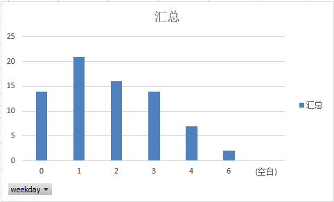
月份分布,排除11月的异常,12月是年底,申请差不多是其他月份的两倍
时刻分布,用了比较取巧的办法,把所有的日期设置为同一天后再画图
基本看不出来什么特征,唯一可以确定的是上班的时候会是申请的集中时间。
import pandas as pdimport matplotlibimport matplotlib.pyplot as pltfrom matplotlib.dates import AutoDateLocator, DateFormatterapply = pd.read_excel(r'E:\py_tests\otherthing\分析.xlsx',usecols="F,K",parse_dates=['date'])plt.figure(figsize=(20,5))ax = plt.gca()ax.xaxis.set_major_formatter(DateFormatter('%H:%M')) #设置时间显示格式ax.xaxis.set_major_locator(AutoDateLocator(maxticks=24)) #设置时间间隔plt.plot_date(apply.date, apply.op, fmt='b.')# plt.xticks(rotation=90, ha='center')plt.grid()plt.show()
前面的图不好看,改了一下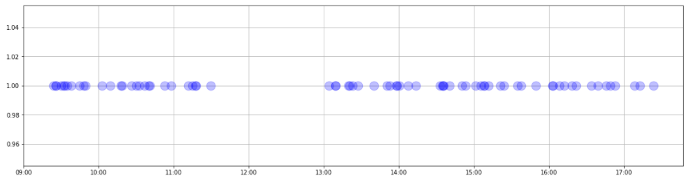
import pandas as pdimport matplotlibimport matplotlib.pyplot as pltfrom matplotlib.dates import AutoDateLocator, DateFormatterapply = pd.read_excel(r'E:\py_tests\otherthing\分析.xlsx',usecols="F,K",parse_dates=['date'])plt.figure(figsize=(20,5))#改图片大小ax = plt.gca()ax.xaxis.set_major_formatter(DateFormatter('%H:%M')) #设置时间显示格式ax.xaxis.set_major_locator(AutoDateLocator(maxticks=24)) #设置时间间隔plt.plot_date(apply.date, apply.op, fmt='b.', alpha = 0.25, markersize=30)# plt.xticks(rotation=90, ha='center')plt.grid()plt.show()

若有收获,就点个赞吧
0 人点赞
