1.background-clip
设置元素的背景(背景图片或颜色)是否延伸到边框、内边距盒子、内容盒子下边。共有四个值可用。
- border-box:默认值,延伸到边框下方
- padding-box:延伸至内边距外沿,不会绘制到边框处
- content-box:背景被裁剪至内容区外延
- text:背景被裁剪为文字的前景色
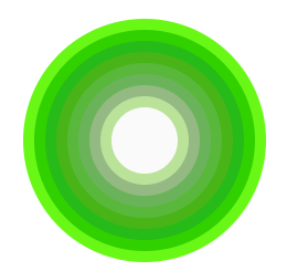
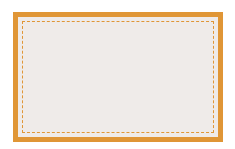
2.多重边框
- 实现边框:通过box-shaodw属性的第四个参数,阴影扩张半径来模拟边框效果,当我们只设置扩张半径时,产生的效果相当于一条实线边框。
- 虚线边框:通过属性outline和对应描边偏移outline-offset来实现。
div:nth-of-type(1) {width: 60px;height: 60px;border-radius: 50%;background: #fafafa;margin: 105px 29px;box-shadow: 0 0 0 10px #bae299, 0 0 0 20px #94b983, 0 0 0 30px #6bb35a,0 0 0 40px #59b83c, 0 0 0 50px #49b417, 0 0 0 60px #26bb18,0 0 0 70px #31d100, 0 0 0 80px #69f816;}div:nth-of-type(2) {width: 200px;height: 120px;background: #efebe9;border: 5px solid #b4a078;outline: #b4a078 dashed 1px;outline-offset: -10px;margin-bottom: 20px;}
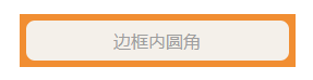
3.边框内圆角
box-shadow会紧贴border-radius圆角边,描边不会与圆角边border-radius贴合,将两者组合,通过box-shadow填补描边outline产生的间隙达到效果。
div {width: 209px;margin: 29px auto;padding: 8px 16px;border-radius: 8px;background: #f4f0ea;outline: 6px solid #b4a078;box-shadow: 0 0 0 5px #b4a078;}
4.background

若有收获,就点个赞吧
0 人点赞
