border
border-radius
- 复合属性
- border-radius:左上角、 右上角、右下角、左下角
- border-top-left-radius: 左上角
- border-top-right-radius: 右上角
- border-bottom-left-radius: 左下角
- border-bottom-right-radius: 右下角
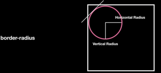
注意:每个角都有两个数值 例如border-top-left-radius: 10px 10px;
-
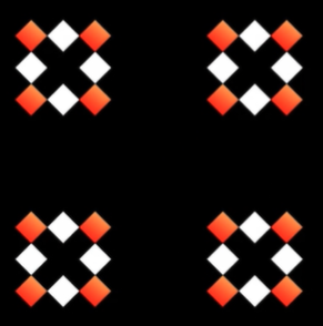
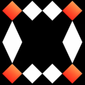
border-radius切割方向
border-top-left-radius:10px 200px;
每个角都只能放大到节点的宽高,例如一个盒子宽高都是100px,那么角的两个数值都只能是100px,也可以再往高了写,但是没有用
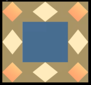
border-radius特殊写法
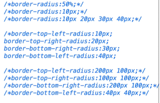
border-radius: 10px 20px 30px 40px / 10px 20px 30px 40px
- / 前面的代表四个角 / 后面的对应前面的四个角再划分两个
- 相当于border-top-left-radius:10px 10px;
- border-top-right-radius:20px 20px;
- border-bottom-right-radius:30px 30px;
border-bottom-left-radius: 40px 40px;
border-image
-
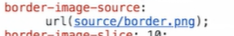
border-image-source
图片地址
- border-image-source: url(../images/image.png)
支持渐变色
截取
- 配合border-image-source使用
- 参数只支持数字或百分比,不支持像素
- 存在4个切割线border-image-slice: 10 20 30 40;
- 上右下左线
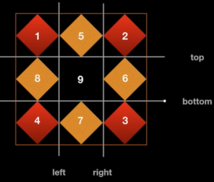
- 默认值为100%
-
border-image-outset
-
border-image-width
设置border里面能显示的图片背景的宽度,和boerder-width没有关系
- 一般不会改变border-image-width的宽度,使用默认值 1 就是border-image-width:1
border-image-width:auto 使用auto会默认向border-image-slice看齐
参数
- stretch 默认值 拉伸
- round 与repeat关键字类似,满足平铺块的时候平铺,不满足时拉伸
- repeat 重复平铺
- space 与repeat关键字类似,满足平铺块的时候平铺,不满足时填充空白
- 支持填写两个参数,只能填写两个,第一个参数标识水平方向,第二个参数表示垂直方向
border-image-repeat: round repeat;
border-image: source slice repeat;
border-image: url(https:www.baidu.com) 100 repeat
box-shadow
给盒子增加阴影(内阴影)(外阴影)
- 默认外阴影,如果想增加内阴影需要给第一个值设置为 inset
- box-shadow: inset

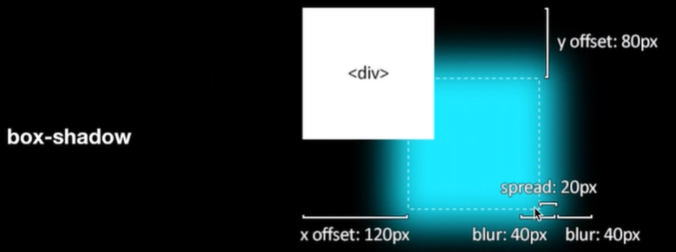
外阴影
- 参数解析
参数1
- 水平偏移量
参数2
- 垂直偏移量
参数3
- 阴影模糊 模糊范围
- 基于边框的原来位置向两侧同时展开模糊
参数4 可选
- 扩大 默认为0
参数5
参数1
- inset 设置内阴影
参数2
- 水平偏移量
参数3
- 垂直偏移量
参数4
- 阴影模糊 模糊范围
- 基于边框的原来位置向两侧同时展开模糊
参数5 可选
- 扩大 默认为0
参数6
-
书写
box-shadow:inset 0px 0px 0px 0px #fff
设置多个阴影
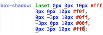
box-shadow: inset 0px 0px 10px 0px #fff, 3px 0px 10px 0px #f0f, 0px -3px 10px #0ff;
- 解释:设置盒子内阴影,盒子外阴影,盒子外阴影
-
实例
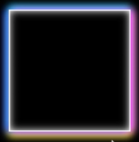
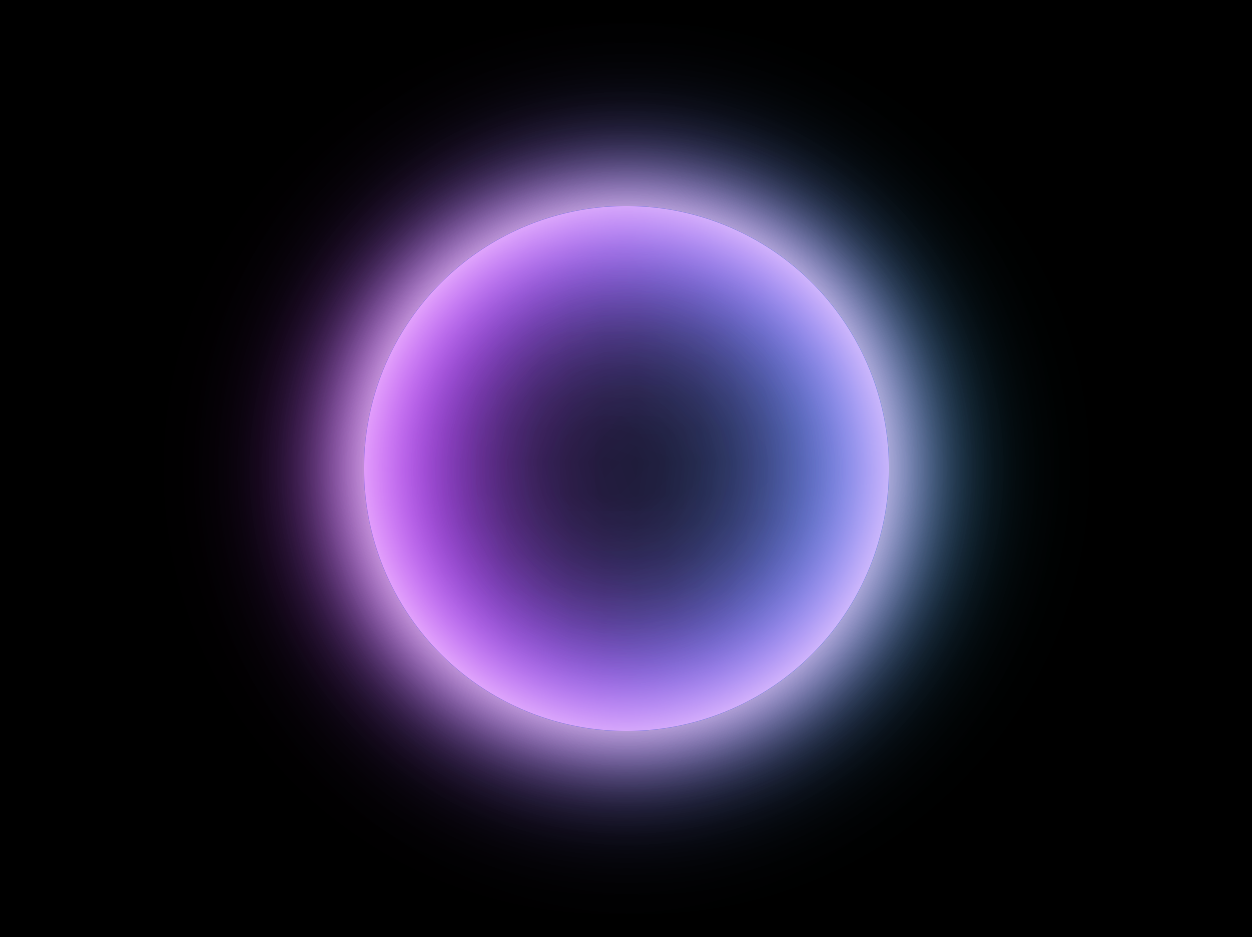
<style>* {margin: 0;padding: 0;}body {background-color: #000;}div {position: absolute;width: 300px;height: 300px;left: calc(50% - 150px);top: calc(50% - 150px);border-radius: 50%;box-shadow: inset 0px 0px 50px #fff, inset 10px 0px 80px #f0f,inset -10px 0px 80px #0ff, inset 10px 0px 300px #f0f,inset -10px 0px 300px #0ff, 0px 0px 50px #fff, -10px 0px 80px #f0f,10px 0px 80px #0ff;}</style>
-
calc计算函数
节点增加定位后top和left设置50%left:50%是元素最左边(左上角)和中线重合的地方,这个时候是不居中的,需要减去该元素的宽度一半,即margin-left等于负的宽度的一半
- 这个时候直接使用计算函数来实现就不用使用margin了
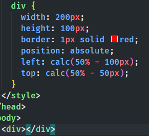
注意:calc计算函数中操作符两侧一定要有空格,要不然不会生效

若有收获,就点个赞吧
0 人点赞
