感知模式
在本章中,我们将讨论感知模式如何工作以及它们在设计系统中的作用。
In this chapter we’ll discuss how perceptual patterns work and their __role in a design system.
_
想象一下,我们俩都有一间房子,拥有一套相同的家具:一张桌子,几把椅子,一张床和一个衣柜。即使家具是相同的,我们的房子也会感觉截然不同:可能是因为家具,材料,颜色,纹理,床罩上的织物,装饰品的样式,我们如何布置房间,照明甚至是我们在里面播放的音乐。我将这种属性称为感知模式。因为它们,您的房子可能感觉像是波希米亚风情,而我的感觉就像是仓库。
Imagine we bothhave a house, with the same set of furniture: a table, a few chairs, a bed, and a wardrobe.Even though the furniture is the same, our houses can feel distinctly different: it could be because of the style of the furniture, the materials, colors, textures, the fabric on the bed covers, the style of the ornaments, how we lay out the room, the lighting, or even the music we play inside.I refer to such attributes as perceptual patterns. Because of them, your house might feel like a bohemianlair, and mine like a warehouse.
数字产品中的感知模式示例包括语音语调,版式,调色板,布局,插图和图标样式,形状和纹理,间距,图像,交互或动画,以及将这些元素组合在一起的所有特定方式,以及在接口中使用。
Examples of perceptual patterns in digital products include tone of voice, typography, color palette, layouts, illustra- tions and iconography styles, shapes and textures, spacing, imagery, interactions or animations, and all the specific ways in which those elements are combined and used in an interface.
感知模式始终存在,即使它们不是故意设计的。即使是纯功能性的工具也具有美感。
Perceptual patterns are always present, even if they’renot purposefully designed. Even a purely functional tool has an aesthetic.
有时,这些品质被视为产品的样式或外观–在其上一层。但是要使它们有效,它们不仅必须存在于品牌表面,而且必须存在于品牌的核心,并且它们应该与产品一起发展。有效时,感知模式将成为强大的产品差异化因素。
Sometimes such qualities are seen as styling or the skin of a product – a layer on top. But to be effective they must live not only on the surface but at the core of the brand, and they should evolve with the product. When effective, perceptual patterns become powerful product differentiators.
6 这种思维方式可以使参观地方完全不同。无论是咖啡馆,新城市还是野餐点,我都想考虑一个地方的感觉,然后尝试确定一些组合在一起以营造那种氛围的方式。
6 This way of thinking can make visiting places a whole different ex- perience. Be it a coffee shop, a new city, or a picnic spot, I like to think about how a place feels and then try to determine some of the patterns that combine to create that atmosphere.
感知模式有助于表达品牌形象
即使产品属于同一域并且具有相似的模块,它们也会感觉有所不同。为了写这本书,我尝试了许多功能非常相似的文字处理器。只有其中的几个,包括我现在正在使用的那种,都有一种写作环境可以帮助我集中精力并提高工作效率。
Products can feel different, even if they belong to the same domain and have similar modules. To write this book I tried dozens of word processors with very similar functionality. Only a couple of them, including the one I’m using now, had the kind of writing environment that helped me focus and be most productive.7
我可以形容它清脆而平静,表现出无干扰的美感,并强调重要内容,例如文档大纲的显示,或者当我接近“写作目标”时变成绿色的小圆圈。这种环境是由某些模式组合而成的,尽管乍一看很难确定它们是什么。
I can describe it as crisp and calm, exhibiting a distraction-free aesthetic with an accent on important things, such as the display of the document outline, or the small circles which turn green as I approach my “writing goal.” This environment is created through a combination of certain patterns, although at a first glance it’s not easy to pinpoint what they are.
7 如果您想知道的话,请访问http://smashed.by/ulysses。
7 It’s http://smashed.by/ulysses, in case you wanted to know.
再举一个例子:Spotify。对我来说,感觉温暖而私密。在这个每月超过1亿用户的数字音乐服务界面中,营造亲密氛围的模式究竟是什么?除了功能以外,很大程度上还取决于图像的样式,颜色组合(尤其是绿色与黑色的比例),互动的微妙而平静的感觉以及版式选择。
Let’s take another example: Spotify. To me it feels warm and personal. What exactly are the patterns that create the ambi-ence of intimacy in this digital music service interface with over 100 million monthly users? As well as the functionality, it’s largely due to the imagery styles, color combinations (particularly the ratio of green to black), the subtle and calm feel of interactions, and the typography choices.
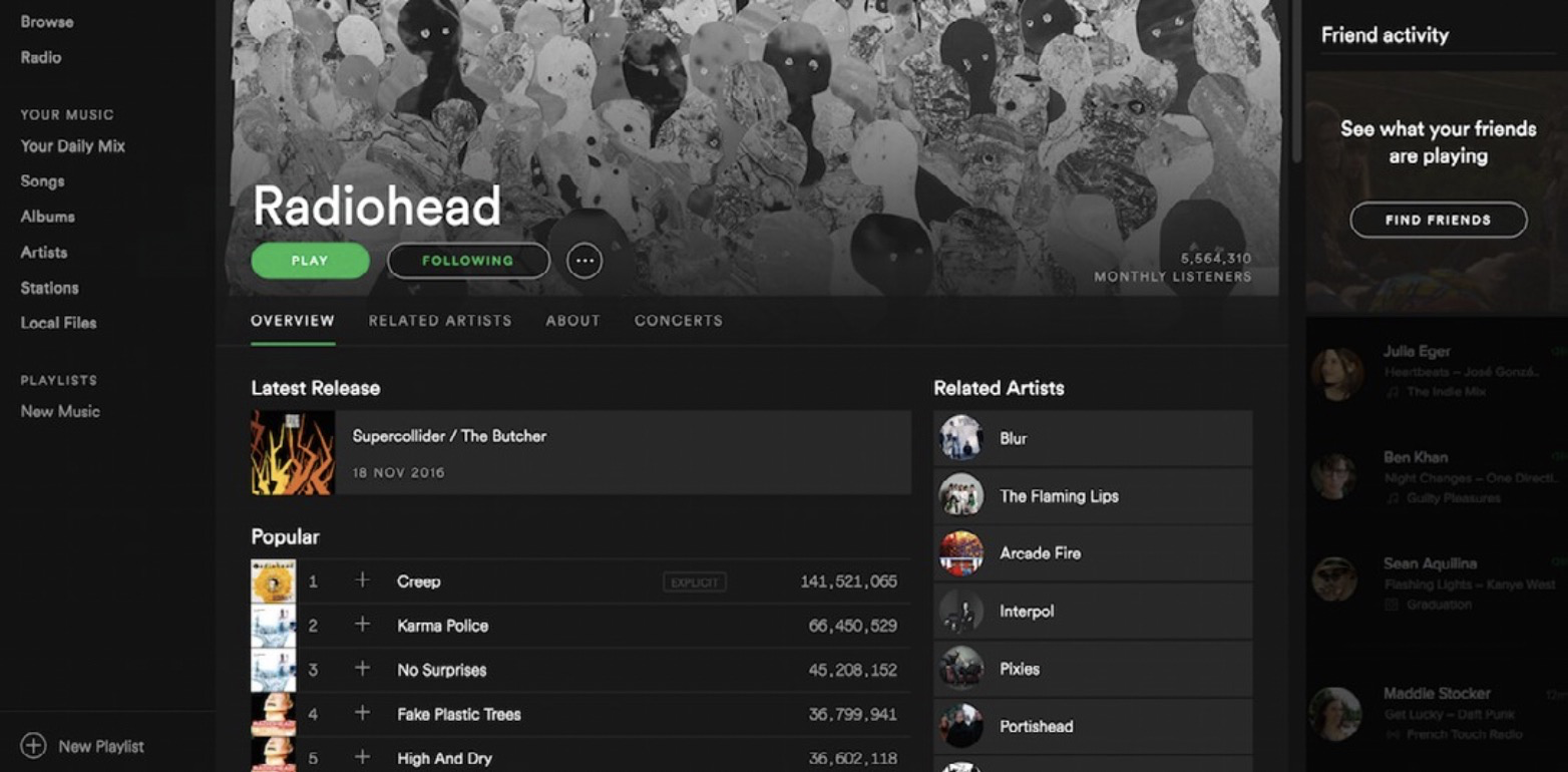
Spotify的亲密氛围是多种感知模式相结合的结果,例如微妙的交互作用,柔和的图像和色彩强调
_
另一方面,Smashing Magazine的俏皮,创意,开放,热情和略微另类的特征通过不同的样式集传达–从大胆的调色板和插图,到最小的细节,例如在某些地方略微倾斜接口元素。
On the other hand, the playful, creative, openly enthusias- tic and slightly offbeat character of Smashing Magazine is conveyedthrough a different set of patterns – from the bold color palette and illustrations, down to the smallest details, such as a slight angle on some of the interface elements.
8 Spotify的愿景“每时每刻都适合的音乐”及其设计原则“情感”与通过感知模式创造的感觉一致。
8 Spotify’s vision, “The right music for every moment,” and their design principle “emotive” are inline with the feel created through perceptual patterns.
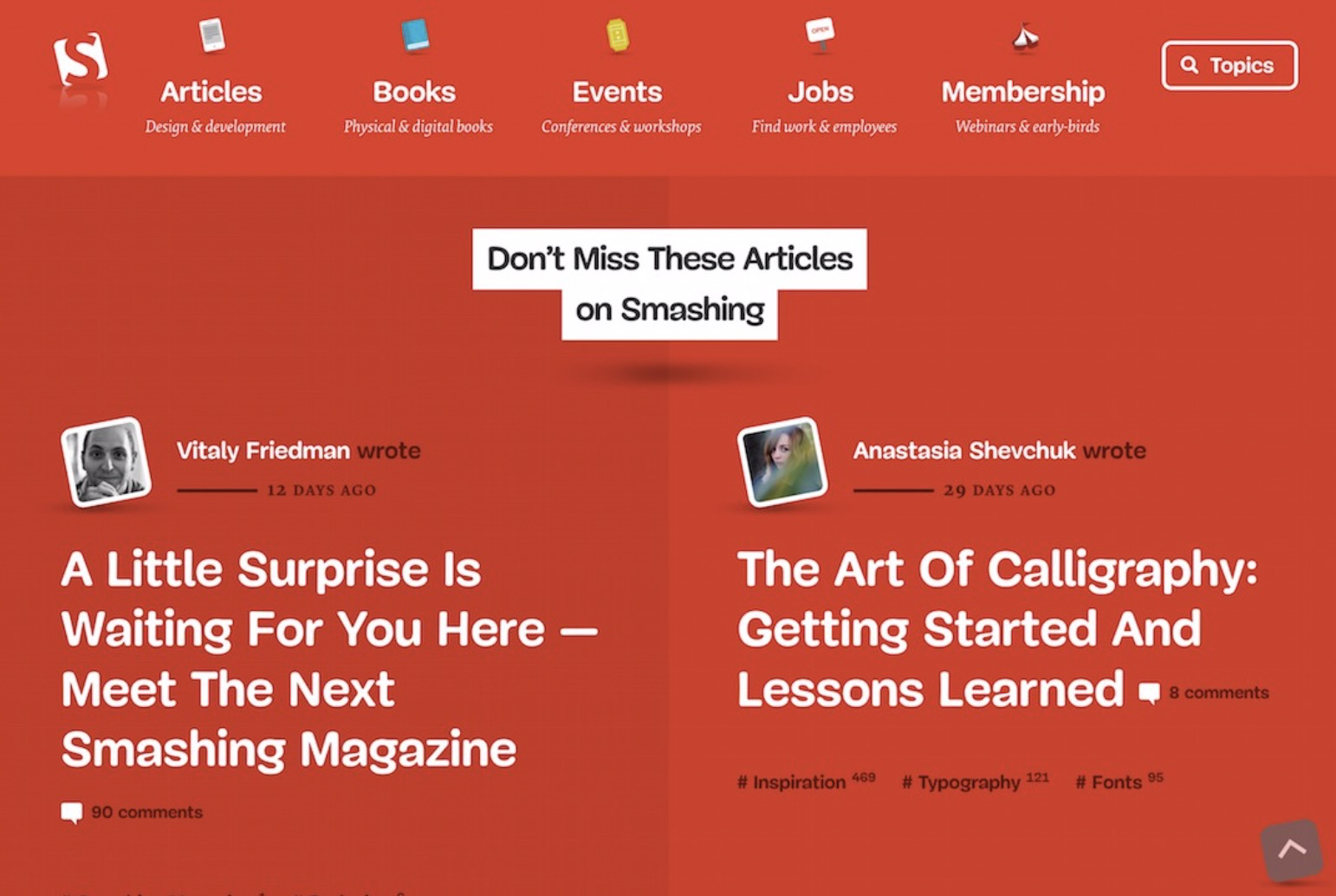
新的《粉碎杂志》的特征通过多种感知模式传达,从印刷处理到图像和图标的嬉戏角度
_
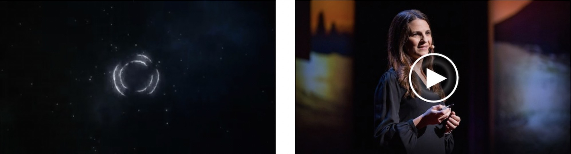
感知模式通过界面表达品牌,并使其令人难忘。看一下下一页上的图像:您可以识别它们代表哪些产品吗?
Perceptual patterns express the brand through the interfaceand help to make it memorable. Take a look at the images on the next page: can you recognize which products they represent?
您能认出这两个图像代表哪些产品吗?
_
这些图像中没有很多信息:字体样式,一些形状和颜色以及一些图标。但是这些视觉提示是如此独特,以至于您可能仍然能够识别出它们属于哪些产品(Slack和TED)。通过有目的地重复应用,它们形成了模式,这就是为什么我们可以召回并关联它们的原因,甚至当它们出现在上下文之外时。
There isn’t a lot of information in these images: typography styles, some shapes and colors, and a few icons. But those visual cues are so distinct that you might still have been able to recognize which products they belong to (Slack and TED).Bybeing applied purposefully and repeatedly, they form pat- terns, which is why we can recall and associate them, even when they appear out of context.
感知不仅受构建模块(例如调色板和字体)的影响,还受它们之间的关系的影响。在模块中始终使用标题和颜色是不够的。我们还应该意识到使产品具有一定感觉的独特比例和组合。颜色如何相互关联?图像与版式有什么关系?版式与间距有什么关系?
Perception is influenced not only by the building blocks such as color palette and typeface, but the relationships between them.It’s not enough to use headings and colors across the modules consistently. We should also be aware of the unique proportions and combinations that make the product feel a certainway. How do the colors relate to one another? How does the imagery relate to the typography?How does the typography relate to the spacing?
TED的UX设计师Michael McWatters在一次采访中分享了以正确的比例显示红色对于TED品牌的重要性:“应谨慎而谨慎地使用红色。在错误的地方或过多使用它,再也感觉不到TED。”
Michael McWatters, UX architect at TED, shared in an interview how important it is for TED’s brand that the color red appears in the right proportions: “Red should be used spar- ingly and thoughtfully. Use it in the wrong places, or too much, and it doesn’t feel like TED anymore.”
感知模式连接系统
在模块化系统中,实现视觉连贯性和无缝接缝可能很棘手。模块是由不同的人针对不同的目标创建的。由于感知模式贯穿系统中的不同部分,因此它们将各部分连接起来。当连接有效时,用户会感觉到将模块链接在一起的统一性。
In modular systems, achieving visual coherence and seam-lessness can be tricky. Modules are created by different people for different goals. Since perceptual patterns perme- ate through different parts in the system, they connect the parts. When the connections are effective, users perceive the unity that links the modules together.
看看Vox和《卫报》如何运用感知模式将不同元素整合在一起,将它们整合在一起。在Vox上,醒目的图像覆盖着大标题,清晰的字体对和宽敞的空白,在Vox的旗帜下共同传达了生活方式杂志的感觉-它宽敞,非正式,甚至有些叛逆。相比之下,《卫报》的版式,间距,图像和色彩营造出一种更密集,更可信的感觉,更适合于严肃的新闻和意见来源。
Look how Vox and the Guardian apply perceptual patterns to bring together different elements, integrating them in a cohesive whole. At Vox, eye-catching imagery overlaid with large headings, crisp typeface pairings and generous white space all come together to convey the feeling of a lifestyle magazine under the Vox banner – it’s spacious, informal and perhaps even a little rebellious. In contrast, typography, spacing, imagery and color in the Guardian create a denser, more credible feel, more fitting for a source of serious jour- nalism and opinion.
9 TED UX用户体验设计师Michael McWatters访谈,2016年8月
10 这些截图是在2017年3月拍摄的。几周后,Vox将其设计更改为更密集的报纸般的感觉,以更加“可信和聪明”的形式出现。见http://smashed.by/behindvox
9 Interview with Michael McWatters, UX architect, TED, Aug. 2016 10 Thesescreenshots were takenin March 2017. A couple of weeks lat- er Vox changed their design to a denser newspaper-like feel, to come across as more “credible and smart.” See http://smashed.by/behindvox

不仅可以在模块之间建立连接,而且可以跨不同的平台和上下文建立连接。特定于平台的标准(例如材料设计)对如何设计和构建模式具有权威性的看法。当公司严格遵循本机平台约定时,它们非常依赖于感知模式,以使产品感觉像是同一产品的一部分。
Connections can be made not only between the modules but across different platforms and contexts. Platform-specific standards such as material design take quite an authori- tative view on how patterns should be designed and built.When companies follow native platform conventions strictly, they are very much reliant on perceptual patterns to make the product feel like part of the same brand.
有时候,这是可以帮助建立联系的最小事物。尽管Twitter的Web,本地平台和第三方平台的应用程序之间存在差异,但细微的细节(例如心脏的“赞”互动)有助于传播Twitter的模式语言。
Sometimes it’sthe smallest things that can help make a connection. Even though there are differences between Twitter’s apps for web, native and third-party platforms, small details such as the “Like” interaction of the heart, helpto propagate Twitter’s pattern language.

摘自Twitter的心脏动画,于2015年在适用于iOS的Twitter,Web,Android,TweetDeck,适用于Windows 10的Twitter和其他平台上推出。
_
探索感知模式
如果功能模块反映了用户的需求,那么感知模式将集中于用户的感觉或直觉上。它们不受产品行为和行为的影响,而是受产品努力投射的个性或氛围的影响。
If functional modules reflect what users want and need, then perceptual patterns focus on what they feel or do intuitively. Rather than coming from user behaviors and actions, they are influenced by the personality or ambience a product strives to project.
Aarron Walter在“为情感而设计”一文中建议团队如何通过创建“设计角色”以简单的方式来捕捉关键的个性特质,体现他们希望在您的品牌中体现的特质。沃尔特(Walter)建议以人物角色为基础,以使人的真实形象不那么抽象。如果很难做到,我有时会想到一个地方及其周围环境而不是某人的个性特征会有所帮助。例如,相对于轻松的社交聊天,适合集中写作的氛围是什么?
In Designing for Emotion, Aarron Walter suggests how, in a simple way, teams can capture key personality qualities by creating a “design persona,” which embodies the traits they wish to include in your brand. Walter recommends basing a persona on an actual image of a person, to make it feel less abstract. If that’sdifficult, I sometimes find it helpful to think of a place and its ambience instead, rather than someone’spersonality traits. For example, what is the ambience that suits focused writing as opposed to relaxed social chatter?
无论您是以人还是以地点为起点,最终目标都是以一些最能描述您的品牌的特征(Walter建议大约5至7个)以及避免使用的特征为特征。对于MailChimp,这些特征包括“有趣,但不幼稚。好笑,但不傻。功能强大,但并不复杂。髋关节,但不疏远。非正式,但不马虎。”
Whether you use a person or a place as a starting point, the goal is to end up with a few (Walter recommends around five to seven) traits that best describe your brand, along with the traits to avoid. For MailChimp, those traits include “Fun, but not childish. Funny, but not goofy. Powerful, but not complicated. Hip, but not alienating. Informal, but not sloppy.”11
然后,团队可以通过界面确定使这些特征栩栩如生的方法:视觉上的语气以及其他方式(例如交互和声音)。对于MailChimp,一些视觉感知模式(或Walter所称的“视觉词典”)包括明亮但略微降低饱和度的调色板,简单的sans serif印刷术以及平坦的界面元素,并具有柔软,微妙的纹理,以预热空间。
Teams can then identify ways to bring those traits to life through the interface: the tone of voice, visually, and in other ways, such as interactions and sounds. For MailChimp, some of the visual perceptual patterns (or a“visual lexicon,” as Walter refers to it) included a bright yet slightly desaturated color palette, simple sans serif typogra- phy, and flat interface elements with soft, subtle textures in places, to warm up the space.
以下是一些可以帮助您探索知觉模式的流行设计技术。
Here are some of the popular design techniques that canhelp explore perceptual patterns.
11 Aarron Walter的《为情感而设计》(另请参阅“设计中的个性”)http://smashed.by/personality
11 _Designing for Emotion _by Aarron Walter (see also “Personality in Design” http://smashed.by/personality
情绪板
情绪板是探索不同视觉主题的好工具。它们可以数字化创建(Pinterest12是用于创建数字化情绪板的流行工具),也可以使用杂志和其他印刷材料中的切口将其物理组装在大板上。
Mood boards are a great tool for exploring different visual themes. They can be created digitally (Pinterest is a pop- ular tool for creating digital mood boards) or assembled physically on a large board, using cutouts from magazines and other printed material.
有些人使用情绪板来研究当前趋势或收集想法,而另一些人则利用它们来确定自己的品牌感觉。情绪板可以广泛使用,也可以专注于探索品牌的特定部分,例如颜色或版式。
Some people use mood boards to research current trends or gather ideas, while others generate them to work out what their brand might feel like. Mood boards can be broad, or they can focus on exploring specific parts of the brand, like color or typography.
 探索颜色和渐变的情绪板示例
样式瓷砖
定义了总体品牌方向后,样式图块可用于更详细地探索几种变体。样式拼贴的概念由萨曼莎·沃伦(Samantha Warren)提出,他将其描述为“一种设计交付物,由字体,颜色和界面元素组成,传达了网络视觉品牌的本质。”
Once a general brand directionis defined,style tiles can be useful for exploring several variations in more detail. The concept of style tiles was introduced by Samantha Warren,13 who describes them as “a design deliverable consisting of fonts, colors and interface elements that communicate the essence of a visual brand for the web.”14
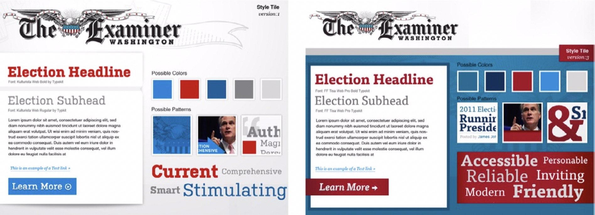 The Washington Examiner 2012 Campaign Site (Image courtesy of Samantha Warren: http://styletil.es/)
像情绪板一样,样式图块可以为用户和涉众提供有价值的讨论点,并评估他们针对特定设计方向的初步反应。比较和对比样式图块可以帮助您选择一个方向而不是另一个方向。
Like mood boards, style tiles can provide valuable discus- sion points with users and stakeholders, and gauge their initial reactions towards specific design directions. Compar-ing and contrasting style tiles against each other can help you make a choice of one direction over the other.
13 http://samanthatoy.com
14 http://styletil.es/
元素集
Dan Mall15 顺着样式图块提出了元素拼贴的想法:这是一种界面部件的组合,用于探索品牌在界面中的工作方式。作为设计交付物,它们比样式瓷砖感觉更具体,更有形。但是不要对元素拼贴抱有像完整的视觉模型那样高的期望。元素拼贴不仅探索一般的品牌方向,而且探索如何通过界面表达品牌。
Riffing on style tiles, Dan Mall15 suggested the idea of an element collage: an assembly of interface pieces that explore how branding works in the interface. As a design deliver- able, they can feel more concrete and tangible than style tiles; yet element collages don’tcome with quite as many expectations as complete visual mock-ups. Element collages explore not only a general brand direction but how brand is expressed through the interface.
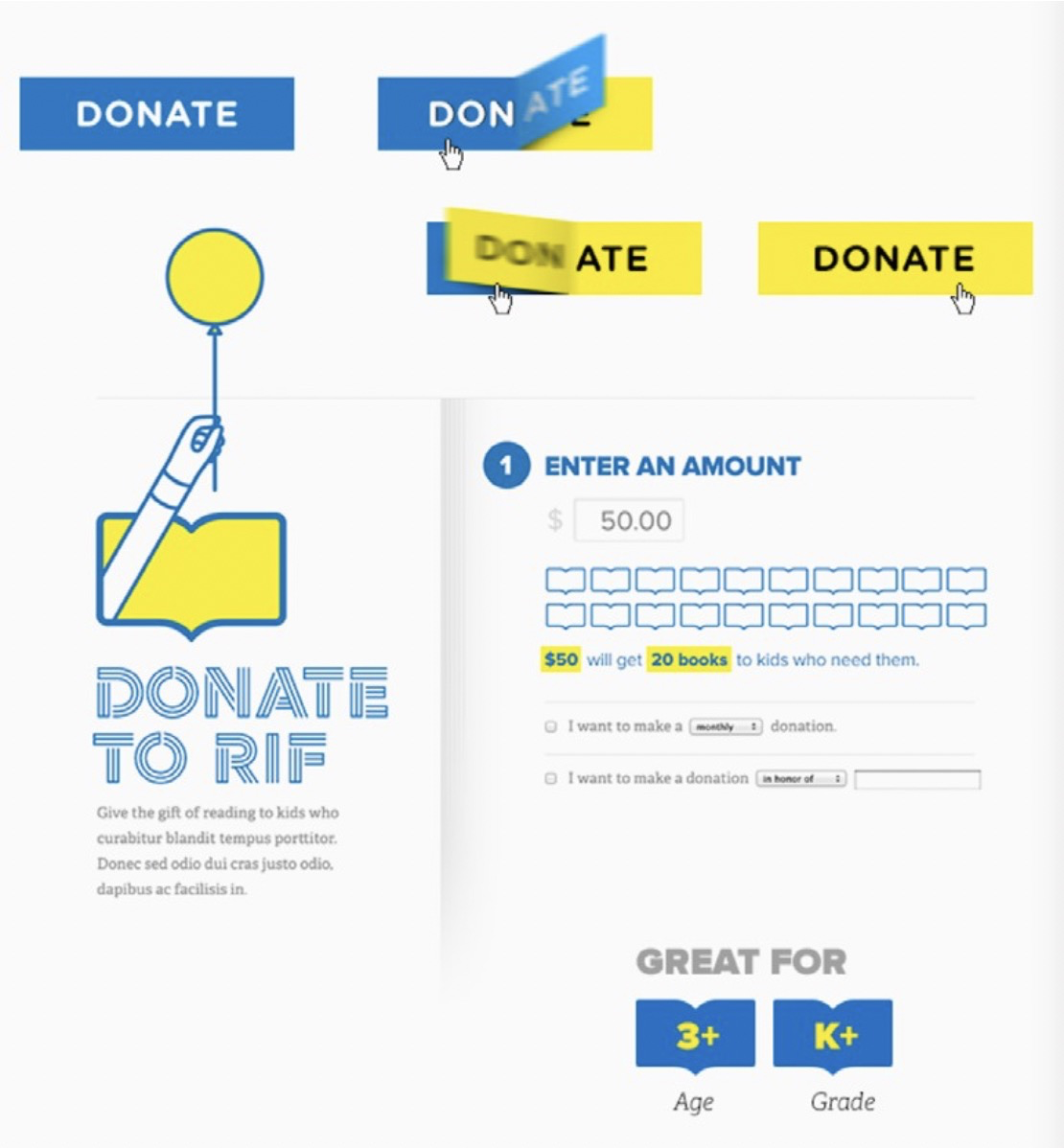
RIF的元素拼贴。 (图片由http://danielmall.com提供)
13 http://danmall.me
这些技术之间的差异并不总是很明显,人们可以互换使用。对我而言,区别在于它们的相对保真度。情绪板更宽松,更开放;他们结合了各种来源的现有材料,以创造出一定的视觉感受。样式图块和元素拼贴更侧重于特定产品以及界面中图案的实际应用。元素拼贴可以提供最高级别的保真度,并且可以用作过渡到完整合成的起点。
The differences between these techniques aren’t always obvious, and people use them interchangeably. For me, the distinction lies in their relative fidelity. Mood boards are looser and more open; they combine existing materials from various sources to create a certain visual feel. Style tiles and element collages are more focused on a specific product and the practical application of patterns in the interface. Ele- ment collages provide the highest level of fidelity and can be used as a starting point to transition into full comps.
迭代与完善
将样式集成到产品中后,便会继续进行样式演变。在具有接口和交互作用的更现实的界面中尝试品牌,通常会导致感知和功能模式的完善。这通常是一个迭代过程,在此过程中,模式会相互影响,直到设计语言开始成形。
The process of evolving the styles continues when they’re integrated into the product. Trying out the brand in a more realistic setting of the interface, with modules and inter- actions, often results in refinement of both perceptual and functional patterns. This is typically an iterative process, where the patterns influence one another, until a design language starts taking shape.
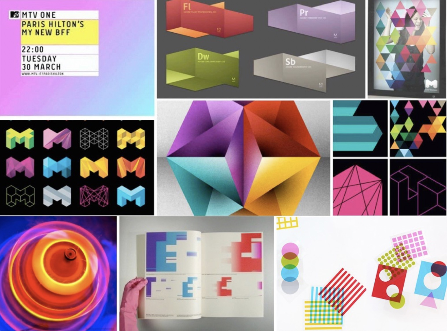
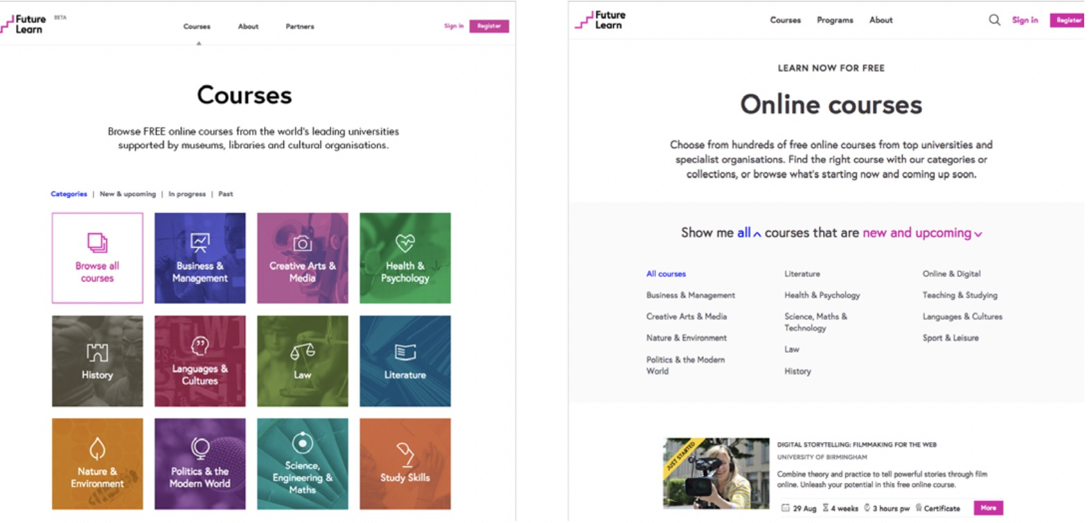
让我们看一下 FutureLearn 的样式是如何开发的。下图显示了 Wolff Olins16 对 FutureLearn 品牌的初步探索。他们捕捉了 FutureLearn 试图展现的某些个性(最小,大胆,明亮,积极,喜庆),但最初的方向和随着时间的演变却存在差异。
Let’s take a look at how FutureLearn’s styles were developed. The image below shows the initial explorations by Wolff Olins16 for the FutureLearn brand. While they capture some of the personality FutureLearn was trying to project (mini- mal, bold, bright, positive, celebratory), there’sa difference between the initial direction and how it evolved over time.
16 http://www.wolffolins.com
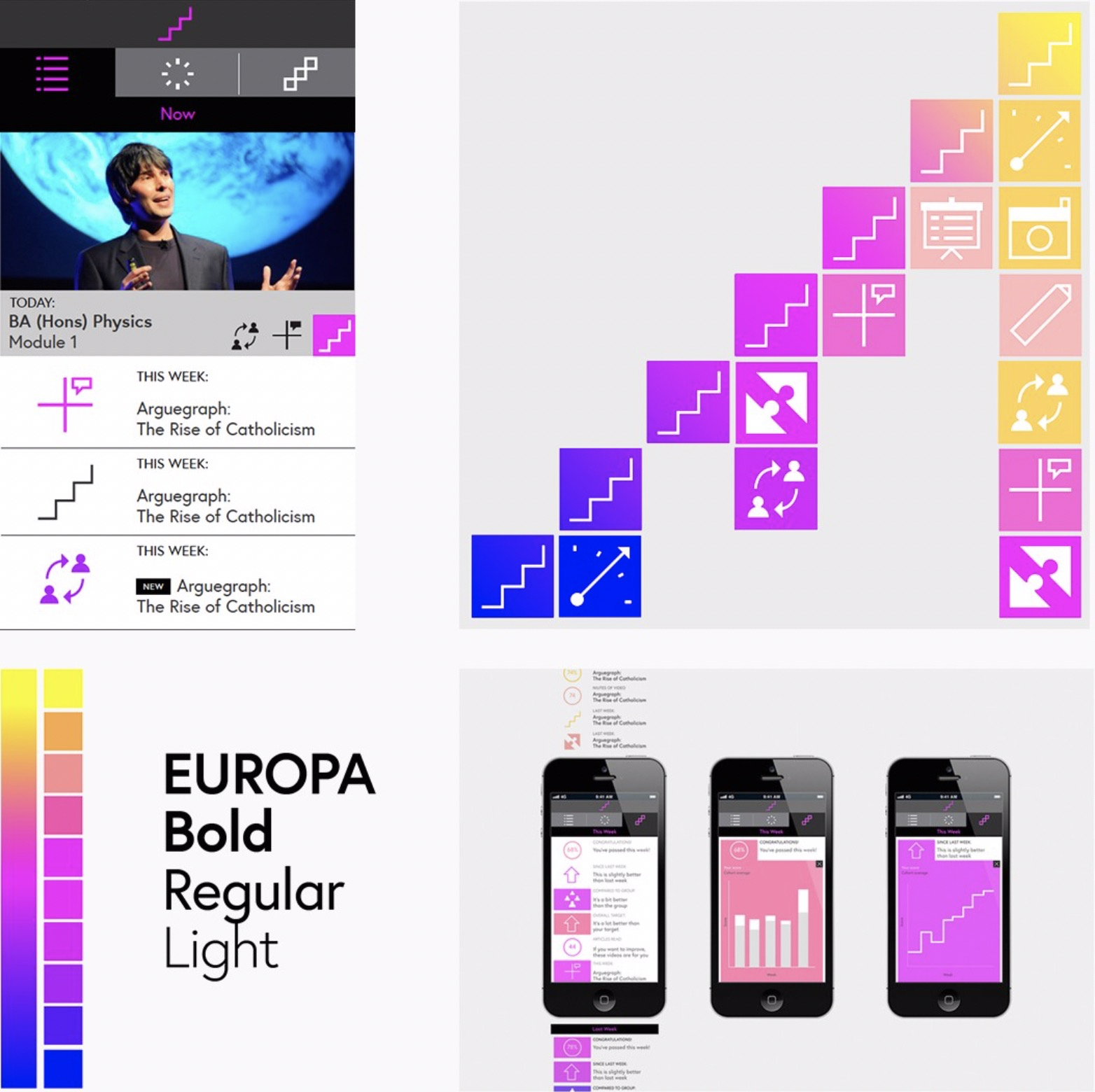
FutureLearn 的重要品牌探索
_
在将视觉效果传递给FutureLearn的内部设计团队之后,这是几个月后核心感知模式的外观:
Here is how the core perceptual patterns looked a few months later, after the visuals were passed on to the internal design team at FutureLearn:
FutureLearn 的元素拼贴
_
通过将它们应用于他们将要居住的实际环境中,这些模式必须变得更加扎实,更加具体和实用。以下是FutureLearn 的组织学从最初的概念到如今在网站上可以看到的设计的演变过程:
By applying them to the actual context they were going to live in, the patterns had to become more grounded, more specific and more practical. Here’s how FutureLearn’s ico- nography evolved from initial concepts to the designs you can see on the site today:
 <br />_Wolff Olins的最初图标设计(左),以及 FutureLearn 设计团队的演变方式。图标中的空白表示学习过程永远不会完成_
在品牌发展的概念阶段,重要的是要扩大规模并扩大规模,而不要担心每个细节。但是,当我们开始应用这些概念时,必须对其进行完善,以使其适合于所占据的新环境。重点从开放式研究转向精细化和一致性。
In the conceptual phase of brand development, it was important to go broad and big, and not worry about every detail. But when we started applying the concepts, they had to be refined, so they felt appropriate for the new environ- ment they occupied. The focus shifted from an open explo- ration to refinement and consistency.
在这个阶段,挑战是如何在保持模式一致的同时继续发展品牌。正如 FutureLearn 的创意总监露西·布莱克威尔(Lucy Blackwell)指出的那样:“当您全神贯注于一致性时,会使产品感觉某种方式的一些重要的微妙之处可能会丢失。”
At this stage the challenge is to continue evolving the brand,while keeping the patterns consistent. As Lucy Blackwell, creative director at FutureLearn noted: “When you’re fully focused on consistency, some of the important subtleties of what makes a product feel a certain way can be lost.”
保持品牌一致性和创造性
正如引入过多例外会削弱品牌一样,过多地关注一致性也会扼杀它。矛盾的是,使设计完全一致并不能保证它会“按品牌生产”。有时可能会产生相反的效果-一致性和一致性之间存在细微的界限。
Just as introducing too many exceptions can weaken a brand, too much focus on consistency can also stifle it. Paradoxically, making design perfectly consistent doesn’t guarantee it’s going to be “on brand.” Sometimes it can have the opposite effect – there’s a fine line between consistency and uniformity.
七名设计师分散在多个业务线中,因此在 FutureLearn 中我们必须设置流程以使我们专注于可重用性和实用性,但是在站点的某些区域中,我们发现自己过于密切地关注它们,有时会以削弱牌。以下是课程页面随时间变化的方式:
With seven designers working in several streams, at Future-Learn we had to set up processes that allowed us to focus on reusability and utility.But in some areas of the site we found ourselves following them too closely, sometimes at the cost of weakening the brand. Here’s how the courses page has changed over time:
2015 年和 2016 年末的 FutureLearn 课程页面
使设计更加实用,整洁和有条理是有意义的,这对于 SEO 和指标也是一个积极的,并且与网站上的其他页面更加一致。但与此同时,我们感到,在此过程中,开始时出现的某些视觉区别就消失了。尽管我们在网站的某些区域(尤其是在品牌营销活动中)接受了此更改,但我们开始进行更多尝试,以期做出更强有力的品牌声明。
It made sense to make the design more practical, clean and organized. It was also a positive change for SEO and metrics, and was more consistent with other pages on the site. But at the same time we felt that in the process some of the visual distinctiveness present at the beginning was lost. While we accepted this change in some areas of the site, in others – particularly in branded marketing campaigns – we started experimenting more, in the attempt to make a stronger brand statement.
如果设计系统仅优先考虑完美一致性,那它可能变得通用且僵化。不断发展的感知模式需要在系统边界之外的空间,积极鼓励设计人员进行探索。一个好的设计系统可以在品牌的一致性和创造力之间取得平衡。
If a design system only prioritizes perfect consistency, it can become generic and rigid. Evolving perceptual patterns requires room outside of the boundaries of the system, and designers should be actively encouraged to explore. A gooddesign system strikes a balance between consistency and creative expression of the brand.
“签名时刻”注意事项
感知模式可以集中在最小的细节上。丹·萨弗(Dan Saffer)在他的书《微互动》(Microinteractions)17中创造了“签名时刻”一词-成为产品差异化因素的小型互动,例如“优美的“加载”动画或吸引人的声音(“您收到邮件!”)。”当它们具有意义或背后的故事时,它们特别强大。例如,TED的“播放”按钮上的细微涟漪效果是受其视频简介的标志性拖放动画启发的。
Perceptual patterns can be concentrated in the smallest details. In his book Microinteractions, Dan Saffer coined the term “signature moments” – small interactions that become product differentiators, such as “an elegant ‘loading’ animation or a catchy sound(‘You’ve got mail!’).”Signature moments are especially powerful when they have meaning or a story behind them. For example, the subtle ripple effect on TED’s play button was inspired by the iconic drop anima- tion of their videos’ intros.
17 http://smashed.by/microinteraction
TED 在视频播放按钮上的涟漪效果反映了 TED 影片简介的放映动画
_
在数字产品中,签名时刻并不总是被视为必要条件,有些团队很难确定优先级。但是,微小的细节可以为体验增加更多的深度和意义。在我们使设计系统化和结构化的过程中,重要的是要意识到使某些事物与众不同的细节。在设计系统中,总是需要空间来培育和发展这些时刻。
In digital products, signature moments are not always seen as a requirement, and some teams struggle to prioritize them.18 But it’s the small details that can add an additional layer of depth and meaning to the experience. In our efforts to systemize and structure design it’s important to be con- scious of the details that make something feel distinct. In a design system, there always needs to be space to nurture and evolve those moments.
小型实验
我们如何为创新探索创造空间?然后我们如何将新样式折叠到系统中?在FutureLearn中,我们发现首先进行小规模实验最有效。如果某些元素运行良好,我们将逐步将它们集成到界面的其他部分。
How can we make a space for creative explorations? And how do we then fold the new styles into the system? At FutureLearn, we found that it was most effective to experi- ment on a small scale first. If some of the elements worked well, we’d gradually integrate them into other parts of the interface.
18 For great practical advice on designing microinteractions andintegrating them into a product, see Microinteractions: Designing with Details by Dan Saffer (http://microinteractions.com/).
比如,我们认为纯功能性的切换按钮在学习者完成某个步骤时缺乏庆祝和成就感。取而代之的是圆形样式,有弹性的动画和刻度图标。
For example, we felt that the purely functional toggle button lacked the feel of celebration and accomplishment when learners completed a step. It was replaced with a circular style, a bouncy animation and a tick icon popping up.
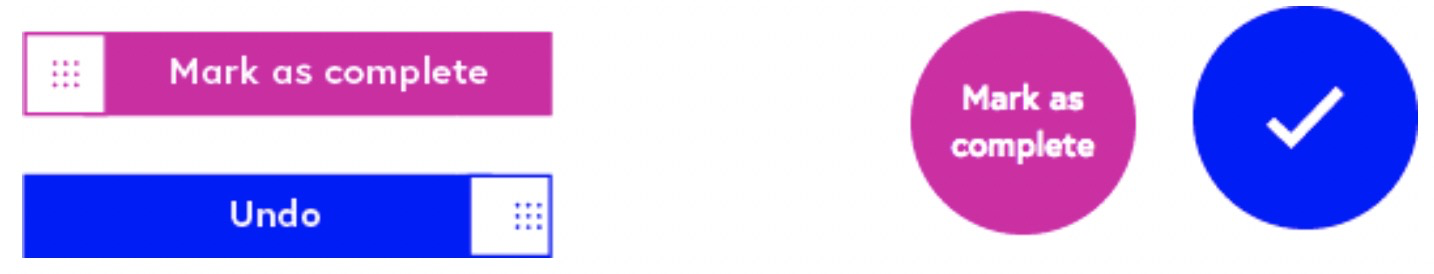
Original progress button (left) and redesigned button on FutureLearn.
_
尽管新按钮获得了学习者的积极反馈,但直到我们开始回应圆形图案,弹性动画和网站其他区域的滴答声时,它才成为系统的一部分。如果没有这些添加,该元素将断开连接。
While the new button received positive feedback from our learners, it didn’t feel like part of the system until we started echoing the circular pattern, the bouncy animation and the ticks in other areas of the site. Without these additions, the element felt disconnected.
有时,我们会在促销区域(例如主页或广告系列网站)上尝试新的模式。 Future-Learn的品牌以前主要采用方形形状。在首页的重新设计过程中,我们引入了三角形模式。当其他设计师开始将其应用于其他领域(例如图像样式和证书设计)时,它得到了增强。
On occasion we tried out new patterns on promotional areas, such as the home page or a campaign site. Future- Learn’s brand used to employ primarily square shapes. During a home page redesign, we introduced a trian- gle pattern. It was strengthened when other designers started applying it in other areas, such as image styles and certificate designs.
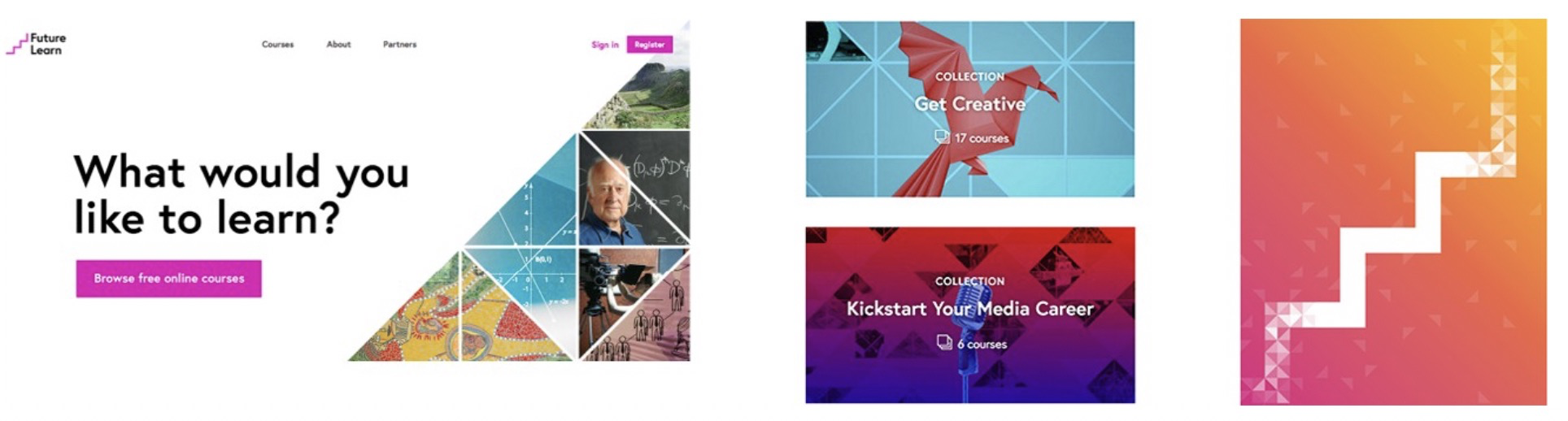
在首页上进行三角形的初始实验起初相当平坦(左),但其他采用该模式并将其应用到他们的项目中的设计师给予了新的改变
_
在试验三角形图案时,我们知道它们不在 FutureLearn 的典型方形美学范围内,但想给他们一个尝试,看看会发生什么。后来我们了解到,虽然三角形与品牌合作,但必须谨慎使用三角形,并且只能将其用作网站发现和营销区域的视觉增强,而不能用于课程学习体验页面。
While experimenting with the triangle patterns, we were aware that they were outside FutureLearn’s typical square aesthetic, but wanted to give them a try to see what would happen. We learned later that while triangles worked with the brand, they had to be used sparingly and only as a visual enhancement in the discovery and marketing areas of the site, not on the in-course learning experience pages.
探索新样式时,请在网站的一小部分尝试。请注意您在做什么,系统外部的模式以及尝试它们的原因。如果它们起作用,请通过将其应用到站点的其他区域中,将它们逐渐折叠到系统中。注意他们扮演的角色。对于FutureLearn,三角形用于创建动态效果。圆圈通常与刻度线结合使用,可以作为进步的积极保证。
When exploring new styles, try them out on a small area of the site. Be aware of what you’re doingdifferently, the pat- terns that are outside of the system, and the reasons for try- ing them. If they work, gradually fold them into the system by applying them in other areas of the site. Be conscious of the role they play. For FutureLearn, triangles are used to cre- ate a dynamic effect; circles are used as a positive reassur- ance of progress, typically in combination with a tick.
平衡品牌和业务需求
由于有时将感知模式仅视为样式或装饰,因此,与更新交互流程相比,更改感知模式的竞争性较小。结果,临时的业务需求可能会导致引入不适用于该品牌的元素。例如,我们希望让学习者知道何时开始新课程,因此我们在课程图像中添加了黄色横幅。
Because perceptual patterns are sometimes seen merely as styling or decoration, changing them can be less conten- tious than, say, updating the flow of an interaction. As a result, ad hoc business requirements can lead to introduc- ing elements that don’t sit comfortably with the brand.For example, we wanted to let our learners know when new courses were starting, so we added yellow banners to the course images.
FutureLearn 上的“刚刚开始”横幅突出显示最近开始的课程
即使标语上的商标并不完美,这也不是问题,因为当时只有几门课程在运行,我们不考虑在未来的几个月内开设更多的课程。发生这种情况时,课程模块的平衡已从突出的感觉转变为显得有点扎眼和面向销售,这是我们在FutureLearn品牌中尽量避免的感觉。同样,由于这被视为样式的一部分,因此很难确定优先级,并且花了很长时间解决。
Even though the banner wasn’tperfectly on brand, it wasn’ta problem since only a few courses were running at the time. What we didn’trealize was how many more courses would start within a few months. When it happened, the balance of the course module shifted from feeling like a highlight, to appearing a bit garish and sales-oriented, which is a feeling we try to avoid in the FutureLearn brand. Again, because this was seen as part of styling, it was hard to prioritize and took a long time to address.
无论我们对品牌有多大的保护,这些事情都会发生–新的需求要求定制模式和一次性调整。如果我们不了解它们,这种例外可能会稀释或削弱品牌。
No matter how much we guard the brand, these things will happen – new requirements demand custom patterns and one-off tweaks. If we’re not conscious of them, such excep-tions can dilute or weaken the brand.
签名模式:团队合作
有时,即使很小的变化也会导致感知发生变化。在 FutureLearn 中,我们曾经几乎全用圆圈替换了课程进度模块中的正方形,后来才意识到这样做会完全改变界面的感觉。要控制事物的感觉,您需要了解影响事物的确切模式。
Sometimes even a small change can alter perception. At FutureLearn, we once almost replaced the square shapes in the course progress module with circles, before we noticed that doing so would completely change the feel of the inter- face. To control how something feels, you need to under- stand the exact patterns that influence it.
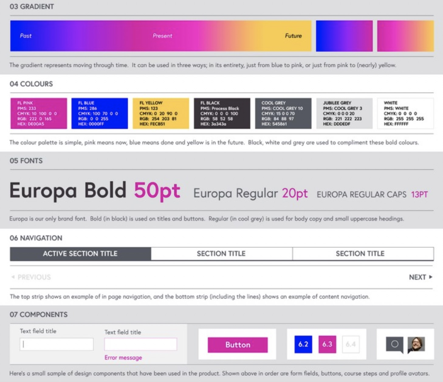
在您的团队中,尝试进行快速练习。要求每个人为您的产品写下最独特的感知模式。鼓励人们超越诸如调色板和字体之类的构成要素,而要考虑针对您品牌的高级原则,组合和处理方法。不仅要考虑元素,还要考虑它们背后的含义-它们描绘的图像和它们讲述的故事。在 Future-Learn 的界面中,其中一些模式是:
- 积极而令人鼓舞的语气
- 主要是白色调色板和粉红色调
- 宽大的空白
- 一般大字体,注重可读性
- 高对比度字体,比例成大标题
- 充满活力的粉红色至蓝色渐变
- 粉色到蓝色微妙的悬停互动
- 1px浅灰色笔触
- 1px带有“中断”的正方形图标
- 促销区域主要是正方形,有时是圆形的三角形
In your team, try running a quick exercise. Ask each per-son to write down the most distinct perceptual patterns for your product. Encourage people to look beyond the building blocks such as color palette and typeface, and instead think of high-level principles, combinations and treatments that are specific to your brand. Think not only about the elements, but the meaning behind them – the images they portray and the stories they tell. In Future- Learn’s interface, some of those patterns are:
- Positive and encouraging tone of voice
- Primarily white color palette with pink accents
- Generous white space
- Generally large type size with a focus on readability
- High-contrast typography with proportionally largeheadings
- Vibrant pink to blue gradient
- Pink to blue subtle hover interactions
- 1px light-gray strokes
- 1px square icons with a “break”
- Mostly square and occasionally circular shapes, trian- gles in promotional areas
就像第二章所述的在设计原则中找到共享主题的练习一样,比较团队的思想可以浮出不同的品牌认知方式。刚开始时质量可能模糊不清,但它们是进行讨论的良好基础。对最独特的感知模式达成共识是您未来将其系统化的有用起点。
Like the exercise with finding shared themes in you designprinciples described in the second chapter, comparing your team’sthoughts can surface different ways in which you perceive your brand. The qualitiesmight be vague and indis-tinct at firstbut they’re a great basis for discussions. Reach-ing a shared understanding of the most distinct perceptual patterns is a usefulstarting point for your future work on systemizing them.19
模式和原则是设计系统的重要组成部分。但是,当然,如果您在团队中工作,那么他们还不够。选择单词和规则并不能构成一种语言。只有当您将含义赋予这些词并且其他人开始共享这种含义时,它才开始成为一种语言。
Patterns and principles are an important part of a design system. But, of course, if you work in a team, they’re not enough. A selection of words and rules doesn’t make a language. It only starts becoming a language when you attribute meaning to those words and other people start sharing this meaning.
19 在第9章中,我们将讨论对感知模式进行界面清点并将其集成到系统中。
19 In chapter 9, we’ll talk about conducting an interface inventory on perceptual patterns and integrating them into the system.

若有收获,就点个赞吧
0 人点赞
