本文我们将介绍如何使用 FormMaking 来引入自己的高级组件,并可以通过设计器进行配置,处理事件等操作。
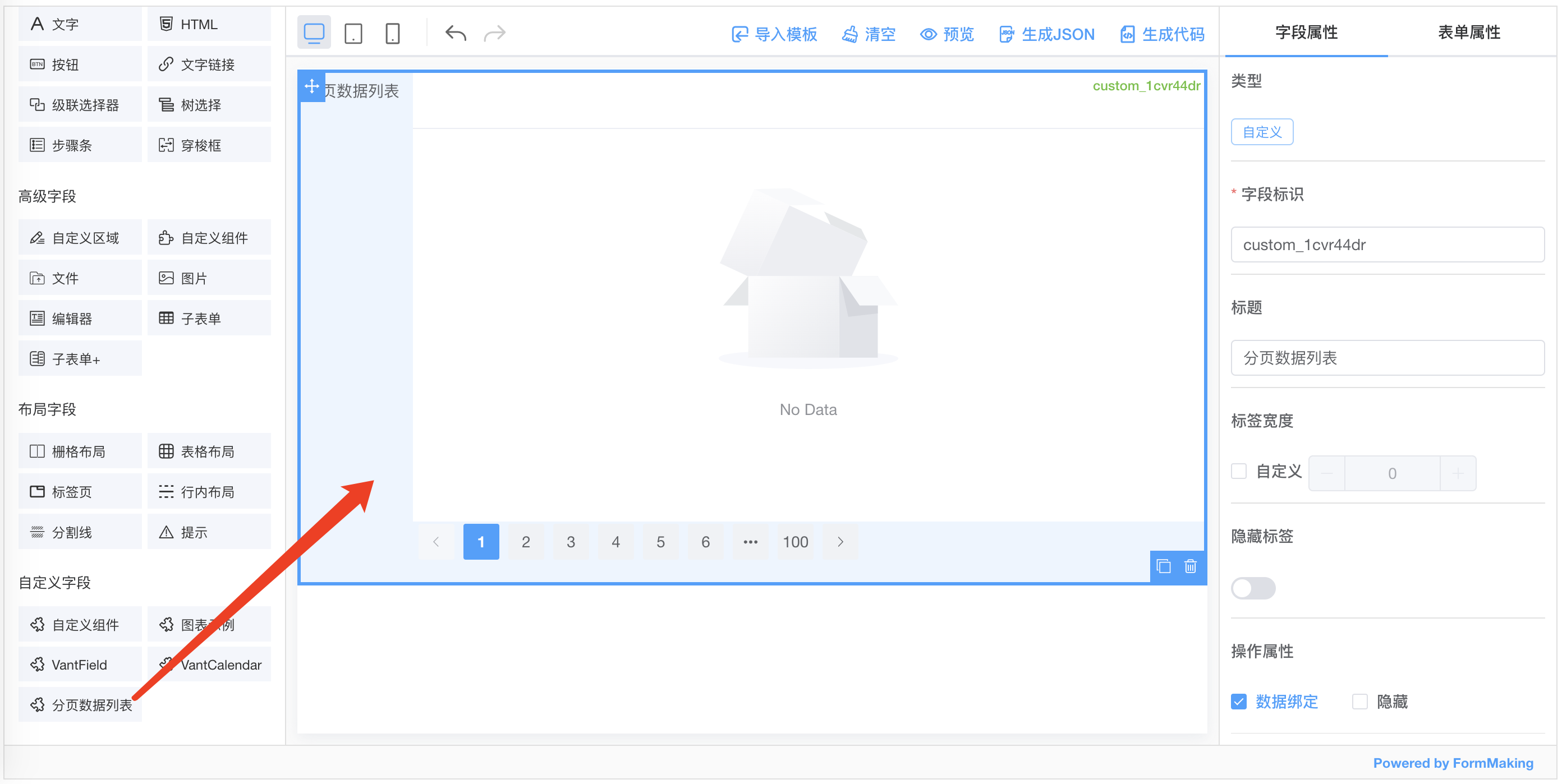
封装分页数据表格组件
我们将封装 一个分页数据表格组件,组件采用 ElementPlus TableV2 。
<template><div><div style="height: 400px"><el-auto-resizer><template #default="{ height, width }"><el-table-v2:columns="columns":data="data":width="width":height="height"fixed/></template></el-auto-resizer></div><el-paginationbackgroundlayout="prev, pager, next":total="1000"v-model:current-page="currentPage"@current-change="loadPageData"/></div></template><script setup>import { onMounted, ref, watch } from 'vue'const props = defineProps({modelValue: {type: Array,default: () => []},columns: {type: Array,default: () => []}})const emit = defineEmits(['on-load'])const data = ref(props.modelValue)const currentPage = ref(1)const loadPageData = (index) => {// 通过 emit,可以将事件抛出到设计器中进行配置emit('on-load', index)}onMounted(() => {emit('on-load', currentPage.value)})watch(() => props.modelValue, (val) => {data.value = val})</script>
引入到设计器
注册组件
首先应该在自己项目中进行组件的注册。
import CustomPaginationTable from 'PaginationTable.vue'app.use(FormMakingV3, {components: [{name: 'custom-pagination-table',component: CustomPaginationTable // 自定义组件}]})
也可以使用Vue.component 进行组件的注册
app.component('custom-pagination-table', CustomPaginationTable)
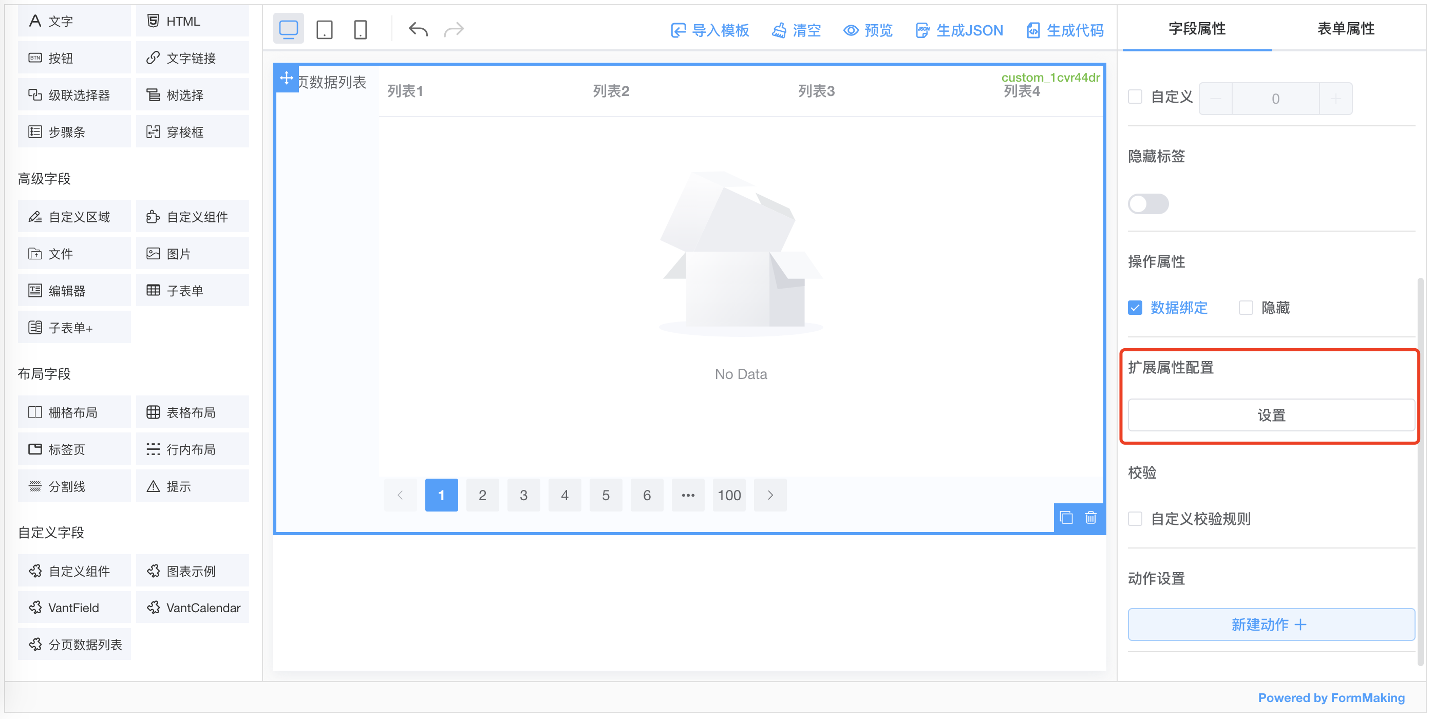
设计器配置
<template><fm-making-form:custom-fields="customFields"></fm-making-form></template><script>export default {data() {return {customFields: [{name: '分页数据列表',el: 'custom-pagination-table',options: {defaultValue: [],labelWidth: 0,isLabelWidth: false,hidden: false,dataBind: true,validator: '',extendProps: {columns: [] // 用于配置表格的列}},events: {onLoad: '' // 定义设计器可以配置的事件,处理组件 emit 的事件}}]}}}</script>
配置组件表格
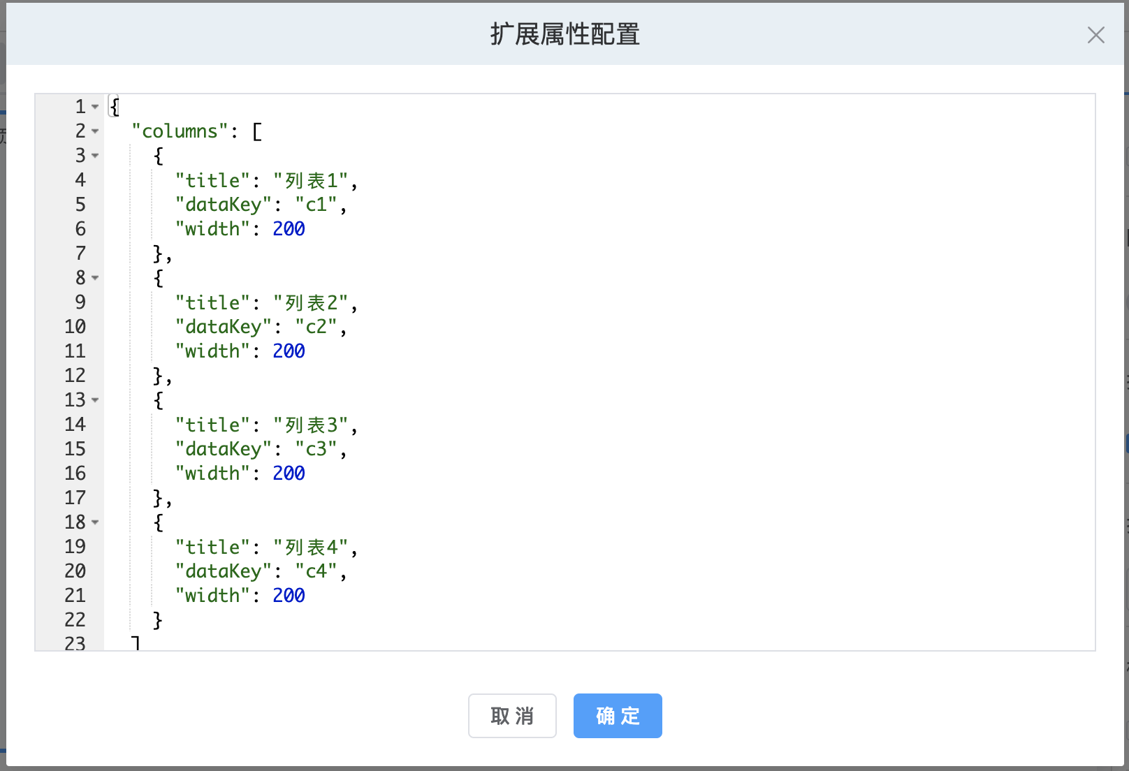
表格列配置
数据加载
数据加载的 on-load事件,我们在自定义组件中通过emit抛出到设计器中进行配置,在字段属性-动作设置中添加onLoad事件配置如下: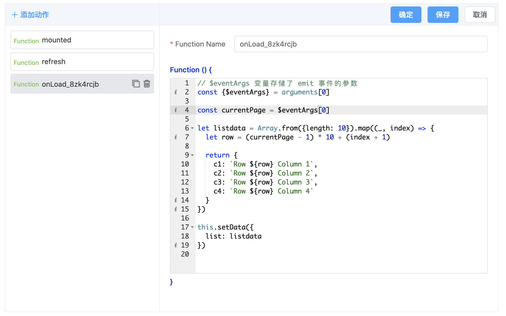
效果展示
我们来查看下最后的效果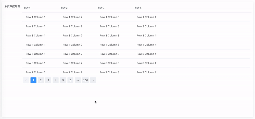

若有收获,就点个赞吧
0 人点赞
