多个元素水平垂直布局
- Row 水平布局
- Column 垂直布局
- Row、Column、Flex会被Expanded撑开,充满主轴可用空间
- Row、Column、Flex会被Flexible撑开,充满副轴可用空间
MainAxisAlignment(主轴)和CrossAxisAlignment(副轴)常用于Row和Column控件中,主要是用来控制子控件排列的位置,并可以配合textDirection和verticalDirection属性来控制子控件排列的方向及改变MainAxisAlignment和CrossAxisAlignment的起始位置。
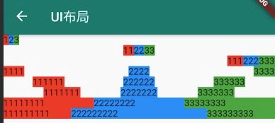
new Column(children: <Widget>[new Row( // 默认居左mainAxisAlignment: MainAxisAlignment.start,children: [Material(color: Colors.red,child: Text('1'),),Material(color: Colors.blue,child: Text('2'),),Material(color: Colors.green,child: Text('3'),),],),new Row( // 居中mainAxisAlignment: MainAxisAlignment.center,children: [Material(color: Colors.red,child: Text('11'),),Material(color: Colors.blue,child: Text('22'),),Material(color: Colors.green,child: Text('33'),),],),new Row( // 居右mainAxisAlignment: MainAxisAlignment.end,children: [Material(color: Colors.red,child: Text('111'),),Material(color: Colors.blue,child: Text('222'),),Material(color: Colors.green,child: Text('333'),),],),new Row( // 将主轴空白位置进行均分,排列子元素,手尾没有空隙mainAxisAlignment: MainAxisAlignment.spaceBetween,children: [Material(color: Colors.red,child: Text('1111'),),Material(color: Colors.blue,child: Text('2222'),),Material(color: Colors.green,child: Text('3333'),),],),new Row( // 将主轴空白区域均分,使中间各个子控件间距相等,首尾子控件间距为中间子控件间距的一半mainAxisAlignment: MainAxisAlignment.spaceAround,children: [Material(color: Colors.red,child: Text('111111'),),Material(color: Colors.blue,child: Text('222222'),),Material(color: Colors.green,child: Text('333333'),),],),new Row( // 将主轴空白区域均分,使各个子控件间距相等mainAxisAlignment: MainAxisAlignment.spaceEvenly,children: [Material(color: Colors.red,child: Text('1111111'),),Material(color: Colors.blue,child: Text('2222222'),),Material(color: Colors.green,child: Text('3333333'),),],),new Row(children: [new Expanded(child: Material(color: Colors.red,child: Text('11111111'),)),new Expanded(child: Material(color: Colors.blue,child: Text('22222222'),)),new Expanded(child: Material(color: Colors.green,child: Text('33333333'),)),],),new Row(children: [new Expanded(child: Material(color: Colors.red,child: Text('111111111'),)),new Expanded(child: Material(color: Colors.blue,child: Text('222222222'),),flex: 2, // 中间宽度是两边的 2 倍),new Expanded(child: Material(color: Colors.green,child: Text('333333333'),)),],),],),)
通过 Padding 实现边距布局
Padding(padding: EdgeInsets.all(4),child: Text('padding widget'))Padding(padding: EdgeInsets.only(left: 4, top: 4 right: 4, bottom: 4),child: Text('padding widget'))Container(width: MediaQuery.of(context).size.width,padding: EdgeInsets.only(left: 8, bottom: 6, right: 0, top: 6),child: Text('Container 实现padding布局',style: new TextStyle(color: Color.fromARGB(255, 255, 255, 255),fontSize: 20,),),)
通过 Container 或 Material 容器组件 color 实现背景色
Container(width: MediaQuery.of(context).size.width,padding: EdgeInsets.only(left: 8, bottom: 6, right: 0, top: 6),color: Colors.black38,child: Text('通过 Container 的 color 属性可以实现文字背景色',style: new TextStyle(color: Color.fromARGB(255, 255, 255, 255),fontSize: 20,),),)Material(borderRadius: BorderRadius.circular(8), // 圆角color: Colors.white)
通过 BoxDecoration 实现图片圆角
new Container(height: 240,decoration: BoxDecoration(image: DecorationImage(image: NetworkImage('https://cdn.jsdelivr.net/gh/flutterchina/website@1.0/images/homepage/screenshot-1.png'),fit: BoxFit.cover,),borderRadius: BorderRadius.only(topLeft: Radius.circular(8.0),topRight: Radius.circular(8.0)),),),
通过 FlatButton.icon 实现左边 Icon + 右边文字的布局模式
FlatButton.icon(icon: Icon(Icons.share,color: Colors.white,),label: Text('分享',style: new TextStyle(color: Colors.white,),), //`Text` to displayonPressed: () {// click implement},)
通过 Stack + Position 层级叠加和绝对定位布局
- Stack 可以实现层级布局,children 后面的 widget 会覆盖到上面
- Position 可以实现绝对定位
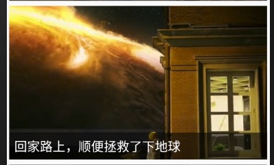
Stack(children: <Widget>[Positioned(child: new Image(image: NetworkImage('https://cdn.jsdelivr.net/gh/flutterchina/website@1.0/images/homepage/screenshot-2.png'),width: double.infinity,height: 240,fit: BoxFit.cover,),),Positioned(bottom: 0,child: Container(width: MediaQuery.of(context).size.width,padding: EdgeInsets.only(left: 8, bottom: 6, right: 0, top: 6),color: Colors.black54,child: Text('回家路上,顺便拯救了下地球',style: TextStyle(color: Colors.white,fontSize: 20.0),maxLines: 1,overflow: TextOverflow.ellipsis),)),],)

若有收获,就点个赞吧
0 人点赞
