函数解析
Help on function bar in module plotly.express._chart_types:bar(data_frame=None, x=None, y=None, color=None, facet_row=None, facet_col=None, facet_col_wrap=0, hover_name=None, hover_data=None, custom_data=None, text=None, error_x=None, error_x_minus=None, error_y=None, error_y_minus=None, animation_frame=None, animation_group=None, category_orders={}, labels={}, color_discrete_sequence=None, color_discrete_map={}, color_continuous_scale=None, range_color=None, color_continuous_midpoint=None, opacity=None, orientation='v', barmode='relative', log_x=False, log_y=False, range_x=None, range_y=None, title=None, template=None, width=None, height=None)In a bar plot, each row of `data_frame` is represented as a rectangularmark.Parameters----------data_frame: DataFrame or array-like or dictThis argument needs to be passed for column names (and not keywordnames) to be used. Array-like and dict are tranformed internally to apandas DataFrame. Optional: if missing, a DataFrame gets constructedunder the hood using the other arguments.x: str or int or Series or array-likeEither a name of a column in `data_frame`, or a pandas Series orarray_like object. Values from this column or array_like are used toposition marks along the x axis in cartesian coordinates. Forhorizontal histograms, these values are used as inputs to `histfunc`.y: str or int or Series or array-likeEither a name of a column in `data_frame`, or a pandas Series orarray_like object. Values from this column or array_like are used toposition marks along the y axis in cartesian coordinates. For verticalhistograms, these values are used as inputs to `histfunc`.color: str or int or Series or array-likeEither a name of a column in `data_frame`, or a pandas Series orarray_like object. Values from this column or array_like are used toassign color to marks.facet_row: str or int or Series or array-likeEither a name of a column in `data_frame`, or a pandas Series orarray_like object. Values from this column or array_like are used toassign marks to facetted subplots in the vertical direction.facet_col: str or int or Series or array-likeEither a name of a column in `data_frame`, or a pandas Series orarray_like object. Values from this column or array_like are used toassign marks to facetted subplots in the horizontal direction.facet_col_wrap: intMaximum number of facet columns. Wraps the column variable at thiswidth, so that the column facets span multiple rows. Ignored if 0, andforced to 0 if `facet_row` or a `marginal` is set.hover_name: str or int or Series or array-likeEither a name of a column in `data_frame`, or a pandas Series orarray_like object. Values from this column or array_like appear in boldin the hover tooltip.hover_data: list of str or int, or Series or array-like, or dictEither a list of names of columns in `data_frame`, or pandas Series, orarray_like objects or a dict with column names as keys, with valuesTrue (for default formatting) False (in order to remove this columnfrom hover information), or a formatting string, for example ':.3f' or'|%a' or list-like data to appear in the hover tooltip or tuples with abool or formatting string as first element, and list-like data toappear in hover as second element Values from these columns appear asextra data in the hover tooltip.custom_data: list of str or int, or Series or array-likeEither names of columns in `data_frame`, or pandas Series, orarray_like objects Values from these columns are extra data, to be usedin widgets or Dash callbacks for example. This data is not user-visiblebut is included in events emitted by the figure (lasso selection etc.)text: str or int or Series or array-likeEither a name of a column in `data_frame`, or a pandas Series orarray_like object. Values from this column or array_like appear in thefigure as text labels.error_x: str or int or Series or array-likeEither a name of a column in `data_frame`, or a pandas Series orarray_like object. Values from this column or array_like are used tosize x-axis error bars. If `error_x_minus` is `None`, error bars willbe symmetrical, otherwise `error_x` is used for the positive directiononly.error_x_minus: str or int or Series or array-likeEither a name of a column in `data_frame`, or a pandas Series orarray_like object. Values from this column or array_like are used tosize x-axis error bars in the negative direction. Ignored if `error_x`is `None`.error_y: str or int or Series or array-likeEither a name of a column in `data_frame`, or a pandas Series orarray_like object. Values from this column or array_like are used tosize y-axis error bars. If `error_y_minus` is `None`, error bars willbe symmetrical, otherwise `error_y` is used for the positive directiononly.error_y_minus: str or int or Series or array-likeEither a name of a column in `data_frame`, or a pandas Series orarray_like object. Values from this column or array_like are used tosize y-axis error bars in the negative direction. Ignored if `error_y`is `None`.animation_frame: str or int or Series or array-likeEither a name of a column in `data_frame`, or a pandas Series orarray_like object. Values from this column or array_like are used toassign marks to animation frames.animation_group: str or int or Series or array-likeEither a name of a column in `data_frame`, or a pandas Series orarray_like object. Values from this column or array_like are used toprovide object-constancy across animation frames: rows with matching`animation_group`s will be treated as if they describe the same objectin each frame.category_orders: dict with str keys and list of str values (default `{}`)By default, in Python 3.6+, the order of categorical values in axes,legends and facets depends on the order in which these values are firstencountered in `data_frame` (and no order is guaranteed by default inPython below 3.6). This parameter is used to force a specific orderingof values per column. The keys of this dict should correspond to columnnames, and the values should be lists of strings corresponding to thespecific display order desired.labels: dict with str keys and str values (default `{}`)By default, column names are used in the figure for axis titles, legendentries and hovers. This parameter allows this to be overridden. Thekeys of this dict should correspond to column names, and the valuesshould correspond to the desired label to be displayed.color_discrete_sequence: list of strStrings should define valid CSS-colors. When `color` is set and thevalues in the corresponding column are not numeric, values in thatcolumn are assigned colors by cycling through `color_discrete_sequence`in the order described in `category_orders`, unless the value of`color` is a key in `color_discrete_map`. Various useful colorsequences are available in the `plotly.express.colors` submodules,specifically `plotly.express.colors.qualitative`.color_discrete_map: dict with str keys and str values (default `{}`)String values should define valid CSS-colors Used to override`color_discrete_sequence` to assign a specific colors to markscorresponding with specific values. Keys in `color_discrete_map` shouldbe values in the column denoted by `color`.color_continuous_scale: list of strStrings should define valid CSS-colors This list is used to build acontinuous color scale when the column denoted by `color` containsnumeric data. Various useful color scales are available in the`plotly.express.colors` submodules, specifically`plotly.express.colors.sequential`, `plotly.express.colors.diverging`and `plotly.express.colors.cyclical`.range_color: list of two numbersIf provided, overrides auto-scaling on the continuous color scale.color_continuous_midpoint: number (default `None`)If set, computes the bounds of the continuous color scale to have thedesired midpoint. Setting this value is recommended when using`plotly.express.colors.diverging` color scales as the inputs to`color_continuous_scale`.opacity: floatValue between 0 and 1. Sets the opacity for markers.orientation: str (default `'v'`)One of `'h'` for horizontal or `'v'` for vertical)barmode: str (default `'relative'`)One of `'group'`, `'overlay'` or `'relative'` In `'relative'` mode,bars are stacked above zero for positive values and below zero fornegative values. In `'overlay'` mode, bars are drawn on top of oneanother. In `'group'` mode, bars are placed beside each other.log_x: boolean (default `False`)If `True`, the x-axis is log-scaled in cartesian coordinates.log_y: boolean (default `False`)If `True`, the y-axis is log-scaled in cartesian coordinates.range_x: list of two numbersIf provided, overrides auto-scaling on the x-axis in cartesiancoordinates.range_y: list of two numbersIf provided, overrides auto-scaling on the y-axis in cartesiancoordinates.title: strThe figure title.template: str or dict or plotly.graph_objects.layout.Template instanceThe figure template name (must be a key in plotly.io.templates) ordefinition.width: int (default `None`)The figure width in pixels.height: int (default `None`)The figure height in pixels.Returns-------plotly.graph_objects.Figure
最简单的柱状图
源代码
#将plotly交互包导入import plotly.express as px#获取数据data_canada = px.data.gapminder().query("country == 'Canada'")#绘制图形fig = px.bar(data_canada, x='year', y='pop')#展示数据fig.show()
个人分析
这个是最简单的一个绘制过程,导入软件包,获取数据,绘制图形以及最后展示图形。获取数据是利用了谷歌的一个数据,国内的网络可能会有些问题,但其实问题不大,本质上就是一个DataFrame,标准的pandas那种格式,下面把这组数据的情况展示下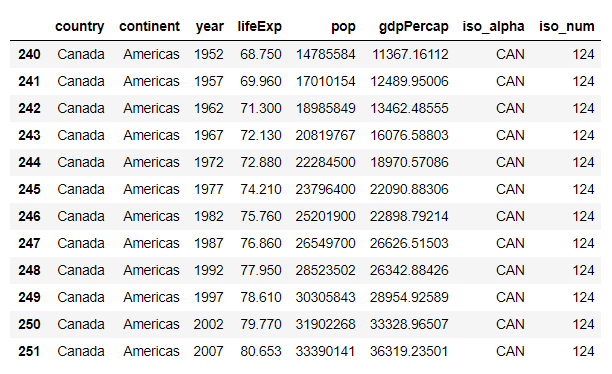
可以直接导出,具体的命令如下
import plotly.express as pximport pandas as pddata_canada= px.data.gapminder().query("country == 'Canada'")data_canada.to_csv("data_canada")fig = px.bar(data_canada, x='year', y='pop')fig.show()
然后结果如下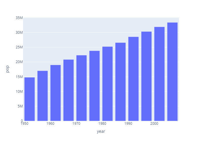
最后一步便是保存图片了,也是很方便的
import plotly.express as pximport pandas as pddata_canada= px.data.gapminder().query("country == 'Canada'")data_canada.to_csv("test.csv")fig = px.bar(data_canada, x='year', y='pop')fig.show()fig.write_image('figure.svg')
fig.write_image可以导出多种格式的图片(png,jpg,svg,pdf,eps),包括矢量图,满足各类人群需求。
总的来说plotly从绘图到保存很方便,完美的接合pandas清洗数据。
自定义参数
源代码
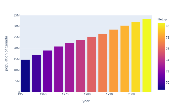
import plotly.express as pxdata = px.data.gapminder()data_canada = data[data.country == 'Canada']fig = px.bar(data_canada, x='year', y='pop',hover_data=['lifeExp', 'gdpPercap'], color='lifeExp',labels={'pop':'population of Canada'}, height=400)fig.show()
图像
解读
可以看到柱状图的颜色是根据color参数来定义的,这个图是lifeExp;
hover_data是关于网页的,比如你把鼠标点到某个图上,会显示这两个值,输出文件是看不到的;
labels其实就是我们横纵坐标的值,这里是把pop数据值显示为更长的population of Canada。
width和hight就是设置图形的宽和高
堆叠柱状图
源代码
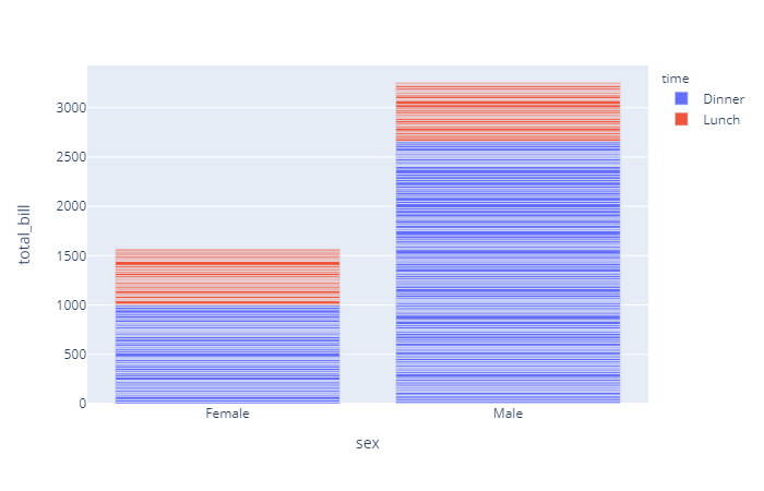
import plotly.express as pxdf = px.data.tips()fig = px.bar(df, x="sex", y="total_bill", color='time')fig.show()
图片
解读
这种其实是个极端情况,有很多的Y值公用一个X值,实际中往往不是这种。
分组柱状图
源代码
# Change the default stackingimport plotly.express as pxfig = px.bar(df, x="sex", y="total_bill", color='smoker', barmode='group',height=400)fig.show()
图片
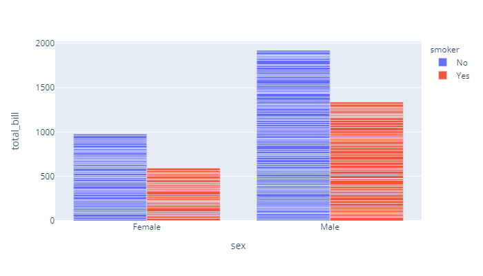
解读
其实主要调整了下barmode参数,这个参数决定了柱状图的模式。

若有收获,就点个赞吧
0 人点赞
