转载自:https://blog.csdn.net/qq_41612675/article/details/97259712

    1. 前两天要画一个echarts图,用两条曲线来分别展示修改前和修改后的高度和体积的对应关系,形成对比。<br />H作为x轴,V作为y轴。HV都是可变的。<br />封装数据:series中的data项[[H,V],[H,v]···],按参考文章1中的一样,将数据封装成如下格式:<br />![](https://cdn.nlark.com/yuque/0/2020/png/215201/1583506560771-e3f3486f-845f-4a19-b0da-5f8194bce425.png#align=left&display=inline&height=260&originHeight=260&originWidth=313&size=0&status=done&style=none&width=313)
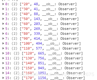
<br />第一列为H,第二列为V<br />具体的封装办法。。。自己搞吧。。。<br />由于我这里要画两条曲线以作对比,x轴的H值可能是完全不一样的,比如我的第二条x轴的数据是以10开头的:<br />![](https://cdn.nlark.com/yuque/0/2020/png/215201/1583506571696-e6096cab-c69a-4663-8c7d-dfe8d98bb612.png#align=left&display=inline&height=251&originHeight=251&originWidth=312&size=0&status=done&style=none&width=312)
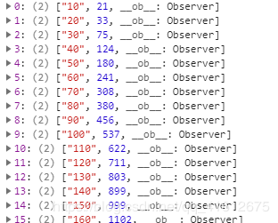
<br />然后series里是这样的:<br />![](https://cdn.nlark.com/yuque/0/2020/png/215201/1583506578423-106b1f77-26d7-4fe4-89d9-28a2970585ef.png#align=left&display=inline&height=245&originHeight=245&originWidth=411&size=0&status=done&style=none&width=411)
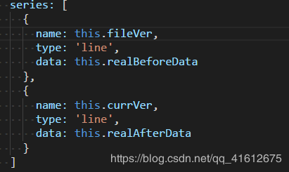
<br />坑来了:第一个的x点是20,第二个的是10,图画的时候是以第一个data的数据先画,后画第二个data中的,也就是说,按第一个data的H值画好了x轴点,若是第二个data中存在第一个data中没有的H值,那么这个值会补到第一组x点的最后面,曲线是乱画的。所以要设置xAxis中的data数组:<br />将两条曲线的x轴的数据拿出来进行 拼接、去重、排序操作<br />![](https://cdn.nlark.com/yuque/0/2020/png/215201/1583506586766-5488f1d7-3c6d-4331-9988-4524f8cace8b.png#align=left&display=inline&height=95&originHeight=95&originWidth=683&size=0&status=done&style=none&width=683)

    Echarts多条折线图对应的x轴数据不同且使连线连续 - 图1
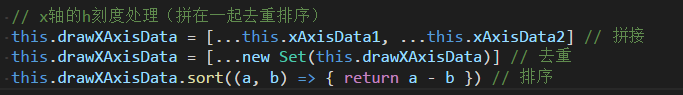
    至此,已经完成了绝大部分,最后处理第一条曲线在a点有值,但第二条曲线在a点没值的情况,不让其中断,使用connectNulls:true来连接空数据,option如下:

    1. var option = {
    2. title: {
    3. text: '对比'
    4. },
    5. tooltip: {
    6. trigger: 'axis'
    7. },
    8. legend: {
    9. data: this.lengedData
    10. },
    11. grid: {
    12. left: '3%',
    13. right: '4%',
    14. bottom: '3%',
    15. containLabel: true
    16. },
    17. toolbox: {
    18. right: 50,
    19. feature: {
    20. saveAsImage: {}
    21. }
    22. },
    23. xAxis: {
    24. name: 'H',
    25. type: 'category',
    26. boundaryGap: false,
    27. data: this.drawXAxisData
    28. },
    29. yAxis: {
    30. name: 'V',
    31. type: 'value'
    32. },
    33. series: [
    34. {
    35. name: this.fileVer,
    36. type: 'line',
    37. data: this.realBeforeData,
    38. // 这是让h刻度缺失的点,数据正常连接不断开
    39. connectNulls: true
    40. },
    41. {
    42. name: this.currVer,
    43. type: 'line',
    44. data: this.realAfterData,
    45. connectNulls: true
    46. }
    47. ]
    48. }

    最后,有一个小知识点: 如果echarts图画在tab页,图的宽度就会只有100px,解决方法: 重新给echarts图设置宽度。
    如下:
    ref写在画图的div的外层,
    Echarts多条折线图对应的x轴数据不同且使连线连续 - 图2

    1. <div ref="echart">
    2. <div id="drawchart" style="width: 100%;height: 400px;"/>
    3. </div>