一.简介
- 1、ConstraintLayout是一个ViewGroup,它允许您以灵活的方式定位和调整小部件的大小。可以在从API 9开始的Android系统上使用;
- 2、Android Studio 2.2中主要的新增功能之一;
- 3、更方便的使用可视化的方式来编写界面(传统的方式是使用XML代码来编写界面,可视化操作的背后仍是靠编写XML代码来完成的);
- 4、优点:可以有效地解决布局嵌套过多的问题(减少嵌套,性能提升);
- 5、特点:使用约束(后面使用就知道了)的方式来指定各个控件的位置和关系的,有点类似RelativeLayout,但远比RelativeLayout强大,ConstraintLayout可以按照比例约束控件位置和尺寸,能够更好地适配屏幕大小不同的机型。
二.基本使用
- 1、依赖:在app/build.gradle文件中添加ConstraintLayout,如自己添加的依赖为,implementation ‘com.android.support.constraint:constraint-layout:1.1.3’;
- 2、拖动,约束,删除
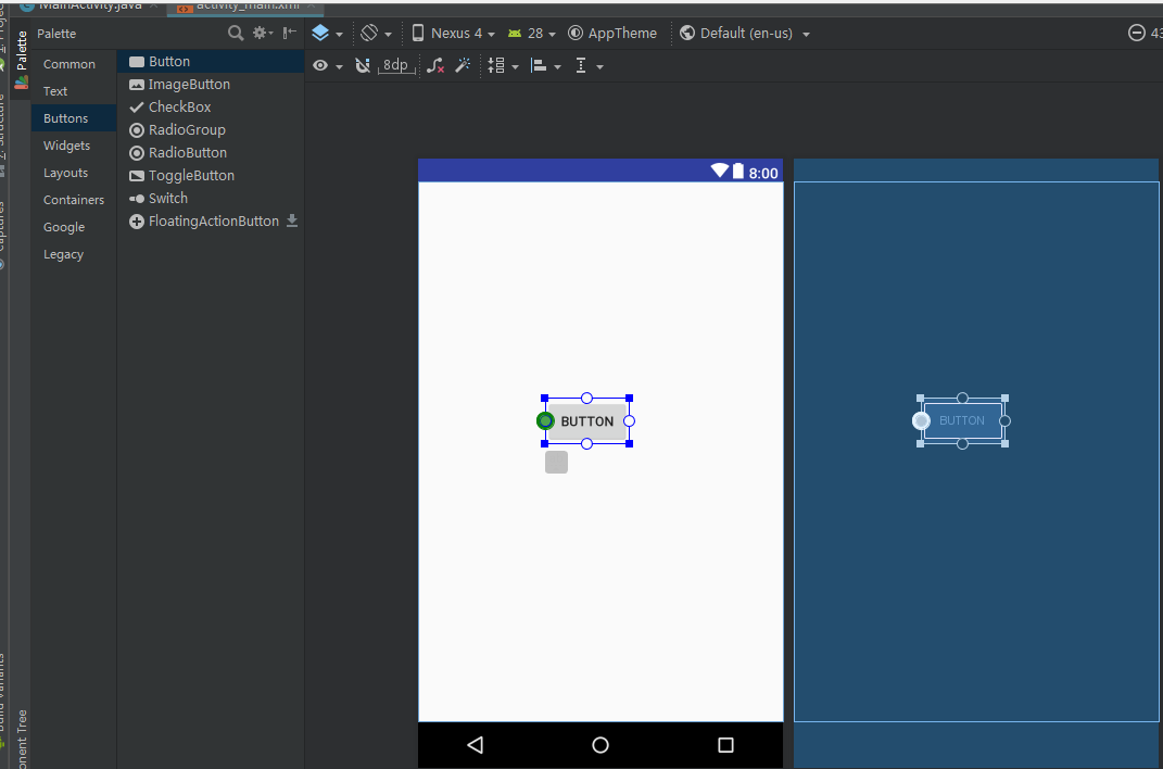
- 2.1.拖动:想要向布局中添加一个Button,那么只需要从左侧的Palette区域拖一个Button进去就可以了,如下图所示:

- 2.2.约束: 可以一个控件的四个方向上给添加约束。如下图的Button四个边中间位置的圆圈就是用来添加约束的。接着介绍约束的基本用法和相对于另一个控件进行定位来使用约束。
- 2.2.1.约束的基本用法:
看图能更直观的去理解约束的基本用法,如,让Button位于屏幕的右下方,同时设置距离右侧100dp和距离下方200dp。先给Button设置右侧和下方的约束,然后将Button整体移动。
如果想要让Button居中,需要给Button四个位置都添加约束。
- 2.2.2.约束相对于另一个控件进行定位
在上个的布局基础之上,添加一个新的Button,要求在原来的Button的正下方,且距离原来的Button底部100dp。
- 2.3.删除
删除控件的其中一个约束(鼠标放在约束的位置,点击一下即可实现删除该约束)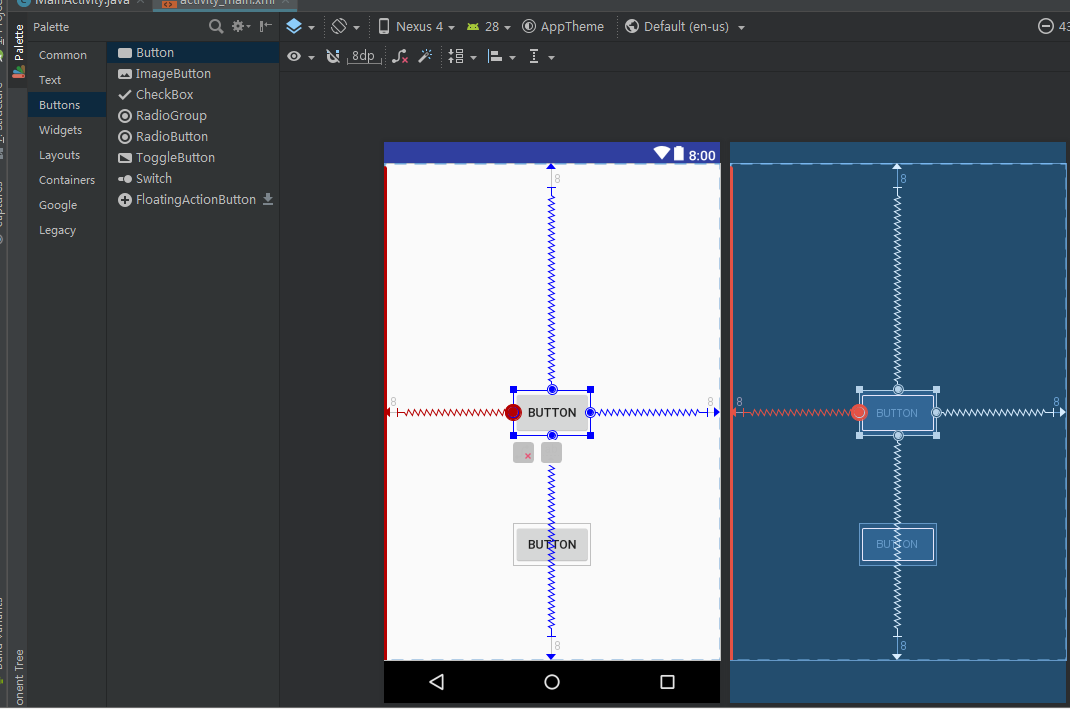
删除控件的所有约束(控件左下方的红色x点击一下,蓝色箭头位置,即可删除该控件的所有约束)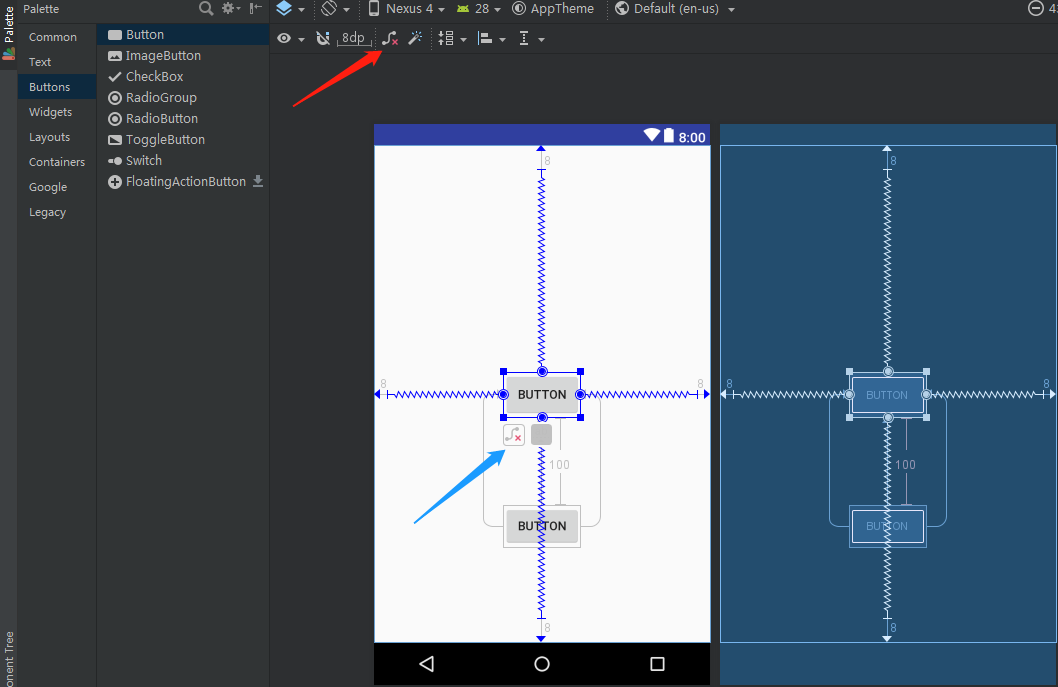
删除当前界面的所有控件的约束(上图红色箭头位置,点击即可删除当前界面的所有控件的约束)
三.进阶用法
包含四个部分内容:Attributes区域,Guidelines,自动添加约束和属性的使用。
- 1、Attributes区域
更方便的设置属性,点击事件,控件是否可见,背景,大小等等。
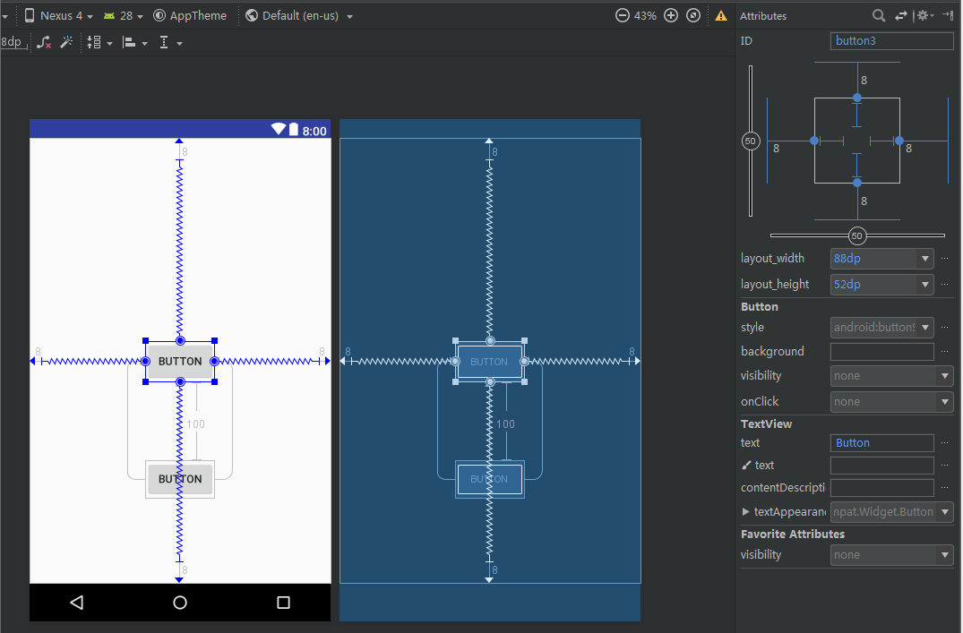
图片右上方的区域涉及到一些比较重要的内容:
- 右上角位置有一个横向和一个纵向的轴,中间位置各有一个50,调整这两个轴的比例值可以改变控件的位置。当两个轴的值都为0的时候,控件在屏幕的最上角位置,都为100的时候,控件在屏幕的右下方。需要注意的是:控件默认四个方位的Margin为8dp,设置为0dp需要手动修改。下图展示,让中间控件移动到右下方,且设置边距为0dp。

- 再看看另外一部分,如下图鼠标点击操作,控件的大小可以直接改变,一共有三种状态,WRAP_CONTENT,固定的尺寸大小和MATCH_CONSTRAINT。
- WRAP_CONTENT:enforcing constraints (Added in 1.1)强制约束;
- 固定的尺寸大小:可以自己设置给出具体的值;
- MATCH_CONSTRAINT: (Added in 1.1)匹配约束。和match parent区别在于,match parent是填充当前控件的父布局,而MATCH_CONSTRAINT是用于填充满当前控件的约束规则。当控件设置为MATCH_CONSTRAINT时,XML中会显示为0dp,默认生成的大小占所有的可用空间。有以下几个属性可以使用:
layout_constraintWidth_min 和 layout_constraintHeight_min : 设置最小尺寸
layout_constraintWidth_max 和 layout_constraintHeight_max : 设置最大尺寸
layout_constraintWidth_percent 和 layout_constraintHeight_percent : 设置相对于父控件的百分比

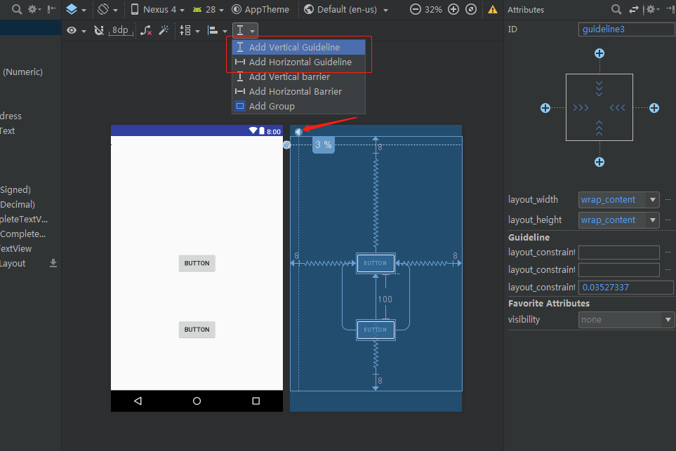
- 2、Guidelines
- 用法,点击通知栏中的Guidelines图标(红色方框上方)可以添加一个垂直或水平方向上的Guideline(Guideline默认是使用的dp尺)。选中Guideline,并点击一下最上面的箭头图标将它改成百分比尺。
Guideline 具有以下的三种定位方式:
- layout_constraintGuide_begin 距离父容器起始位置的距离(左侧或顶部)
- layout_constraintGuide_end 距离父容器结束位置的距离(右侧或底部)
- layout_constraintGuide_percent 距离父容器宽度或高度的百分比
GuideLine是不会显示在设备上(标记为View.GONE),GuideLine可以是水平的也可以是垂直的。其它控件可以相对GuideLine添加相应的约束。
- 3、自动添加约束
通知栏两个属性:左侧红色箭头 - Autoconnect,右侧红色箭头 - Infer Constraints。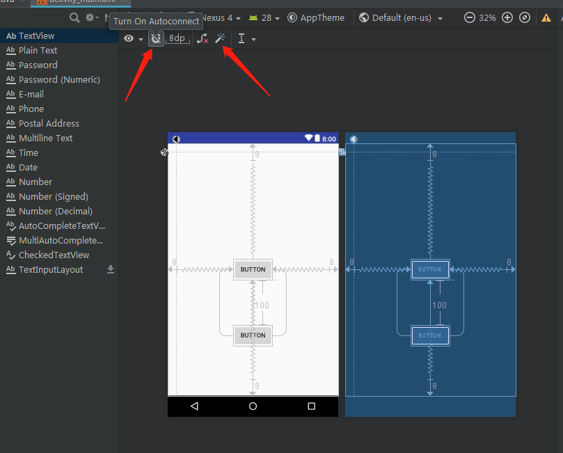
- Autoconnect:当界面比较复杂的时候,为控件一个个去添加约束是比较麻烦的事情,Autoconnect能够简化这些操作,自动添加约束,但是,Autoconnect需要手动打开,即点击一下通知栏按钮即可,默认不开启。当然,我们只能把它当做一个工具来使用,不能依赖它完全实现准确无误的约束。
- Infer Constraints:将设计稿需要的控件全部先拖动到页面中,摆放好大致的位置,然后点击通知栏Infer Constraints按钮,就能为所有控件自动添加约束了。
- 4、属性的使用
- 4.1.相对位置属性的使用
- layout_constraintXxx_toXxxOf分析:
- layout为固定格式。
- constraintXxx,指定当前控件需要设置约束的属性部分。如constraintLeft表示对当前控件的左边进行约束设置。
- toXxxOf:其指定的内容是作为当前控件设置约束需要依赖的控件或父容器(可以理解为设置约束的参照物).eg:toLeftOf=”parent” :表示当前控件相对于父容器的左边进行约束设置。
- 下面的这些属性需要结合id才能进行约束:
- layout_constraintXxx_toXxxOf分析:
- 4.1.相对位置属性的使用
layout_constraintLeft_toLeftOf // 左边左对齐
layout_constraintLeft_toRightOf // 左边右对齐
layout_constraintRight_toLeftOf // 右边左对齐
layout_constraintRight_toRightOf // 右边右对齐
layout_constraintTop_toTopOf // 上边顶部对齐
layout_constraintTop_toBottomOf // 上边底部对齐
layout_constraintBottom_toTopOf // 下边顶部对齐
layout_constraintBottom_toBottomOf // 下边底部对齐
layout_constraintBaseline_toBaselineOf // 文本内容基准线对齐
layout_constraintStart_toEndOf // 起始边向尾部对齐
layout_constraintStart_toStartOf // 起始边向起始边对齐
layout_constraintEnd_toStartOf // 尾部向起始边对齐
layout_constraintEnd_toEndOf // 尾部向尾部对齐
4.2.Margin边距的使用
- 普通边距属性:android:layout_marginXxx,如,android:layout_marginStart;
- 被依赖控件GONE之后的边距属性:layout_goneMarginXxx,如,layout_goneMarginStar;
- 注意:约束布局的可见性属性和其它布局相比,存在区别:当控件设为GONE时,被认为尺寸为0。可以理解为布局上的一个点。而传统的view设置gone时该view会移除出这个布局容器。若GONE的控件对其它控件有约束,则约束保留并生效,但所有的边距(margin)会清零。传统情况下如果GONE控件对其它控件有约束的话 会提示找不到该控件View。
4.3.bias (偏移)
- 偏移属性:
layout_constraintHorizontal_bias // 水平偏移
layout_constraintVertical_bias // 垂直偏移
- 不论是水平方向还是垂直方向,默认两边各占50%。如:
<android.support.constraint.ConstraintLayout ...><!-- buttonA更靠近屏幕左侧 --><Button android:id="@+id/buttonA" ...app:layout_constraintHorizontal_bias="0.3"app:layout_constraintLeft_toLeftOf="parent"app:layout_constraintRight_toRightOf="parent/><!-- buttonB更靠近屏幕上方 --><Button android:id="@+id/buttonB" ...app:layout_constraintVertical_bias="0.3"app:layout_constraintLeft_toLeftOf="parent"app:layout_constraintRight_toRightOf="parent/><android.support.constraint.ConstraintLayout/>
- 通过设置bias(偏移),可以非常便捷地实现屏幕适配。
- 4.4.Ratio(比例)
- 将控件的宽和高设置为一个比例,前提是至少宽或高有一个设置为0dp(即MATCH_CONSTRAINT),并将属性layout_constraintDimensionRatio设置为给定的比例。例如:
<!-- 将按钮的高度设置为与其宽度相同 --><Button android:layout_width="wrap_content"android:layout_height="0dp"app:layout_constraintDimensionRatio="1:1" />
- 比率可以有两种表示方式:1,表示宽度和高度之比的浮点值;2,“宽:高”形式的比率。- 如果宽高都设置为0dp(MATCH_CONSTRAINT),这种情况,也可以设置比率。要基于另一个的尺寸约束一个特定的边,可以预先附加w或h,分别约束宽度或高度。例如:
<Button android:layout_width="0dp"android:layout_height="0dp"app:layout_constraintDimensionRatio="H,16:9"app:layout_constraintBottom_toBottomOf="parent"app:layout_constraintTop_toTopOf="parent"/>
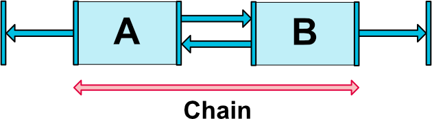
- 4.5.chains(链)
- 链使我们能够对一组在水平或竖直方向互相关联的控件的属性进行统一管理。
- 成为链的条件:一组控件它们通过一个双向的约束关系链接起来。 例如(图为横向的链,纵向同理,同时附加代码示例):
**
<android.support.constraint.ConstraintLayout ...><Buttonandroid:id="@+id/ButtonA"android:layout_width="wrap_content"android:layout_height="wrap_content"app:layout_constraintLeft_toLeftOf="parent"app:layout_constraintRight_toLeftOf="@+id/ButtonB" /><Buttonandroid:id="@+id/ButtonB"android:layout_width="wrap_content"android:layout_height="wrap_content"app:layout_constraintLeft_toRightOf="@+id/ButtonA"app:layout_constraintRight_toRightOf="parent" /><android.support.constraint.ConstraintLayout/>
- 链头:链由链的第一个元素(链的“头”)上设置的属性控制,即链头。如图(3个控件相互约束,两端两个控件分别与parent约束,成为一条链):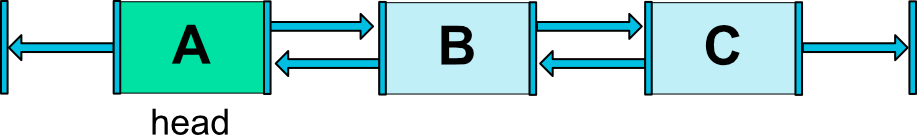- 通过属性layout_constraintHorizontal_chainStyle设置可以改变整条链的样式。链的样式分类和效果图:- CHAIN_SPREAD :展开元素 (默认);- CHAIN_SPREAD_INSIDE:展开元素,但链的两端贴近parent;- 在CHAIN_SPREAD模式下,如果一些控件被设置为0dp(即MATCH_CONSTRAINT),那么控件将会把所有剩余的空间均分;- CHAIN_PACKED:链的元素将被打包在一起;- 在CHAIN_PACKED模式,子元素的水平或垂直偏移属性将影响打包元素的位置;

4.6.Barrier(屏障)
- 一个虚拟的辅助控件,它可以阻止一个或者多个控件越过自己,就像一个屏障一样。当某个控件要越过自己的时候,Barrier会自动移动,避免自己被覆盖。
- Barrier跟GuideLine一样不会显示在设备上。
相关属性
- barrierDirection:屏障的方位。
- constraint_referenced_ids:包含的引用id。
如,有两个垂直方向的按钮,id分别为button1,button2:
添加Barrier,如果button1,button2的内容发生了改变,也就是宽度发生了变化,屏障会自动根据设定的方向移动。代码如下:
<android.support.constraint.ConstraintLayout ...>...<!-- 在button1,button2的结束位置添加屏障,也就是在右侧添加屏障 --><android.support.constraint.Barrierandroid:id="@+id/barrier"android:layout_width="wrap_content"android:layout_height="wrap_content"app:barrierDirection="end"app:constraint_referenced_ids="button1,button2" /><android.support.constraint.ConstraintLayout/>
- [具体场景使用](http://www.jcodecraeer.com/a/anzhuokaifa/androidkaifa/2017/1017/8601.html)
- 4.7.Circular Positioning(圆形定位)
- 圆形定位可以让一个控件以另一个控件为中心点, 来设置其相对与该中心点的距离和角度。
- 属性:
- layout_constraintCircle:引用另一个控件的 id。
- layout_constraintCircleRadius:到另一个控件中心的距离。
- layout_constraintCircleAngle:控件的角度(顺时针,0 - 360 度)。
<android.support.constraint.ConstraintLayout ...><Button android:id="@+id/buttonA" ... /><Button android:id="@+id/buttonB" ...app:layout_constraintCircle="@+id/buttonA"app:layout_constraintCircleRadius="100dp"app:layout_constraintCircleAngle="45" /></android.support.constraint.ConstraintLayout>
4.8.Group(组)
可以控制一组控件的可见性。通过将一组控件归类,然后对该组控件进行设置显示或者隐藏。关于Group只介绍了最基本的用法。通过属性constraint_referenced_ids添加控件的引用到该组。如下: ```
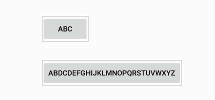
- 4.9.**PlaceHolder(占位符)**- 在Placeholder中可使用setContent()设置另一个控件的id,然后该占位符就会显示设置的那个控件,若被设置的控件之前在界面中显示,那么被设置的控件会在原来的位置消失掉,最终会在Placeholder位置显示。代码示例:
<!-- Placeholder 的位置在左上角,通过content设置TextView的id,TextView会在左上角显示,原来居中显示的TextView会消失 --><android.support.constraint.Placeholderandroid:id="@+id/placeholder"android:layout_width="wrap_content"android:layout_height="wrap_content"app:content="@+id/textview"app:layout_constraintLeft_toLeftOf="parent"app:layout_constraintTop_toTopOf="parent" /><TextViewandroid:id="@+id/textview"android:layout_width="100dp"android:layout_height="50dp"android:gravity="center"android:background="#ddd"android:text="我原来是居中的textview"android:textColor="#000000"app:layout_constraintBottom_toBottomOf="parent"app:layout_constraintEnd_toEndOf="parent"app:layout_constraintRight_toRightOf="parent"app:layout_constraintStart_toStartOf="parent"app:layout_constraintTop_toTopOf="parent" />
```
- 4.10.ConstraintSet(约束集)
- ConstraintSet功能很强大,自己只做简单的了解。
- 用来通过代码管理布局属性的集合对象,可以通过这个类来创建各种布局约束,然后把创建好的
布局约束应用到一个 ConstraintLayout 上。
- [ConstraintSet官方文档](https://developer.android.google.cn/reference/android/support/constraint/ConstraintSet);- [实现动画效果](https://blog.csdn.net/weixin_37730482/article/details/71080567);
四.参考资料

若有收获,就点个赞吧
0 人点赞
