seaborn.JointGrid
译者:Yet-sun
class seaborn.JointGrid(x, y, data=None, height=6, ratio=5, space=0.2, dropna=True, xlim=None, ylim=None, size=None)
用于绘制具有边际单变量图的双变量图的网格。
__init__(x, y, data=None, height=6, ratio=5, space=0.2, dropna=True, xlim=None, ylim=None, size=None)
设置子图的网格。
参数:x, y:字符串或向量
在
data中的数据或变量名
data:DataFrame, 可选
当
xandy是变量名的时候为 DataFrame。
height:数字
图中每一条边的大小(以英寸为单位)
ratio:数字
联合轴大小与边缘轴高度的比率。
space:数字,可选
联合轴和边缘轴之间的空间
dropna:bool, 可选
如果为 True,则删除
x和y中缺少的观察结果。
{x, y}lim:二元组,可选
在绘图之前设置轴限制。
也可以看看
用于绘制具有多种不同默认绘图类型的双变量图的高级界面。
例子:
初始化图形,但不在其上绘制任何图形:
>>> import seaborn as sns; sns.set(style="ticks", color_codes=True)>>> tips = sns.load_dataset("tips")>>> g = sns.JointGrid(x="total_bill", y="tip", data=tips)
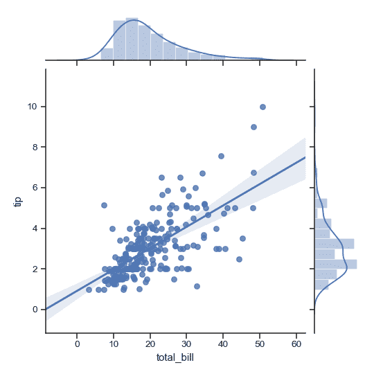
使用默认参数添加绘图:
>>> g = sns.JointGrid(x="total_bill", y="tip", data=tips)>>> g = g.plot(sns.regplot, sns.distplot)
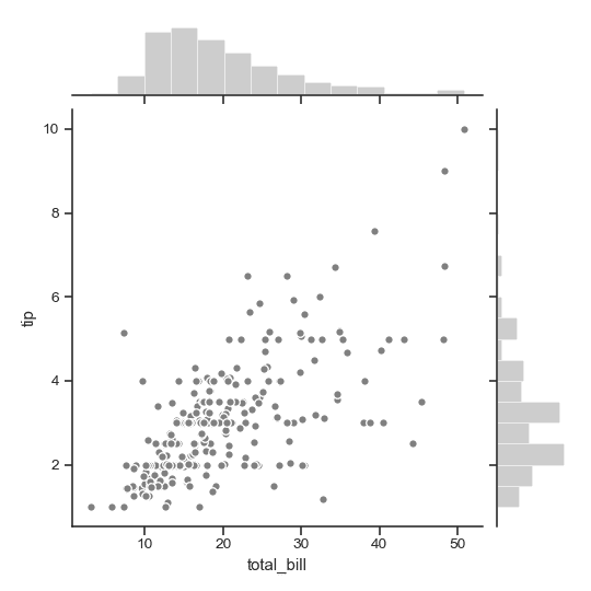
分别绘制联合分布图和边缘直方图,这可以以更精细的级别控制其他参数:
>>> import matplotlib.pyplot as plt>>> g = sns.JointGrid(x="total_bill", y="tip", data=tips)>>> g = g.plot_joint(plt.scatter, color=".5", edgecolor="white")>>> g = g.plot_marginals(sns.distplot, kde=False, color=".5")
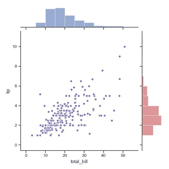
分别绘制两个边缘直方图:
>>> import numpy as np>>> g = sns.JointGrid(x="total_bill", y="tip", data=tips)>>> g = g.plot_joint(plt.scatter, color="m", edgecolor="white")>>> _ = g.ax_marg_x.hist(tips["total_bill"], color="b", alpha=.6,... bins=np.arange(0, 60, 5))>>> _ = g.ax_marg_y.hist(tips["tip"], color="r", alpha=.6,... orientation="horizontal",... bins=np.arange(0, 12, 1))
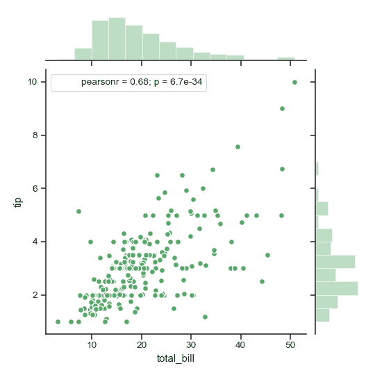
添加注释,其中包含总结双变量关系的统计信息:
>>> from scipy import stats>>> g = sns.JointGrid(x="total_bill", y="tip", data=tips)>>> g = g.plot_joint(plt.scatter,... color="g", s=40, edgecolor="white")>>> g = g.plot_marginals(sns.distplot, kde=False, color="g")>>> g = g.annotate(stats.pearsonr)
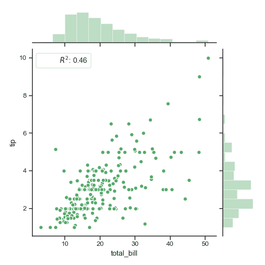
使用自定义的函数和注释格式
>>> g = sns.JointGrid(x="total_bill", y="tip", data=tips)>>> g = g.plot_joint(plt.scatter,... color="g", s=40, edgecolor="white")>>> g = g.plot_marginals(sns.distplot, kde=False, color="g")>>> rsquare = lambda a, b: stats.pearsonr(a, b)[0] ** 2>>> g = g.annotate(rsquare, template="{stat}: {val:.2f}",... stat="$R^2$", loc="upper left", fontsize=12)
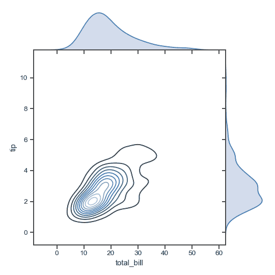
移除联合轴和边缘轴之间的空间:
>>> g = sns.JointGrid(x="total_bill", y="tip", data=tips, space=0)>>> g = g.plot_joint(sns.kdeplot, cmap="Blues_d")>>> g = g.plot_marginals(sns.kdeplot, shade=True)
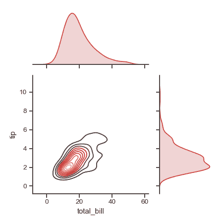
绘制具有相对较大边缘轴的较小图:
>>> g = sns.JointGrid(x="total_bill", y="tip", data=tips,... height=5, ratio=2)>>> g = g.plot_joint(sns.kdeplot, cmap="Reds_d")>>> g = g.plot_marginals(sns.kdeplot, color="r", shade=True)
设置轴的限制:
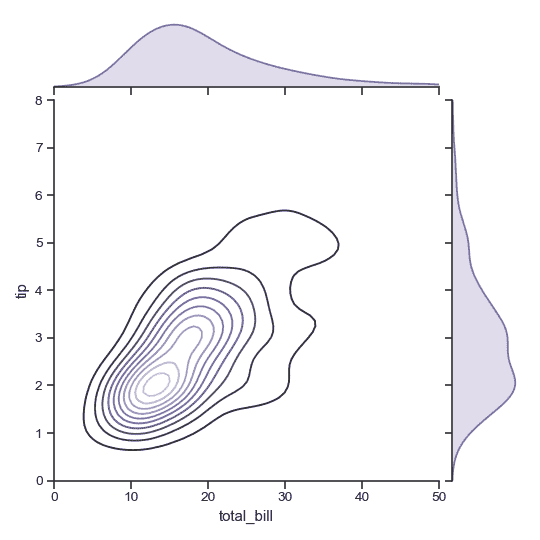
>>> g = sns.JointGrid(x="total_bill", y="tip", data=tips,... xlim=(0, 50), ylim=(0, 8))>>> g = g.plot_joint(sns.kdeplot, cmap="Purples_d")>>> g = g.plot_marginals(sns.kdeplot, color="m", shade=True)
方法
__init__(x, y[, data, height, ratio, space, …]) | 设置子图的网格设置子图的网格。
annotate(func[, template, stat, loc]) | 用关于关系的统计数据来标注绘图。
plot(joint_func, marginal_func[, annot_func]) | 绘制完整绘图的快捷方式。
plot_joint(func, **kwargs) | 绘制 x 和 y的双变量图。
plot_marginals(func, **kwargs) | 分别绘制 x 和 y 的单变量图。
savefig(args, *kwargs) | 封装 figure.savefig 默认为紧边界框。
set_axis_labels([xlabel, ylabel]) |在双变量轴上设置轴标签。

若有收获,就点个赞吧
0 人点赞
