- 原文出处:Ihadeed
- 作者:Ahmad Shadeed
- 时间:2020-03-31
- 译者:李尧
我是一个很好奇的人,经常喜欢开着浏览器开发者工具去看看网页是如何实现的。这是我第一次写这样的博客。我发现了一些 CSS 特性很有意思的用法 (至少对我来说是的),我想和你们分享一下。
Facebook 的新设计最近开始面向用户推出公测,我在大约两周前就收到了邀请。刚开始的时候,我自己看每个UI元素感觉都有点偏大,过了好几天才渐渐习惯了过来。下面,我会来讲述自己所看到的那些有趣的东西。
让我们开始吧!
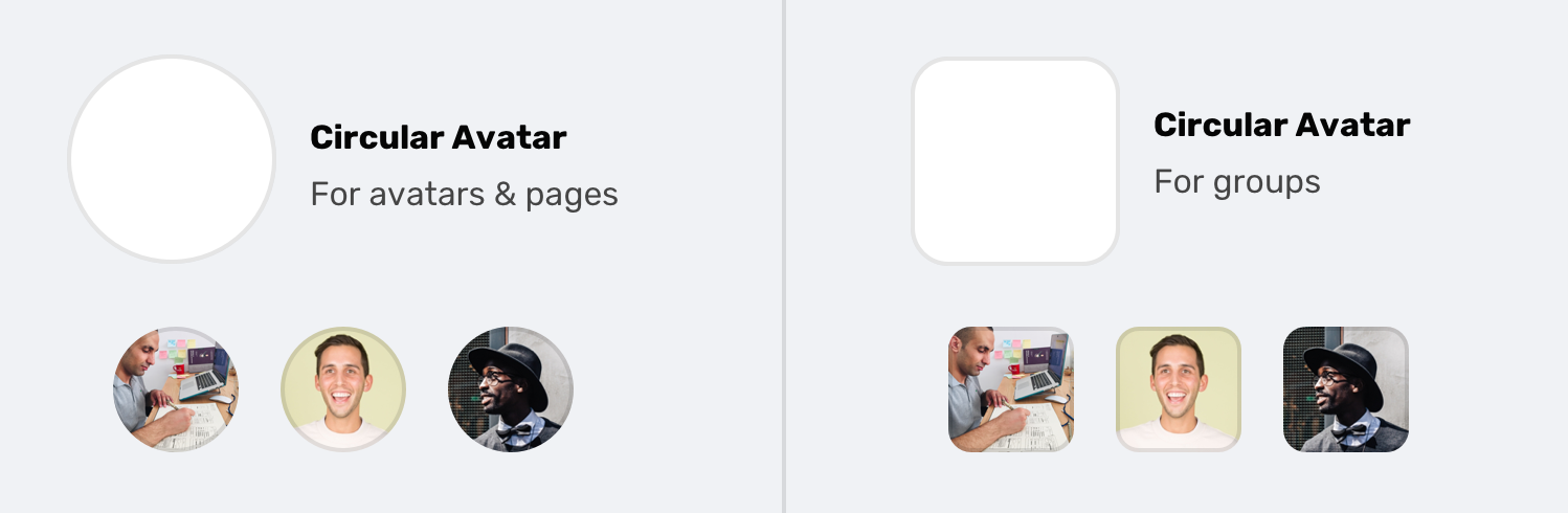
一、头像框使用SVG

△SVG 被用于头像框,比如个人资料中的照片、你的页面或你所在的组。
<svg role="none" style="height: 36px; width: 36px;"><mask id="avatar"><circle cx="18" cy="18" fill="white" r="18"></circle></mask><g mask="url(#avatar)"><image x="0" y="0" height="100%" preserveAspectRatio="xMidYMid slice" width="100%" xlink:href="avatar.jpg" style="height: 36px; width: 36px;"></image><circle cx="18" cy="18" r="18"></circle></g></svg>
我不禁问自己,他们为什么要在这里使用SVG呢?以下是我的想法:
- 头像框需要有一个带有半透明黑色 (10%) 的内边框,使得亮色的头像也能显示出一个圆型的轮廓,哪怕头像是全白底色的。
- HTML的
<img>标签是无法设置box-shadow属性的,于是他们使用 SVG 来解决它。 - 为了实现让图像显示为一个圆形的功能,他们使用了 SVG
<mask>和 SVG<image>元素。
正如我提到的,头像的内边框对于明亮的图像很有用,如下图所示。
▽ 内边框实现方式如下:
circle,
rect {
  stroke-width: 2;
  stroke: rgba(0, 0, 0, 0.1);
  fill: none;
}
如果图像是矩形的,则要使用的形状标签是 rect:
<svg role="none" style="height: 36px; width: 36px;">
  <mask id="avatar">
    <rect cy="18" fill="white" height="36" rx="8" ry="8" width="36" x="0" y="0"></rect>
  </mask>
  <g mask="url(#avatar)">
    <image x="0" y="0" height="100%" preserveAspectRatio="xMidYMid slice" width="100%" xlink:href="avatar.jpg" style="height: 36px; width: 36px;"></image>
    <rect cy="18" fill="white" height="36" rx="8" ry="8" width="36" x="0" y="0"></rect>
  </g>
</svg>
有趣的是,主页 feed 中的头像是使用 <img> 和 <div> 元素构建的透明内边框。见下文:
<div class="avatar-wrapper>
    <img class="avatar" width="40" height="40" src="avatar.jpg" width="40" alt="">
    <div class="avatar-outline"></div>
</div>
.avatar-wrapper {
    position: relative;
}
.avatar {
    display: block;
    border-radius: 50%;
}
.avatar-outline {
    position: absolute;
    left: 0;
    top: 0;
    width: 100%;
    height: 100%;
    box-shadow: inset 0 0 0 1px rgba(0, 0, 0, 0.1);
    border-radius: 50%;
}
由于 SVG 技术仅用于少数几个地方,我猜测使用 <img> 和 <div> 的原因与页面大小有关。如果 SVG 用于 feed 头像,这将导致用户在向下滚动时下载的数据量增加。
二、使用定格 Div 来代替 Margin
I wasn’t old enough to live in the days of spacer GIFS, but I saw something that I think is related to them. I will call it a spacer div, if that’s ok?
我未曾生活在定格动画的时代,但我看到了一些我认为与它们类似的东西。所以我先会称其为定格 Div,如果可以的话。
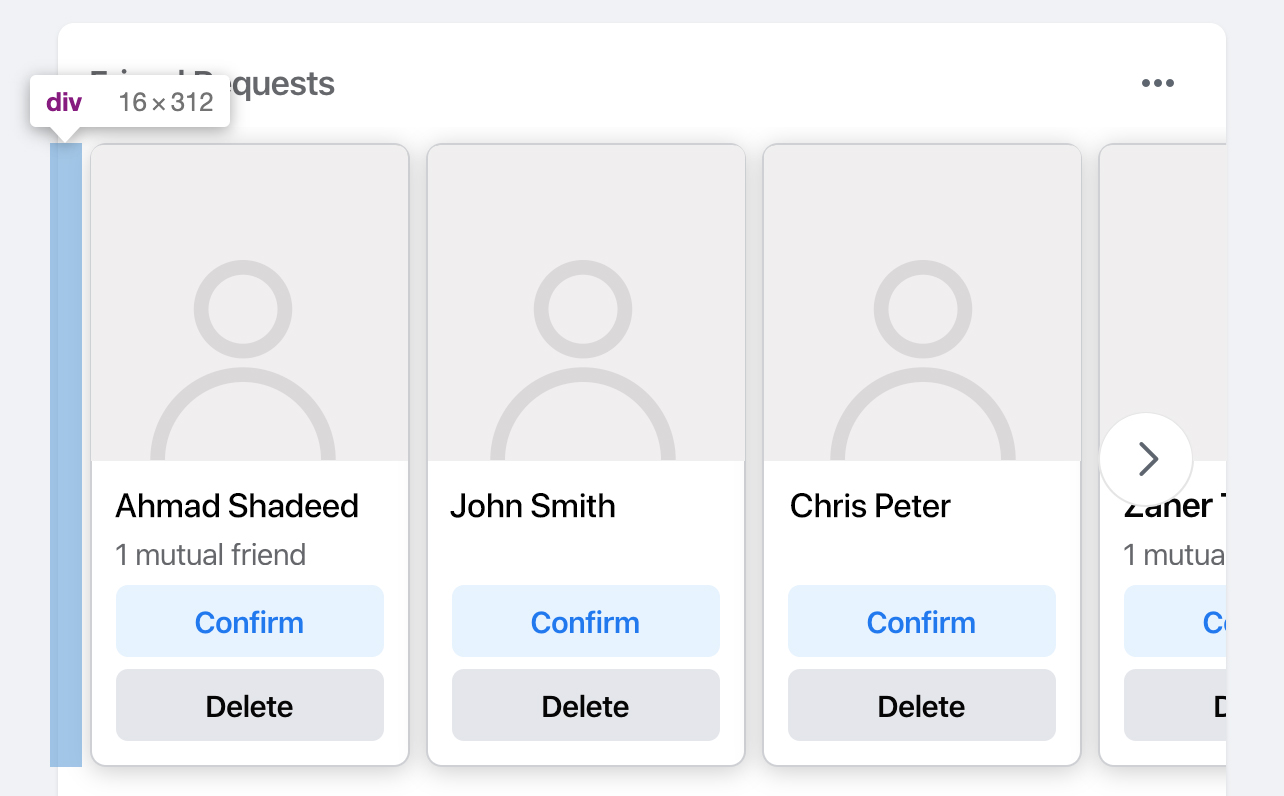
让我们先看看这里的上下文。上图是主页 feed 中随机出现的好友请求的一部分。这是一个人物的矩阵视图,这个矩阵需要从左边有一个边距。通常,我会按 margin-left: 16px 来做。然而,Facebook 添加了一个 <div> 作为容器边缘和矩阵之间的间隔。
我想知道原因是什么?
- 也许在他们所构建的设计系统中,一个容器元素,添加外边距是不被允许的?
- 也许这是一个React组件,可以通过为它指定宽度去用在任何一个地方?
为什么那里没有外边距?目前为止我所见到的,CSS (~ 10万行以上) 里都是实体类选择器,并且可以很容易地将一个类添加到包装器中去赋予它一个外边距。
三、使用 CSS 滤镜

你看到里面的四个图标了吗?加号和箭头是图像,而消息和通知是 SVG 元素。我不知道这种混合背后的原因是什么。
单击最后一个图标时,图标的颜色变为蓝色。我有点纳闷,当这只是一个图片时,颜色是如何改变的?也许图片在Hover时被改变了?不!我发现是一个 CSS 滤镜改变了图片的颜色。
.icon {
    filter: invert(39%) sepia(57%) saturate(200%) saturate(200%) saturate(200%) saturate(200%) saturate(200%) saturate(147.75%) hue-rotate(202deg) brightness(97%) contrast(96%)
}
Yes, this is a production code from Facebook.com. This is very weird for me. Is it that hard to replace this with an SVG icon and simply change the fill color?
This is also used for the verified account icon.
And also for the user profile links.
.icon {
    filter: invert(59%) sepia(11%) saturate(200%) saturate(135%) hue-rotate(176deg) brightness(96%) contrast(94%);
}

If you’re interested to learn more about how to convert a black image to any color using CSS filters, this answer is for you. Also, here is a tool by Barrett Sonntag for that purpose.
更新: 2020年4月3日

四、使用切图投影

The main header has a shadow which you might expect it was added via CSS box-shadow, correct? Well, the answer is no. They used a <div> with a background image that is repeating across the x-axis.
I downloaded the image they used to you can see it closely.
This is a 2px * 14px image that is being repeated. Not only that, there is a dedicated <div> for that shadow.What’s the point of using that?
Update: 3 April 2020
Royi Hagigi from Facebook confirmed that the reason behind using an image is for performance. It’s interesting that a tiny shadow causes such performance issues.
When Royi was asked about how they tested this, he answered:
I totally agree.
Using CSS Variables Extensively
I liked that they used CSS variables. From what I saw, there are 320+ variables added to the :root element. Those values are used for the dark mode as well.
When the dark mode is toggled, the class __fb-dark-mode is added to the HTML element. Once added, it overrides all the variables defined in the :root as below:
:root {
    /* Light mode variables */
    -fds-active-icon:  #3578E5;
    --fds-attachment-footer-background:  #F2F3F5;
    --fds-blue-05:  #ECF3FF;
    --fds-blue-30:  #AAC9FF;
    --fds-blue-40:  #77A7FF;
}
.__fb-dark-mode:root, .__fb-dark-mode {
    /* Override the light variables */
    --fds-active-icon:  black;
    --fds-attachment-footer-background:  black;
    --fds-blue-05:  black;
    --fds-blue-30:  black;
    --fds-blue-40:  black;
}
Here is a video when the class is toggled. I recommend to view it full screen!
线夹 (截断多行文本)

On the sidebar, there is a list of links like the user profile, most recent, memories.. etc. What I noticed there is the use of multi-line text truncating.
.element {
    display: -webkit-box;
    -webkit-box-orient: vertical;
    -webkit-line-clamp: 2;
}
The above styles are added as inline styles, and they also change based on the browser. See the below mockup:
The browser support is fairly good for this CSS feature. As per CanIUse, all major browser supports that feature but with a prefix. You can learn more about it from this article by CSS Tricks.
Using Divs For Hover Effects
Usually, we do hover effects in CSS. For example, a button that needs a different grey shade on hover, we simply use the following:
.element:hover {
    background: #ccc;
}
However, it seems that for a large website like Facebook, this is not practical. While testing and inspecting things, I noticed an element that is shown only on hover, and its main job is to act is a hover element.
.hover-div {
    position: absolute;
    right: 0;
    left: 0;
    top: 0;
    bottom: 0;
    pointer-events: none;
    border-radius: 6px;
    inset: 4px 0px;
    background-color: var(--hover-overlay);
    transition-property: opacity;
    transition-timing-function: var(--fds-animation-fade-out);
    cursor: pointer;
}
This element is being toggled in JavaScript to change the opacity from 0 to 1, so I played with it a bit and discovered that it’s being used heavily for a lot of components. See the collection of screenshots below for where this element is being used:
I like the consistency and simplicity of having the same hover effect for a lot of elements. If that means anything, it means that the design language is consistent and the system was carefully designed. Well done, Facebook!
Using Inset Property
It’s a shorthand that for the top, right, bottom, and left properties. It can be used like this:
.element {
    inset: 4px 0;
    /* Which is equivalent to: top: 4px, bottom: 4px, left: 0, right: 0 */
}
The inset property is used on the hover div for some elements, and it’s being added inline in HTML. I noticed it on the component below: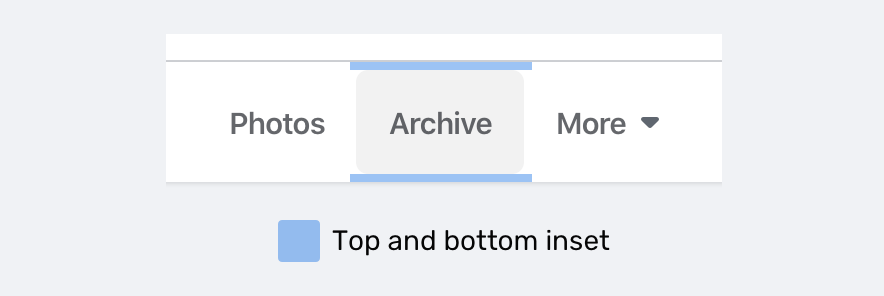
At the time of writing, inset is supported only in Firefox 66+ as per CanIUse.
Dir=Auto And CSS Logical Properties
For a multilingual website like Facebook, it’s sometimes hard to expect how the content will be. For example, the user name in the post component has dir="auto" attribute. It means that the direction of the text will be based on the language. For example, it will be left-to-right for English, and right-to-left for Arabic.
Adding on that, there is an inline CSS that changes the text direction (It looks like dir=auto is not enough.
<div dir="auto" style="text-align: start;">محتوى بالعربية</div>
Notice that text-align: start is added on the element. This is a CSS logical property which equivalent to text-align: right for LTR layouts.
If you’re interested to dig more in RTL styling, I wrote a detailed guide about that.
Dynamic Cover Photo Background

Do you notice that there is a gradient with a color similar to the main color in the cover photo? This is added dynamically based on the cover photo. How it works?
1. Get The Dominant Color
At first, we need to get the dominant (the most used) color in the cover photo. Once it’s there, the team created a small cover photo with that color only.
2. Add A Background That Is Using The Dominant Color

The background added for the element is from the dominant color. I highlighted the original cover photo in a white border for clarifying purposes.
3. Add A Gradient Above The Background
.element {
    background-image: linear-gradient(to top, #FFFFFF, rgb(255, 255, 255), rgba(255,255,255,0.7), rgba(255,255,255,0.4), rgba(255,255,255,0));
}

And when the design is dark, the gradient is flipped from white to black:
.element {
    background-image: linear-gradient(to top, #000, rgb(0, 0, 0), rgba(0,0,0,0.7), rgba(0,0,0,0.4), rgba(0,0,0,0));
}
Hint: you can use this tool to get the dominant color from an image.
Multiple Box Shadows

I liked how the team created a shadow for elements like dropdown menus for example. The shadow make you feel that it has depth and it’s far more real than just sticking with a regular shadow.
.element {
    box-shadow: 0 12px 28px 0 rgba(0, 0, 0, 0.2), 0 2px 4px 0 rgba(0, 0, 0, 0.1), inset 0 0 0 1px rgba(255, 255, 255, 0.5);
}
你可能会想,为什么会有一个 50% 透明白色的嵌入式阴影?嗯,那是黑暗模式。有关嵌入阴影的放大图像,请参见下文:
Clever one, I liked it!
Empty Elements For Flexbox Grids
I noticed that all the grids in website are using flexbox. There is one that caught my attention which is “Your Photos” section.
.wrapper {
    display: flex;
    flex-wrap: wrap;
    justify-items: space-between;
}
.item {
    width: 205px;
}
That sounds cool, right? Using space-between for the spacing is risky, because it can fail in cases like having only three photos. See the mockup below how it failed: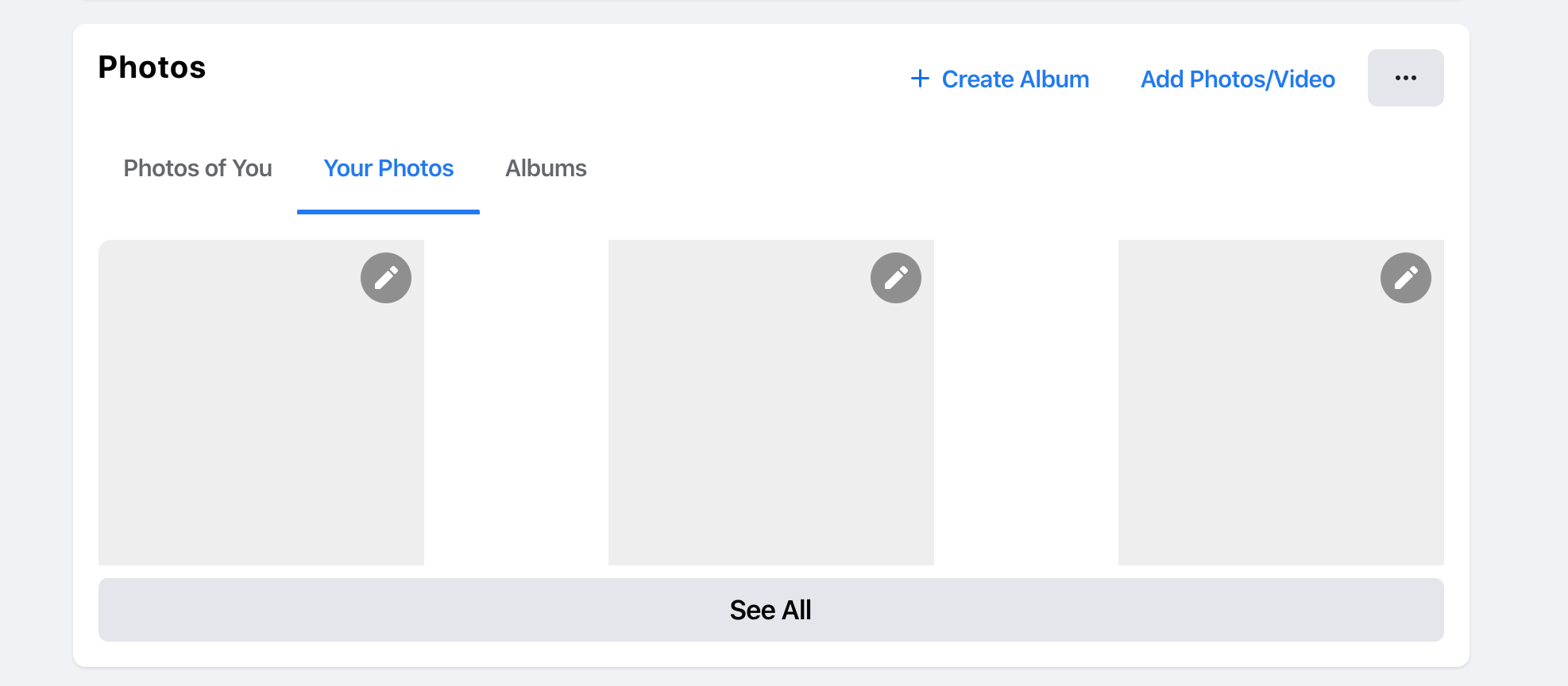
How did they fix such an issue? Well, there are four empty <div> elements with a width equal to each photo. The HTML looks like this:
<div class="wrapper">
    <div class="item"><a href="#"><img src="photo.jpg"></a></div>
    <div class="item"><a href="#"><img src="photo.jpg"></a></div>
    <div class="item"><a href="#"><img src="photo.jpg"></a></div>
    <div class="item"><a href="#"><img src="photo.jpg"></a></div>
    <div class="empty"></div>
    <div class="empty"></div>
    <div class="empty"></div>
    <div class="empty"></div>
</div>
That way, those empty divs will act as a fake item and they will keep the spacing equal between the items.
使用垂直媒体查询
For me, it’s rare to see a use for vertical media queries in the wild. I liked that they used one to shorten the width of the news feed in the home page. Here is the CSS used:
@media (min-height: 700px) {
    .element {
        width: 584px;
    }
}
That’s all, folks. I enjoyed working on this article and learned a lot. I hope you find it useful, and please spread the world if you like it.

若有收获,就点个赞吧
0 人点赞
