LazyLoad 组件
先去配置中修改属性:dynamicImport: true,
该属性主要是配置按需加载的问题
主要用到 react 中的两个东西:
- lazy 方法
- Suspense 标签
调用 react 中的 lazy方法,该方法接收一个调用 import 方法的回调函数并且返回一个 Promise 对象
Suspense 标签接收一个 fallback 参数,fallback 是在子组件未解析完前执行的,主要是在里面渲染一些 loading 的效果。
index
import React, { lazy, Suspense } from 'react'// import Demo from './demo'const Demo = lazy(() => import('./demo'))const Index = () => {return (<div><Suspense fallback={<h1>loading...</h1>}><Demo /></Suspense></div>)}export default Index
demo
import React from 'react'function Demo() {return <div>demo</div>}export default Demo
当然现在的网络环境,直接显示效果是没有这么明显的。想要看到明显loading的效果:
- 直接在控制台中设置网络为节流模式
懒加载的主要目的是优化前端性能,减少请求或延迟请求数,常用有这么几种方法:
- 使用
setTimeout或setInterval纯粹的延迟加载 - 条件加载,符合某些条件或者触发了某些事件再开始异步加载
- 可视区加载,即利用监控导航条来加载可以看到的区域
这里是第一种
import React, { lazy, Suspense, useState, useEffect } from 'react'const LazyLoad = props => {const _renderLazy = () => {let Lazyconst { component, delay, ...restProps } = propsif (!component || component.constructor.name !== 'Promise') {Lazy = import('./error')}Lazy = lazy(() => {return new Promise((resolve, reject) => {setTimeout(() => {resolve(component)})}, delay || 300)})return <Lazy {...restProps} />}return (<div><Suspense fallback={<h5>loading...</h5>}>{_renderLazy()}</Suspense></div>)}export default LazyLoad
ErrorBoundary 组件
对组件进行错误处理
在实际项目当中会遇到因为某些错误导致页面直接报错、白屏的问题,这会带来很不好的开发体验或是差劲的用户体验。
针对错误处理,react 提供了两个构造函数
官网中文文档|错误边界
- getDerivedStateFromError 他只能检测父组件中子组件发生的错误,而不能检测自身发生的错误。
- componentDidCatch ```jsx import React, { Component } from ‘react’
export default class ErrorBoundary extends Component { constructor(props) { super(props) this.state = { flag: false, } }
static getDerivedStateFromError(error) { console.log(‘eee’, error) return { flag: true, } }
/* error: 抛出的错误
- info: 带有 componentStack key 的对象,其中包含有关组件引发错误的栈信息
在这其中做日志相关的操作,因为其返回的信息会相对来说比较全面一点
*/
componentDidCatch(error, info) {}
render() {
return (
{this.state.flag ? () } }
) : (<h1>发生了未料到的错误,请稍微再刷新试试</h1>
)}this.props.children
当这个组件并不是处理错误信息的万能方法,当遇到类似点击事件引发的错误时以及一些异步函数内部导致的错误时,就无法进行检测。<a name="TCYLH"></a>### Modal 组件基于 `[createPotal](https://zh-hans.reactjs.org/docs/react-dom.html#createportal)` 这个api> 创建 portal。[Portal](https://zh-hans.reactjs.org/docs/portals.html) 将提供一种将子节点渲染到 DOM 节点中的方式,该节点存在于 DOM 组件的层次结构之外。可以借此用来处理自定义弹窗、输入框以及对话框等场景。<br />**CreateProtal**```jsximport React, { useEffect } from 'react'import ReactDOM from 'react-dom'const CreatePortal = props => {const { children } = propsconst body = document.querySelector('body')const el = document.createElement('div')useEffect(() => {el.setAttribute('id', 'portal-root')body.appendChild(el)return () => {body.removeChild(el)}}, [body, el])return ReactDOM.createPortal(children, el)}export default CreatePortal
Modal
import React from 'react'import CreateProtal from '../CreatePortal'import { Icon } from 'antd-mobile'const Styles = {modal: {position: 'relative',top: '0',left: '0',zIndex: '999',},body: {backgroundColor: '#fff',position: 'fixed',height: '100%',width: '100%',top: '0',left: '0',display: 'flex',alignItems: 'center',justifyContent: 'center',},close: {position: 'fixed',top: '10px',right: '10px',},}const Modal = props => {const { children, show } = propsconst handleClose = () => {const { onClose } = propsonClose && onClose()}return (<>{show ? (<CreateProtal style={Styles.modal}><div style={Styles.body}>{children}<Icontype="cross"size="lg"style={Styles.close}onClick={handleClose}/></div></CreateProtal>) : null}</>)}export default Modal
测试
import React, { useState } from 'react'// import CreateProtal from '@/components/CreatePortal'import Modal from '../../../components/Modal'import { Button } from 'antd-mobile'const Index = () => {const [show, setShow] = useState(false)const handleClick = () => {setShow(true)}const handleClose = () => {setShow(false)}return (<div><Button type="primary" onClick={handleClick}>modal</Button><Modal show={show} onClose={handleClose}>modal</Modal></div>)}export default Index
效果: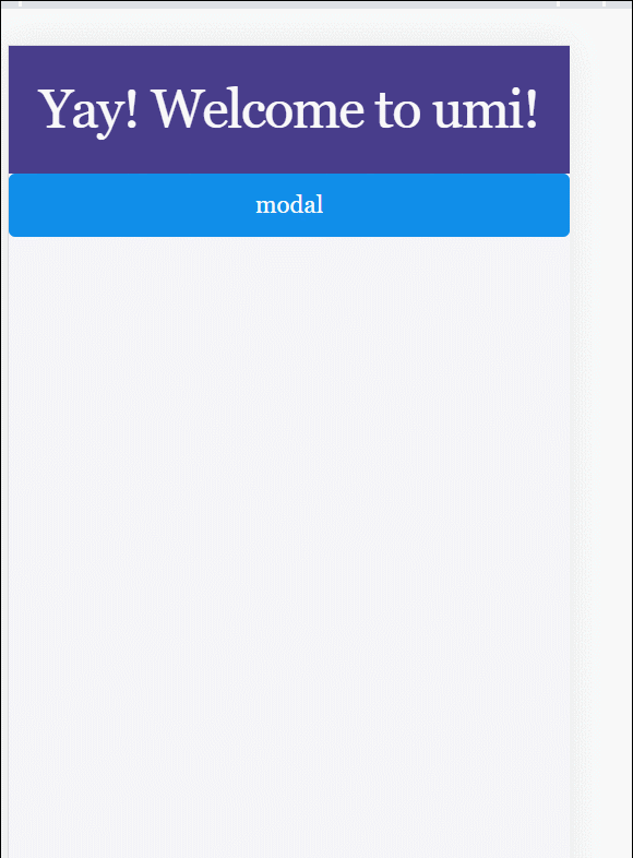

若有收获,就点个赞吧
0 人点赞
