可通过Theme.of获取ThemeData对象。也可以指定主题应用于Theme的后代组件。
相关组件
文字样式-ThemeData#TextTheme
子组件可以通过ThemeData.of获取主题的数据进行使用。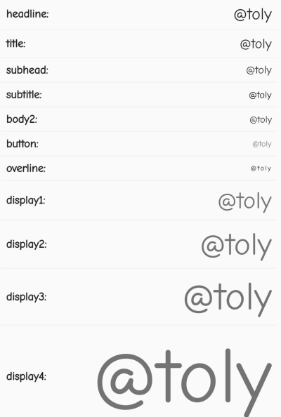
import 'package:flutter/material.dart';class TextThemeDemo extends StatelessWidget {@overrideWidget build(BuildContext context) {var queryData = Theme.of(context).textTheme;var styles = {"headline: ": queryData.headline,"title: ": queryData.title,"subhead: ": queryData.subhead,"subtitle: ": queryData.body1,"body2: ": queryData.body2,"button: ": queryData.button,"overline: ": queryData.overline,"subtitle: ": queryData.subtitle,"button: ": queryData.caption,"display1: ": queryData.display1,"display2: ": queryData.display2,"display3: ": queryData.display3,"display4: ": queryData.display4,};return Container(child: Column(children: styles.keys.map((e) => buildItem(e, styles[e])).toList(),),);}Widget buildItem(String e, TextStyle style) => Column(children: <Widget>[Padding(padding: const EdgeInsets.all(8.0),child: Row(mainAxisAlignment: MainAxisAlignment.spaceBetween,children: <Widget>[Text(e,style: TextStyle(fontSize: 16, fontWeight: FontWeight.bold),),Text("@toly",style: style,)],),),Divider(height: 1,)],);}
Theme的用法
使用Theme,可以指定非常多的属性作为主题,这些属性将应用于所有的后代组件,如指定字体、滑块、卡片、文字、分割线、按钮等属性。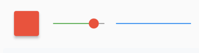
import 'package:flutter/material.dart';
class CustomTheme extends StatelessWidget {
  @override
  Widget build(BuildContext context) {
    return Theme(
        data: ThemeData(
            cardTheme: CardTheme(color: Colors.red, elevation: 4),
            dividerTheme: DividerThemeData(
                color: Colors.blue,
                thickness: 2
            ),
            sliderTheme: SliderThemeData(
              thumbColor: Colors.red,
              activeTrackColor: Colors.green,
              inactiveTrackColor: Colors.grey,
            )),
        child: Wrap(
            crossAxisAlignment: WrapCrossAlignment.center,
            children: <Widget>[
              Card(
                child: Container(
                  width: 50,
                  height: 50,
                  color: Colors.transparent,
                ),
              ),
              Container(
                  width: 150,
                  child: Slider(value: 0.8, onChanged: (v) => {})),
              Container(  width: 150,child: Divider())
            ]));
  }
}

若有收获,就点个赞吧
0 人点赞
