- Using State in Jetpack Compose
- Using State in Jetpack Compose
- About this codelab
- What you’ll learn
- What you’ll need
- What you’ll build
- Open Project into Android Studio
- Exploring the start code
- The UI update loop
- Unstructured state
- Using Unidirectional Data Flow
- Explore TodoScreen composables
- Define TodoActivityScreen composable
- Flow the events up
- Pass the state down
- Run the app again
- Disheveled Design
- Adding random to a composable
- Exploring recomposition
- Introducing memory to composable functions
- Making remembered values controllable
- Create a stateful TextField composable
- Try out TodoItemInput
- Make the button click add an item
- Run it again
- Code cleanup
- Derive iconsVisible from state
- Update the event to use icon
- Finish the design with an imeAction
- Run the app again to try out the new icons
- Convert TodoInputItem to a stateless composable
- Run the application again
- Convert TodoViewModel to use mutableStateOf
- Update TodoActivityScreen to use the new ViewModel
- Define editor state
- Define editor events
- End editing when removing items
- Run the app again
- Add a test to TodoViewModelTest
- Pass the state and events to TodoScreen
- Define a inline editor composable
- LazyColumnFor)">Use the inline editor in LazyColumnFor)
- Try out the new interactive editor!
- Swap the header when editing
- Run the app again
- Define a slot on
TodoItemInput - Display the content of
buttonSlot - Update stateful
TodoItemEntryInputto use the slot - Update
TodoItemInlineEditorto use the slot - Run the app again
- What’s next?
- Sample apps">Sample apps
- Reference docs

Using State in Jetpack Compose
- Introduction
- Getting set up
- Understanding Unidirectional Data Flow
- Compose and ViewModels
- Memory in Compose
- State in Compose
- Dynamic UI based on state
- Extracting stateless composables
- Use State in ViewModel
- Test State in ViewModel
- Reuse stateless composables
- Use slots to pass sections of the screen
- Congratulations
bug_report Report a mistakeclosemenu
Using State in Jetpack Compose
_access_time_77 mins remainingUsing State in Jetpack Compose
About this codelab
subject上次更新时间:11月 12, 2020_account_circle_Sean McQuillan 编写
- Introduction
In this codelab you’ll learn about state and how it can be used and manipulated by Jetpack Compose.
Before we dive in, it’s useful to define what exactly state is. At its core, state in an application is any value that can change over time. This is a very broad definition, and encompases everything from a Room database to a variable on a class.
State in an application is any value that can change over time.
For example it may be a value stored in a Room database, a variable on a class, or even the current value read from an accelerometer.
All Android applications display state to the user. A few examples of state in Android applications:
- A Snackbar that shows when a network connection can’t be established
- A blog post and associated comments
- Ripple animations on buttons that play when a user clicks
- Stickers that a user can draw on top of an image
In this codelab you will explore how to use and think about state when using Jetpack Compose. To do this, we will build a TODO application. At the end of this codelab you’ll have built a stateful UI that displays an interactive, editable, TODO list.

In the next section you’ll learn about Unidirectional Data Flow – a design pattern that is core to understanding how to display and manage state when using Compose.
What you’ll learn
- What is unidirectional data flow
- How to think about state and events in a UI
- How to use Architecture Component’s
ViewModelandLiveDatain Compose to manage state - How Compose uses state to draw a screen
- When to move state to a caller
- How to use internal state in Compose
- How to use
State<T>to integrate state with Compose
What you’ll need
- The latest Android Studio 4.2
- Knowledge of Kotlin
- Consider taking the Jetpack Compose basics codelab before this codelab
- Basic understanding of Compose (such as the
@Composableannotation) - Basic familiarity with Compose layouts (e.g. Row and Column)
- Basic familiarity with modifiers (e.g. Modifier.padding)
- Basic understanding of Architecture Component’s
ViewModelandLiveData
What you’ll build
- An interactive TODO app using unidirectional data flow in compose
- Getting set up
This codelab requires the latest Android Studio 4.2
Download Android Studio 4.2 on the canary channel.
To download the sample app, you can either:
… or clone the GitHub repository from the command line by using the following command:
git clone https://github.com/googlecodelabs/android-compose-codelabs.gitcd android-compose-codelabs/StateCodelab
The compose-codelabs repo contains starter code for all codelabs in the pathway.
For this codelab, use the StateCodelab project.
 StateCodelab — Project that contains the start and finished code for this codelab
This directory contains the start and finished code for this codelab. In the Project view on the left of Android Studio you will find two modules.
 start – the starter code for this project, you will make changes to this to complete the codelab
- finished – the completed code for this codelab
At any time you can run either module in Android Studio by changing the run configuration in the toolbar.

Open Project into Android Studio
- On the Welcome to Android Studio window select
 Open an Existing Project
 - Select the folder
[Download Location]/StateCodelab(tip: make sure you select theStateCodelabdirectory containingbuild.gradle) - When Android Studio has imported the project, test that you can run the
startandfinishedmodules.
The start module will display an empty screen when you first download the sample.
Exploring the start code
The start code contains four packages:
examples– Example Activities for exploring the concepts of unidirectional data flow. You will not need to edit this package.ui– Contains themes auto-generated by Android Studio when starting a new compose project. You will not need to edit this package.util– Contains helper code for the project. You will not need to edit this package.todo– The package containing the code for the Todo screen we are building. You will be making modifications to this package.
This codelab will focus on the files in the todo package. In the start module there are several files to become familiar with.
Provided files in todo package
Data.kt– Data structures used to represent aTodoItemTodoComponents.kt– Reusable composables that you will use to build the Todo screen. You will not need to edit this file.
Files you will edit in todo package
TodoActivity.kt– Android Activity that will use Compose to draw a Todo screen after you’re done with this codelab.TodoViewModel.kt– AViewModelthat you will integrate with Compose to build the Todo screen. You will connect it to Compose and extend it to add more features as you complete this codelab.TodoScreen.kt– Compose implementation of a Todo screen that you will build during this codelab.
- Understanding Unidirectional Data Flow
This section is an introduction to the concept of unidirectional data flow using the Android view system.
If you’re already familiar with unidirectional data flow and how it can be used to structure code feel free to skip to the next section.
The UI update loop
Before we get to our TODO app, let’s explore the concepts of unidirectional data flow using the Android view system.
What causes state to update? In the introduction we talked about state as any value that changes over time. This is only part of the story of state in an Android application.
In Android apps, state is updated in response to events. Events are inputs generated from outside our application, such as the user tapping on a button calling an OnClickListener, a EditText calling afterTextChanged, or an accelerometer sending a new value.
Events notify a part of a program that something has happened.
For example, a user pressing a button will call a click event.
In all Android apps, there’s a core UI update loop that goes like this:

- Event – An event is generated by the user or another part of the program
- Update State – An event handler changes the state that is used by the UI
- Display State – The UI is updated to display the new state
Managing state in Compose is all about understanding how state and events interact with each other.
Unstructured state
Before we get to Compose, let’s explore events and state in the Android view system. As a “Hello, World” of state we are going to build a hello world Activity that allows the user to input their name.

One way we could write this is to have the event callback directly set the state in the TextView, and the code, using ViewBinding, might look something like this:
The code for this section is already complete in the examples package.
You don’t need to make any changes to the source code in this section.
HelloCodelabActivity.kt
class HelloCodelabActivity : AppCompatActivity() {

   private lateinit var binding: ActivityHelloCodelabBinding
   var name = ""

   override fun onCreate(savedInstanceState: Bundle?) {
       /* ... */
       binding.textInput.doAfterTextChanged {text ->
           name = text.toString()
           updateHello()
       }
   }

   private fun updateHello() {
       binding.helloText.text = "Hello, $name"
   }
}
This code shows unstructured state stored in an Activity.
Code like this does work, and for a small example like this it’s fine. However, it tends to become hard to manage as the UI grows.
As you add more events and state to an Activity built like this several problems can arise:
- Testing – since the state of the UI is interwoven with the
Viewsit can be difficult to test this code. - Partial state updates – when the screen has many more events, it is easy to forget to update part of the state in response to an event. As a result the user may see an inconsistent or an incorrect UI.
- Partial UI updates – since we’re manually updating the UI after each state change, it’s very easy to forget this sometimes. As a result the user may see stale data in their UI that randomly updates.
- Code complexity – it’s difficult to extract some of the logic when coding in this pattern. As a result, code has a tendency to become difficult to read and understand.
Using Unidirectional Data Flow
To help fix these problems with unstructured state, we introduced Android Architecture Components which contain ViewModel and LiveData.
A ViewModel lets you extract state from your UI and define events that the UI can call to update that state. Let’s look at the same Activity written using a ViewModel.

HelloCodelabActivity.kt
class HelloCodelabViewModel: ViewModel() {

   // LiveData holds state which is observed by the UI
   // (state flows down from ViewModel)
   private val _name = MutableLiveData("")
   val name: LiveData<String> = _name

   // onNameChanged is an event we're defining that the UI can invoke
   // (events flow up from UI)
   fun onNameChanged(newName: String) {
       _name.value = newName
   }
}

class HelloCodeLabActivityWithViewModel : AppCompatActivity() {
   val helloViewModel by viewModels<HelloCodelabViewModel>()

   override fun onCreate(savedInstanceState: Bundle?) {
       /* ... */

       binding.textInput.doAfterTextChanged {
           helloViewModel.onNameChanged(it.toString())
       }

       helloViewModel.name.observe(this) { name ->
           binding.helloText.text = "Hello, $name"
       }
   }
}
In this example, we moved the state from the Activity to a ViewModel. In a ViewModel, state is represented by LiveData. A LiveData is an observable state holder, which means that it provides a way for anyone to observe changes to the state. Then in the UI we use the observe method to update the UI whenever the state changes.
An observable is any state object that provides a way for anyone to listen for changes to that state.
For example, LiveData, StateFlow, Flow, and Observable are all observable.
The ViewModel also exposes one event: onNameChanged. This event is called by the UI in response to user events, such as what happens here whenever the EditText‘s text changes.
Going back to the UI update loop we talked about earlier we can see how this ViewModel fits together with events and state.
- Event –
onNameChangedis called by the UI when the text input changes - Update State –
onNameChangeddoes processing, then sets the state of_name - Display State –
name‘s observer(s) are called, which notifies the UI of state changes
By structuring our code this way, we can think of events flowing “up” to the ViewModel. Then, in response to events the ViewModel will do some processing and possibly update state. When the state is updated it flows “down” to the Activity.

This pattern is called unidirectional data flow. Unidirectional data flow is a design where state flows down and events flow up. By structuring our code this way we gain a few advantages:
- Testability – by decoupling state from the UI that displays it, it’s easier to test both the ViewModel and the Activity
- State encapsulation – because state can only be updated in one place (the
ViewModel), it’s less likely that you’ll introduce a partial state update bug as your UI grows - UI consistency – all state updates are immediately reflected in the UI by the use of observable state holders
So, while this approach does add a bit more code – it tends to be easier and more reliable to handle complex state and events using unidirectional data flow.
Unidirectional data flow is a design where events flow up and state flows down.
For example, in a ViewModel events are passed up with method calls from the UI while state flows down using LiveData.
It’s not just a term to describe ViewModel – any design where events flow up and state goes down is unidirectional.
In the next section we’ll see how to use unidirectional data flow with Compose.
- Compose and ViewModels
In the last section we explored unidirectional data flow in the Android View system using ViewModel and LiveData. Now we’re going to move into Compose and explore how to use unidirectional data flow in Compose using ViewModels.
If you skipped the last section, we defined these terms:
- State – any value that can change over time
- Event – notify a part of a program that something has happened
- Unidirectional data flow – a design where events flow up and state flows down
At the end of this section you’ll have built this screen:

Explore TodoScreen composables
The code you downloaded contains several composables that you’ll use and edit throughout this codelab.
The composables in the downloaded project are split into two files that you can explore as you work the codelab.
TodoScreen.kt– These composables interact directly with state and we will be editing this file as we explore state in compose.TodoComponents.kt– These composables define reusable bits of UI that we will use to build theTodoScreen. You do not need to edit these composables to complete this codelab.
This file division is a bit arbitrary to focus the code in TodoScreen.kt on state. In practice these composables might go in the same file, or be spread across several files depending on how you use them in your project.
Open up TodoScreen.kt and take a look at the existing TodoScreen composable:
TodoScreen.kt
@Composable
fun TodoScreen(
   items: List<TodoItem>,
   onAddItem: (TodoItem) -> Unit,
   onRemoveItem: (TodoItem) -> Unit
) {
   /* ... */
}
Right now, nothing is displayed if you run the app.
Later in this section, you will write the code to call TodoScreen from TodoActivity.
To see what this composable displays, use the preview pane in Android Studio by clicking on the split icon in the top right corner  .
.

This composable displays an editable TODO list, but it doesn’t have any state of its own. Remember, state is any value that can change – but none of the arguments to TodoScreen can be modified.
items– an immutable list of items to display on the screenonAddItem– an event for when the user requests adding an itemonRemoveItem– an event for when the user requests removing an item
In fact, this composable is stateless. It only displays the items list that was passed in and has no way to directly edit the list. Instead, it is passed two events onRemoveItem and onAddItem that can request changes.
A stateless composable is a composable that cannot directly change any state.
This raises the question: if it’s stateless how can it display an editable list? It does that by using a technique called state hoisting. State hoisting is the pattern of moving state up to make a component stateless. Stateless components are easier to test, tend to have fewer bugs, and open up more opportunities for reuse.
It turns out the combination of these parameters works to allow the caller to hoist state out of this composable. To see how this works go let’s explore the UI update loop of this composable.
- Event – when the user requests an item be added or removed
TodoScreencallsonAddItemoronRemoveItem - Update state – the caller of
TodoScreencan respond to these events by updating state - Display state – when the state is updated,
TodoScreenwill be called again with the newitemsand it can display them on screen
The caller is responsible for figuring out where and how to hold this state. It can store items however makes sense, for example in memory or read them from a Room database. TodoScreen is completely decoupled from how the state is managed.
State hoisting is a pattern of moving state up to make a component stateless.
When applied to composables, this often means introducing two parameters to the composable.
value: T– the current value to displayonValueChange: (T) -> Unit– an event that requests the value to change, whereTis the proposed new value
Define TodoActivityScreen composable
Open up TodoViewModel.kt and find an existing ViewModel that defines one state variable and two events.
TodoViewModel.kt
class TodoViewModel : ViewModel() {

   // state: todoItems
   private var _todoItems = MutableLiveData(listOf<TodoItem>())
   val todoItems: LiveData<List<TodoItem>> = _todoItems

   // event: addItem
   fun addItem(item: TodoItem) {
        /* ... */
   }

   // event: removeItem
   fun removeItem(item: TodoItem) {
        /* ... */
   }
}
We want to use this ViewModel to hoist the state from TodoScreen. When we’re done, we’ll have created a unidirectional data flow design that looks like this:

To get started integrating TodoScreen into TodoActivity, open up TodoActivity.kt and define a new @Composable function TodoActivityScreen(todoViewModel: TodoViewModel) and call it from setContent in onCreate.
In the rest of this section we will build the TodoActivityScreen one step at a time. You can start by calling TodoScreen with fake state and events like this:
TodoActivity.kt
class TodoActivity : AppCompatActivity() {

   val todoViewModel by viewModels<TodoViewModel>()

   override fun onCreate(savedInstanceState: Bundle?) {
       super.onCreate(savedInstanceState)
       setContent {
           StateCodelabTheme {
               Surface {
                   TodoActivityScreen(todoViewModel)
               }
           }
       }
   }
}

@Composable
private fun TodoActivityScreen(todoViewModel: TodoViewModel) {
   val items = listOf<TodoItem>() // in the next steps we'll complete this
   TodoScreen(
       items = items,
       onAddItem = { }, // in the next steps we'll complete this
       onRemoveItem = { } // in the next steps we'll complete this
   )
}
What is StateCodelabTheme and Surface?
That’s the default theme that was created by Android Studio when starting a new Compose project. To learn more about theming in compose check out Compose Theming guide
The Surface adds a background to the app, and configures the color of text.
This composable will be a bridge between the state stored in our ViewModel and the TodoScreen composable that’s already defined in the project. You can change TodoScreen to take the ViewModel directly, but then TodoScreen would be a bit less reusable. By preferring simpler parameters such as List<TodoItem>, TodoScreen is not coupled to the specific place that state is hoisted.
If you run the app right now, you’ll see that it displays a button but clicking it doesn’t do anything. This is because we haven’t yet connected our ViewModel to TodoScreen.

Flow the events up
Now that we have all the components we need – a ViewModel, a bridge composable TodoActivityScreen, and TodoScreen, let’s wire everything together to display a dynamic list using unidirectional data flow.
In TodoActivityScreen pass addItem and removeItem from the ViewModel.
TodoActivity.kt
@Composable
private fun TodoActivityScreen(todoViewModel: TodoViewModel) {
   val items = listOf<TodoItem>()
   TodoScreen(
       items = items,
       onAddItem = { todoViewModel.addItem(it) },
       onRemoveItem = { todoViewModel.removeItem(it) }
   )
}
The events passed to TodoScreen use the Kotlin lambda syntax. To learn more about lambdas in Kotlin, check out the Kotlin documentation.
When TodoScreen calls onAddItem or onRemoveItem, we can pass the call to the correct event on our ViewModel.
Kotlin tip
You can also generate a lambda that calls a single method using the method reference syntax. This will create a lambda out of a method call. Using method reference syntax, onAddItem above can also be expressed as onAddItem = todoViewModel::addItem.
This codelab will use the method reference syntax for future calls.
Pass the state down
We’ve wired up the events of our unidirectional data flow – now we need to pass the state down.
Edit TodoActivityScreen to observe the todoItems LiveData using observeAsState:
TodoActivity.kt
@Composable
private fun TodoActivityScreen(todoViewModel: TodoViewModel) {
   val items: List<TodoItem> by todoViewModel.todoItems.observeAsState(listOf())
   TodoScreen(
       items = items,
       onAddItem = { todoViewModel.addItem(it) },
       onRemoveItem = { todoViewModel.removeItem(it) }
   )
}
If you get a compiler error that observeAsState or getValue are not defined make sure you have the following imports:
import androidx.compose.runtime.getValue
import androidx.compose.runtime.livedata.observeAsState
This line will observe the LiveData and let us use the current value directly as a List<TodoItem>.
There’s a lot packed into this one line – so let’s take it apart:
val items: List<TodoItem>declares a variableitemsof typeList<TodoItem>todoViewModel.todoItemsis aLiveData<List<TodoItem>from theViewModel.observeAsStateobserves aLiveData<T>and converts it into aState<T>object so Compose can react to value changeslistOf()is an initial value to avoid possiblenullresults before theLiveDatais initialized, if it wasn’t passeditemswould beList<TodoItem>?which is nullable.byis the property delegate syntax in Kotlin, it lets us automatically unwrap theState<List<TodoItem>>fromobserveAsStateinto a regularList<TodoItem>
observeAsState observes a LiveData and returns a State object that is updated whenever the LiveData changes.
It will automatically stop observing when the composable is removed from composition.
Run the app again
Run the app again and you’ll see a dynamically updating list! Clicking on the button on the bottom will add new items while clicking on an item removes it.
In this section we explored how to build a unidirectional data flow design in Compose using ViewModels. We also saw how to use a stateless composable to display a stateful UI by using a technique called state hoisting. And, we continued to explore how to think about dynamic UIs in terms of state and events.
In the next section we’ll explore adding memory to composable functions.
- Memory in Compose
Now that we’ve explored how to use compose with ViewModels to build a unidirectional data flow, let’s explore how compose can interact with state internally.
In the last section, you saw how compose updates the screen by calling composables again. A process called recomposition. We were able to display a dynamic list by calling TodoScreen again.
In this and the next section and the next we’ll explore how to make stateful composables.
A stateful composable is a composable that owns a piece of state that it can change over time.
In this section we’ll explore how to add memory to a composable function – which is a building block we’ll need to add state to Compose in the next section.
Disheveled Design
Mock from designer

For this section, a new designer on your team has given you a mock following the latest design trend – disheveled design. The core principle of disheveled design is to take a good design and add seemingly random changes to it to make it “interesting.”
In this design, each icon is tinted to a random alpha between 0.3 and 0.7.
Tip: Disheveled design is not actually a design trend.
Adding random to a composable
To get started, open up TodoScreen.kt and find the TodoRow composable. This composable describes a single row in the todo list.
iconAlpha has a bug that we’ll fix in a moment. It will change the tint color every time the list changes.
Define a new val iconAlpha with a value of randomTint(). This is a float between 0.3 and 0.7 like our designer asked for. Then, set the tint of the icon.
TodoScreen.kt
@Composable
fun TodoRow(todo: TodoItem, onItemClicked: (TodoItem) -> Unit, modifier: Modifier = Modifier) {
   Row(
       modifier = modifier
           .clickable { onItemClicked(todo) }
           .padding(horizontal = 16.dp, vertical = 8.dp),
       horizontalArrangement = Arrangement.SpaceBetween
   ) {
       Text(todo.task)
       val iconAlpha = randomTint()
       Icon(
           asset = todo.icon.vectorAsset,
           tint = AmbientContentColor.current.copy(alpha = iconAlpha)
       )
   }
}
If you check the preview again you’ll see that the icon now has a random tint color.

What is AmbientContentColor.current?
AmbientContentColor gives you the preferred color for content such as Icons and Typography. It is changed by composables such as Surface that draw a background.
Exploring recomposition
Run the app again to try out the new disheveled design, you’ll immediately notice that the tints seem to change all the time. Your designer tells you that though we were going for random – this is just a bit too much.
App with icons changing tint when list changes

What’s going on here? It turns out that the recomposition process is calling randomTint for each row on the screen again every time that the list changes.
Recomposition is the process of calling composables again with new inputs to update the compose tree. In this case when TodoScreen is called again with a new list, LazyColumnFor) will recompose all of the children on the screen. This will then call TodoRow again, generating a new random tint.
Recomposition is the process of running the same composables again to update the tree when their data changes
Compose generates a tree, but it is a bit different than the UI tree you may be familiar with from the Android view system. Instead of a tree of UI widgets, compose generates a tree of composables. We can visualize TodoScreen like this:
TodoScreen tree

When Compose runs composition the first time it builds a tree of every composable that was called. Then, during recomposition updates the tree with the new composables that get called.
The reason the icons update every time the TodoRow recompose is because TodoRow has a hidden side-effect. A side-effect is any changes that’s visible outside of the execution of a composable function.
The call to Random.nextFloat() updates the internal random variable used in a pseudo-random number generator. This is how Random returns a different value every time you ask for a random number.
A side-effect is any change that’s visible outside of a composable function.
Recomposing a composable should be side-effect free.
For example, updating state in a ViewModel, calling Random.nextInt(), or writing to a database are all side-effects.
Introducing memory to composable functions
We don’t want the tint to change every time that TodoRow recomposes. To do that, we need a place to remember the tint that we used in the last composition. Compose lets us store values in the composition tree, so we can update TodoRow to store the iconAlpha in the composition tree.
remember) gives a composable function memory.
A value computed by remember will be stored in the composition tree, and only be recomputed if the keys to remember change.
You can think of remember as giving storage for a single object to a function the same way a private val property does in an object.
Edit TodoRow and surround the call to randomTint with remember like this:
TodoScreen.kt
val iconAlpha: Float = remember(todo.id) { randomTint() }
Icon(
   asset = todo.icon.vectorAsset,
   tint = AmbientContentColor.current.copy(alpha = iconAlpha)
)
Looking at the new compose tree for TodoRow, you can see that iconAlpha has been added to the compose tree:
TodoRow tree using remember

If you run the app again now, you’ll see that the tint doesn’t update every time the list changes. Instead, when recomposition happens, the previous value stored by remember is returned.
If you look closely at the call to remember, you’ll see we’re passing todo.id as the key argument.
remember(todo.id) { randomTint() }
A remember call has two parts:
- key arguments – the “key” that this remember uses, this is the part that is passed in parenthesis. Here we’re passing
todo.idas the key. - calculation – a lambda that computes a new value to be remembered, passed in a trailing lambda. Here we’re computing a random value with
randomTint().
The first time this composes, remember always calls randomTint and remembers the result for the next recomposition. It also keeps track of the todo.id that was passed as well. Then, during recomposition it will skip calling randomTint and return the remembered value unless a new todo.id is passed to TodoRow.
Values remembered in composition are forgotten as soon as their calling composable is removed from the tree.
They will also be re-initialized if the calling composable moves in the tree. You can cause this in the LazyColumnFor) by removing items at the top.
An idempotent composable always produces the same result for the same inputs and has no side-effects on recomposition.
Composables should be idempotent to support recomposition.
Recomposition of a composable must be idempotent. By surrounding the call to randomTint with remember, we skip the call to random on recomposition unless the todo item changes. As a result, TodoRow has no side-effects and always produces the same result every time it recomposes with the same input and is idempotent.
Making remembered values controllable
If you run the app now, you’ll see that it’s displaying a random tint on each icon. Your designer is pleased that this is following the principles of disheveled design and approves it for shipping.
But before you do, there’s one minor code change to do before checking this in. Right now there’s no way for the caller of TodoRow to specify the tint. There’s a lot of reasons they might want to – for example the VP of product noticing this screen and requiring a hotfix to remove the disheveling right before you ship the app.
To allow the caller to control this value, simply move the remember call to a default argument of a new iconAlpha parameter.
@Composable
fun TodoRow(
   todo: TodoItem,
   onItemClicked: (TodoItem) -> Unit,
   modifier: Modifier = Modifier,
   iconAlpha: Float = remember(todo.id) { randomTint() }
) {
   Row(
       modifier = modifier
           .clickable { onItemClicked(todo) }
           .padding(horizontal = 16.dp)
           .padding(vertical = 8.dp),
       horizontalArrangement = Arrangement.SpaceBetween
   ) {
       Text(todo.task)
       Icon(
            asset = todo.icon.vectorAsset,
            tint = AmbientContentColor.current.copy(alpha = iconAlpha)
        )
   }
}
Now the caller gets the same behavior by default – TodoRow calculates a randomTint. But they can specify any alpha they want. By allowing the caller to control the alphaTint this composable is more reusable. On another screen, a designer may want to display all the icons with 0.7 alpha.
When adding memory to a composable, always ask yourself “will some caller reasonably want to control this?”
If the answer is yes, make a parameter instead.
If the answer is no, keep it as a local variable.
There’s also a really subtle bug with our remember usage. Try adding enough todo rows to scroll a few off screen by clicking “Add random todo” repeatedly then scrolling. As you scroll, you’ll notice that the icons change alpha every time they scroll back onto the screen.
Remember stores values in the Composition, and will forget them if the composable that called remember is removed.
This means you shouldn’t rely upon remember to store important things inside of composables that add and remove children such as LazyColumnFor).
For example, animation state for a short animation is safe to remember in a child of LazyColumnFor, but a Todo task’s completion would be forgotten on scroll if remembered here.
In the next sections we’ll explore state and state hoisting – which will give you the tools you need to fix bugs like these.
- State in Compose
In the last section we learned how composable functions have memory, now we’re going to explore using that memory to add state to a composable.
Todo input (state: expanded) 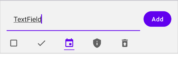
Todo input (state: collapsed) 
Our designer has moved on from disheveled design and is now into post-Material. The new design for todo input takes up the same space as a collapsible header and has two main states: expanded and collapsed. The expanded version will show whenever the text is not empty.
To build this, first we’ll build the text and button, then we’ll look at adding the auto-hiding icons.
Editing text in a UI is stateful. The user updates the currently displayed text every time they type a character, or even when they change the selection. In the Android view system, this state is internal to EditText and exposed via onTextChanged listeners, however since compose is designed for unidirectional data flow this wouldn’t fit.
TextField) is the compose equivalent to Material’s EditText
TextField in compose is a stateless composable. Just like the TodoScreen that displays a changing list of todos, a TextField just displays whatever you tell it to and issues events when the user types.
Built-in composables are designed for unidirectional data flow
Most built-in composables provide at least one stateless version for each API. Compared to the View system, the built-in composables provide an option without internal state for stateful UI such as editable text. This avoids duplicated state between your application and the component. For example, it’s possible in Compose to hoist the state for a Checkbox to a server-based API with no duplicated state.
Create a stateful TextField composable
To start exploring state in compose we’re going to make a stateful component for displaying an editable TextField.
A stateful composable is a composable that owns a piece of state that it can change over time.
To get started, open TodoScreen.kt and add the following function
TodoScreen.kt
@Composable
fun TodoInputTextField(modifier: Modifier) {
   val (text, setText) = remember { mutableStateOf("") }
   TodoInputText(text, setText, modifier)
}
Warning: This text field doesn’t hoist its state when it should. Later in this section we will remove this function.
This function uses remember to add memory to itself, then in the memory it stores a mutableStateOf to create a MutableState<String> which is a builtin type of Compose that provides an observable state holder.
Since we’re going to immediately pass a value and setter event to TodoInputText, we destructure the MutableState object into a getter and a setter.
mutableStateOf) creates a MutableState<T> which is an observable state holder built into compose.
interface MutableState<T> : State<T> {
override var value: T
}
Any changes to value will automatically recompose any composable functions that read this state.
You declare a MutableState object in a composable three ways:
val state = remember { mutableStateOf(default) }var value by remember { mutableStateOf(default) }val (value, setValue) = remember { mutableStateOf(default) }
When creating State<T> (or other stateful objects) in composition, it’s important to remember it. Otherwise it will be re-initialized every composition.
MutableState<T> similar to MutableLiveData<T>, but integrated with the compose runtime. Since it’s observable, it will tell compose whenever it’s updated so compose can recompose any composables that read it.
And that’s it. We’ve created an internal state in TodoInputTextField.
To see it in action, define another composable TodoItemInput that shows the TodoInputTextField and a Button.
TodoScreen.kt
@Composable
fun TodoItemInput(onItemComplete: (TodoItem) -> Unit) {
   // onItemComplete is an event will fire when an item is completed by the user
   Column {
       Row(Modifier
           .padding(horizontal = 16.dp)
           .padding(top = 16.dp)
       ) {
           TodoInputTextField(Modifier
               .weight(1f)
               .padding(end = 8.dp)
           )
           TodoEditButton(
               onClick = { /* todo */ },
               text = "Add",
               modifier = Modifier.align(Alignment.CenterVertically)
           )
       }
   }
}
TodoItemInput has only one parameter, an event onItemComplete. When the user completes a TodoItem the event will be triggered. This pattern of passing a lambda is the main way that you define custom events in compose.
Also, update the TodoScreen composable to call TodoItemInput in the background TodoItemInputBackground that’s already defined in the project:
TodoScreen.kt
@Composable
fun TodoScreen(
   items: List<TodoItem>,
   onAddItem: (TodoItem) -> Unit,
   onRemoveItem: (TodoItem) -> Unit
) {
   Column {
       // add TodoItemInputBackground and TodoItem at the top of TodoScreen
       TodoItemInputBackground(elevate = true, modifier = Modifier.fillMaxWidth()) {
           TodoItemInput(onItemComplete = onAddItem)
       }
...
Try out TodoItemInput
Since we just defined a major UI composable for the file, it’s a good idea to add a @Preview for it. This will allow us to explore that composable in isolation, as well as allow readers of this file to preview it quickly.
In TodoScreen.kt add a new preview function to the bottom:
TodoScreen.kt
@Preview
@Composable
fun PreviewTodoItemInput() = TodoItemInput(onItemComplete = { })
Now you can run that composable either in interactive preview or on an emulator to debug this composable in isolation.
When you do, you’ll see that it correctly displays an editable text field that allows the user to edit text. Whenever they type a character, the state is updated which triggers recomposition updating the TextField displayed to the user.

Make the button click add an item
Now we want to make the “Add” button actually add a TodoItem. To do that, we’ll need access to the text from the TodoInputTextField.
If you look at part of the composition tree of TodoItemInput you can see that we’re storing the text state inside of TodoInputTextField.
TodoInputItem composition tree (builtin composables hidden)

This structure won’t let us wire the onClick up because onClick needs to access the current value of text. What we want to do is expose the text state to TodoItemInput – and use unidirectional data flow at the same time.
Unidirectional data flow applies both to high level architecture and the design of a single composable when using Jetpack Compose. Here, we want to make it so that events always flow up and state always flows down.
This means we want state to flow down from TodoItemInput, and events to flow up.
Unidirectional data flow diagram for TodoItemInput

In order to do that, we’ll need to move the state from the child composable, TodoInputTextField, to the parent TodoItemInput.
TodoInputItem composition tree with state hoisting (builtin composables hidden)

This pattern is called state hoisting. We will “hoist” (or lift) state from a composable to make it stateless. State hoisting the main pattern to build unidirectional data flow designs in Compose.
State hoisting is a pattern of moving state up to make a component stateless.
When applied to composables, this often means introducing two parameters to the composable.
value: T– the current value to displayonValueChange: (T) -> Unit– an event that requests the value to change
To start hoisting state, you can refactor any internal state T of a composable to a (value: T, onValueChange: (T) -> Unit) parameter pair.
Edit TodoInputTextField to hoist the state by adding (value, onValueChange) parameters:
TodoScreen.kt
// TodoInputTextField with hoisted state

@Composable
fun TodoInputTextField(text: String, onTextChange: (String) -> Unit, modifier: Modifier) {
   TodoInputText(text, onTextChange, modifier)
}
This code adds a value and onValueChange parameter to TodoInputTextField. The value parameter is text, and the onValueChange parameter is onTextChange.
Then, because the state is now hoisted, we remove the remembered state from TodoInputTextField.
State that is hoisted this way has some important properties:
- Single source of truth – by moving state instead of duplicating it, we’re ensuring there’s only one source of truth for the text. This helps avoid bugs.
- Encapsulated – only
TodoInputItemwill be able to modify the state, while other components can send events toTodoInputItem. By hoisting this way, only one composable is stateful even though multiple composables use the state. - Shareable – hoisted state can be shared as an immutable value with multiple composables. Here we’re going to use the state in both
TodoInputTextFieldandTodoEditButton. - Interceptable –
TodoItemInputcan decide to ignore or modify events before changing its state. For example,TodoItemInputcould format :emoji-codes: into emoji as the user types. - Decoupled – the state for
TodoInputTextFieldmay be stored anywhere. For example, we could choose to back this state by a Room database that is updated every time a character is typed without modifyingTodoInputTextField.
Now, add the state in TodoItemInput and pass it to TodoInputTextField:
TodoScreen.kt
@Composable
fun TodoItemInput(onItemComplete: (TodoItem) -> Unit) {
   val (text, setText) = remember { mutableStateOf("") }
   Column {
       Row(Modifier
           .padding(horizontal = 16.dp)
           .padding(top = 16.dp)
       ) {
           TodoInputTextField(
               text = text,
               onTextChange = setText,
               modifier = Modifier
                   .weight(1f)
                   .padding(end = 8.dp)
           )
           TodoEditButton(
               onClick = { /* todo */ },
               text = "Add",
               modifier = Modifier.align(Alignment.CenterVertically)
           )
       }
   }
}
Now we’ve hoisted the state, and we can use the current value of text to drive the behavior of the TodoEditButton. Finish the callback and enable the button only when the text is not blank per the design:
TodoScreen.kt
// edit TodoItemInput
TodoEditButton(
   onClick = {
       onItemComplete(TodoItem(text)) // send onItemComplete event up
       setText("") // clear the internal text
   },
   text = "Add",
   modifier = Modifier.align(Alignment.CenterVertically),
   enabled = text.isNotBlank() // enable if text is not blank
)
We’re using the same state variable, text, in two different composables. By hoisting the state we’re able to share the state like this. And, we’ve managed to do it while making only TodoItemInput a stateful composable.
Run it again
Run the app again and you’ll see that you can now add todo items! Congratulations – you’ve just learned how to add state to a composable, and how to hoist it!

Code cleanup
Before you move on, inline the TodoInputTextField. We just added it in this section to explore state hoisting. If you look into the code of TodoInputText that was provided with the codelab, you’ll see that it already hoists state following the patterns that we discussed in this section.
When you’re done, your TodoItemInput should look like this:
TodoScreen.kt
@Composable
fun TodoItemInput(onItemComplete: (TodoItem) -> Unit) {
   val (text, setText) = remember { mutableStateOf("") }
   Column {
       Row(Modifier
           .padding(horizontal = 16.dp)
           .padding(top = 16.dp)
       ) {
           TodoInputText(
               text = text,
               onTextChange = setText,
               modifier = Modifier
                   .weight(1f)
                   .padding(end = 8.dp)
           )
           TodoEditButton(
               onClick = {
                   onItemComplete(TodoItem(text))
                   setText("")
               },
               text = "Add",
               modifier = Modifier.align(Alignment.CenterVertically),
               enabled = text.isNotBlank()
           )
       }
   }
}
In the next section we’ll continue to build this design and add the icons. You’ll use the tools we learned in this section to hoist the state and build interactive UIs with unidirectional data flow.
- Dynamic UI based on state
In the last section you learned how to add state to a composable, and how to use state hoisting to make a composable that uses state stateless.
Now we’re going to explore building a dynamic UI based on state. Going back to the mock from the designer, we should show the icon row whenever the text is not blank.
Todo input (state: expanded - text not blank)
Todo input (state: collapsed - text is blank)
Derive iconsVisible from state
Open up TodoScreen.kt and create a new state variable to hold the currently selected icon and a new val iconsVisible that’s true whenever text is not blank.
TodoScreen.kt
@Composable
fun TodoItemInput(onItemComplete: (TodoItem) -> Unit) {
   val (text, setText) = remember { mutableStateOf("") }
   val (icon, setIcon) = remember { mutableStateOf(TodoIcon.Default)}
   val iconsVisible = text.isNotBlank()
    // ...
We added a second piece of state, icon, that holds the currently selected icon.
The value iconsVisible does not add a new state to TodoItemInput. There is no way for TodoItemInput to directly change it. Instead, it is based entirely upon the value of text. Whatever the value of text is in this recomposition, iconsVisible will be set accordingly and we can use it to show the correct UI.
We could add another bit of state to TodoItemInput to control when the icons are visible, but if you look closely at the spec the visibility is based entirely upon the text that has been input. If we made two states, it would be easy for them to get out of sync.
Instead, we prefer to have a single source of truth. In this composable, we only need text to be state, and iconsVisible can be based on text.
If you’re familiar with functional transforms, iconsVisible is mapped from the value of text.
To do the same transformation to a LiveData, you would use the map) function:
val iconsVisible: LiveData<Boolean> = textLiveData.map { it.isNotBlank() }
Continue editing TodoItemInput to show the AnimatedIconRow depending on the value of iconsVisible. If iconsVisible is true, display an AnimatedIconRow, if it’s false display a Spacer with 16.dp.
TodoScreen.kt
@Composable
fun TodoItemInput(onItemComplete: (TodoItem) -> Unit) {
   val (text, setText) = remember { mutableStateOf("") }
   val (icon, setIcon) = remember { mutableStateOf(TodoIcon.Default)}
   val iconsVisible = text.isNotBlank()
   Column {
       Row( /* ... */ ) {
           /* ... */
       }
       if (iconsVisible) {
           AnimatedIconRow(icon, setIcon, Modifier.padding(top = 8.dp))
       } else {
           Spacer(modifier = Modifier.preferredHeight(16.dp))
       }
   }
}
Recomposition can change the structure of the composition tree based on new data.
Here we’re swapping AnimatedIconRow for a Spacer. You can also change the entire tree, as you might do in a Navigation composable.
If you run the app again now, you’ll see that the icons animate in when you enter text.
Here we’re dynamically changing the composition tree based on the value of iconsVisible. Here is a diagram of the composition tree for both states.
This sort of conditional-show logic is equivalent to visibility gone in the Android view system.
TodoItemInput composition tree when iconsVisible changes

There is no “visibility” property in compose.
Since compose can dynamically change the composition, you do not need to set visibility gone. Instead, remove composables from the composition.
If you run the app again, you’ll see that the icon row displays correctly, but if you click “Add” the icon doesn’t make it into the added todo row. This is because we haven’t updated our event to pass the new icon state, let’s do that next.
Update the event to use icon
Edit TodoEditButton in TodoItemInput to use the new icon state in the onClick listener.
TodoScreen.kt
TodoEditButton(
   onClick = {
       onItemComplete(TodoItem(text, icon))
       setIcon(TodoIcon.Default)
       setText("")
   },
   text = "Add",
   modifier = Modifier.align(Alignment.CenterVertically),
   enabled = text.isNotBlank()
)
You can use the new icon state directly in the onClick listener. We also reset it to default when the user is done entering a TodoItem.
If you run the app now, you’ll see an interactive todo input with animated buttons. Great job!

Finish the design with an imeAction
When you show the app to your designer, they tell you that it should submit the todo item from the ime action on the keyboard. That’s the blue button in the bottom right:
Android Keyboard with ImeAction.Done

TodoInputText lets you respond to imeAction with its onImeAction event.
We really want this the onImeAction to have the exact same behavior as the TodoEditButton. We could duplicate the code, but that would be hard to maintain over time as it’d be easy to only update one of the events.
Lets extract the event into a variable, so we can use it for both the TodoInputText‘s onImeAction and TodoEditButton‘s onClick.
Edit TodoItemInput again to declare a new lambda function submit that handles the user performing a submit action. Then pass the newly defined lambda function to both TodoInputText and TodoEditButton.
TodoScreen.kt
@Composable
fun TodoItemInput(onItemComplete: (TodoItem) -> Unit) {
   val (text, setText) = remember { mutableStateOf("") }
   val (icon, setIcon) = remember { mutableStateOf(TodoIcon.Default)}
   val iconsVisible = text.isNotBlank()
   val submit = {
       onItemComplete(TodoItem(text, icon))
       setIcon(TodoIcon.Default)
       setText("")
   }
   Column {
       Row(Modifier
           .padding(horizontal = 16.dp)
           .padding(top = 16.dp)
       ) {
           TodoInputText(
               text = text,
               onTextChange = setText,
               modifier = Modifier
                   .weight(1f)
                   .padding(end = 8.dp),
               onImeAction = submit // pass the submit callback to TodoInputText
           )
           TodoEditButton(
               onClick = submit, // pass the submit callback to TodoEditButton
               text = "Add",
               modifier = Modifier.align(Alignment.CenterVertically),
               enabled = text.isNotBlank()
           )
       }
       if (iconsVisible) {
           AnimatedIconRow(icon, setIcon, Modifier.padding(top = 8.dp))
       } else {
           Spacer(modifier = Modifier.preferredHeight(16.dp))
       }
   }
}
If you wanted to, you could further extract the logic from this function. However, this composable is looking pretty good so we’ll stop here.
This is one of the big advantages of Compose – since you’re declaring your UI in Kotlin you’re able to build any abstractions needed to make the code decoupled and reusable.
This imeAction will not work in alpha05 due to a bug that is expected to be fixed in later alphas. In alpha05, when you press the Done action, the text will clear and no item will be added.
Run the app again to try out the new icons
Run the app again and you’ll see that the icons show and hide automatically as the text changes state. You can also change the icon selection. When you hit the “Add” button you will see that a new TodoItem is generated based on the values input.
Congratulations, you’ve learned about state in compose, state hoisting, and how to build dynamic UIs based on state.
In the next few sections we’ll explore how to think about making reusable components that interact with state.
- Extracting stateless composables
Your designer is on a new design trend today. Gone are disheveled UI and post-Material, this week’s design follows the design trend “neo-modern interactive.” You asked them what that means, and the answer was a bit confusing and involved emoji, but anyway, here are the mocks.
Tip: neo-modern interactive is probably a design trend
Mock for editing mode

The designer says it reuses the same UI as the input with the buttons changed to a save and done emoji.
At the end of the last section, we left TodoItemInput as a stateful composable. This was fine when it was just for inputting todos – but now that it’s an editor it will need to support state hoisting.
In this section, you’ll learn how to extract state from a stateful composable to make it stateless. This will allow us to reuse the same composable for both adding todos and editing them.
Convert TodoInputItem to a stateless composable
To get started, we need to hoist the state from TodoItemInput. But where will we put it? We could put it directly in TodoScreen – but it’s already working really well with internal state and a finished event. We don’t really want to change that API.
What we can do instead is split the composable into two – one that has state and the other that is stateless.
Open up TodoScreen.kt and break TodoItemInput into two composables, then rename the stateful composable to TodoItemEntryInput as it’s only useful for entering new TodoItems.
You can perform this refactor without typing any code using the Refactor->Function (Extract Method) command in Android Studio.
- Select the UI parts of
TodoItemInput(Columnand its children) - Select Refactor -> Function (
Cmd/Ctl+Alt+M, in the right click menu)

- Ensure that the new function is
public(we want to export both the stateful and stateless composable)

- Name the new function
TodoItemInput

- Reorder parameters to put
(value, onValueChange)pairs next to each other

- Rename the parameters
setTextandsetIcontoonTextChangeandonIconChangerespectively

- OK
Then:
Alt+Enteron the new function call and select “Add names to call arguments“

- Rename the stateful function
TodoItemEntryInput*
- The stateful and stateless
TodoItemEntrycomposables could keep the same name in practice, but the new name will make it easier to talk about it in this codelab.
TodoScreen.kt
@Composable
fun TodoItemEntryInput(onItemComplete: (TodoItem) -> Unit) {
   val (text, setText) = remember { mutableStateOf("") }
   val (icon, setIcon) = remember { mutableStateOf(TodoIcon.Default)}
   val iconsVisible = text.isNotBlank()
   val submit = {
       onItemComplete(TodoItem(text, icon))
       setIcon(TodoIcon.Default)
       setText("")
   }
   TodoItemInput(
       text = text,
       onTextChange = setText,
       icon = icon,
       onIconChange = setIcon,
       submit = submit,
       iconsVisible = iconsVisible
   )
}

@Composable
private fun TodoItemInput(
   text: String,
   onTextChange: (String) -> Unit,
   icon: TodoIcon,
   onIconChange: (TodoIcon) -> Unit,
   submit: () -> Unit,
   iconsVisible: Boolean
) {
   Column {
       Row(
           Modifier
               .padding(horizontal = 16.dp)
               .padding(top = 16.dp)
       ) {
           TodoInputText(
               text,
               onTextChange,
               Modifier
                   .weight(1f)
                   .padding(end = 8.dp),
               submit
           )
           TodoEditButton(
               onClick = submit,
               text = "Add",
               modifier = Modifier.align(Alignment.CenterVertically),
               enabled = text.isNotBlank()
           )
       }
       if (iconsVisible) {
           AnimatedIconRow(icon, onIconChange, Modifier.padding(top = 8.dp))
       } else {
           Spacer(modifier = Modifier.preferredHeight(16.dp))
       }
   }
}
This transformation is a really important one to understand when using compose. We took a stateful composable, TodoInputItem, and split it into two composables. One with state (TodoItemEntryInput) and one stateless (TodoItemEntry).
The stateless composable has all of our UI-related code, and the stateful composable doesn’t have any UI-related code. By doing this, we make the UI code reusable in situations where we want to back the state differently.
Extracting a stateless composable from a stateful composable makes it easier to reuse the UI in different locations.
Run the application again
Run the application again to confirm that todo input still works.
Congratulations, you’ve successfully extracted a stateless composable from a stateful composable without changing it’s API.
We’ll explore in the next section how this allows us to reuse the UI logic in different locations without coupling the UI with state.
- Use State in ViewModel
Reviewing the neo-modern interactive mock from our designer, we’ll need to add some state representing the current edit item.
Mock for editing mode
Now we need to decide where to add the state for this editor. We could build another stateful composable “TodoRowOrInlineEditor“ that handles displaying or editing an item, but we only want to show one editor at a time. Looking at the design closely, the top section also changes when in editing mode as well. So we’re going to have to do some state hoisting to allow the state to be shared.
State tree for TodoActivity
Since both TodoItemEntryInput and TodoInlineEditor need to know about the current editor state to enable hiding the input at the top of the screen, we need to hoist the state to at least TodoScreen. The screen is the lowest level composable in the hierarchy that’s a common parent of every composable that needs to know about editing.
However, since the editor is derived from and will be mutating the list, it should really live next to the list. We want to hoist state to the level that it might be modified. The list lives in TodoViewModel, so that’s exactly where we’ll add it.
When hoisting state, there are three rules to help you figure out where it should go
- State should be hoisted to at least the lowest common parent of all composables that use the state (or read)
- State should be hoisted to at least the highest level it may be changed (or modified)
- If two states change in response to the same events they should be hoisted together
You can hoist state higher than these rules require, but underhoisting state will make it difficult or impossible to follow unidirectional data flow.
Convert TodoViewModel to use mutableStateOf
In this section you’ll add state for the editor in TodoViewModel, and in the next section you’ll use it to build an inline editor.
At the same time, we’ll explore using mutableStateOf in a ViewModel and see how it simplifies state code compared to LiveData when targeting Compose.
Open up TodoViewModel.kt and replace the existing todoItems with a mutableStateOf:
TodoViewModel.kt
class TodoViewModel : ViewModel() {

   // remove the LiveData and replace it with a mutableStateOf
   //private var _todoItems = MutableLiveData(listOf<TodoItem>())
   //val todoItems: LiveData<List<TodoItem>> = _todoItems

   // state: todoItems
   var todoItems: List<TodoItem> by mutableStateOf(listOf())
       private set

   // event: addItem
   fun addItem(item: TodoItem) {
        todoItems = todoItems + listOf(item)
   }

   // event: removeItem
   fun removeItem(item: TodoItem) {
       // toMutableList makes a mutable copy of the list we can edit, then
       // assign the new list to todoItems (which is still an immutable list)
       todoItems = todoItems.toMutableList().also {
           it.remove(item)
       }
   }
}
If you get a compiler error that getValue and setValue are not defined make sure you have the following imports:
import androidx.compose.runtime.getValue
import androidx.compose.runtime.mutableStateOf
import androidx.compose.runtime.setValue
MutableState is built with idiomatic Kotlin in mind, and supports property delegate syntax. We used it earlier in this codelab inside a composable – but you can also use it inside of stateful classes like a ViewModel.
The declaration of todoItems is short and captures the same behavior as the LiveData version.
// state: todoItems
var todoItems: List<TodoItem> by mutableStateOf(listOf())
    private set
This makes a new MutableStateOf<List<TodoItems>> then uses the property delegate syntax to convert it into a regular List<TodoItem>. By specifying private set, we’re restricting writes to this state object to a private setter only visible inside the ViewModel.
The events were also shortened. Since MutableState is written for Kotlin it has better nullability guarantees than LiveData can provide. Both event listeners are able to remove extra null-safety code. And, because we’re able to use the property delegate syntax, we don’t have to call .value every time you read or write from todoItems.
MutableState is intended to be read by Compose.
If this ViewModel was also used by the View system, it would be better to continue using LiveData.
You don’t have to use MutableState when using Compose.
Compose has built-in support for LiveData, StateFlow, and other observable types. You could write this ViewModel using only LiveData and it would be supported by Compose.
Update TodoActivityScreen to use the new ViewModel
Open TodoActivity.kt and update TodoActivityScreen to use the new ViewModel.
TodoActivity.kt
@Composable
private fun TodoActivityScreen(todoViewModel: TodoViewModel) {
   TodoScreen(
       items = todoViewModel.todoItems,
       onAddItem = todoViewModel::addItem,
       onRemoveItem = todoViewModel::removeItem
   )
}
Run the app again and you’ll see that it works with the new ViewModel. You’ve changed the state to use MutableState – new let’s explore how to create an editor state.
Define editor state
Now it’s time to add state for our editor. To avoid duplicating the todo text – we’re going to edit the list directly. To do that, instead of keeping the current text that we’re editing, we’ll keep a list index for the current editor item.
Open up TodoViewModel.kt and add an editor state.
Define a new private var currentEditPosition that holds the current edit position. It’ll hold the list index that we’re currently editing.
Then, to expose the currentEditItem to compose using a getter. Even though this is a regular Kotlin function, currentEditPosition is observable to Compose just like a State<TodoItem>.
TodoViewModel.kt
class TodoViewModel : ViewModel() {

   // private state
   private var currentEditPosition by mutableStateOf(-1)

   // state
   var todoItems by mutableStateOf(listOf<TodoItem>())
       private set

   // state
   val currentEditItem: TodoItem?
       get() = todoItems.getOrNull(currentEditPosition)

   // ..
Whenever a composable calls currentEditItem, it will observe changes to both todoItems and currentEditPosition. If either change, the composable will call the getter again to get the new value.
State<T> transformations are regular Kotlin code.
Compose will observe any State<T> read by a composable, even if the read happens in a regular Kotlin function called by the composable. Here we’re reading from currentEditPosition and todoItems to generate currentEditItem. Compose will recompose a composable that reads currentEditPosition whenever either changes.
If you’re familiar with functional transforms, currentEditItem depends on both currentEditPosition and todoItems and would use zip to combine them.
For State<T> transformations to work, the state must be read from a State<T> object.
If you had defined currentEditorPosition as a regular Int (private var currentEditPosition = -1), compose would not be able to observe changes to it.
Define editor events
We’ve defined our editor state, now we’ll need to define events that composables can call to control editing.
Make three events: onEditItemSelected(item: TodoItem), onEditDone(), and onEditItemChange(item: TodoItem).
The events onEditItemSelected and onEditDone just change the currentEditPosition. By changing currentEditPosition, compose will recompose any composable that reads currentEditItem.
TodoViewModel.kt
class TodoViewModel : ViewModel() {
   ...

   // event: onEditItemSelected
   fun onEditItemSelected(item: TodoItem) {
      currentEditPosition = todoItems.indexOf(item)
   }

   // event: onEditDone
   fun onEditDone() {
      currentEditPosition = -1
   }

   // event: onEditItemChange
   fun onEditItemChange(item: TodoItem) {
      val currentItem = requireNotNull(currentEditItem)
      require(currentItem.id == item.id) {
          "You can only change an item with the same id as currentEditItem"
      }

      todoItems = todoItems.toMutableList().also {
          it[currentEditPosition] = item
      }
   }
}
The event onEditItemChange updates the list at currentEditPosition. This will change both the value returned by currentEditItem and todoItems at the same time. Before it does that, there’s some safety checks to make sure the caller isn’t trying to write the wrong item.
End editing when removing items
Update the removeItem event to close the current editor when an item is removed.
TodoViewModel.kt
// event: removeItem
fun removeItem(item: TodoItem) {
   todoItems = todoItems.toMutableList().also { it.remove(item) }
   onEditDone() // don't keep the editor open when removing items
}
Run the app again
And that’s it! You’ve updated your ViewModel to use MutableState and saw how it can simplify observable state code.
In the next section we’ll add a test for this ViewModel, then move into building the editing UI.
Since there were a lot of edits in this section, here’s a full listing of TodoViewModel after all changes are applied:
TodoViewModel.kt
import androidx.compose.runtime.getValue
import androidx.compose.runtime.mutableStateOf
import androidx.compose.runtime.setValue
import androidx.lifecycle.LiveData
import androidx.lifecycle.MutableLiveData
import androidx.lifecycle.ViewModel

class TodoViewModel : ViewModel() {

   private var currentEditPosition by mutableStateOf(-1)

   var todoItems by mutableStateOf(listOf<TodoItem>())
       private set

   val currentEditItem: TodoItem?
       get() = todoItems.getOrNull(currentEditPosition)

   fun addItem(item: TodoItem) {
       todoItems = todoItems + listOf(item)
   }

   fun removeItem(item: TodoItem) {
       todoItems = todoItems.toMutableList().also { it.remove(item) }
       onEditDone() // don't keep the editor open when removing items
   }

   fun onEditItemSelected(item: TodoItem) {
       currentEditPosition = todoItems.indexOf(item)
   }

   fun onEditDone() {
       currentEditPosition = -1
   }

   fun onEditItemChange(item: TodoItem) {
       val currentItem = requireNotNull(currentEditItem)
       require(currentItem.id == item.id) {
           "You can only change an item with the same id as currentEditItem"
       }

       todoItems = todoItems.toMutableList().also {
           it[currentEditPosition] = item
       }
   }
}
State<T> is intended to be used by Compose.
Application state that’s used outside of Compose should not use State<T> to hold the state.
- Test State in ViewModel
It’s a good idea to test your ViewModel to make sure your application logic is correct. In this section we’ll write a test to show how to test a view model using State<T> for state.
Add a test to TodoViewModelTest
Open TodoViewModelTest.kt in the test/ directory and add a test for removing an item:
TodoViewModelTest.kt
import com.example.statecodelab.util.generateRandomTodoItem
import com.google.common.truth.Truth.assertThat
import org.junit.Test

class TodoViewModelTest {

   @Test
   fun whenRemovingItem_updatesList() {
       // before
       val viewModel = TodoViewModel()
       val item1 = generateRandomTodoItem()
       val item2 = generateRandomTodoItem()
       viewModel.addItem(item1)
       viewModel.addItem(item2)

       // during
       viewModel.removeItem(item1)

       // after
       assertThat(viewModel.todoItems).isEqualTo(listOf(item2))
   }
}
This test shows how to test State<T> that’s directly modified by events. In the before section, it creates a new ViewModel then adds two items to todoItems.
The method we’re testing is removeItem, which removes the first item in the list.
Finally, we use Truth assertions to assert that the list contains only the second item.
We don’t have to do any extra work to read todoItems in a test if the updates were caused directly by the test (as we’re doing here by calling removeItem) – it’s just a List<TodoItem>.
Warning: If writes to MutableState<T> are performed on another thread, they will not be immediately visible from your test.
The low level API for making changes visible is Snapshot.sendApplyNotifications()
High level APIs for handling this are currently being worked on, and this codelab will be updated when they are finalized.
The rest of the tests for this ViewModel follow the same basic pattern – so we’ll skip them as exercises in this codelab. You can add more tests of the ViewModel to confirm it works, or open TodoViewModelTest in the finished module to see more tests.
In the next section, we’ll add the new editing mode to the UI!
Warning: There are no current APIs to wait for writes to State<T> objects in tests.
If todoItems was populated asynchronously, for example by a database call, there is not currently a way to wait for it to be updated. We expect to have an API for this before 1.0, but it is not yet ready.
- Reuse stateless composables
We’re finally ready to implement our neo-modern interactive design! As a reminder, this is what we’re trying to build:
Mock for editing mode
Pass the state and events to TodoScreen
We just finished defining all of the state and events we’ll need for this screen in TodoViewModel. Now we’ll update TodoScreen to take the state and events it will need to display the screen.
Open TodoScreen.kt and change the signature of TodoScreen to add the three new events:
onStartEdit: (TodoItem) -> Unit, onEditItemChange: (TodoItem) -> Unit, and onEditDone: () -> Unit
TodoScreen.kt
@Composable
fun TodoScreen(
   items: List<TodoItem>,
   currentlyEditing: TodoItem?,
   onAddItem: (TodoItem) -> Unit,
   onRemoveItem: (TodoItem) -> Unit,
   onStartEdit: (TodoItem) -> Unit,
   onEditItemChange: (TodoItem) -> Unit,
   onEditDone: () -> Unit
) {
   // ...
}
These are just the new state and event we just defined on the ViewModel.
PreviewTodoScreen will not compile after changing the signature.
You can update the call to TodoScreen to the required arguments like this
TodoScreen(items, null, {}, {}, {}, {}, {})
Then in TodoActivity.kt, pass the new values in TodoScreenActivity
TodoActivity.kt
@Composable
private fun TodoActivityScreen(todoViewModel: TodoViewModel) {
   TodoScreen(
       items = todoViewModel.todoItems,
       currentlyEditing = todoViewModel.currentEditItem,
       onAddItem = todoViewModel::addItem,
       onRemoveItem = todoViewModel::removeItem,
       onStartEdit = todoViewModel::onEditItemSelected,
       onEditItemChange = todoViewModel::onEditItemChange,
       onEditDone = todoViewModel::onEditDone
   )
}
This just passes the state and events that our new TodoScreen requires.
It’s a good idea to use named arguments when a composable has several arguments.
Define a inline editor composable
Create a new composable in TodoScreen.kt that uses the stateless composable TodoItemInput to define an inline editor.
TodoScreen.kt
@Composable
fun TodoItemInlineEditor(
   item: TodoItem,
   onEditItemChange: (TodoItem) -> Unit,
   onEditDone: () -> Unit,
   onRemoveItem: () -> Unit
) = TodoItemInput(
   text = item.task,
   onTextChange = { onEditItemChange(item.copy(task = it)) },
   icon = item.icon,
   onIconChange = { onEditItemChange(item.copy(icon = it)) },
   submit = onEditDone,
   iconsVisible = true
)
This composable is stateless. It only displays the item passed, and uses the events to request that the state update. Because we extracted a stateless composable TodoItemInput before, we’re able to use it in this stateless context easily.
What is copy(task = it) and copy(icon = it).
These functions are auto-generated by Kotlin for values on a data class. Calling copy will make a copy of the data class with the parameter specified changed.
This example shows the reusability of stateless composables. Even though the header uses a stateful TodoItemEntryInput on the same screen we’re able to hoist the state all the way to the ViewModel for the inline editor.
Stateless composables are decoupled from how their state is stored.
In this example, we’re holding the state passed to TodoItemInlineEditor as an element of a list in a ViewModel. However, it could easily be changed to be stored in a Room database without changing the code of TodoItemInlineEditor.
Use the inline editor in LazyColumnFor)
In the LazyColumnFor in TodoScreen, display TodoItemInlineEditor if the current item is being edited, otherwise show the TodoRow.
Also, start editing when clicking an item (instead of removing it like before).
TodoScreen.kt
// fun TodoScreen()
// ...
LazyColumnFor(
   items = items,
   modifier = Modifier.weight(1f),
   contentPadding = PaddingValues(top = 8.dp)
) { todo ->
   if (currentlyEditing?.id == todo.id) {
       TodoItemInlineEditor(
           item = currentlyEditing,
           onEditItemChange = onEditItemChange,
           onEditDone = onEditDone,
           onRemoveItem = { onRemoveItem(todo) }
       )
   } else {
       TodoRow(
           todo,
           { onStartEdit(it) },
           Modifier.fillParentMaxWidth()
       )
   }
}
// ...
The LazyColumnFor composable is the compose equivalent of a RecyclerView. It will only recompose the items on the list needed to display the current screen, and as the user scrolls it will dispose of composables that left the screen and make new ones for the elements scrolling on.
LazyColumnFor is for displaying large lists of items.
It only composes the items currently on the screen, and disposes of them as soon as they leave. Unlike RecyclerView it doesn’t need to do any recycling – compose handles the creation of new composables in a more efficient manner.
Try out the new interactive editor!
Run the app again, and when you click on a todo row it’ll open the interactive editor!

We’re using the same stateless UI composable to draw both the stateful header and the interactive edit experience. And, we didn’t introduce any duplicated state while doing so.
Already, this is starting to come together, though that add button looks out of place and we need to change the header. Let’s finish up the design in the next few steps.
We will finish the button design in a later step, for now you can leave the button with “Add” text.
Swap the header when editing
Next, we’ll finish the header design and then explore how to swap out the button for emoji buttons that the designer wants for their neo-modern interactive interactive design.
Go back to the TodoScreen composable and make the header respond to changes in editor state. If currentlyEditing is null, then we’ll show TodoItemEntryInput and pass elevation = true to TodoItemInputBackground. If currentlyEditing is not null, pass elevation = false to TodoItemInputBackground and display text that says “Editing item” in the same background.
TodoScreen.kt
@Composable
fun TodoScreen(
   items: List<TodoItem>,
   currentlyEditing: TodoItem?,
   onAddItem: (TodoItem) -> Unit,
   onRemoveItem: (TodoItem) -> Unit,
   onStartEdit: (TodoItem) -> Unit,
   onEditItemChange: (TodoItem) -> Unit,
   onEditDone: () -> Unit
) {
   Column {
       val enableTopSection = currentlyEditing == null
       TodoItemInputBackground(elevate = enableTopSection) {
           if (enableTopSection) {
               TodoItemEntryInput(onAddItem)
           } else {
               Text(
                   "Editing item",
                   style = MaterialTheme.typography.h6,
                   textAlign = TextAlign.Center,
                   modifier = Modifier
                       .align(Alignment.CenterVertically)
                       .padding(16.dp)
                       .fillMaxWidth()
               )
           }
       }
      // ..
Again, we’re changing the compose tree on recomposition. When the top section is enabled, we show TodoItemEntryInput, otherwise we show a Text composable displaying “Editing item.”
TodoItemInputBackground that was in the starter code automatically animates resizing as well as elevation changes – so when you enter editing mode this code automatically animates between the states.
Run the app again

Run the app again and you’ll see that it animates between the editing not-editing states. We’re almost done building this design.
In the next section, we’ll explore how to structure the code for the emoji buttons.
- Use slots to pass sections of the screen
Stateless composables that display complex UI can end up with a lot of parameters. If it’s not too many parameters and they directly configure the composable, this is OK. However, sometimes you need to pass parameters to configure the children of a composable.

In our neo-modern interactive design, the designer wants us to keep the Add button on the top but swap it out for two emoji-buttons for the inline editor. We could add more parameters to TodoItemInput to handle this case, but it’s not clear these are really the responsibility of TodoItemInput.
What we need is a way for a composable to take in a pre-configured button section. This will allow the caller to configure the buttons however it needs to without sharing all of the state required to configure them with TodoItemInput.
This will both cut down the number of parameters passed to stateless composable, as well as make them more reusable.
The pattern to pass a pre-configured section is slots. Slots are parameters to a composable that allow the caller to describe a section of the screen. You’ll find examples of slots throughout the built-in composable APIs. One of the most commonly used examples is Scaffold.
Scaffold) is the composable for describing an entire screen in Material design, such as the topBar, bottomBar, and body of the screen.
Instead of providing hundreds of parameters to configure each section of the screen, Scaffold exposes slots that you can fill in with whatever composables you want. This both cuts down on the number of parameters to Scaffold, and makes it more reusable. If you want to build a custom topBar, Scaffold is happy to display it.
@Composable
fun Scaffold(
   // ..
   topBar: @Composable (() -> Unit)? = null,
   bottomBar: @Composable (() -> Unit)? = null,
   // ..
   bodyContent: @Composable (PaddingValues) -> Unit
) {
Slots are parameters to a composable function that allow the caller to describe a section of the screen.
Declare a slot with a parameter of type @Composable () -> Unit.
Define a slot on TodoItemInput
Open TodoScreen.kt and define a new @Composable () -> Unit parameter on the stateless TodoItemInput called buttonSlot.
TodoScreen.kt
@Composable
fun TodoItemInput(
   text: String,
   onTextChange: (String) -> Unit,
   icon: TodoIcon,
   onIconChange: (TodoIcon) -> Unit,
   submit: () -> Unit,
   iconsVisible: Boolean,
   buttonSlot: @Composable() () -> Unit
) {
  // ...
This is a generic slot that the caller can fill in with the desired buttons. We’ll use it to specify different buttons for the header and inline editors.
Display the content of buttonSlot
Replace the call to TodoEditButton with the content of the slot.
TodoScreen.kt
@Composable
fun TodoItemInput(
   text: String,
   onTextChange: (String) -> Unit,
   icon: TodoIcon,
   onIconChange: (TodoIcon) -> Unit,
   submit: () -> Unit,
   iconsVisible: Boolean,
   buttonSlot: @Composable() () -> Unit,
) {
   Column {
       Row(
           Modifier
               .padding(horizontal = 16.dp)
               .padding(top = 16.dp)
       ) {
           TodoInputText(
               text,
               onTextChange,
               Modifier
                   .weight(1f)
                   .padding(end = 8.dp),
               submit
           )

           // New code: Replace the call to TodoEditButton with the content of the slot

           Spacer(modifier = Modifier.width(8.dp))
           Box(Modifier.align(Alignment.CenterVertically)) { buttonSlot() }


           // End new code
       }
       if (iconsVisible) {
           AnimatedIconRow(icon, onIconChange, Modifier.padding(top = 8.dp))
       } else {
           Spacer(modifier = Modifier.preferredHeight(16.dp))
       }
   }
}
We could directly call buttonSlot(), but we need to keep the align to center whatever the caller passes us vertically. To do that, we place the slot in a Box which is a basic composable.
Update stateful TodoItemEntryInput to use the slot
Now we need to update the callers to use the buttonSlot. First let’s update TodoItemEntryInput:
TodoScreen.kt
@Composable
fun TodoItemEntryInput(onItemComplete: (TodoItem) -> Unit) {
   val (text, setText) = remember { mutableStateOf("") }
   val (icon, setIcon) = remember { mutableStateOf(TodoIcon.Default)}
   val iconsVisible = text.isNotBlank()
   val submit = {
       onItemComplete(TodoItem(text, icon))
       setIcon(TodoIcon.Default)
       setText("")
   }
   TodoItemInput(
       text = text,
       onTextChange = setText,
       icon = icon,
       onIconChange = setIcon,
       submit = submit,
       iconsVisible = iconsVisible
   ) {
       TodoEditButton(onClick = submit, text = "Add", enabled = text.isNotBlank())
   }
}
Since buttonSlot is the last parameter to TodoItemInput, we can use trailing lambda syntax. Then, in the lambda just call TodoEditButton like we were before.
Update TodoItemInlineEditor to use the slot
To finish the refactor, change TodoItemInlineEditor to use the slot as well:
TodoScreen.kt
@Composable
fun TodoItemInlineEditor(
   item: TodoItem,
   onEditItemChange: (TodoItem) -> Unit,
   onEditDone: () -> Unit,
   onRemoveItem: () -> Unit
) = TodoItemInput(
   text = item.task,
   onTextChange = { onEditItemChange(item.copy(task = it)) },
   icon = item.icon,
   onIconChange = { onEditItemChange(item.copy(icon = it)) },
   submit = onEditDone,
   iconsVisible = true,
   buttonSlot = {
       Row {
           val shrinkButtons = Modifier.widthIn(20.dp)
           TextButton(onClick = onEditDone, modifier = shrinkButtons) {
               Text(
                   text = "\uD83D\uDCBE", // floppy disk
                   textAlign = TextAlign.End,
                   modifier = Modifier.width(30.dp)
               )
           }
           TextButton(onClick = onRemoveItem, modifier = shrinkButtons) {
               Text(
                   text = "❌",
                   textAlign = TextAlign.End,
                   modifier = Modifier.width(30.dp)
               )
           }
       }
   }
)
Here we’re passing buttonSlot as a named parameter. Then, in buttonSlot, we make a Row containing the two buttons for the inline editor design.
Run the app again
Run the app again and play around with the inline editor!

If you look closely, you’ll notice the icon tint changes when entering and exiting the editor. This is because the tint is remembered in the TodoRow which is removed and then re-added to composition when we open the editor.
If you want to make the tint stable, you can hoist it to the ViewModel.
In this section we customized our stateless composable using a slot, which allowed the caller to control a section of the screen. By using slots, we avoided coupling TodoItemInput with all of the different designs that may be added in the future.
When you find yourself adding parameters to stateless composables to customize the children, evaluate if slots would be a better design. Slots tend to make composables more reusable while keeping the number of parameters manageable.
- Congratulations
Congratulations, you’ve successfully completed this codelab and learned how to structure state using unidirectional data flow in a Jetpack Compose app!
You learned how to think about state and events to extract stateless composables in compose, and saw how to reuse a complex composable in different situations on the same screen. You’ve also learned how to integrate a ViewModel with Compose using both LiveData and MutableState.
What’s next?
Check out the other codelabs on the Compose pathway
Sample apps
- JetNews demonstrates how to use unidirectional data flow to use stateful composables to manage state in a screen built using stateless composables
Reference docs

若有收获,就点个赞吧
0 人点赞
