兼容性问题
- 列表滚动定位的
Element.scrollIntoView()方法,为了滚动的平滑以及设置定位元素的位置,需要设置scrollIntoViewOptions,在开发时Chrome中测试一切正常,但是移动端测试发现在IOS中不支持。- 解决方案为:引入了scroll-into-view-if-needed插件,在各端测试正常。
- 参考之前的项目总结文档,也可使用better-scroll。
- 在比较旧的设备中,
flex布局下的子元素中,不可以设置position: absolute;否则会使flex中设置的居中这类布局效果失效。- 解决方案为:不同时使用两种布局,或在
absolute中也增加居中定位。
- 解决方案为:不同时使用两种布局,或在
在部分华为设备中,
video标签,仅在点击播放视频的第一次缓冲时(暂停以及后续网速问题导致缓冲时不出现)会出现一个很大的三角形播放按钮,而video标签中并没有设置control属性,设置查询到的一些CSS伪类display:none;并没有生效。该移动端项目左上角会有一个返回按钮,点击该按钮会按照逻辑返回到上一个页面,但是某些手机支持在屏幕上从左向右滑动返回(与点击浏览器到后退按钮相同),之前的跳转逻辑是在每次跳转时都调用
history.push(),这样会造成两种返回方式返回的页面不同,为了支持该需求,将部分跳转改为了history.replace(),具体跳转如下图: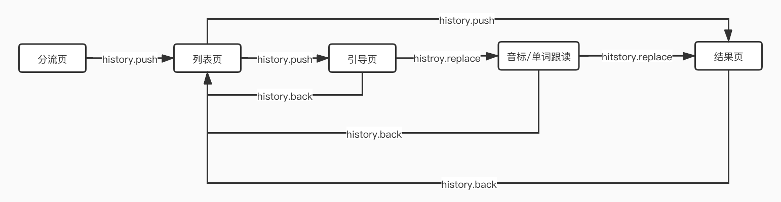
某些简单优化记录
测试时发现在iPad设备中,
overflow的滚动会有些卡。- 经过查询,在需要滚动的
div中增加css属性:-webkit-overflow-scrolling: touch;可以解决卡顿问题
- 经过查询,在需要滚动的
该项目的使用
rem,根据设备自动调整font-size来做到自适应,之前项目中自适应font-size的方法觉得写的蛮好,因此记录下来:export function initFontSize() {let base = 375; // UI稿宽度const { documentElement } = document;const mediaQuery = window.matchMedia('(orientation: portrait)'); // 检测是否为竖屏let timer;let standardRatio = 667 / 375; // 设计稿宽高比if (isPad()) {standardRatio = 1024 / 768; // iPad设计稿宽高比base = 768;}function setFontSize() {const isLandscape = !mediaQuery.matches;let screenWidth = window.screen.width;let screenHeight = window.screen.height;if (screenWidth < screenHeight) {[ screenWidth, screenHeight ] = [ screenHeight, screenWidth ];}let width = documentElement.clientWidth;let height = screenHeight;const realRatio = width / height;// 根据相对设计稿更小的宽或者高来计算fontSizeif (realRatio >= standardRatio) {width = height * standardRatio;documentElement.classList.remove('adjustHeight');documentElement.classList.add('adjustWidth');} else {height = width / standardRatio;documentElement.classList.remove('adjustWidth');documentElement.classList.add('adjustHeight');}window.adjustWidth = width;window.adjustHeight = height;// fontSize = 自适应宽与原来宽度比 * 初始fontSizelet target = width / base * 16;if (isLandscape) {target /= standardRatio;}documentElement.style.fontSize = `${target}px`;const currentSize = window.getComputedStyle(documentElement).fontSize.replace('px', '');if (target !== currentSize) {documentElement.style.fontSize = `${target / currentSize * target}px`;}}window.addEventListener('resize', function() {clearTimeout(timer);timer = setTimeout(setFontSize, 300);}, !1);window.addEventListener('pageshow', function(e) {e.persisted && (clearTimeout(timer), timer = setTimeout(setFontSize, 300));}, !1);window.addEventListener('orientationchange', function() {console.log('改变了手机方向');setFontSize();}, false);setFontSize();}

若有收获,就点个赞吧
0 人点赞
