含义:全屏布局就是指HTML页面铺满整个浏览器窗口,并且没有滚动条。而且还可以跟着浏览器的大小变化而变化;
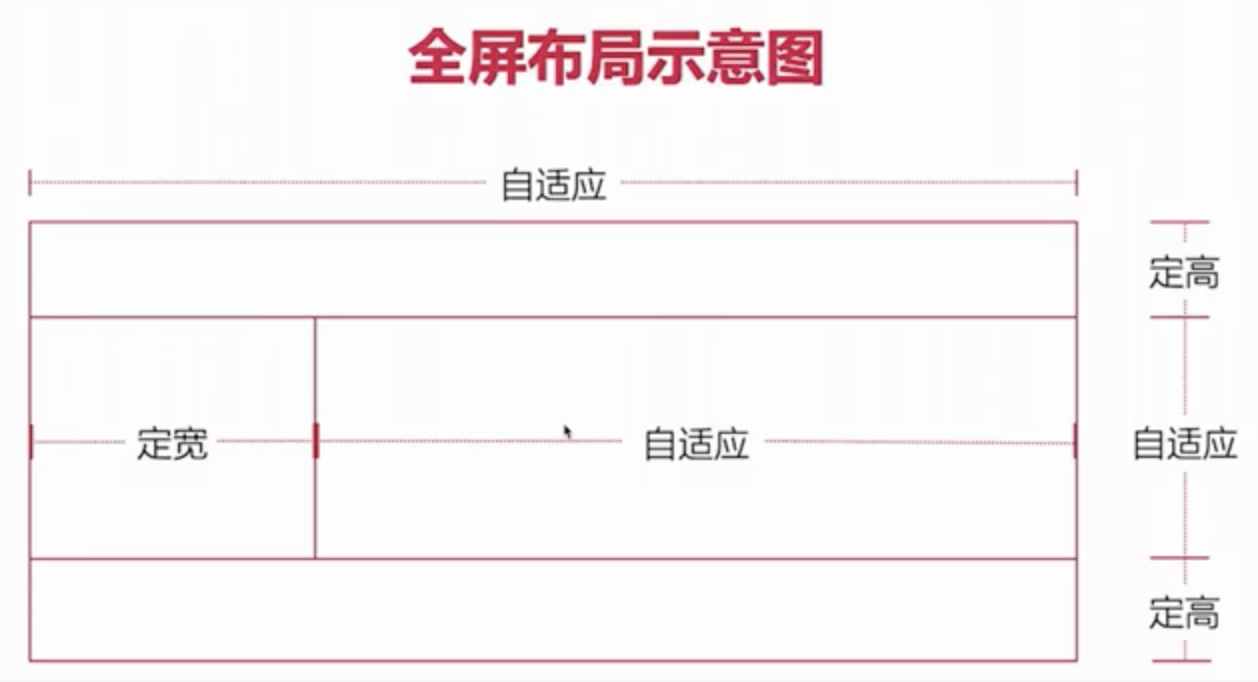
<!--头部和底部 定稿中间 - 左右 左定宽 右边自适应全屏 - 不能出现滚动条 - 串口进行缩放--><header></header><div class="content"><div class="left"></div><div class="right"></div></div><footer></footer>
* {
  margin: 0;
  padding: 0;
}

header {
  height: 100px;
  background-color: lightgray;
  /* 固定头部 - 定位元素的宽度本身内容的属性 */
  position: fixed;
  top: 0;
  /* 宽度撑开 - width:100% */
  left: 0;
  right: 0;
}

.content {
  background-color: lightblue;
  /* 高度撑开 */
  position: fixed;
  top: 100px;
  bottom: 100px;
  left: 0;
  right: 0;
  /* 隐藏 - atuo overflow-x overflow-y */
  overflow-y: scroll;
}

.content .left {
  width: 300px;
  height: 100%;
  background-color: lightcoral;
  /* 定宽 300 */
  position: fixed;
  top: 100px;
  bottom: 100px;
  left: 0;
}

.content .right {
  height: 10000px;
  background-color: greenyellow;
  /* 自适应 */
  position: fixed;
  /* 宽度撑开 */
  left: 300px;
  right: 0;
  /* 高度撑开 */
  top: 100px;
  bottom: 100px;
}

footer {
  height: 100px;
  background-color: lightslategray;
  position: fixed;
  bottom: 0;
  /* 宽度撑开 - width:100% */
  left: 0;
  right: 0;
}

若有收获,就点个赞吧
0 人点赞


