折线图使用 Matplotlib 开箱即用。 折线图中可以包含多条折线,更改颜色,更改折线类型等等。
Matplotlib 是用于绘图的 Python 模块。 折线图是它可以创建的多种图表类型之一。
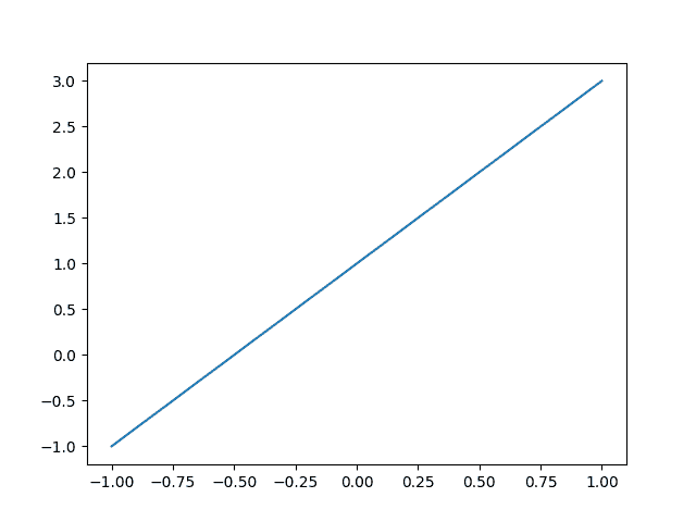
折线图示例
折线图
首先导入matplotlib和numpy,它们对于制图非常有用。
您可以使用plot(x, y)方法创建折线图。
import matplotlib.pyplot as pltimport numpy as npx = np.linspace(-1, 1, 50)print(x)y = 2*x + 1plt.plot(x, y)plt.show()
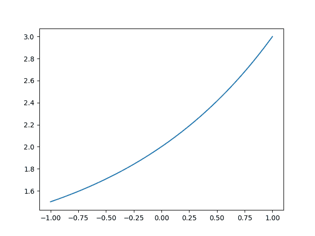
曲线
plot()方法也适用于其他类型的折线图。 不需要是直线,y可以具有任何类型的值。
import matplotlib.pyplot as pltimport numpy as npx = np.linspace(-1, 1, 50)y = 2**x + 1plt.plot(x, y)plt.show()
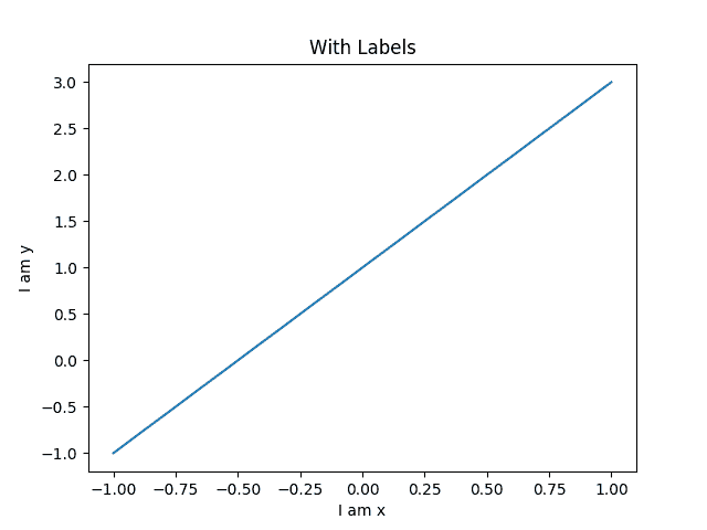
带有标签的直线
要知道您在看什么,您需要元数据。 标签是一种元数据。 它们显示图表的内容。 图表具有x标签,y标签和标题。
import matplotlib.pyplot as pltimport numpy as npx = np.linspace(-1, 1, 50)y1 = 2*x + 1y2 = 2**x + 1plt.figure()plt.plot(x, y1)plt.xlabel("I am x")plt.ylabel("I am y")plt.title("With Labels")plt.show()
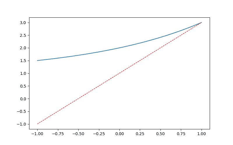
多个直线
绘图中可以有多条线。 要添加另一行,只需再次调用plot(x, y)函数。 在下面的示例中,我们在图表上绘制了y(y1, y2)的两个不同值。
import matplotlib.pyplot as pltimport numpy as npx = np.linspace(-1, 1, 50)y1 = 2*x + 1y2 = 2**x + 1plt.figure(num = 3, figsize=(8, 5))plt.plot(x, y2)plt.plot(x, y1,color='red',linewidth=1.0,linestyle='--')plt.show()
虚线
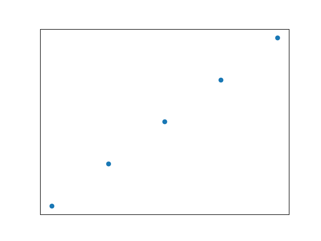
线可以是点的形式,如下图所示。 调用scatter(x, y)方法而不是调用plot(x, y)。scatter(x, y)方法还可以用于(随机)将点绘制到图表上。
import matplotlib.pyplot as pltimport numpy as npn = 1024X = np.random.normal(0, 1, n)Y = np.random.normal(0, 1, n)T = np.arctan2(X, Y)plt.scatter(np.arange(5), np.arange(5))plt.xticks(())plt.yticks(())plt.show()
直线刻度
您可以更改绘图上的刻度。 将它们设置在x轴,y轴上,甚至更改其颜色。 这条线可以更粗并且具有alpha值。
import matplotlib.pyplot as pltimport numpy as npx = np.linspace(-1, 1, 50)y = 2*x - 1plt.figure(figsize=(12, 8))plt.plot(x, y, color='r', linewidth=10.0, alpha=0.5)ax = plt.gca()ax.spines['right'].set_color('none')ax.spines['top'].set_color('none')ax.xaxis.set_ticks_position('bottom')ax.yaxis.set_ticks_position('left')ax.spines['bottom'].set_position(('data', 0))ax.spines['left'].set_position(('data', 0))for label in ax.get_xticklabels() + ax.get_yticklabels():label.set_fontsize(12)label.set_bbox(dict(facecolor='y', edgecolor='None', alpha=0.7))plt.show()

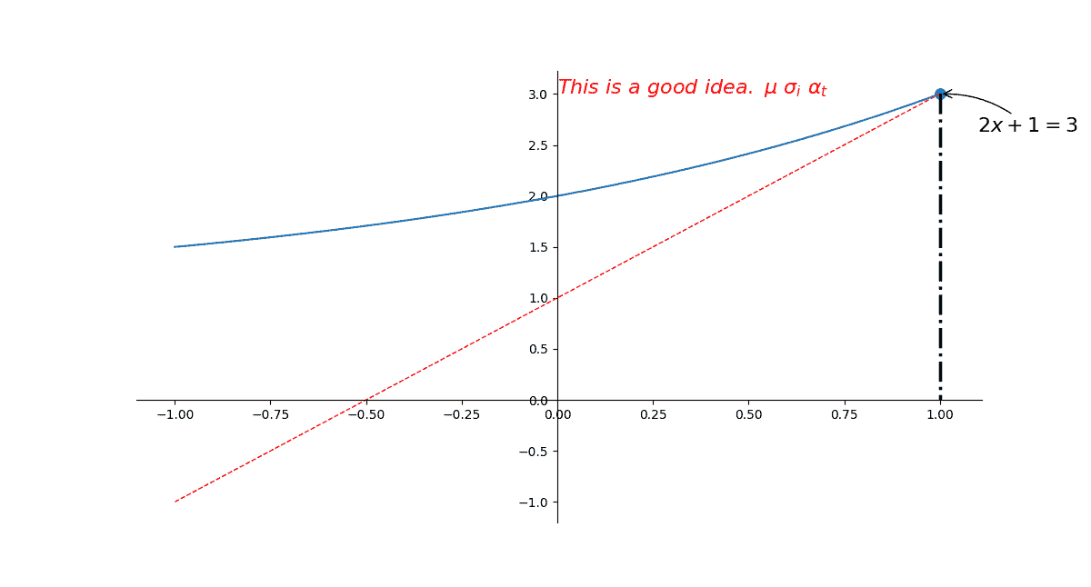
渐近线
可以将渐近线添加到该图。 为此,请使用plt.annotate()。 在下面的图中还有一条虚线。 您可以试一下代码以查看其工作原理。
import matplotlib.pyplot as pltimport numpy as npx = np.linspace(-1, 1, 50)y1 = 2*x + 1y2 = 2**x + 1plt.figure(figsize=(12, 8))plt.plot(x, y2)plt.plot(x, y1, color='red', linewidth=1.0, linestyle='--')ax = plt.gca()ax.spines['right'].set_color('none')ax.spines['top'].set_color('none')ax.xaxis.set_ticks_position('bottom')ax.yaxis.set_ticks_position('left')ax.spines['bottom'].set_position(('data', 0))ax.spines['left'].set_position(('data', 0))x0 = 1y0 = 2*x0 + 1plt.scatter(x0, y0, s = 66, color = 'b')plt.plot([x0, x0], [y0, 0], 'k-.', lw= 2.5)plt.annotate(r'$2x+1=%s$' %y0,xy=(x0, y0),xycoords='data',xytext=(+30, -30),textcoords='offset points',fontsize=16,arrowprops=dict(arrowstyle='->',connectionstyle='arc3,rad=.2'))plt.text(0, 3,r'$This\ is\ a\ good\ idea.\ \mu\ \sigma_i\ \alpha_t$',fontdict={'size':16,'color':'r'})plt.show()
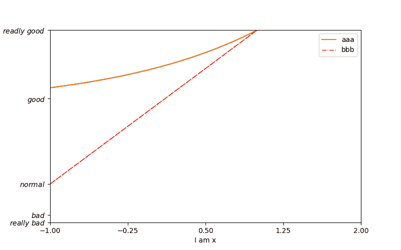
带有文字刻度的直线
不一定是数字刻度。 秤也可以包含文字,例如以下示例。 在plt.yticks()中,我们只传递一个带有文本值的列表。 然后将这些值显示在y轴上。
import matplotlib.pyplot as pltimport numpy as npx = np.linspace(-1, 1, 50)y1 = 2*x + 1y2 = 2**x + 1plt.figure(num = 3, figsize=(8, 5))plt.plot(x, y2)plt.plot(x, y1,color='red',linewidth=1.0,linestyle='--')plt.xlim((-1, 2))plt.ylim((1, 3))new_ticks = np.linspace(-1, 2, 5)plt.xticks(new_ticks)plt.yticks([-2, -1.8, -1, 1.22, 3],[r'$really\ bad$', r'$bad$', r'$normal$', r'$good$', r'$readly\ good$'])ax = plt.gca()ax.spines['right'].set_color('none')ax.spines['top'].set_color('none')ax.xaxis.set_ticks_position('bottom')ax.yaxis.set_ticks_position('left')ax.spines['bottom'].set_position(('data', 0))ax.spines['left'].set_position(('data', 0))plt.show()

若有收获,就点个赞吧
0 人点赞
